Intro
In the last Pixelblog, we established a template for an 8-direction top down character with idle, and run animations. With a solid foundation set, our character takes the stage once more to showcase weapon based attacks in all 8 directions. Honoring asymmetric details, all 8 positions offer a unique view of the action as the weapon always remains in the same hand. Wether you prefer to slice, stab or bash your enemies, our versatile character model can handle various offensive equips.
Motion Breakdown
No matter the direction, the action is performed in 6 frames. Depending on the weapon type, the motion spans 4, or 5 phases with varying frame timing.
Anticipation- This phase expresses the wind up of the strike, drawing back the weapon to a point where it can naturally strike with powerful momentum. This model uses 1 frame, at various delay durations. The longer and more dramatic the wind up, the more impactful a strike can feel, but results in more input delay in the context of gameplay.
Smear- This phase captures the greatest leap in motion, conveying movement from the wind up all the way to nearly the extent of the strike. Spanning multiple frames of brief duration, the weapon leaves a smeared trailed to emphasize the speed, and define the path of travel.
Rebound- This phase is only seen in the hammer example, and could be applicable in other weapons, or attack styles that have the weapon make contact with the ground. It captures a subtle bounce after the weapon hits the ground in 1 brief frame.
Follow Through- Shown with 1 frame, this phase marks the full extension of the attack, moving into the target 1 more pixel without any smear effects. The frame duration holds longer to emphasize the commitment of the attack, and weight of the weapon.
Recover- This phase shows the weapon being drawn back to the default idle position. The movement is captured in 1 frame, positioned somewhere between the follow through, and first idle frame. The frame duration can be slightly delayed to emphasize a heavy weapon, but is relatively fast.
No matter how great the jump in movement appears in the anticipation, and recover frames, refrain from using smear effects, as it noisily distracts from the forwards striking movement.
As described, the frame timing strongly plays into the the physical characteristics of each weapon. Specific timing for each frame is provided for each weapon type.
Sword

Of course, we start with the most popular choice of cold steel in hand- the trusty ol’ sword. More specifically, a medium weight short sword, which offers a neutral weight to length balance. While somewhat lacking range, the sweeping motion across the body provides a relatively wide area of attack. Furthermore, the slashing action is quick with minimal delay on the anticipation, follow through, and recover frames. The angular shapes of the smears captures strong motion while providing a solid feel to the weapon. The motion and angle of the swipe are fairly consistent, but there are deliberate variations made to keep the hitbox of the attack relatively balanced across all directions.
Frame timing in milliseconds- 100, 50, 50, 50, 100, 50
Total cycle- 400
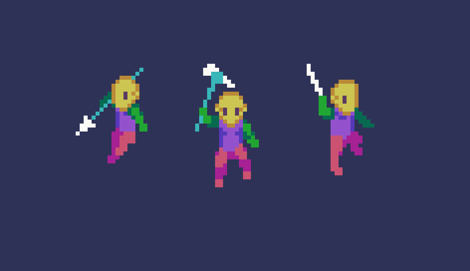
Spear

Keep your distance and poke em’ to death. The spear offers greater range than the sword, but holds longer on the anticipation and follow through, as slightly more commitment is needed to get the full power of this long weapon. Otherwise, the distribution of frames across the phases of motion are the same as the sword. Note, the underhand grip of the spear in the idle position, and how that transfers into the attack animation, in contrast to the upheld sword.
Frame timing in milliseconds- 200, 50, 50, 50, 150, 50
Total cycle- 550
Hammer

A true chad weapon. The weighty hammer offers a hefty strike, that is countered by the longest anticipation, follow through, and recover frames of the bunch. Along with the longer frame duration, the screen shake effect, and subsequent rebound frame help sell the powerful weight behind the strike. While the strike comes from overhead like the sword, the forward trajectory creates a slimmer hitbox, compensated by greater attack strength. Again, the sharp geometry of the smears evokes a greater feeling of impact than a curvy style.
Frame timing in milliseconds- 250, 50, 50, 50, 300, 100
Total cycle- 800
FINAL THOUGHTS
True talent for animating characters is a rare thing, and I’m no exception. Only through numerous attempts and failures have I made gains. At this point, I’ve built enough confidence to trust the process, but it never comes easy. At first, approaching an 8 direction character felt overwhelming, but my doubts eased as I settled into the process. After all, animation happens one frame at a time. Through careful organization and steady pacing, I was able to produce satisfying results, and dare I say, I even had a little fun. I’m sure there is still much that could be improved. I tried to keep the poses of every frame consistent across all angles, but I took some liberties to bring out the romance of each view point, and balance the hitboxes for potential gameplay. If you rotated the sprite on every step of the animation I’m sure you could spot some jankyness, but I don’t think such detail would be noticed in a practical context.
I was going to flesh out the run animation, and an attack animation with the complete character design from last lesson, but I figured it’s more useful to make more weapon variants with the dummy character. Ultimately, I hope my journey into the frontier of 8 direction animation provides solid footing to make your venture as smooth as possible.
RESOURCES
Please consider supporting my work by becoming a Patron. Among many other rewards, Patrons can download the assets featured in my tutorials. But, most importantly, you allow me to continue making new content!
Many of my popular assets are also available to purchase from my digital shop
Alternatively, you can support me by making a one-time donation
Assets featured in this Pixelblog are available in Top Down Character Attack Animation Asset Pack
Source files used in the making of this Pixelblog are available in Top Down Character Attack Animation Source Files
Get caught up on all my downloads
You made it to the end of the article. Thank you for reading!
-By Raymond Schlitter