Intro
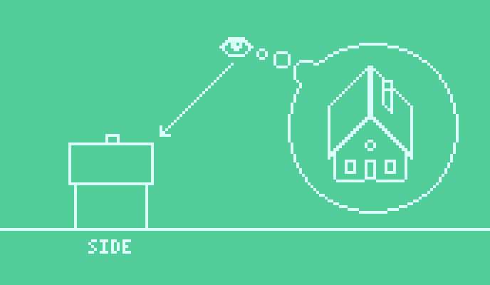
Welcome back for another round of graphical projection. In last month's Pixelblog I created a farm house from top-down and side-view perspectives. Now I'm going to take it to the next level and reveal more dimension to our humble little abode. Get ready to produce graphics in one of the most iconic pixel art styles!

ISOMETRIC

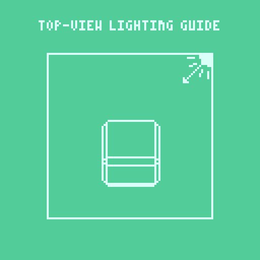
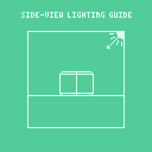
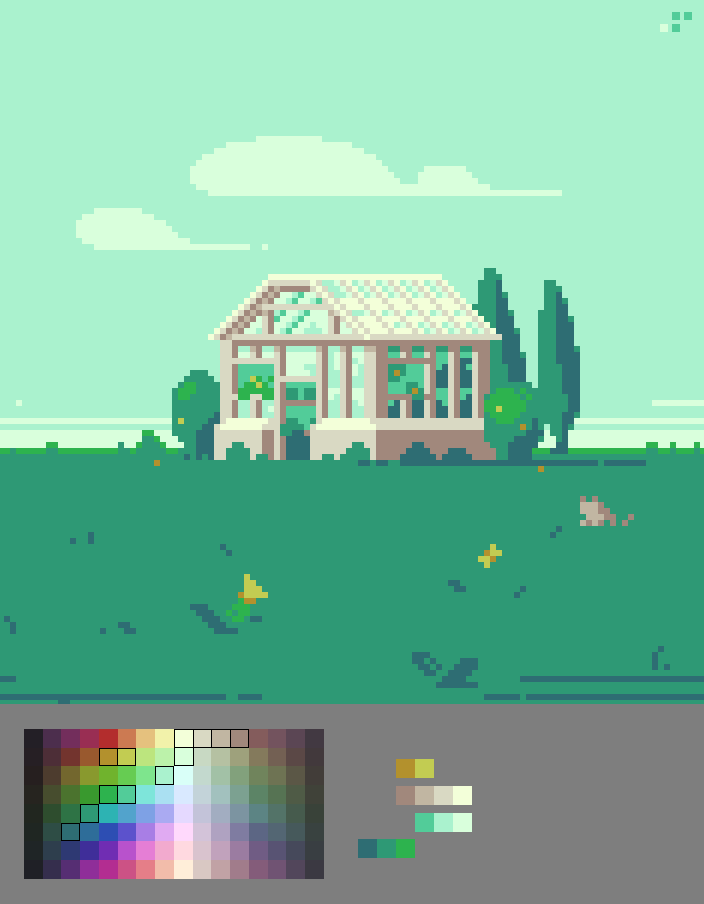
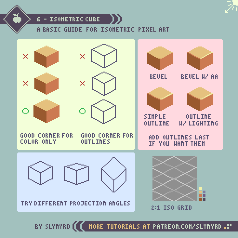
Isometric projection uses a tilted top-down view similar to 3/4 top-down, but it also rotates the building 45 degrees. This unique 3D perspective allows you to display a great deal of information by revealing the roof and multiple walls at the same time.

In true isometric projection the angles between the projection of the axes are equal, or 120 degrees if a cube. In pixel art this is most closely achieved by using angled lines with a 2:1 pixel ratio. I sometimes refer to these as two-step lines. It's possible to use a different projection angle, but two-step lines create the most realistic perspective. Essentially, isometric pixel art can be made by conforming to a grid of such lines.
Key Points
Isometric pixel art has been heavily used in video games since the early 80's as a means to produce convincing 3D graphics. Now, It's become iconic of the retro aesthetic and is still a crowd-pleaser. It sure does look nice but there are a few things to consider.
Advantages - Creates convincing 3D assets. Can be tiled. Opens more dimensional possibilities in terms of gameplay when used in video games.
Disadvantages - Economical but still more demanding to produce than straight side-view or top-view. The rotated perspective makes it difficult to create video games with precise direct input controls. Twitchy games like shooters can be very hard to control when presented in isometric perspective.
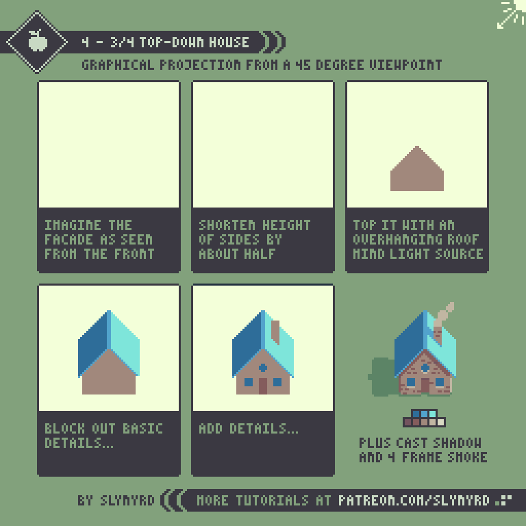
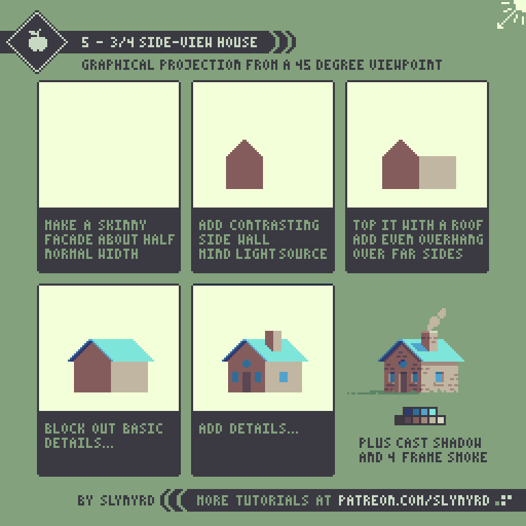
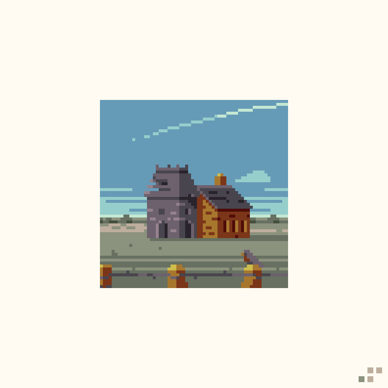
Now let's make an isometric version of our farm house from the previous lesson.

That wasn't so bad, was it? Check out some tips to sharpen your isometric skills.
workflow tips
Define rules - You will save yourself a headache by establishing some guidelines as early as possible. For example, color palette, light source, scale, proportions and other style properties should always be consistent. This goes for any style of pixel art.

The art of copy and paste - You will often see the same clusters repeated in isometric forms, so why not reuse them? Work efficiently by copying and pasting this and that here and there.

Work on a grid - Using a grid can be a good way to quickly lay down lines with the correct angle.

Use a ruler - If you find grids to be distracting simply designate a layer to use as a ruler when things need to be lined up. Make a long line with the 2:1 pixel ratio in a bright color and you're set!
Final Word
So now we've covered top-down, side-view, and isometric perspectives. There are many different graphical projections I haven't covered yet, but these are the most common and those I'm most familiar with. I will revisit the subject another time when I acquaint myself with some other projections.
Resources
If you find value in my content please consider becoming a Patreon member. Among many other rewards, Pixel Insider members get extra resources to compliment my tutorials. But most importantly, you allow me to continue making new content.
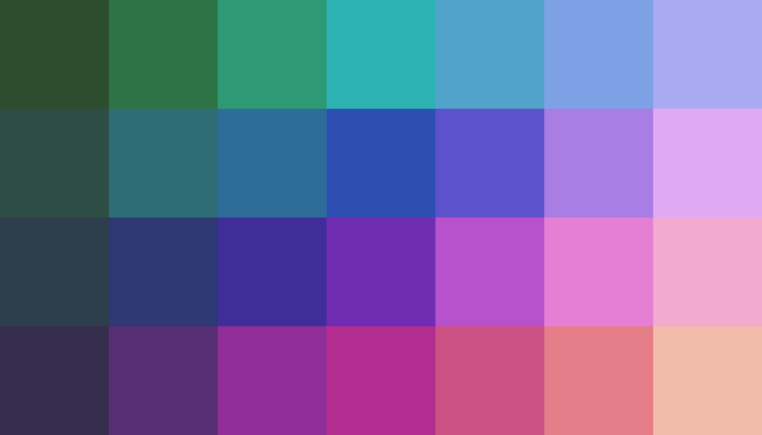
All assets for this feature use colors from my custom palette Mondo.
Get caught up on all my downloads
If you're not ready to commit to the subscription model of Patreon, you can also make a one-time donation and receive exclusive art and downloads.
-By Raymond Schlitter