Intro
The time has come for another venture into isometric pixel art. In this edition, I build out the concept for a turn-based tactical mech game, very much in the vein of the original Front Mission. Since this isn’t my first foray into the isometric style, or mecha designs, we are going to jump right into the heart of the action. So, if you are new to the subject, I suggest a review of my earlier studies in Pixeblog 4, and Pixelblog 41. With that out of the way, let’s start assembling a mecha battalion. By the end of the lesson we’ll have multiple types of mech units, and two different environment settings to stage glorious campaigns within.
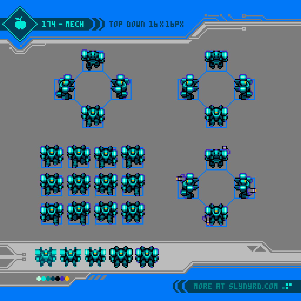
Mech Units
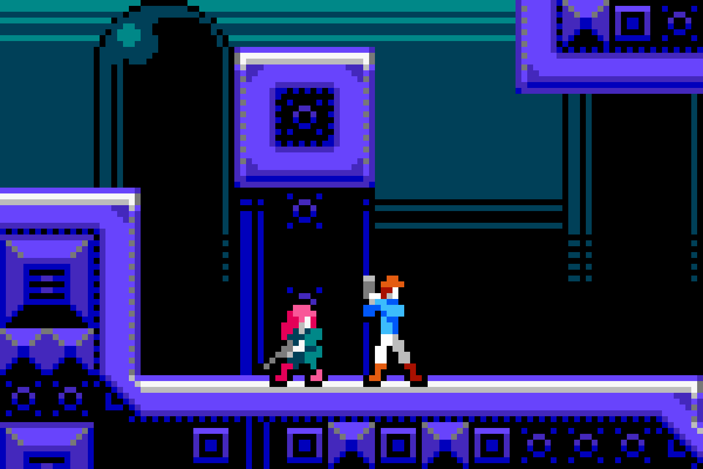
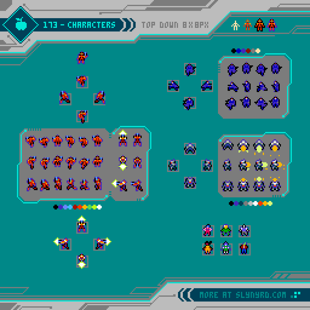
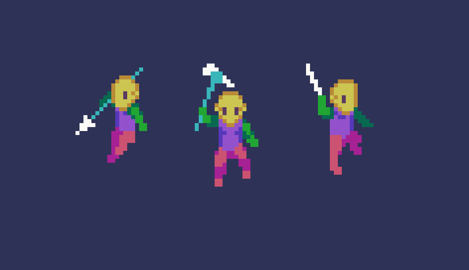
I wouldn’t call myself a mech maniac, but I might be on my way with the many creations I’ve done on the subject over the years. While I have made a number of isometric mech designs, they have all been around 64x64px plus. Generally, lower resolution means less labor, but there is a learning curve to develop the imagination required to abstract details into few pixels that clearly communicate the intended depiction. Roughly working within 32x32px for this study, I had to overcome this challenge. Usually, I start by making simple geometric shapes, like cubes and spheres for the various parts. This method still works for the most part at this scale, but I had to omit parts and details that I normally include at a larger size. Until I actually referenced some Front Mission sprites I was struggling to fit all the components into the small space without just making a noisy blob. It’s like, oh, that hand is literally two pixels.
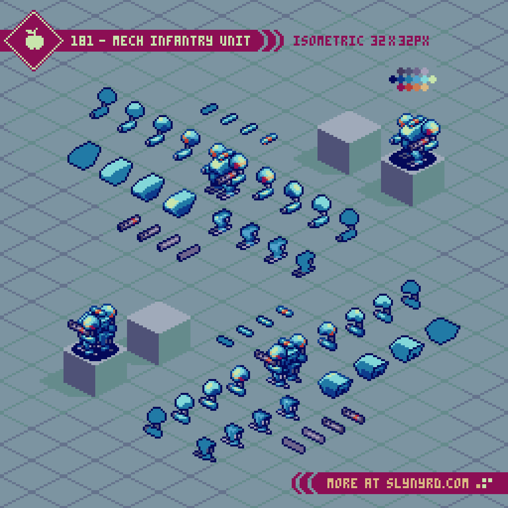
I found the best approach is to start with the body, and work your way out. Most of the defining characteristics are captured in the upper body. Treat the torso more like the front of a tank than a human chest, for a strong form that juts out further than the shoulders. Bulky shoulders, that often sit higher than the head express an imposing power. A sleek, low set head with only one or two brightly colored pixels to represent the optics feels practical, while giving just enough humanoid quality to capture a cool character.
The upper leg area is mostly unseen in the isometric view, and the groin unit can often be omitted. The entire leg, and foot can be designed as a single unit. However, don’t overlook the feet, as they are another prominently seen feature than can throw off the whole design if they don’t mesh well with the rest of the character. Think practical, and make them appear to offer a balanced area of stability, more like skis than regular feet. A straight up humanoid foot with no extra balancing protrusions looks awkward with the bulky style I’m going for. Rather, I look to shapes from animal anatomy, like talons, claws and hooves for distinct designs.
After creating all the parts, and arranging them into the complete unit, I then apply accent color stripes to areas that feel a little bare, and where they will enhance the shapes, rather than muddle with extra noise.
In terms of game design, the infantry unit is the basic all-rounder. Mobility, attack range, power and defense are all average. While decent in most situations, they are often outclassed in one on one situations, and should be moved in groups.
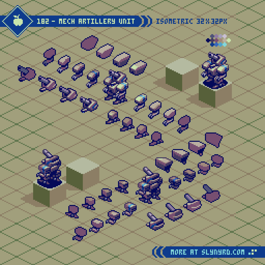
Following the same basic breakdown of components as the infantry, the artillery’s defining feature is a giant cannon merged with the head piece in exchange for a hand held weapon. Bulky legs, and elongated feet help balance the top-heavy design. Where the infantry unit uses more rounded shapes, the artillery is distinguished with sharp blocky shapes.
In terms of strategy, the artillery unit is high in range and attack power, low in mobility, and has average defense. Best to keep these at the rear of your battalion, where they can deal damage and remain invulnerable from most attacks. If you’re trying to take out an artillery, your best bet is to swarm it with multiple units, as you are sure to endure blows when closing the gap.
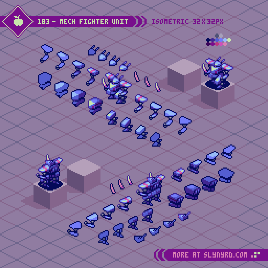
Threatening agility is evoked through sharp triangular shapes, and reverse jointed legs. Wielding a sword the fighter takes on opponents at close range with melee attacks. A pronounced groin piece connected to the body enhances the confident aura.
With high mobility, and attack strength, but low defense, the fighter is best used to pick off stragglers and make killing strikes to weakened units. If you’re going against a fighter you better make sure you can withstand a likely counter attack if you don’t finish it in one blow.
Environment
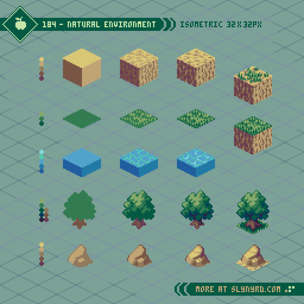
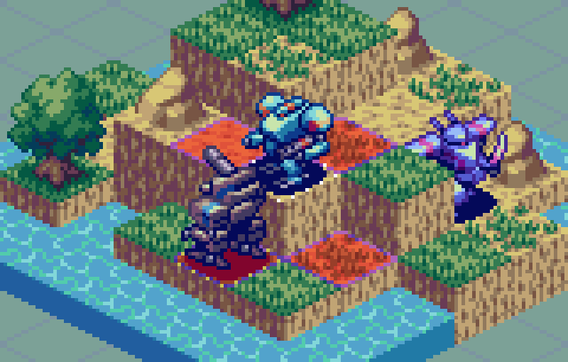
The 3D aspect of isometric projection lends to a great variety of tiles that can be layered into cohesive environments. To appropriately accommodate my mech sprites, the base tile unit is a cube that measures 32x32px. Since the top plane of the cube has 2px tall corners on the right and left ends of the diamond shape, adjacent tiles must be layered with consistent ordering to fit the textures flush, as the top row of pixels must be overlapped. This could be avoided by smashing the diamond down by 1 pixel, so those side corners are only 1px tall. I go through the trouble because I like the look of the wider corners, and cube shaped tiles have to be layered to some extend anyway. I know it’s confusing to explain, but if you play around with tiling these cube units it will make sense.
First. I made the basic dirt tile, then varied grass textures can be applied to the top, rather then duplicating the whole cube. Objects like the rock, and tree are also layered into base tiles.
The water tile is about half the height of the standard 32x32px cubes to make it naturally sit lower than the land, and create more interesting geometry to the landscape.
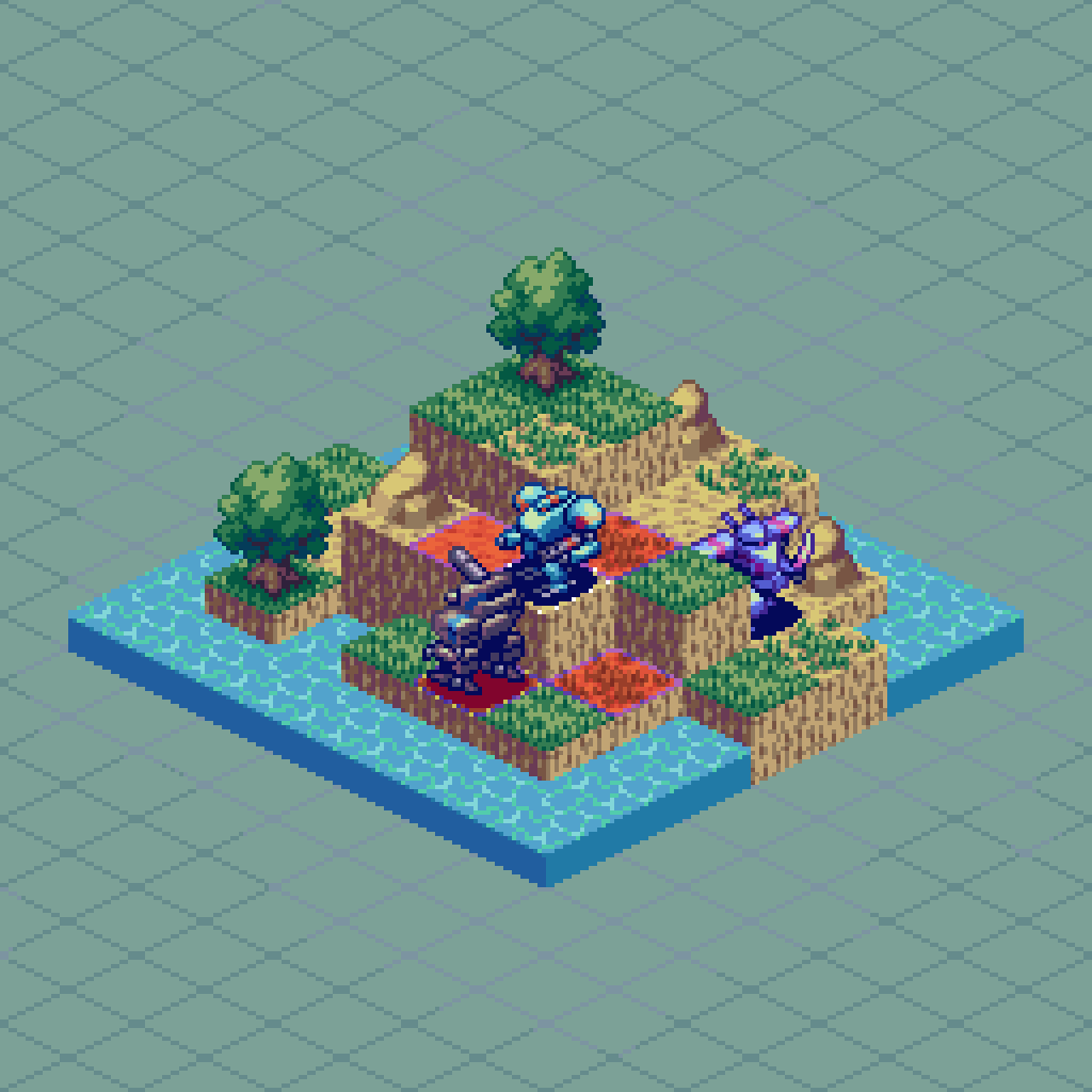
Put it all together and you can make quite a pleasing natural landscape. I imagine the trees, and rocks could be destroyed to convert the space into a traversable tile.
As for the water animation, the line texture on the top has one alternate version that only changes the placement of the highlights in the sub pixels. The entire texture moves down 1px each frame while alternating the highlights. The animation seamlessly loops over the course of 16 frames. Pretty easy, but if you want to see the concept illustrated more thoroughly with some extra effects, check out Micro Tutorial 7.
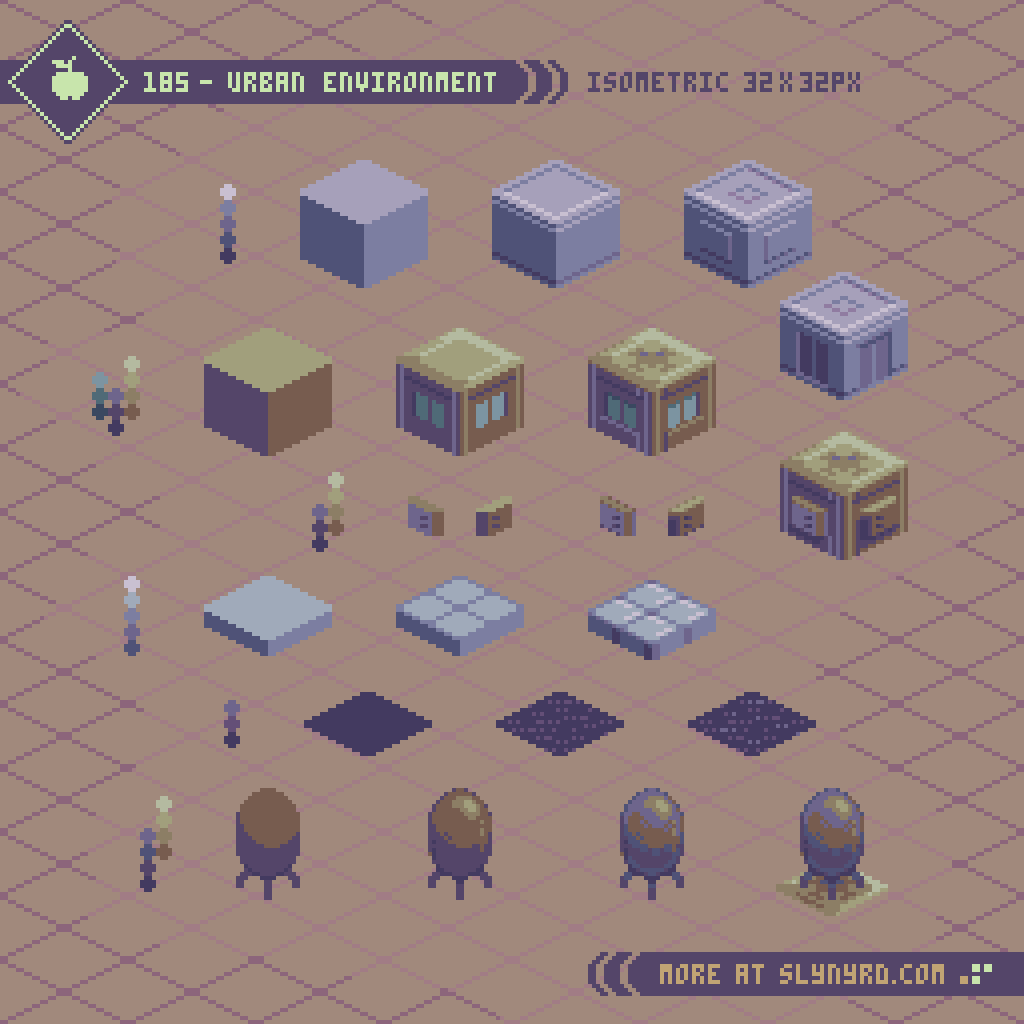
Next, we take the battle to the city. The gray cubes are used as a foundation layer to buildings, and/or a tiled ground texture. The brown cubes can be combined, layered, and stacked to create multi-storied buildings. The shallow, gray tiled texture works great for sidewalks, or just a variation of ground texture. The flat, dark tile represents asphalt texture for ground areas. Finally, the tank feature goes on top of buildings, which could contain, water, gas, or provide some other infrastructural function. Definitely cool if it’s a gas tank that can be destroyed, causing proximal damage.
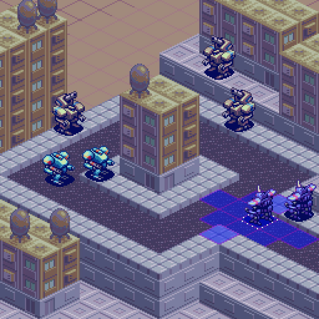
A handful of simple textures turns into a sprawling city. I’m always amazed how much can be done with so few tiles. It’s worth taking the time to make the textures as balanced and pleasing as possible when used in repetition. I’ve spoken much on the principles of sound tile making, and repeating texture in past lessons, so I’ll just let the work speak for itself here.
Final Thoughts
I’ve been making tutorials for years, but with every feature, comes the assumption that it’s part of a game I’m making. I hate to disappoint, but the game ain’t real folks. It’s all for educational purposes, and the hope that I might spark the inspiration in someone to make a real game. We could definitely use more isometric pixel art turn-based strategy games with mechs. When it comes to actual gamedev, my wheelhouse for game design is more centered around shmups and arcade genres, but I do have a strong affinity for srpgs. My colleague and I have discussed the genre with great interest in concept pitching phases of development. Never say never!
RESOURCES
Please consider supporting my work by becoming a Patron. Among many other rewards, Patrons can download the assets featured in my tutorials, and use them for commercial projects. But, most importantly, you allow me to continue making new content!
Many of my popular assets are also available to purchase from my digital shop
Alternatively, you can support me by making a one-time donation
Assets featured in this Pixelblog are available for commercial use in Isometric Mecha Tactics Asset Pack
Source files used in the making of this Pixelblog are available in Isometric Mecha Tactics Source Files
Get caught up on all my downloads
You made it to the end of the article. Thank you for reading!
-By Raymond Schlitter