Pixel Diary - Neomecity by Raymond Schlitter

Intro

Welcome to my first Pixel Diary. The goal here is to provide a deep dive into my thought process behind the art. In this entry, I dig into the art presented in Pixelcast 47. The fast action of the timelapse is enthralling, but when the dust settles, many are still left wondering how the sausage is actually made. Particularly, on a cognitive level. Well, I’ll attempt to answer that question, as I retrace my thoughts from over 13 hours of pixeling. An attention span is required. Any hardy souls coming with me?

Concept

I came up with a vague plan, but wanted to keep it pretty open to spontaneity along the way. The vision swirling in my head was a zoomed out, top down view of a civilization that appears ancient, yet advanced. So, as I often do, I made some ambiguous doodles that leave much to interpretation. The numbers off to the side are from tallying up the time of the recording sessions. In case there is an issue with the recording, I average 30 minute bursts, so I don’t lose large chunks of footage. Over 13 hours in all!

The key elements I wanted to hit upon was a tower as a focal point, the implication of giants with a head on the tower or other body parts elsewhere, and a grand scale with a sense of depth. Definitely I'm influenced by my recent studies of scripture and ancient civilization. Furthermore, I wanted to make something that would fit into the world I'm developing for Death Vapor, which is about a civilization enveloped in sin and perverse technology. You'll see later in the process that I even reuse some assets from the game.  

Process

First, you'll notice things look a little different than my previous time lapses. Since I recently ditched Adobe products, I'm now maining Aseprite for most of my pixeling needs. I'm using the minimal dark theme by Fe to replicate the feel of workspaces I'm more used to. I know some people adore the default pixel font UI, but something about it throws me off. The palette I'm using is Bright Future.

I start the process with a 256x256px canvas. I didn't have a definite plan for the composition, so I start with a mid-size square canvas, which I can easily edit the size and proportions of as the vision forms. Even if I plan to make a large piece, I like to start on a smaller canvas, so I can establish style elements without getting overwhelmed. Style elements entail the color palette, perspective, and detail level of cluster work. It's good to have a rough idea for the composition from the start, but I usually establish these style elements before I get too involved with the comp. It depends on what you are trying to accomplish, a clear vision for the composition is more critical in something using realistic perspective, and dynamic figures. 

Furthermore, you can see I establish several style elements with the creation of the first building, then I step it up with the tower. At 4:51, after I pretty well developed the tower, I start to visualize the overall composition and surrounding structures with basic line art. At this point, I was thinking to fill the entire scene with buildings on one ground level with the minimal warm color palette. While this would give a lot of city details to look at, I thought the composition would be uninteresting, and too many similar elements would detract from the grandness of the tower. So, from about 5:00 to 6:00 my idea was to fill the bottom corner of the canvas with city and surround it with water. This would give a splash of complementary colors, but it wouldn't achieve the depth I was hoping for. 

6:03: at this moment I had it. Instead of surrounding the city with water, I would make it floating in the sky, and put water elements inside the city. To accommodate the vision, I first expand the comp to a vertical orientation to allow a good view of the sky layers and distant ground beyond. Most importune part of blobbing out the cloud layers and making the sky gradient is the colors. This is where I go off from the indexed palette most, creating more subtle steps in the gradient and cloud layers to achieve desired depth and sense of atmosphere. Generally, the colors become more more blue and desaturated as they recede into the background, while closer layers brighter and shifting towards yellow.  

7:04: After introducing the 45 degree angles to the structures the projection appears oblique, or also referred to as military projection, which meshes with the straight on top down buildings, but not so much with isometric. Hence the revision of the bridge here.  

7:48: My next ah ha moment- The head on the tower is just too bald, let's put a magnificent tree growing from the head, and fill the city with lovely vegetation. I hadn't thought of this in the sketches, as I originally was going for an oppressive vibe with everythign drenched in red light. However, after I introduced the sky background, the mood shifted to something more mysterious and wonderful. The vegetation helps blend together the juxtaposition of the red city on the blue background. I also wanted to elevate the tower for the sake of the composition without having to add to the structure.

I did a bit of off camera work on the tree and vegetation concept to work out the colors. I figured all that color sampling would result in indiscernible noise when sped up for the timelapse. However, I still want to mention it, so you know there is a thought process, and a lot of experimentation going on with color selection. I don't just magically have the final refined palette from the get go. Note, there are several color changes made throughout the entire process. I also made a subtle modification post recording, changing the dark wine color on the building to a more desaturated purple. I think this helped smooth out the color ramp and meshes better with the ambience of the sky background. 

8:41: Small comp adjustment to allow more of the garden area to be shown, and put the tower off center for more interesting overall spacial balance. 

9:23: Second pass at cloud details. This time i add a shade and highlight color to each layer. Colors have slightly less contrast with each layer into the background. I refined the shape and clusters with more precision. Using the circle shaped pencil tool, the circle sizes get smaller with each layer into the background to imply spacial depth. 

10:50: The comps still felt a little off due to the lack of details on the left hand side of the city. I first toy with running a bridge off the canvas, but that felt dull and actually weakened the comp. I settled with a waterfall spilling into oblivion of the depths, and intricate openings and platforms across the side of the city. 

11:21: I then move into a final pass of refinements and details across the entire city. Gateways for the main paths, various pillars and monoliths to fill in empty spaces, more openings, roofing elements, and brick details. 

12:57: The ruined city background I created for Death Vapor is exactly what I wanted for the distant ground layer. So, I straight up imported some sections, changes the colors, and made some minor edits to hide repetition. Ta-da! 

13:03: Final pass on cloud layers, polishing clusters and adding anti-aliasing to soften edges. This is nitty gritty stuff I find hard to put into words. Light source, the implied shape and texture, and a fair degree of subjective style all dictate the nature of the clustering. Just keep watching and you will notice a pattern.   

16:10: A fleet of airships suddenly emerges from the clouds! I wanted to try the idea, but wasn't sure if I'd end up including them, and the recording was getting super long at this point, so I worked out the concept off camera. At least. I show the creation of one ship to give you the gist. They ended up being an important element that ties the whole composition together. 

Conclusion

240x320px
30 colors
13 hours
Aseprite

I love epic concepts like this, and I greatly enjoyed the challenge. Pretty much every piece I make, I have doubts somewhere in the middle of the process. This was no different, and I was especially uncertain about the composition right up to the end. I fiddled with the canvas size and position of the city off camera numerous times, but kept going back to what you see in the video. Through experience, I knew if I just stayed the course, things would eventually fall into place. Channeling a vision can be a wild ride, and sometimes I feel like I'm just along for the ride. I was enlightened by the depth of emotions that developed through the process. What started minimal in execution and breadth of expression, blossomed into something complex and ironic. There is a fearful element to the city and its potential denizens, yet it welcomes with its grandeur and gardens. The calming effect of viewing a sweeping natural vista from elevation is subtly undermined by ruined civilization below. Yeah, I've been in my own head for too long. Let me know you thoughts and observations. Still have questions? Let me know. Leave a comment here, or on Youtube.     

Thank you so much for going on this journey with me. If you are still reading you must be one of few. 

Support

I run a one man show, and content like this takes a great amount of time and effort. If you appreciate my work, please considering supporting me.
Patreon
Donate
Shop

Thank you!
-Raymond Schlitter

Pixelblog - 50 - Human Walk Cycle by Raymond Schlitter
intro

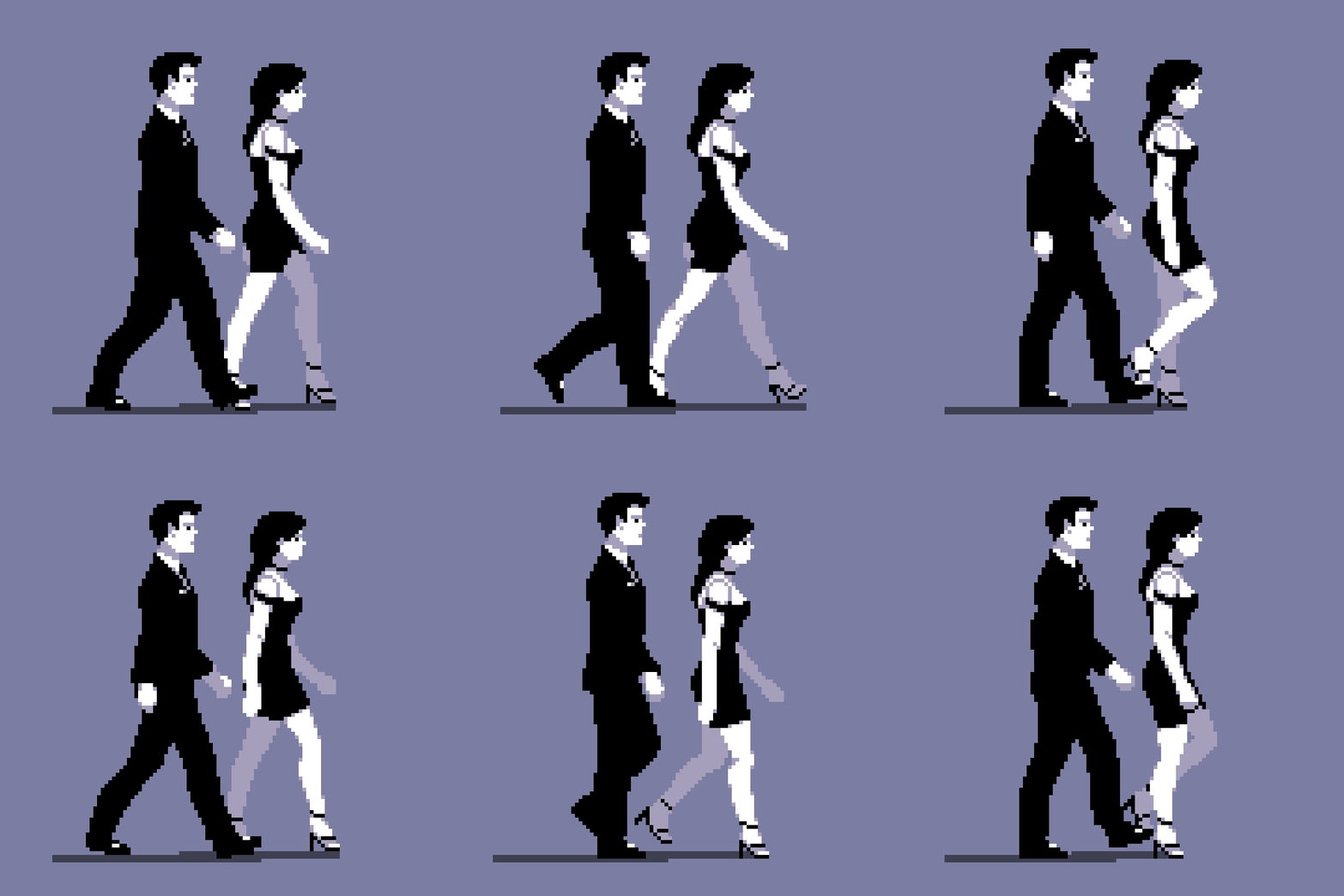
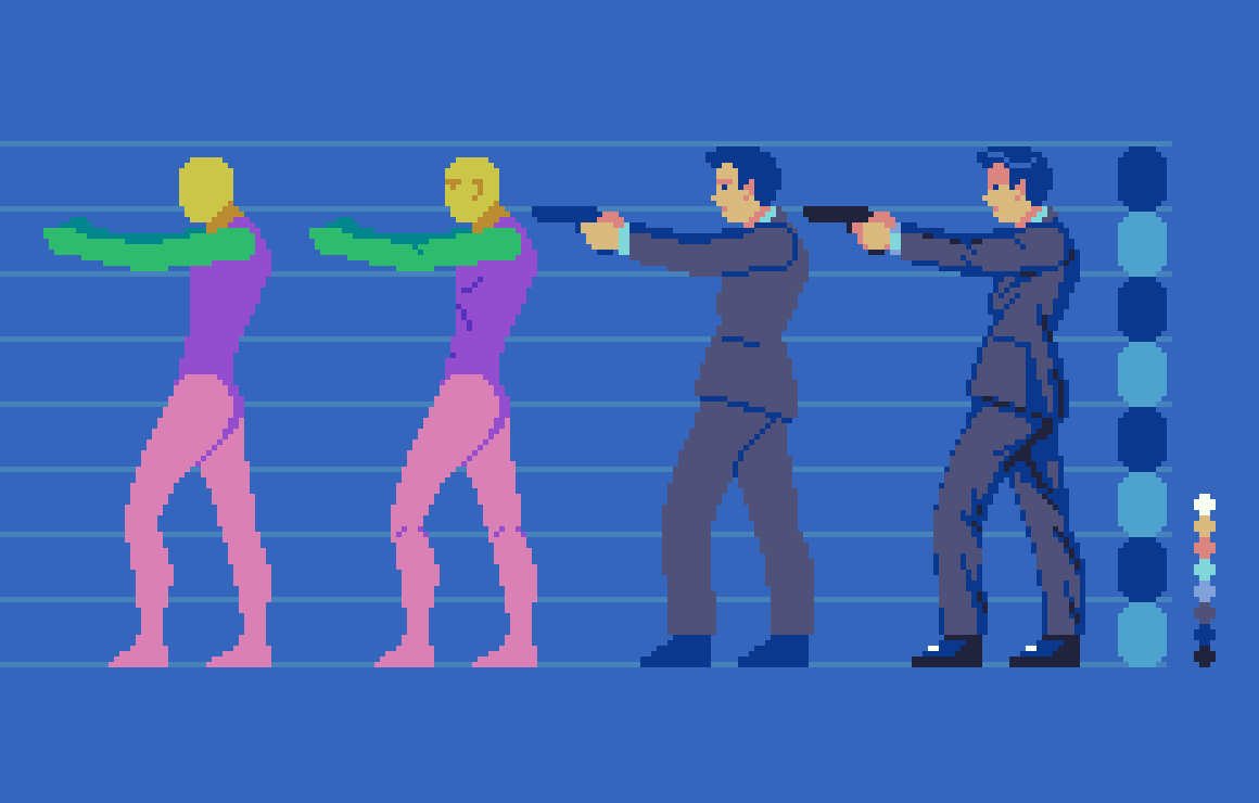
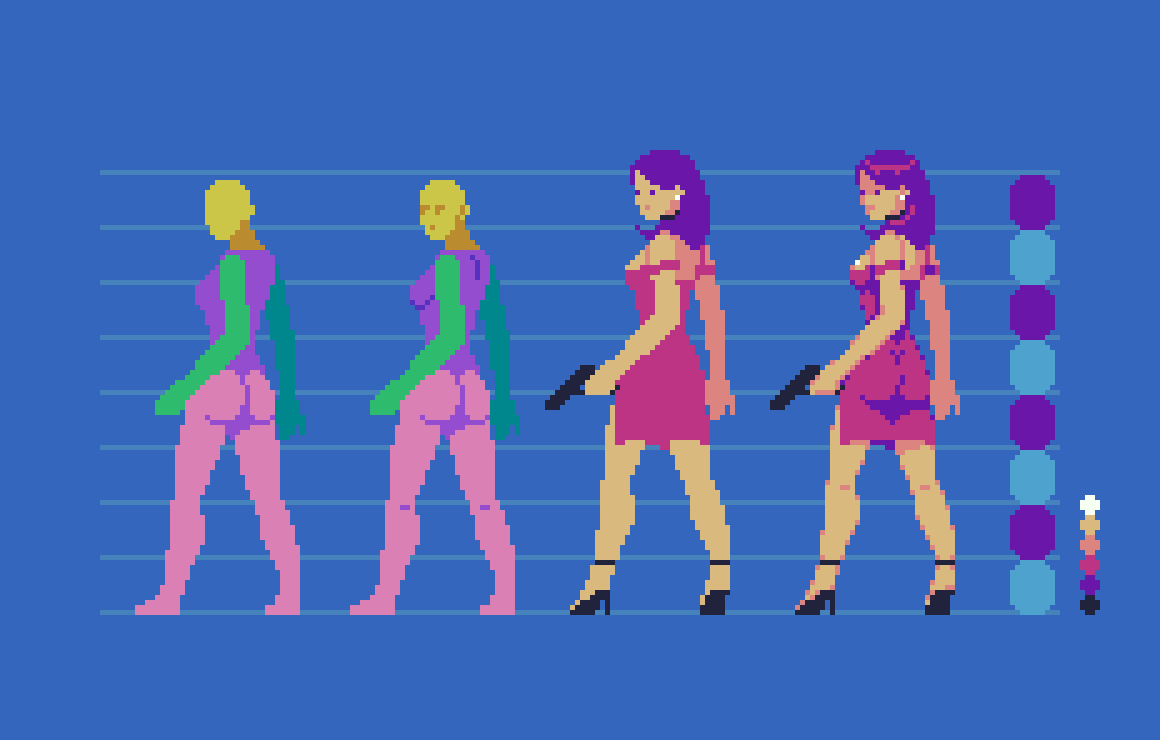
After a thorough study of human anatomy using an 8 head model in Pixelblog 49, it’s time to walk the walk. This is not my first rodeo when it comes to animating a walk cycle, but these sprites are significantly larger than my typical work. While the size affords more details, labor increases exponentially as pixel art is scaled up. Size, details, and frame count must be carefully considered in terms of time cost when designing animated characters. This is especially true for game design, where it’s difficult to plan exactly how many unique actions, and subsequent frames are needed to effectively display the action in balance with the gameplay. Cosmetic details that may seem like a cool idea in a single static image can quickly become a pain when animating and expanding on mechanics. Moreover, while my characters are relatively large from what I am used to, I’ve remained conservative with details and overall frame count. Delibrately on the generic side, I present male and female side-view walking models that can be expanded on, and applied to a wide array of projects.

use References

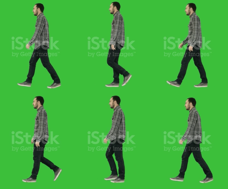
My goal with this animation is to create a fairly realistic casual walk cycle with minimal cartoon embellishments. Therefore, I use real life video references to guide the sequence. If I had a treadmill I might go as far to record my own references. Anyhow, I was able to screen record a few sample references off the web, which I then edited in Photoshop in order to reduce it down to an 8 frame loop.

First, I open the raw video recording in Photoshop, and isolate a section in the timeline to capture a single walk cycle that loops. Then I export that section as a gif.

Next, I open that reference gif, and hand pick the best frames to meet my target of 8 frames. I feel 8 frames strikes a solid balance between economy and fluidity, but of course, you could extract more frames if your ambition is to create hyper smooth motion. In most pixel art game applications, I think anything beyond 8 frames is an aesthetic choice, and not necessary to function, or critical discernment in the eye of the audience.

The raw sliced section at 60fps results in 72 frames. Several frames are identical at such a high frame rate. Nope, not going to need all that.

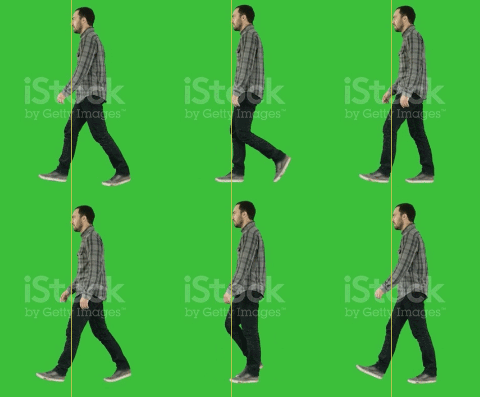
After reducing to 8 key frames and adjusting the playback duration to maintain a natural speed, the final reference looks like this. The slumped posture and limited gate to the arm swing is not ideal to the character I had in mind, but still provides a good base. By comparing this with other references, and making my own embellishments, I can modify aspects to my own preferences.

Dummy template

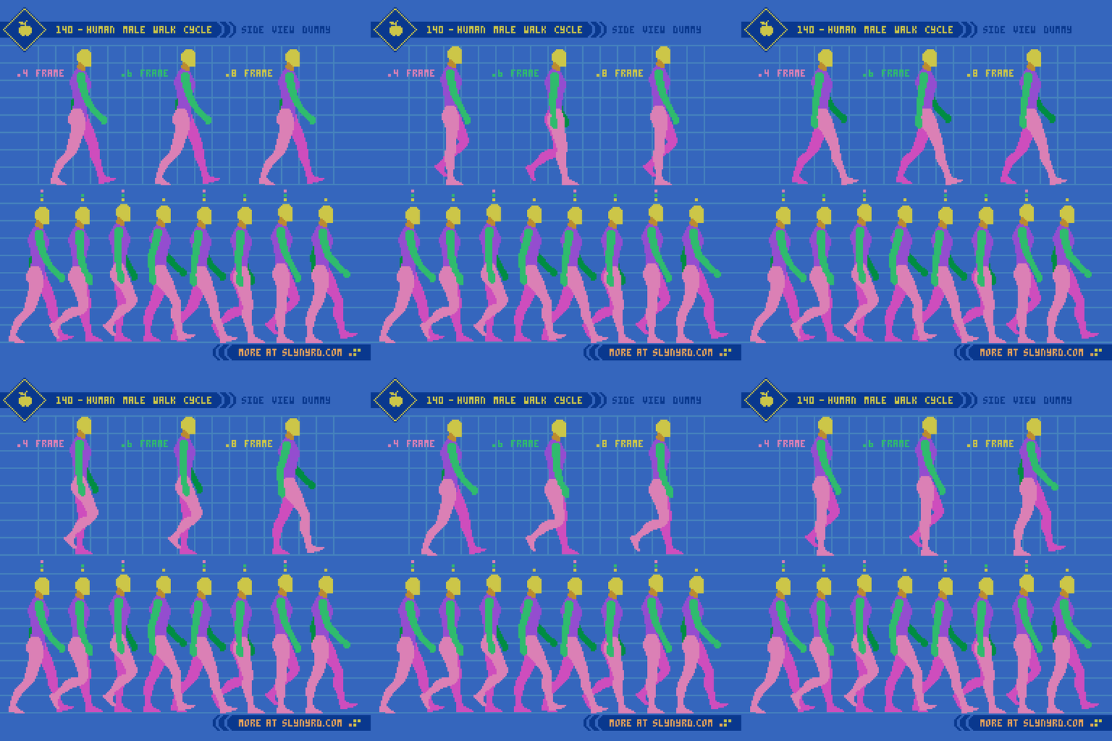
To animate most efficiently, I always start my character drawing process with a simple color coded dummy to clearly define all the core parts of the whole. In this case of a full proportioned human, the breakdown includes head, neck, torso, arms, and legs. Of course, you can further granulize, but I feel that greater distinction at this scale begins to impede on the efficiency of animating.

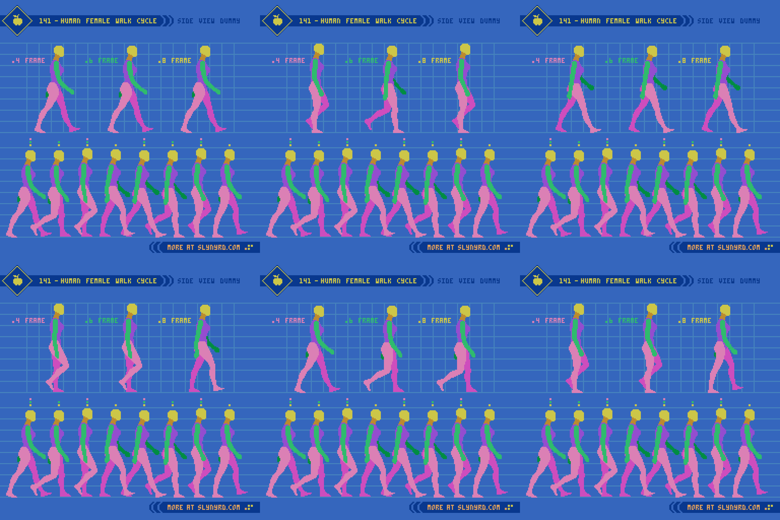
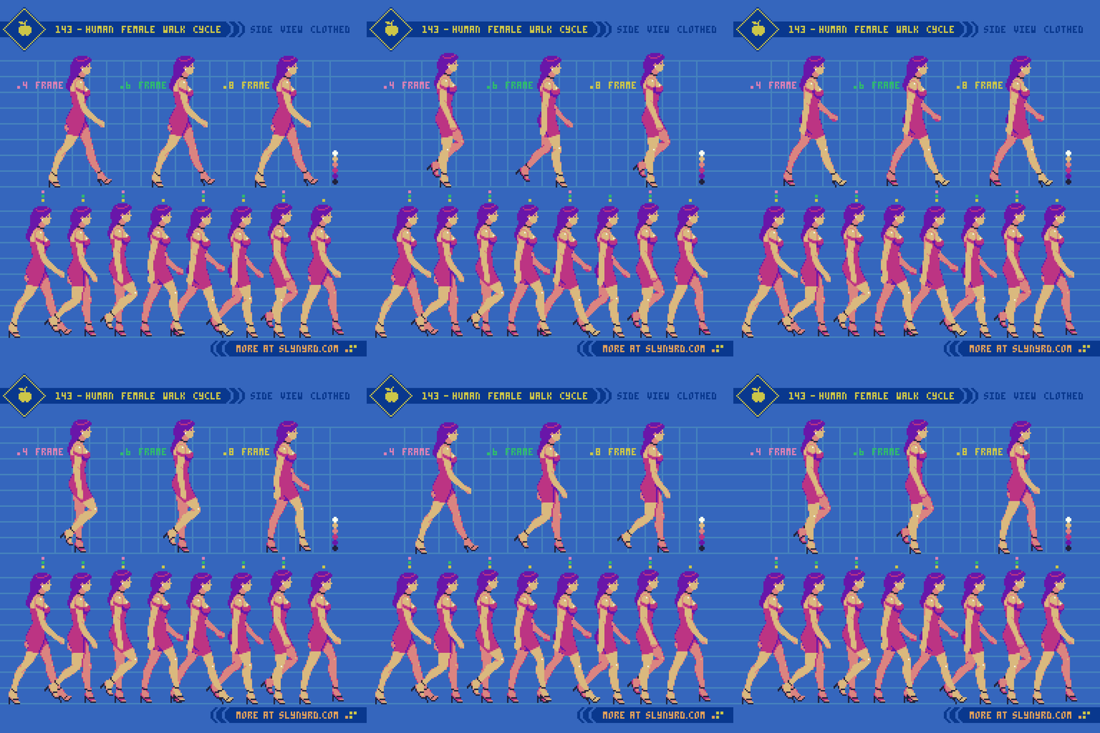
Since I’ve already established the process of defining the form and proportions from the side-view in the previous Pixelblog, I jump right into the animation frames. 8 frames achieves the optimum fluid animation, while the 4 frame version highlights the most important key frames to capturing the essence of the motion, but feels somewhat lacking on it’s own. The 6 frame version strikes a nice middle ground by removing the least compromising frames for more economy, while remaining sufficiently fluid enough to stand on its own.

Observe the frames from left to right,
1. The first frame can be described as the contact point, where the left heel meets the ground, arms and legs are at the extremities of their swing, and the overall height of the figure is at its lowest point.
2. The second frame is the down point, as the left foot comes flat down to the ground and begins to shift back towards center, as the right foot lifts off the ground and begins to swing forward.
3. The third frame is the pass point, where the legs cross one another in the center, and is the point where the figure is tallest.
4. The fourth frame is the swing point, where the right leg makes it most dramatic movement forward, but remains off the ground.

The next four frames are more or less a mirror of the first four frames, with minor adjustment to account for implied perspective. Note, how the swing of the arms relates with the gate of the legs. The movements of appendages on opposite sides of the body track along with shared momentum.

Another important detail is the overall bobbing motion of the figure. Notice the position of the head across the sequence, which create a triangle shaped wave. This produces an appealing sense of energy that feels organic. On the other hand, If the head position across the sequence creates a perfect sine wave, the uniform motion feels a bit unnatural.

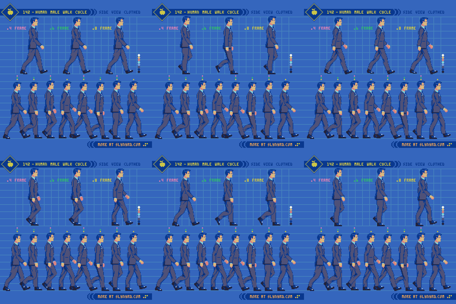
All the same principles apply to the female version, but take note of subtle nuances. The bone structure and curvature of the female figure lends itself to more graceful movement arcs. Of course, this is a generality, and every person, no matter the sex, has unique characteristics to his or her manner of locomotion. The most notable difference in my models can be seen in the arm swing. The female takes a fuller swing that moves all the way back past the hips, while the male’s arms have a relatively tighter course of motion. This gives the man an intentionally more stiff, business like character, and the woman is attributed with peppy elegance. Moving the breast down one pixel on the contact frame makes all the difference.

Clothed design

Time to put some clothes on these dummies.

A well fitted suit adds a slight bulk to the base figure. The most challenging detail is the dynamics of the folding lines in the fabric. Folding lines are determined by the implied tension caused by the body pose, and gravity. Make sure these lines have consistent tension anchor points and direction throughout all frames. Save the trouble, and keep the details of folding lines minimal.

Minimal, formfitting attire presents far less difficulty when animating. However, the high heels account for an altered foot shape, and slightly modified stride. Also, the asymmetrical dress with a slit over the left leg must be considered. Simply reflecting the sprite from right to left would be inaccurate. Technically, the breast pocket on the male is also asymmetrical, but far less noticeable.

Final Thoughts

Strolling, ambling, tip-toeing, shuffling, waddling, striding; considering all the numerous ways which we can describe the manner of human locomotion, one could study the subject endlessly. I’m thrilled to add a couple more walk sequences to the portfolio, but I think I would like to move on to some different actions if I continue to expand on this series. As I stated in the last Pixelblog, my goal is to create assets that could be utilized for a beat em’ up concept. That means punching, kicking, and jumping could be on the table. I might need a detour into another subject before I expand this series, but it kind of depends on the demand. Hit that like if you want to see more. Better yet, join my Patreon and download the assets for you own project.

RESOURCES

Please consider supporting my work by becoming a Patron. Among many other rewards, Patrons can download the assets featured in my tutorials. But, most importantly, you allow me to continue making new content! 

Many of my popular assets are also available to purchase from my digital shop

Alternatively, you can support me by making a one-time donation 

Assets featured in this Pixelblog are available in Human Walk Cycle Asset Pack

Source files used in the making of this Pixelblog are available in Human Walk Cycle Source Files

Get caught up on all my downloads

You made it to the end of the article. Thank you for reading! 

-By Raymond Schlitter
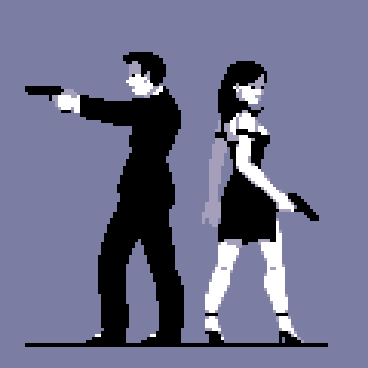
Pixelblog - 49 - Realistic Human Anatomy by Raymond Schlitter
intro

The ability to accurately depict humans is a high effort, high value skill. Although we all inhabit a body, and are capable of instantly recognizing people from the most subtle features, accurately conjuring our likeness on a canvas does not come easy. Even amongst skilled artists, very few can naturally depict the human form without extensive practice, and use of references. At least that’s what I tell myself, as someone who perpetually struggles in the department. I find the main issue is consistency. No matter how strong of a foundation I build, it instantly begins to rust and crumble if I don’t keep regular practice. Well, I’m overdue for a polishing again, and the catalogue could definitely use more content on the topic. If you are new to anatomy, you can stay right here, as we are going to build our way up from basic proportions, before attempting a more expressive pose. Class starts now!

Front View

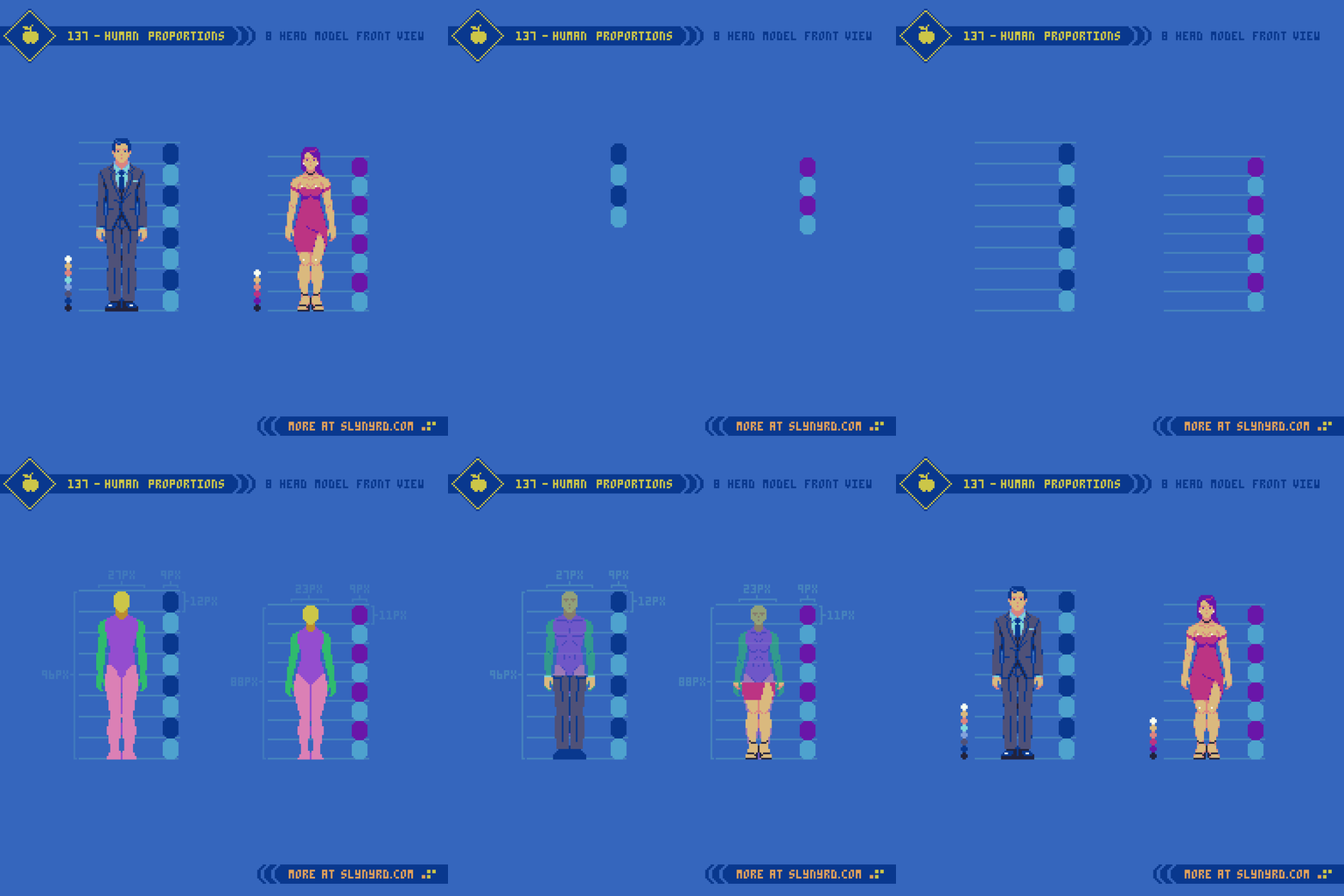
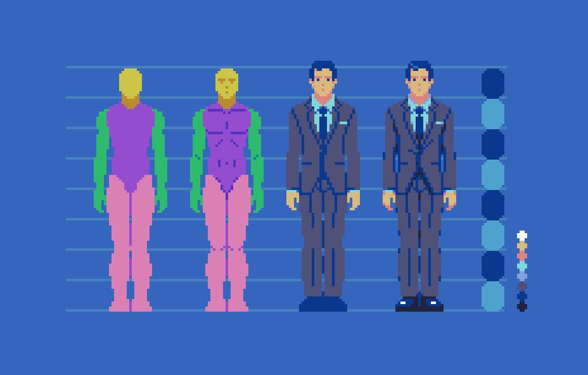
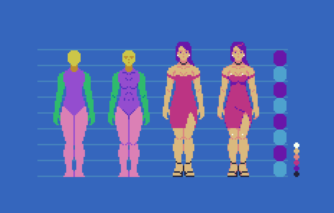
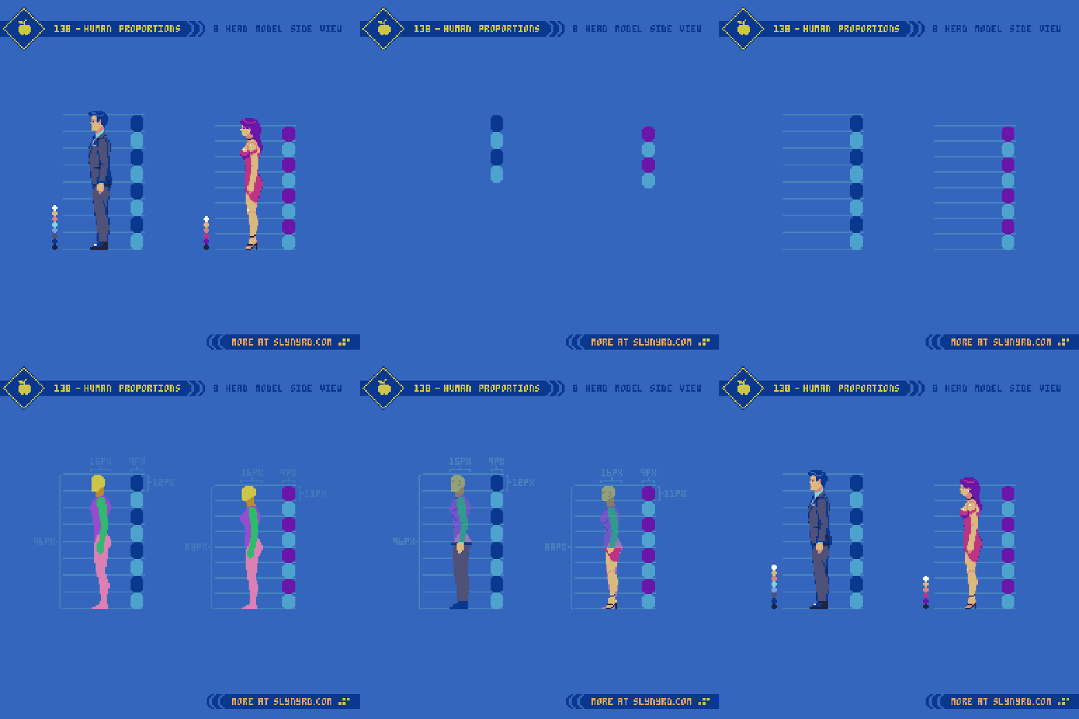
First, we start with an analysis of human proportions from a frontal view. Going for realism, I’m using the conventional 8 head model, which is based on the average size of adult human bodies. Note, that both male and female use the same 8 head model, however, the head unit is just slightly smaller for the female version, resulting in an overall slightly shorter figure.

Back in Pixelblog 17, I introduced the 6 head model, which results in relatively stocky, doll-like proportions. Although not completely realistic, this shortened model works well to capture all pertinent details within a small sprite.

In order to depict all the basic details of the human form within the 8 head model, the sprites need to be fairly large. My 8 head male is 29x96px, vs 29x78px for the 6 head model. In both examples, sizing down much at all would require more abstraction, and omission of facial features. I suppose that’s why you rarely see realistically proportioned characters in 8-bit games, as devs more often opted for expressive chibi style characters that are all eyes and head, with itty bitty legs. Moreover, the super deformed characters also economize animation. However, smaller is not always easier. With few pixels to work with, a keen sense of abstraction is needed to capture the essence of a thing with clarity. On the other hand, a large canvas permits more details, but requires more labor to flesh out. I lean towards the smaller, abstract side of things, as that’s where the magic of pixel art occurs.

Side View

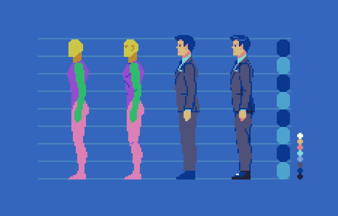
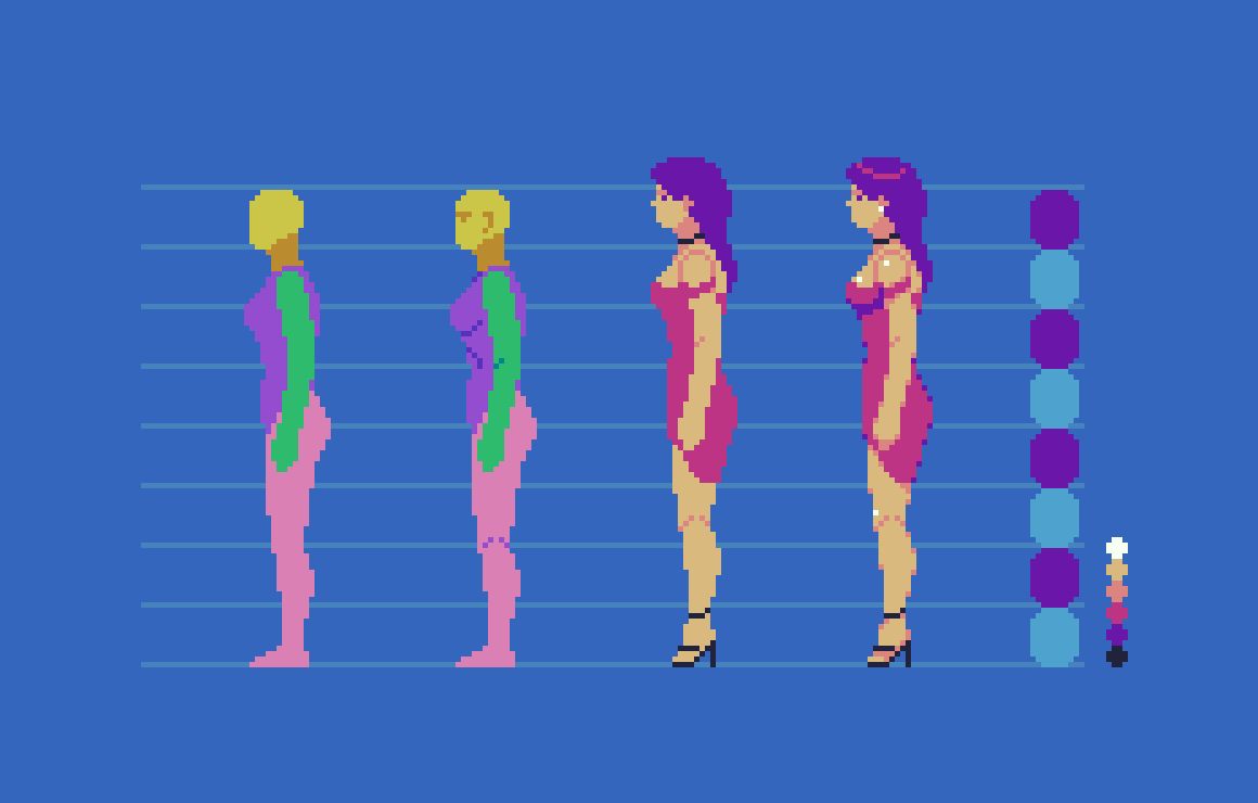
I find the side view a bit easier than the front, as there is only one arm and leg to deal with. In both versions, I start with the head and work my way down the chart with the aid of references. Of course, I use many references with much of my art, especially anatomy. Sometimes I start with a simple skeletal wireframe to capture the overall form and gesture of the figure, which you can see in practice in Pixelblog 17. However, after developing more competence with the subject I feel comfortable jumping right into solid forms at this scale. If the sprites where any larger, I think I might want to wireframe first.

Before developing details, the goal is to perfect the proportions with a sort of crash test dummy that has color coded body parts. Take it one segment at a time, one body part at time, while making many checks in relation to other body parts. Visualize imaginary lines running through the various parts, and you will notice many consistent spacial relationships. For example, elbows and belly button meeting on same level, wrists meet with the groin.

Once the dummy is complete, you can have fun playing with fashion and hairstyles, while converting the dummy to consistent flesh tones. I stuck with fairly tight, form fitting outfits to not overshadow the fundamental anatomy. Also, loose fitting fabrics, and folding dynamics present a whole new lesson for another blog. For now, you can begin to glean the tendencies of the fabric by observing and attempting to recreate these characters.

Action Pose

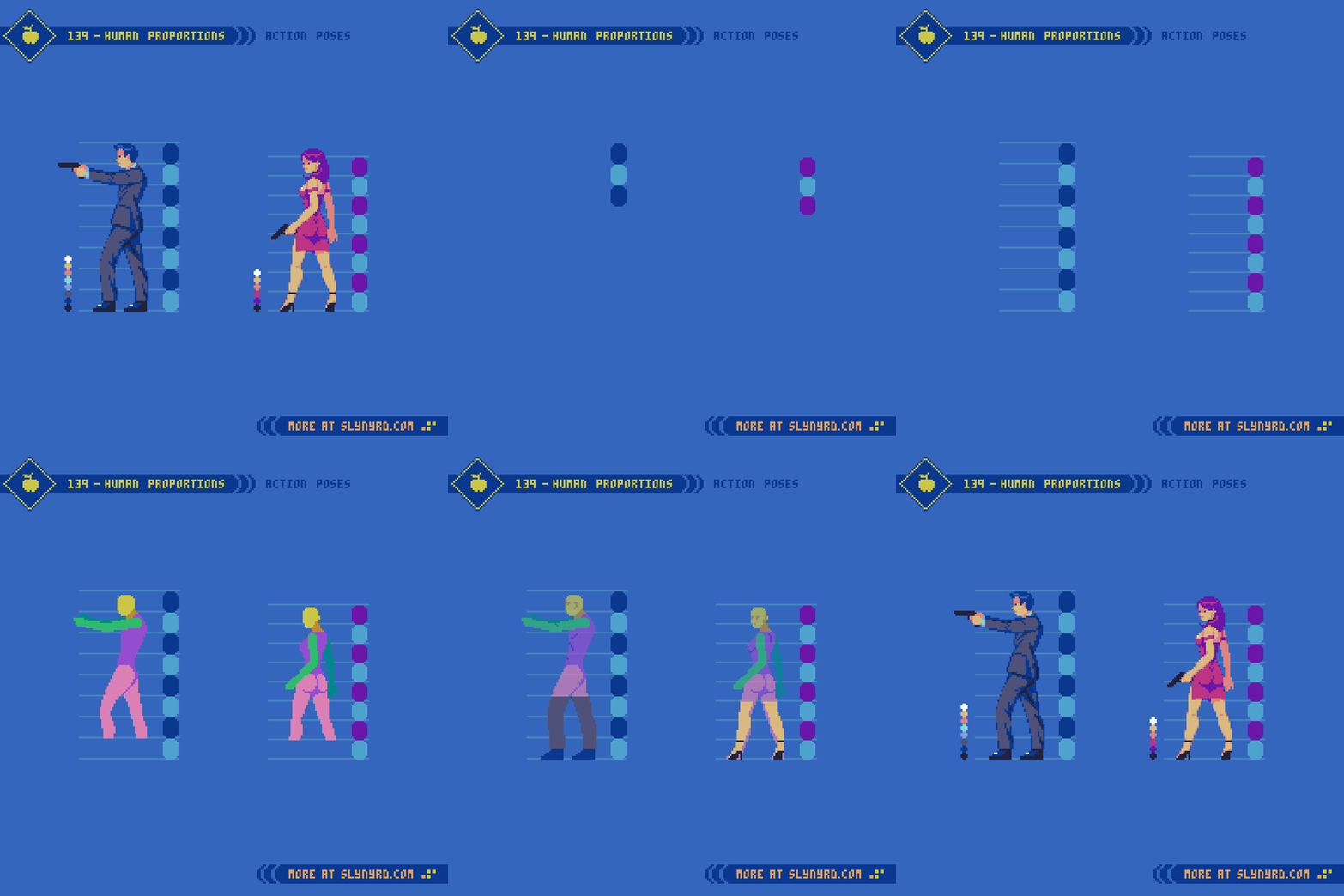
Now that we have our 8 head model established from multiple viewpoints, it’s time try out a more expressive pose. Easier said than done. One must consider how perspective, posture, and clothing items can distort proportions. Even with the long build up of establishing proportions, I feel blind without tons of references. Use references! No shame in straight up copying until you develop a more natural sense for things. It’s a staple of my blog to provide valuable pixel art specific references. I’m dazzled to see people grasp the fundamentals of my tutorials while creating a unique interpretation, however, much can be gained from 1 to 1 recreation.

Final Thoughts

This was a good exercise to reestablish anatomy skills with a realistic model, but I have much more ambitious goals. Truth is, I wanted to create tutorials that would be helpful for creating assets for a beat em’ up, but I found it overwhelming to jump right into animating large realistic sprites without laying some ground work first. So, now that we’ve established a good feel for the 8 head model, and have some basic characters designs, I think we’re prime to start tackling animations in a follow up feature. Eventually, we’ll have all the elements of a full blown beat em’ up on our hands. Better stay loose, and keep up the practice, or the rust will set in again.

RESOURCES

Please consider supporting my work by becoming a Patron

Many of my popular assets are available to purchase from my digital shop

Alternatively, you can support me by making a one-time donation 

Assets featured in this Pixelblog are available in Realistic Human Anatomy Asset Pack

Source files used in the making of this Pixelblog are available in Realistic Anatomy Source Files

Get caught up on all my downloads

You made it to the end of the article. Thank you for reading! 

-By Raymond Schlitter
Pixelblog - 48 - Military Shmup by Raymond Schlitter
Intro

Throughout all of history, man has inevitably engaged in war, over and over again. With little signs the plot will ever change, we find ways to cope with our intrinsic darkness. One silver lining I can find is the inventiveness bore from conflict. While evil in purpose, the drive of battle has resulted in many technological marvels. Like most boys, I found great appeal in machines of warfare. Guns, tanks, jets, and the glory of victory, how could I resist? As an adult, I acknowledge the grim reality behind the tools of war, but I can still admire the ingenuity and design aspects involved. Thankfully, through the magic of video games, we can celebrate weapons of war guilt free. Furthermore, war themed games are disturbingly popular, and come in many genres. When it comes to the aesthetics and logistics of pixel art, my mind goes to the shmup as a natural fit to showcase implements of war in exciting action. However, the following top down assets could just as easily find a home in a strategy, or role playing game. So, strap in for an epic campaign that will provide a plethora of top down military sprites, and a detailed desert city environment.

Fighter Jets

I have fond memories rolling around in the mud and pretending to fight Soviets with plastic guns. It was the cold war era after all. While I would eventually grow out of my days of pretend combat, my interest in the paraphernalia that surrounds it would endure. Particularly, military aircraft and their role in the evolution of aviation perpetually fascinates me. From the fabric covered bi-planes of the early 20th century, to the faster than sound jets of modern day, I find it hard to pick a favorite era.

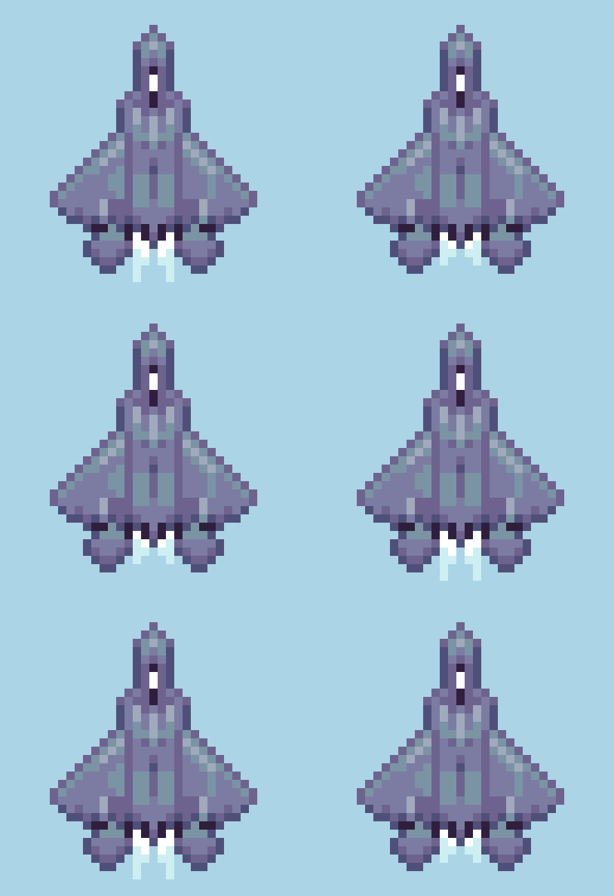
Ultimately, I decided to focus on 4th gen fighter jets. Popularized through film and video games, this era includes some of the most famous designs. Personally, my love for these birds has mostly been fostered from playing the Ace Combat series over the years. However, we aren’t making a 3D flight sim here.

Sticking with low res, the largest sprite is only 25x36px The angular shapes and sleek lines translate nicely into pixel art with little compromise in accuracy with the irl counterparts. I also considered proportions, and the relative sizes of the sprites are informed by actual specs. All sprites only use 6 to 7 colors. The Thrust animation is only 2 frames playing at 0.05 seconds per frame. The drop shadows are made by copying the sprite, reducing scale by 50% and making it solid color. Surprisingly, even at this reduced size each ship has a distinguished silhouette.

In terms of shmup design, these jets are intended to be the player character and are oriented upwards for the vertical scrolling gameplay. You could flip them so they are pointing downward and use them as enemy units, however, the subtly skewed 3/4 top down projection will look odd when reflected. Modify as needed. Which bird you taking up?

Tanks and Helicopters

Choose your death box.

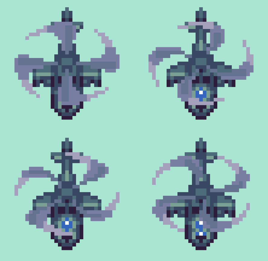
Formidable in their own right, but mere cannon fodder in the face of a fighter jet, these tanks and choppers are intended to be enemy sprites coming down the screen. Again, you could reflect them to point upward, but they will need to be modified to look right.

The largest helicopter sprite is 29x31px including blades. Each sprite only contains 5 to 6 colors. The blade animation contains 4 frames playing at 0.05 seconds per frame. After making the first blade, duplicate, and rotate in 22.5 degree increments for rough versions of the next 3 frames, then polish. Alternatively, you could make the base frame’s contour a perfect symmetrical circle, and rotate duplicates before squishing y plane down a bit on all frames to suit the 3/4 projection. This economic, yet lively motion allows choppers to fly around in all directions with convincing grace.

If I were making a game, I would take the tanks a step further and make the turret a separate layer with at least 8 directions to swivel. Also, it seems a trope to be able to blow off the turret first, before destroying the disabled tank husk.

Desert City

Top down sand dunes make a pleasing texture, and the vastness of the desert captures an appropriately epic stage for the action.

I’ve constructed a desert city environment using 16x16px tiles and only 13 colors. By layering the building tiles, countless formations of vary height and density can be made, Note, the dark bars on the bottom left are drop shadows to place around the buildings. I was able to construct the example environment with only 3 layers.
1. Buildings_2
2. Buildings_1
3. Sand

If you are new to tiles, start here Pixelblog 20

Final Thoughts

We’ve got ourselves a handful of sprites and a basic environment. It’s a good start to many game ideas, but if I were to make the shmup in my head there’s so much to expand on. I already mentioned how I would like to make the tank turrets swivel. The tanks could also have different directions so they can turn and move in all directions. Another essential component is adding roll animation to the jets so they actually tilt when you move left and right across the screen. And we haven’t even got to projectiles and explosion effects. With that said, we may have to pull for a sequel. In the meantime, please check out Pixelblog 31-32 for more on shmup design, and universal assets that could easily be adapted into the military theme.

RESOURCES

Please consider supporting my work by becoming a Patron. Among many other rewards, Patrons can access resources to compliment my tutorials. But most importantly, you allow me to continue making new content! 

Alternatively, you can support me by making a one-time donation 

Assets featured in this Pixelblog are available in Military Shmup Asset Pack

Source files used in the making of this Pixelblog are available in Military Shmup Source Files

Get caught up on all my downloads

You made it to the end of the article. Thank you for reading! 

-By Raymond Schlitter
Pixelblog - 47 - Tiny Pixels by Raymond Schlitter
Intro

In the beginning, pixel art was a practical choice necessitated by technical limitations. Color count, sprite size, animation frames, and layers were all severely limited, if possible at all. Thus, the aesthetic would be defined by economic characteristics. Nowadays, with relatively unlimited computing power, how could it be that pixel art not only lives on, but thrives? Part of the appeal stems from the economy of production, however, I would argue the limitations create design barriers that can require arduous solutions to overcome. In other words, pixel art is not the easy choice. Therefore, it mostly boils down to an aesthetic choice. Sure, nostalgia plays a role for some, but the perpetual love for pixel art has more to do with its intrinsic properties as a visual medium. At its heart, and what I’ve made core to my philosophy on the medium is- the beauty of pixel art comes from the lack of information. The missing details forces the audience to engage their imagination to fill in the gaps, making the experience more personal, and authentic. It’s the same reason why the movie never lives up to the book. Without engagement, it’s just pixels on a screen, or words on a page, but when the human imagination lights up, perfection!

As one becomes more proficient in pixel art, the tendency is to do too much for the viewer, ever pushing for greater details. Continuous improvement through increasing challenge is vital to any artist’s journey, however, to preserve the interactive magic of pixel art, one must strike a balance between necessary information and implied details. As the level of resolution and detail increases, the agency of the audience decreases. At a certain point, it becomes digital illustration when the pixels become irrelevant, and we are all unmistakably seeing the same image. While I greatly admire digital illustration, it seems a waste to achieve it through a pixel art process. The struggle to keep pixel art looking like pixel art is real.

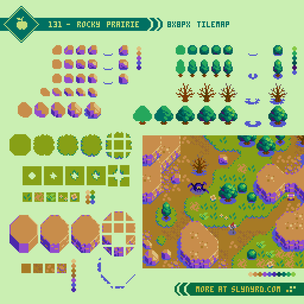
Once in a while, we all need to get back to basics to restore clarity. To stay true to the medium, I’ve cranked down the res for a fun romp in the blocks. Based on an 8x8px tile map, I present a variety of tiny assets that welcome beginners, and remind the pros the joys of simplicity.

Environment

From here on out, the learning comes through visual exploration, and going through the motions presented in the tutorials. For the last several Pixelblogs I’ve designed my tutorials with minimal text baked in the design. Firstly, the pixel font does not read well in text blocks, but most importantly, I want them to be universal by showing without telling. While here in the blog I supplement the gab to provide greater clarity and insight.

All of my previous tile design content is made with 16x16px tiles. 8x8px tiles always seemed too small for the vision I had in mind, but I never gave it a fair shot. Upon this exercise, I’m surprised at how much can be conveyed in such a small space. I can pretty much translate my 16x16px designs with little compromise. Of course, everything becomes quite chonky, especially if made into a full widescreen mock-up. If I were to create a game in this style I would probably go with a classic 4:3 ratio windowed play area, and build a creative UI around the margins. Perhaps a mock-up is due for a future update.

Similar to some of my previous tile concepts, I’ve implemented a layered approach where drop shadows are applied separately, and several tiles can be combined for variation. In some instances I bake the shadow into the asset where the space within the tile permits. The following is the layer order in the above example.

7. Cliffs 2
6. Shadows 2
5. Cliffs 1
4. Trees & Rocks
3. Shadows 1
2. Grass
1. Dirt

Hero

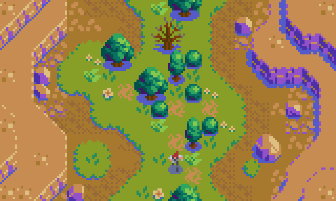
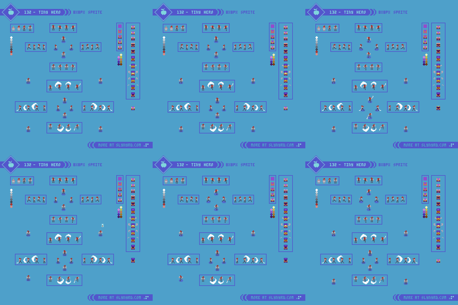
Again, with character sprites, smaller doesn’t necessarily mean less. While many details must be compromised in contrast to my typical 16x32px sprites, everything is there for basic readability. What’s more, the sense of wonder is peaked by the lack detail. It’s clearly a human figure with shoulder pads and flaming red hair, but who this character really is comes from your imagination. In this sense, I find it more novel and compelling than a hyper realistic 3D model rendered in the most advanced game engine.

Much of the expression comes through in the animation. Furthermore, The efficiency of production permits for greater exploration with relatively little effort. Although it’s easy to make many animation frames, the main drawback is there just isn’t many pixels to show the movement. With the minimum of one pixel of movement per frame, just a few frames encompasses a full stride. Fortunately, it’s all you really need. Shift one or two pixels and boom, a turn of the head, or change of posture.

Enemies

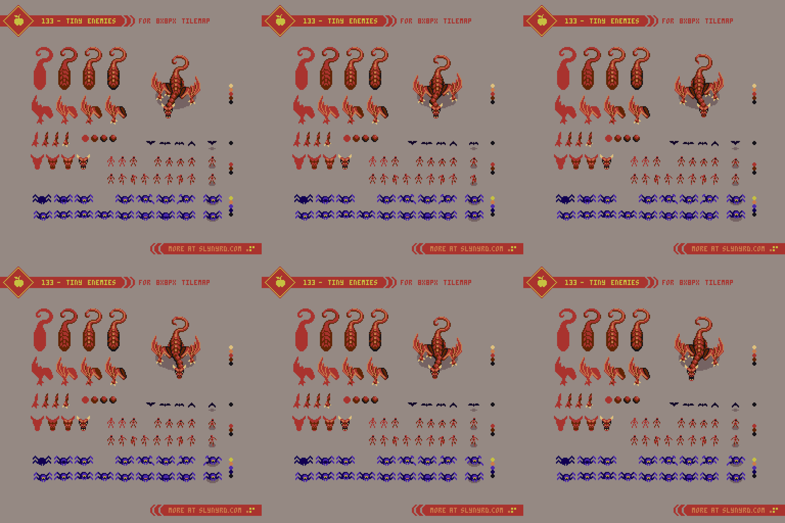
Now for the baddies. Not much to add here in regards to the tiny sprites. For larger characters, both the design and animation can be simplified by breaking it into pieces that can be layered and moved individually. Give it a try!

Final Thoughts

Have you ever felt unsatisfied with the outcome of an artwork, compared to the sketch? Whenever I experience this, it’s usually the fault of overthinking, and overdoing the details. Somewhere, several hours ago I should have put on the brakes, but I just kept massaging the clusters until the magic of the unknown was no more. Whenever I start to veer off the less is more path, of which I believe makes pixel art so endearing, I actually look back at my earlier works to find inspiration. I think, wow, I had the formula figured out and I wasn’t even aware. In my opinion, much of the best art comes from a place of naivety, which intrinsically carries authenticity with it. So how can we maintain that authenticity as our skill grows? Well, it’s a struggle that often gets confounded with comparison. I harken back to the early days, and the simple creations made without any social pressure. To reset my current habits I reconnect to those times with self imposed limitations. For example, keep it tiny.

Resources

Please consider supporting my work by becoming a Patron. Among many other rewards, Patrons can access resources to compliment my tutorials. But most importantly, you allow me to continue making new content! 

Alternatively, you can support me by making a one-time donation

Assets featured in this Pixelblog are available in Tiny Pixel Asset Pack

Source files used in the making of this PIxelblog are available in Tiny Pixels Source Files

Get caught up on all my downloads

You made it to the end of the article. Thank you for reading! 

-By Raymond Schlitter
Pixelblog - 46 - Anti-Gravity Racers by Raymond Schlitter
intro

Our story starts in 1991. Out of nowhere, my two older brothers come home with the newly released Super Nintendo. When I first saw the box, my excitement dampened nearly to anger. Like any healthy 8 year old boy, I was ready to move on from the the kiddy Mario brand, to the blood and guts offered by Sega. However, I was quickly convinced they made the right decision when I discovered F-Zero, which was also brought home that day, along with U.N. Squadron, and the pack-in Super Mario World. You’d never believe it, but the console came with 2 controllers and a game. And that was expected back then. Of all that goodness, F-Zero made the biggest impression with its striking mode 7 graphics, and astounding music. Ultimately, this day would go down as one of my best gaming memories.

Jump to 1995. My friends’ interests are moving on to sports and girls, but I’m committed to this gaming stuff. I’m saving my own allowance, so I can get the new Sony Playstation on day 1. The launch would not disappoint. Toshinden was fun, but the pack-in demo disc had me in awe of the potential of the console. Of those demos, Wipeout was most impressive. Again, another anti-gravity racer pushing the envelope on the stage of new tech. When I finally got the full game, I was in ag racing heaven. The music sounded too cool to be coming out of a video game. One of the most remarkable aspects of the game was the graphic design created by the British studio Designers Republic. It was so fresh, and immersed me in the world with no need for in game narrative.

Jump to today. Looking at my occupation and interests, I realize how great the influence of these games has been on me. My love for Wipeout runs especially deep, and I have enjoyed the series over the years. Recently obsessed with the psx era titles, my inspiration has been renewed. As much as I’d love to make an ag racing game, pixel art doesn’t lend itself well to the genre. But that can’t stop me from making a pure art expression for my love of ag racing. Take a lap with me. By the end of the course you’ll have all the tools to create your own ag racing scene with parallax animation.

Hovercrafts

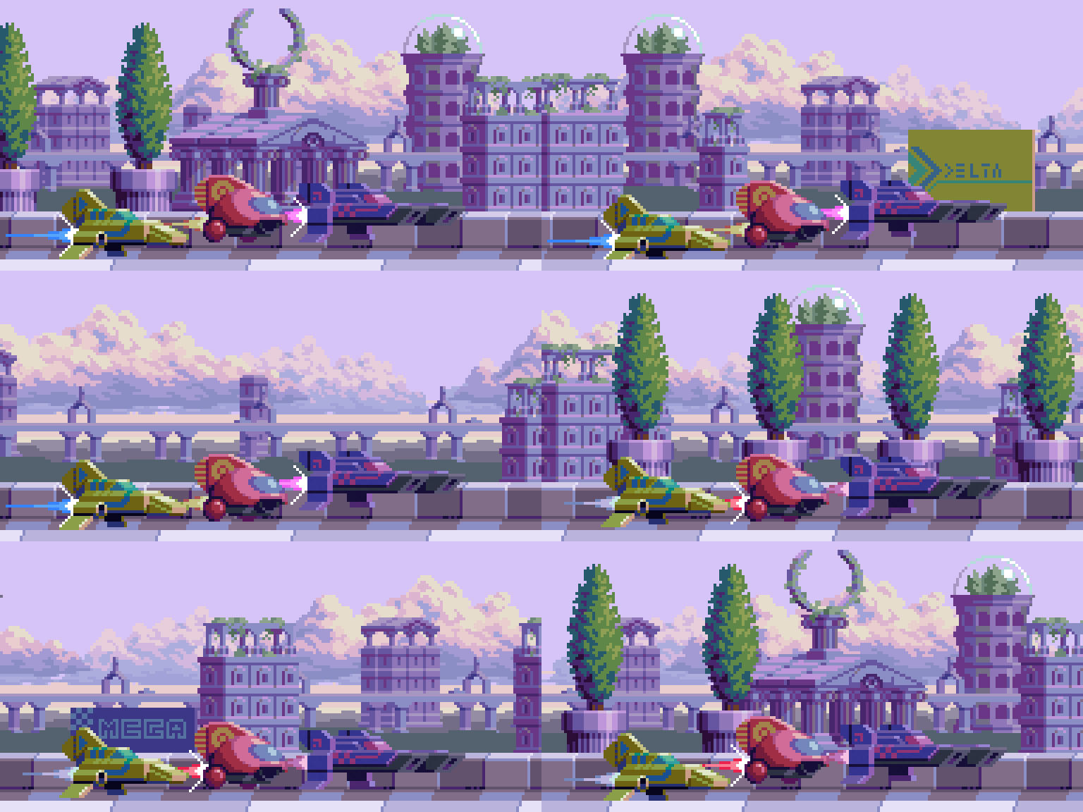
First things first, show me the hovercrafts. Not veering too far from my points of inspiration, these crafts may appear vaguely familiar. It’s fun to think about the manufacturer’s philosophy, performance aspects, and how they might inform the design. Keeping things basic, Delta is the all-rounder. Omni has good acceleration and handling but low top speed, while Mega is the inverse. Well, that’s how I imagine it, but love to see someone come up with more extreme designs.

I break down the main components of the craft in outline form. This can help simplify the design, and get something going fast without worrying about color palette. However, I typically have a palette in mind and jump straight to solid forms, as I find the outlines can complicate the coloring process. I feel I’m in the minority on this, so don’t let me dissuade you from outline sketching if it works for you.

For size reference of each craft, not including thrust trail.
Delta 46x25px
Omni 33x24px
Mega 59x21px

Marble Architecture

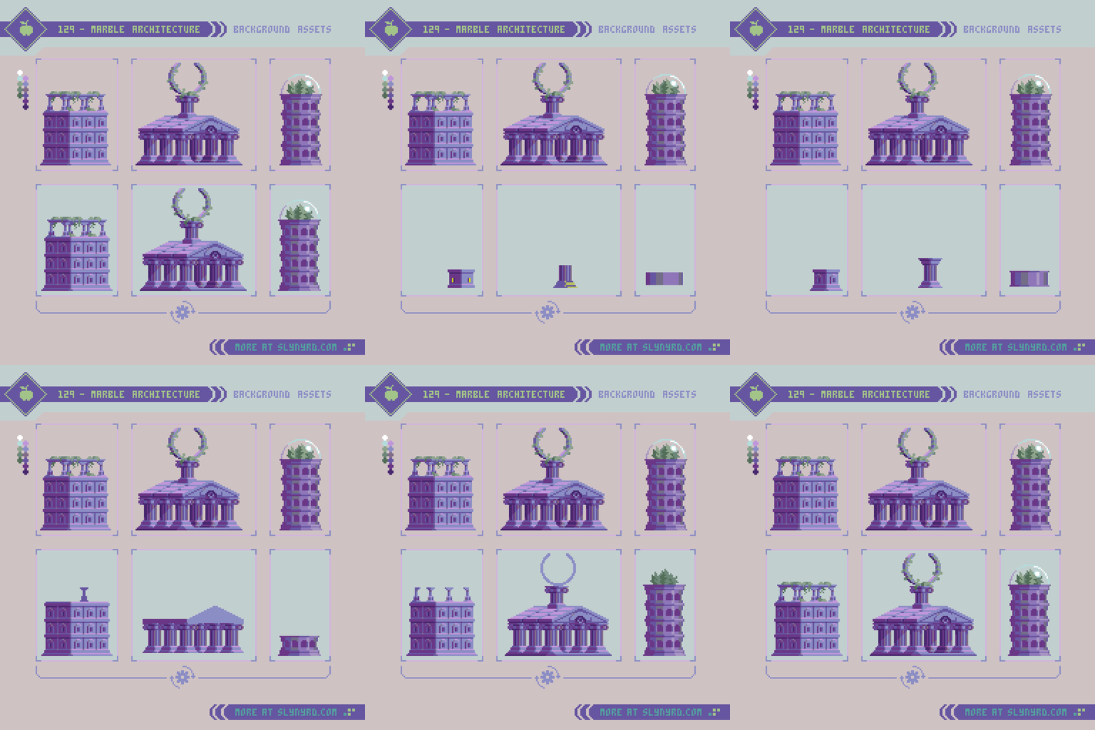
Equally important to the hovercrafts, any good ag racing fiction should be rich in world building, largely established by the race-side scenery. Some circuits feature outlandish sci-fi backdrops, while others represent a more believable vision of the future. Much like old school Wipeout, I tend to favor the latter vision with grounded elements that show a world not so distant from our own history. Furthermore, I went with the timeless aesthetic of Greek/Roman marble architecture. Combined with subtle hints of advanced technology, the style continues the spirit of olympic level competition into the future. I suppose you call this aesthetic marble punk. I love the atmosphere of this style and will definitely want to develop the vision more.

Note the building and temple are intended to be on the same plane, however the the darkest color and pink highlights are omitted from the tower to appear more distant.

Building 50x52px
Temple 75x72px
Tower 30x64px

Natural Scenery

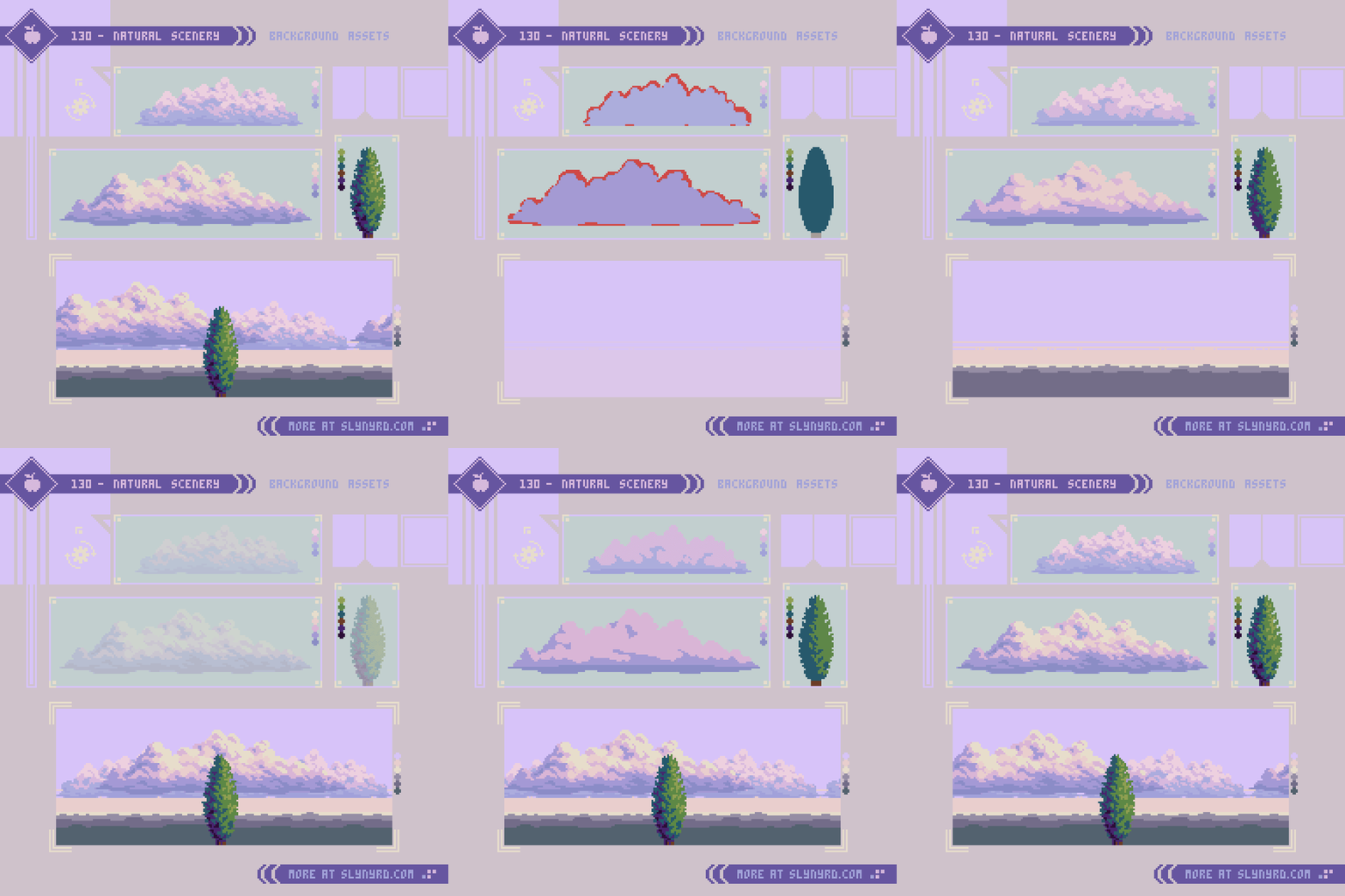
Well, we need a base environment to place things. Further driving the retro future Roman theme, I stuck with a simple natural landscape with proper italian cypress trees.

Understanding of atmospheric perspective is crucial to selecting the best colors to achieve depth in your landscapes. If you are not familiar with the concept you might want to take a detour to Pixelblog 11, for a jump start on landscape painting.

The approach for both the clouds and tree is the same. Rough shape, refine shape, shade with rough clustering, refine clusters. Admittingly, that last step is somewhat “draw the rest of the fucking owl”, but there’s no way around it. Get in there!

Small cloud 96x26px
Large cloud 144x37px

Parallax layers

With all assets complete we can create a parallax animation using my perfect loop technique detailed in Pixelblog 23. Understanding of that particular method will help make sense of the following breakdown.

In a nutshell, the parallax scrolling effect is created by making objects that appear closer to the viewer move faster, while the distant objects move slower. In order to do this, I make several layers of various length and drag them across the scene within a set number of frames. To make it loop perfectly the movement rate per frame must evenly divide with the canvas dimension along the axis of movement. Furthermore, the possible smooth movement rates are determined by the canvas. Choose dimensions wisely.

Here’s the breakdown of the above scene.
Canvas - 192x96px
Frames - 192 frames played at 0.05 per frame
Layers - 9 layers of different movement speed.

The following layers are listed from nearest/fastest to most distant/slowest.
1. racetrack foreground - 32 (pixels moved per frame)
2. racetrack - 24
3. Trees - 16
4. ground + buildings - 6
5. highway - 4
6. ground + buildings - 3
7. ground - 2
8. clouds - 1
9. clouds - 0.5 (moves 1px every 2 frames)

Final Thoughts

You’ve reached the finish line. I hope you enjoyed that as much as I did. While this installment doesn’t introduce any concepts I haven’t touched on before, the amalgamation expands on the possibilities with a showcase of earnest art.

As much as I enjoy designing pixel art in the context of practical game application, nothing is quite as satisfying as making unfettered pure art. But I still can’t help fantasying about the possibility of games. I’m not really into the manager genre, but ag racing would be the best theme to adapt, just for all the rad graphic design potential. No matter, useful assets in here for all types of applications.

While pixel art is often thought of as a medium restricted to low budget video games, it has the power to transcend to the sublime just as well as any respected medium. Nearing a decade of pixel art experience, it’s been exciting to see the evolution of the medium and rise in popularity. Now, more than ever, I’m inspired by what I’m seeing in the pixel art community. I can only hope to contribute to the momentum.

RESOURCES

Please consider supporting my work by becoming a Patron. Among many other rewards, Patrons can access resources to compliment my tutorials. But most importantly, you allow me to continue making new content! 

Alternatively, you can support me by making a one-time donation

Assets featured in this Pixelblog are available in Anti-Gravity Racers Asset Pack

Source files used in the making of this Pixelblog are available in Anti-Gravity Racers Source Files

Get caught up on all my downloads

You made it to the end of the article. Thank you for reading! 

-By Raymond Schlitter
Pixelblog - 45 - Bricks, Walls, Doors, and More by Raymond Schlitter
Intro

A title like that might be the opposite of click bait, but for a pixel head like me, it sounds like a party. While some brick and stone assets have appeared in past lessons, they lack in comparison to my explorations with natural textures. After my umpteenth iteration of grass tiles, the prospect of focusing an entire lesson around brickwork actually sounded refreshing. Spoiler: I had fun! What started as simple patterns quickly became so much more in another display of the magical efficiency of pixel art. Follow me down the pixeled brick road, on a journey that promises to yield great fruits with minimal toil.

Brick Patterns

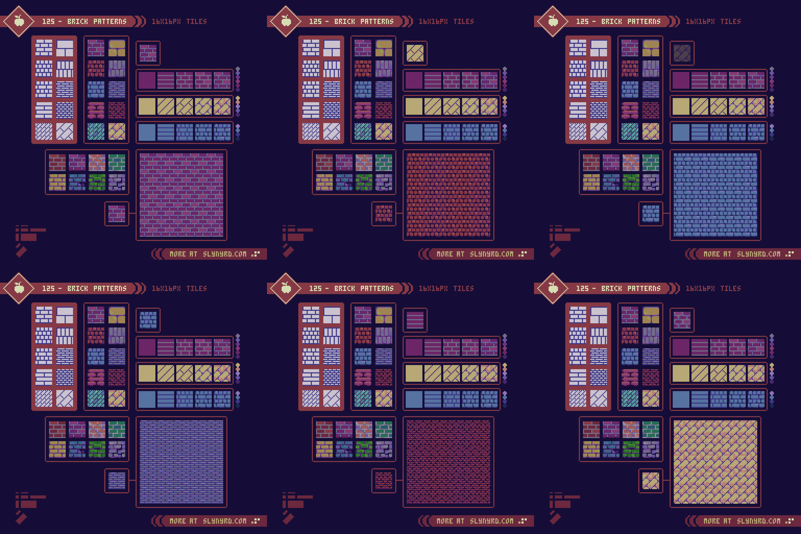
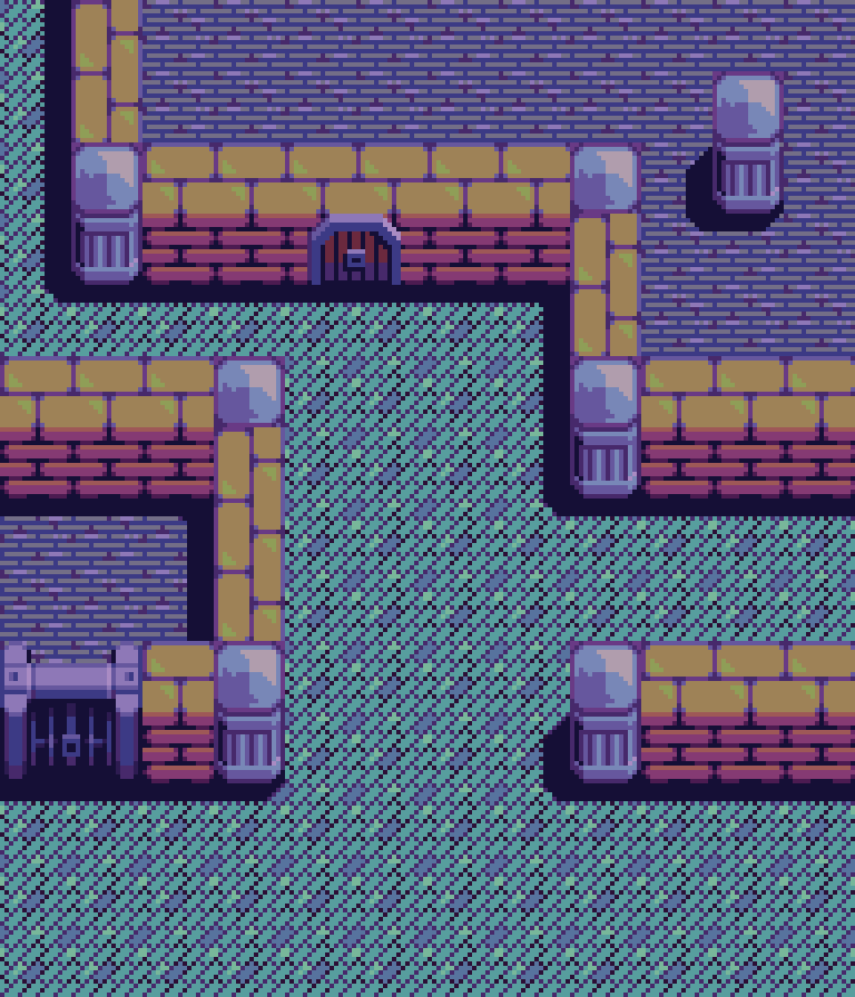
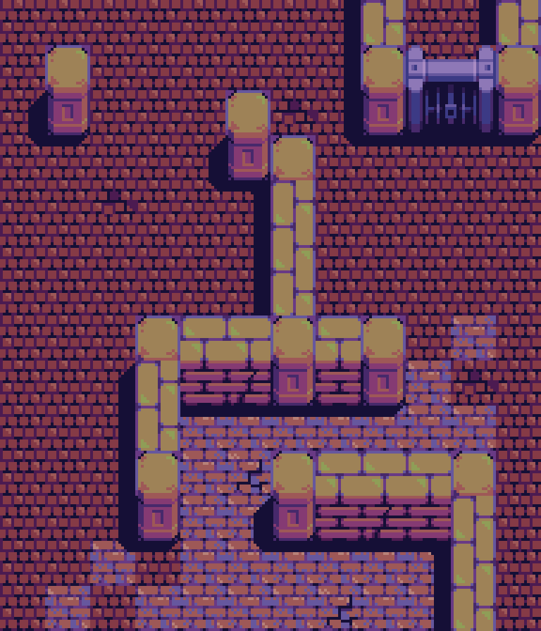
Creating with gamedev in mind, I stuck to a consistent 8-bit style with assets designed for a 16x16px tilemap. Also, the designs were created to be utilized in my familiar top down projection, however, many patterns can just as well be used in a side view projection. Working within 16x16px tiles the number of even patterns is fairly limited. Accounting for a 1 pixel stroke, which represents the grout in this case, brick dimensions that can divide into 16px are 15, 7, 3, and 1. Furthermore, the height and width of all bricks must adhere to one of these four dimensions in order to pattern evenly without any irregular sized bricks. This same rule also applies to the patterns tilted 45 degrees. Note, the graphic in the bottom left corner represents all brick sizes utilized. Typically, patterns use a uniform brick size, but they can also combine bricks of different sizes.

The process is as straight forward as real life brick laying. First, put down some grout: establish the pattern with outlines. Next, lay the bricks: color in the bricks. Then you just have to let it set, and age over time: add discoloration and damage to bricks and grout. Color choice and texture details can greatly change the feel of tiles with the same pattern. Simply changing the grout from light to dark makes a dramatic difference.

Walls and Doors

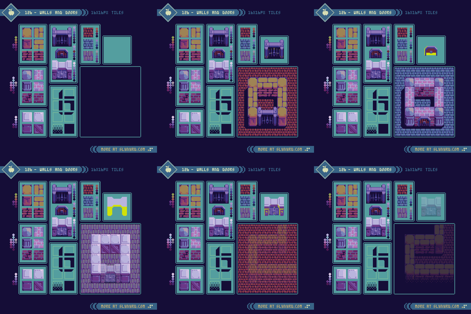
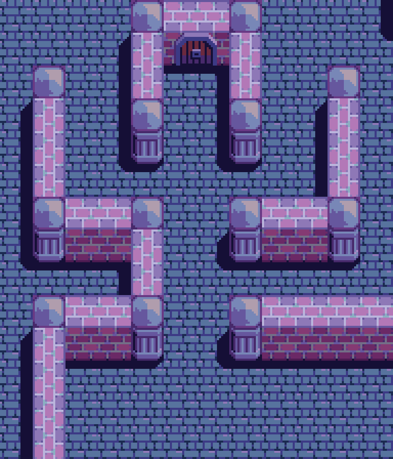
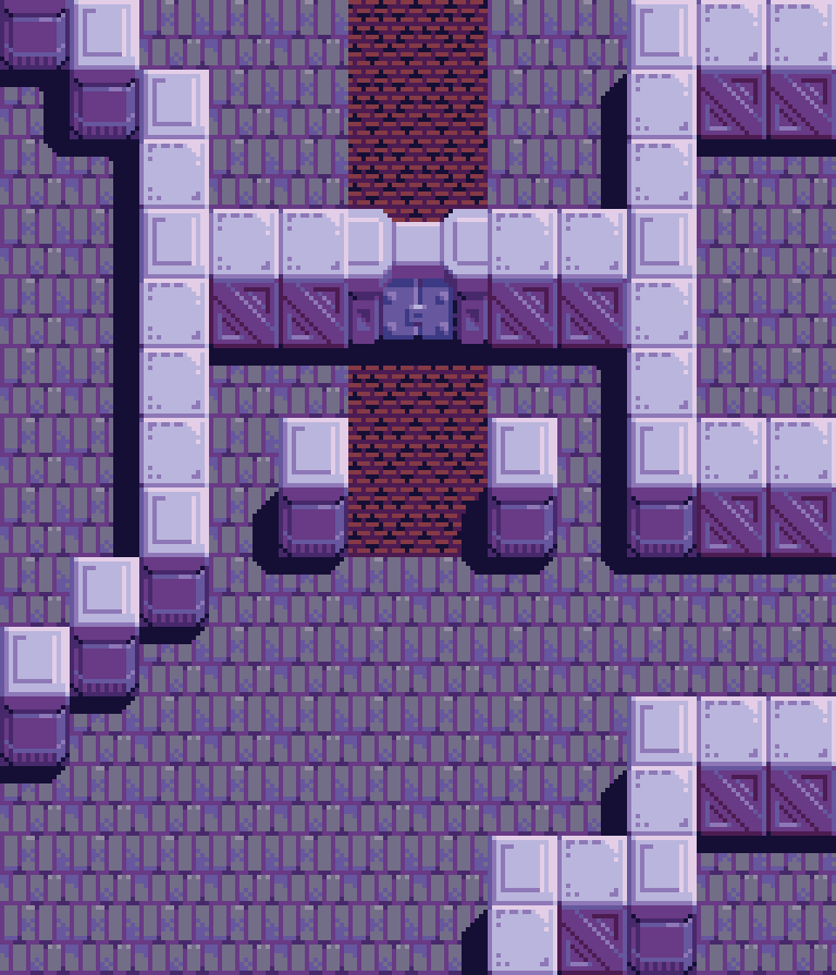
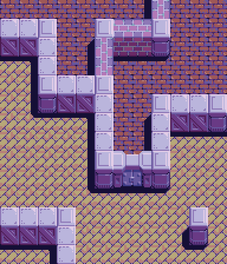
There is no difference between a ground and wall tile in the design itself, but it’s important to consider how they contrast in context to create the illusion of depth. Both brick size and color impact the implied perspective. Furthermore, the tiles that make up the top of the wall are much brighter than the sides. Bricks are typically laid with the broad side down, so when it come to walls, it’s the long narrow side that shows on the exterior. Therefore, the height of the bricks on a side wall tile should typically be shorter than on the top wall tile.

Columns, or some kind of universal corner pieces are an easy way to create corners with minimal assets. It possible to make brick corners in a similar fashion as the walls, but all four corners would require custom variants to represent the proper orientation on the top wall, and to define the edges of the side wall. The payoff hardly seems worth the added complexity, so I went with columns. Another advantage of columns is they can be used apart from walls to give environments more interest.

Speaking of adding interest. It’s always worth the time to make at least one variant of any texture that is used heavily. For example, a cracked, or discolored tile here and there will valiantly fight off visual fatigue. Additionally, drop shadows are a must for the added depth and clarity they provide. By using layers, a simple set of universal shadow tiles can easily be applied across all environments. I usually make my shadows predominantly cast to the left or right of objects, and slightly from the bottom. No matter how tall the object is perceived to be it’s best to keep the shadows fairly short, and no longer than can be contained in a single tile. This helps avoid layering conflicts where long shadows awkwardly overlap other parts of the environment, or make an object look out of place because the lighting doesn’t match when it’s placed over a shadow.

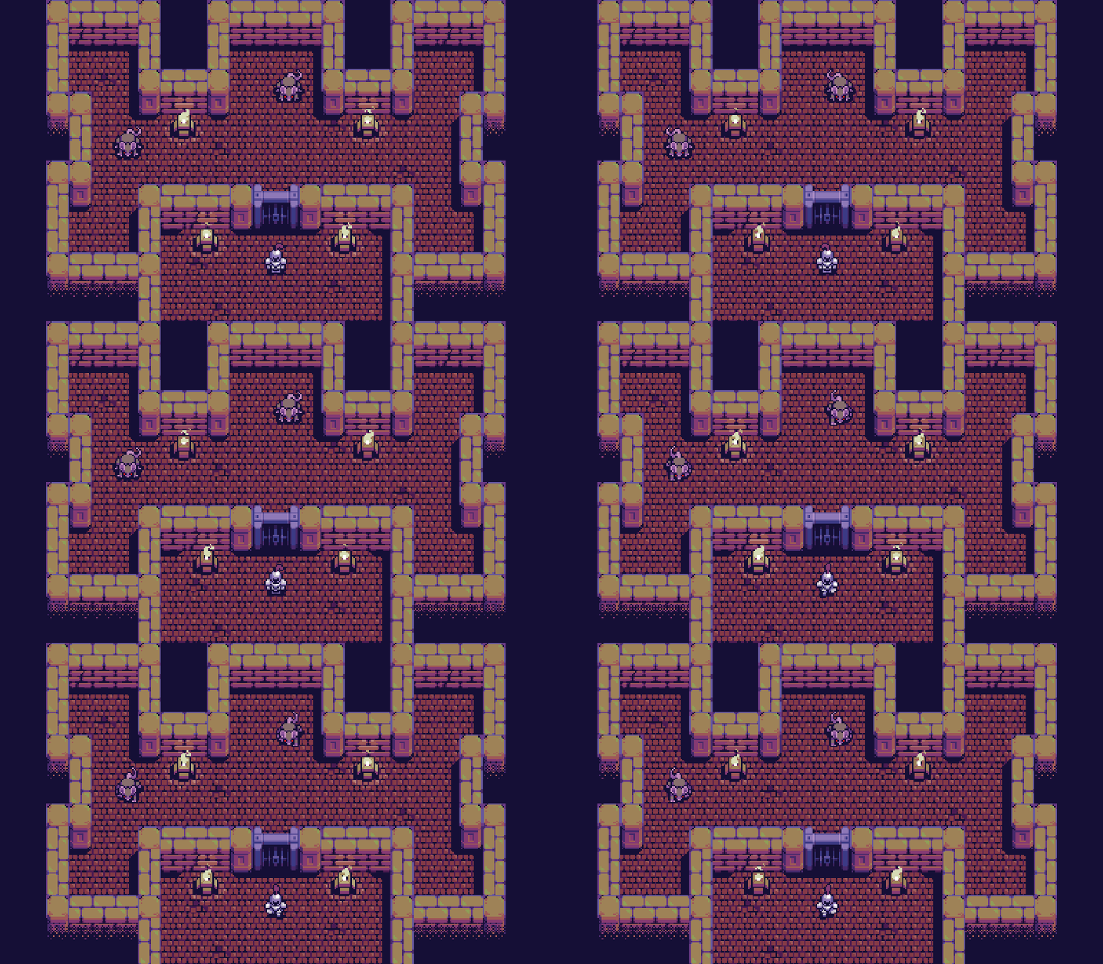
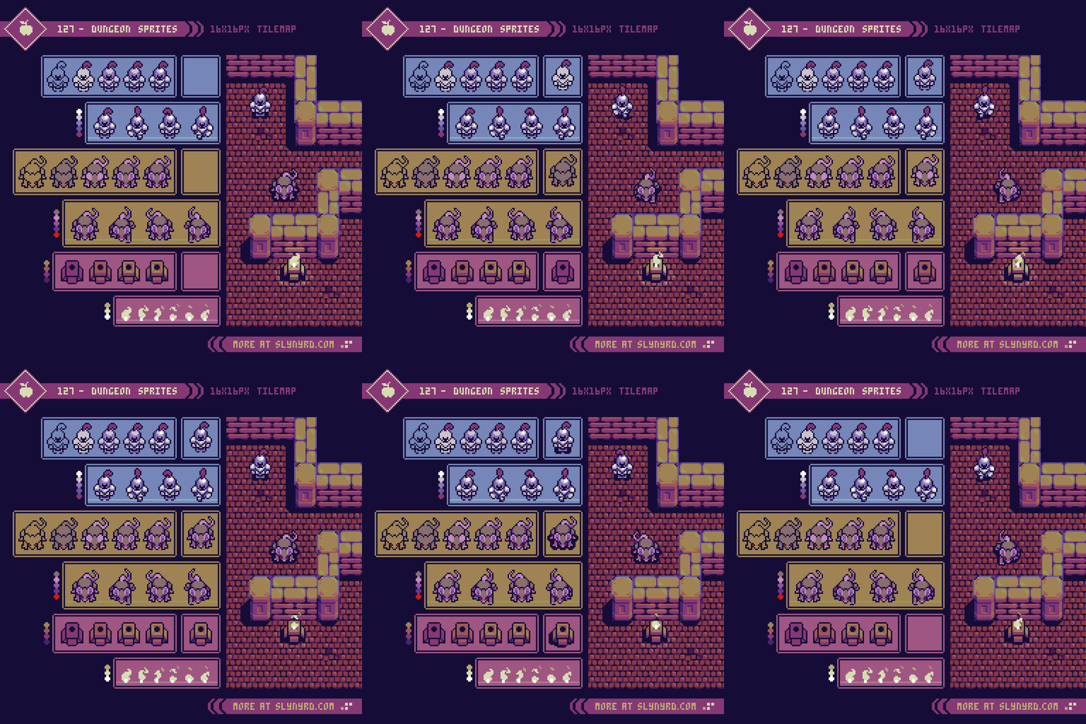
Dungeon Sprites

Now that we have a complete dungeon environment, let’s give it some life with some proper sprites. First, we have a brave pawn. Is he friend or foe? You make the call. Next up, a pesky overgrown rat I’m sure few would be upset to see slain. Four frames gets the job done for a serviceable walk/idle animation. Simply adjust playback speed to vary from idle, walk, and run. The above examples are playing at 0.2s per frame.

Lastly, is a raised fire pit to give our dungeon a little light, and a surprising amount of ambience. Fire is a such a dynamic phenomenon it allows for a broad range of abstract visual interpretations. I generally stick to an S shaped overall flame that whips into smaller S particles. The main flame shape is approached similar to a flag animation, but flowing upwards, tapering. and breaking into particles. Anyway, I feel any written explanation pales in comparison to analyzing and actually doing. Give it a try! The fire in the above example is animated with 6 frames each played at 0.1s, while the flickering highlights play at 0.05s.

FINAL THOUGHTS

Well, I think everything has been laid out and set in stone. I suspected this would be a fun subject, but I didn’t expect a study of simple brick patterns to quickly become a full fledged dungeon environment with several variations. Now I understand why so many classic pixel art games use a lot of brick. You only need a handful of tiles to make a whole level. What I’ve presented here lays the foundation for many plausible game concepts. A procedural bump combat RPG? An action based loot driven dungeon crawler? Hopefully, I’ve inspired and given some seeds to grow your next great idea from. Like with all art, doing is so much more powerful than being told. Try as I might, some insights just can’t come through words. Best I can do is show you pretty pictures and motivate you to go for it. Go through the tutorials, and try to create your own designs to discover the joy of brickwork.

RESOURCES

Please consider supporting my work by becoming a Patron. Among many other rewards, Patrons can access resources to compliment my tutorials. But most importantly, you allow me to continue making new content! 

Alternatively, you can support me by making a one-time donation

Assets featured in this Pixelblog are available in Brick Dungeon Asset Pack

Source files used in the making of this Pixelblog are available in Brick Dungeon Source Files

Get caught up on all my downloads

You made it to the end of the article. Thank you for reading! 

-By Raymond Schlitter

Pixelblog - 44 - Top Down Trees by Raymond Schlitter
Intro

Stoic sentinels of the field plant their roots where they stand to hold vigil between sun and earth for generations. These mighty servants of nature generously provide both shelter and sustenance to all manner of crawling, flying, and slithering forms of life. Beautiful in its breadth of greenery, for both form and goodness of provision. Wether standing among like kind in a sea of green, or a singular keeper of a field, reverence should be held for these wooden guardians. From tiny seed of life to towering giant, all miracles of nature are symbolized in this great gift from god we call tree.

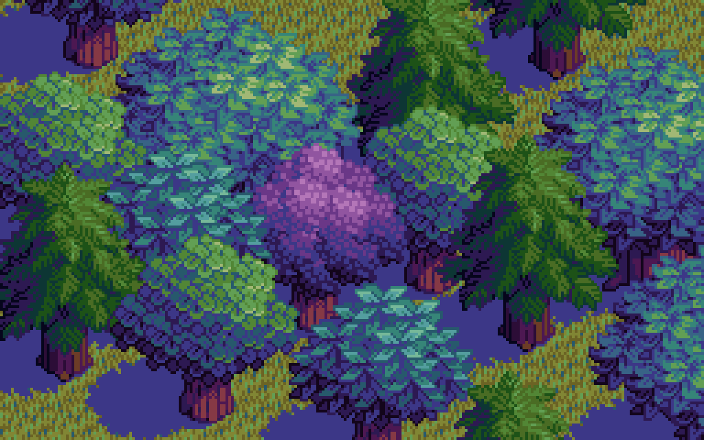
As I write this in late May I’m inspired by the rebirth of green life surrounding me. Celebrating the season of photosynthesis, I present a completely tree themed Pixelblog. Particularly, this lesson focuses on top down designs using a highly efficient modular method I first explored way back in Pixelblog 2. In this update I refine and expand on the technique with a variety of leaf styles, and the introduction of the conifer tree.

Deciduous Tree

It all starts with a bundle o’ leaves.

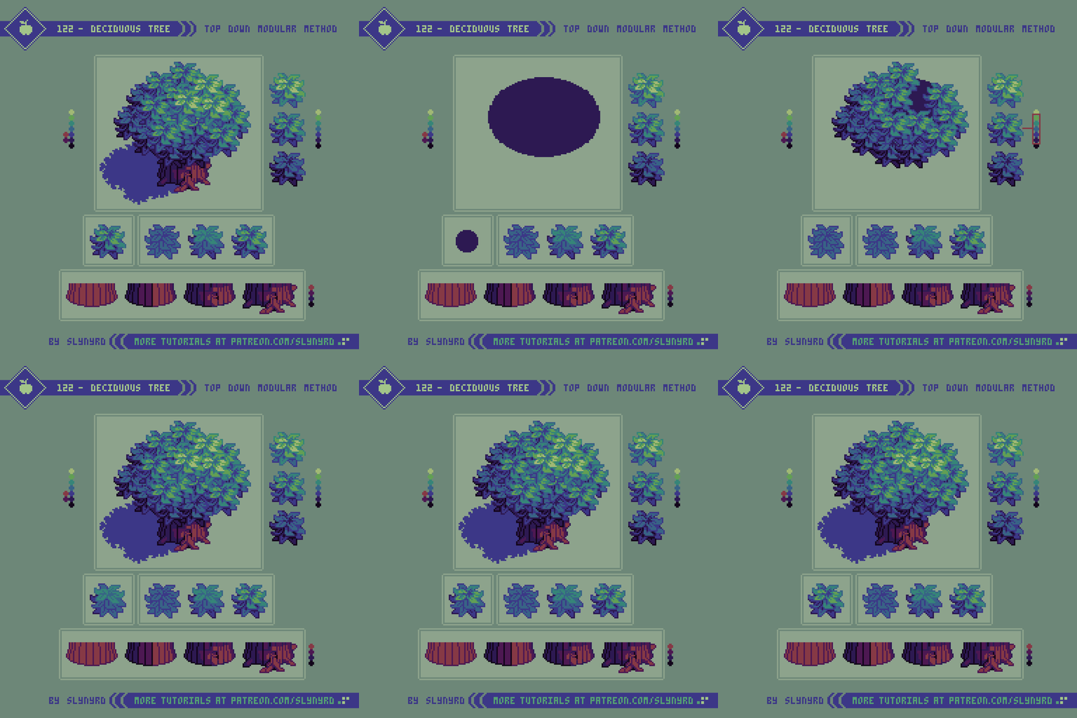
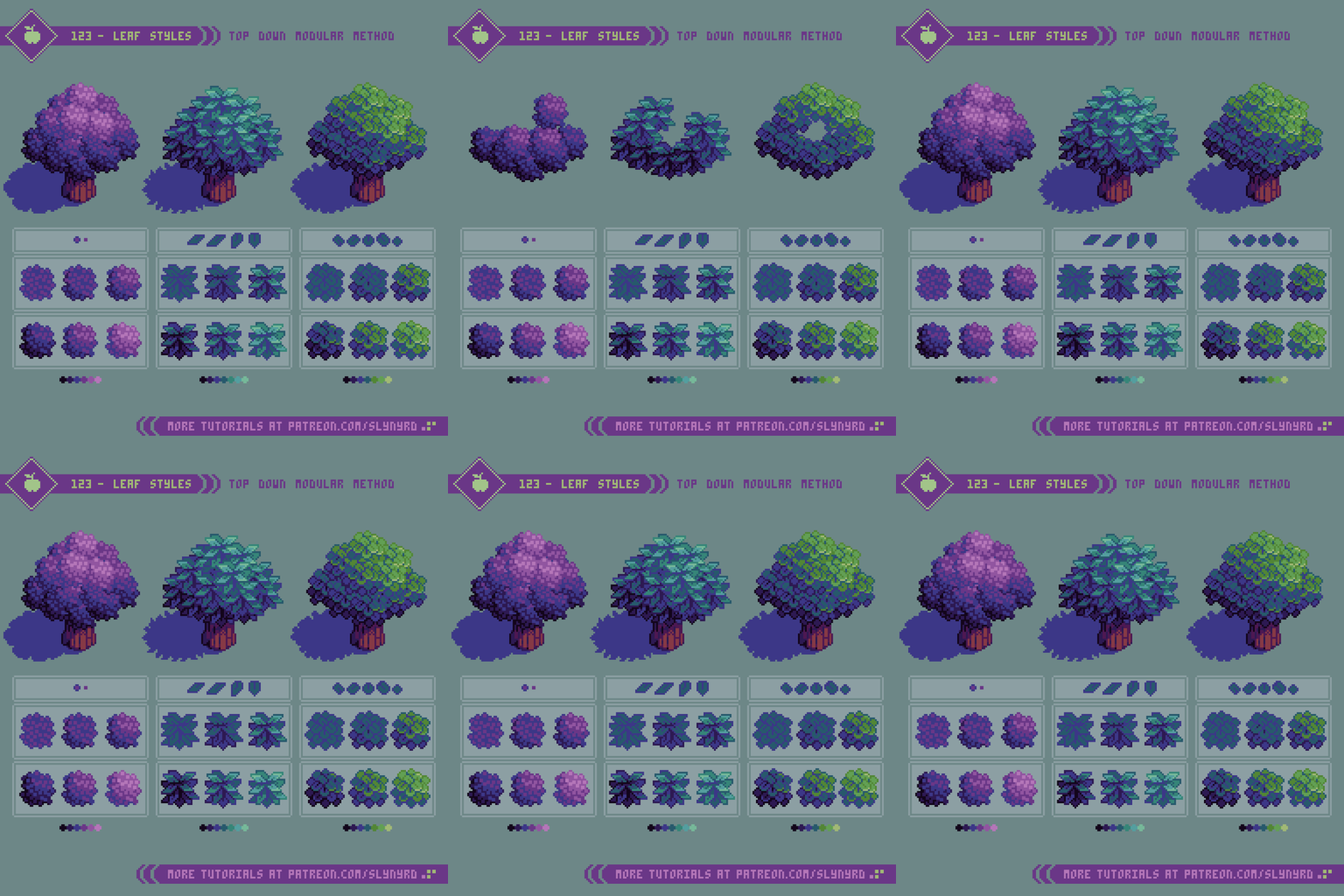
The goal here is to create a single textural unit that comprises all the foliage. Seems easy enough, but great care should be taken with the design of this bundle of leaves. Leaf shapes should be varied but consistent in form. The best way for me to stay consistent is to base the leaves around a basic geometric shape. In the above example, the base form is a trapezoid, specifically a rhombus. Subtle modifications give a touch of waviness for a more natural feel.

The repetition of similar forms is key to maximize the clarity of the texture, while even balance among the distribution of shapes helps hide the pattern that may result from repeating the bundle. That is to say, any uniquely shaped, or sized clusters will draw the eye, making the repetition of the bundles more apparent. Clusters consistent in shape, size and spacial distribution are key to achieving a pleasing overall foliage texture when the bundles are combined. Also, avoid making the bundle itself an awkward shape. Even ball shapes work great for me.

I start by making one bundle of leaves with medium color values. Construction of the bundle can be done with a variety of leaf shapes on separate layers. This allows flexibility to move things around and reorder layers until satisfied. Once I’m happy with the design, I make one darker variant and one lighter variant by shifting all hues up or down a notch on a shared color ramp. With these 3 color variants, I can layer the bundles in a natural fashion according to an implied light source, resulting in a mass of foliage with convincing 3D shape and depth. Take care of unsightly clusters and stray pixels as a result from overlapping the bundles. Placement and layer order of the bundles requires a fair amount of experimentation to find the perfect arrangement with minimal noise. Ultimately, the core bundle is fundamental to the appearance of the final tree. If you are unable to find a pleasing arrangement, it’s likely an issue with the design of the bundle. If the bundles are well designed it should be possible to create a perfect mass of foliage with no extra touch ups needed.

After that, the final step is adding the trunk and a drop shadow. The trunk is pretty straight forward, but if you have trouble visualizing it, start with a basic cylinder and add striping for the bark. The striping should be widest in the center and narrow towards the sides of the trunk. Break up the lines here and there, add a knot or an errant root for organic details. Size and orientation of the drop shadow is determined by the light source. It’s most practical for game design to center the shadow directly under the tree, so that it doesn’t run into other assets, but I like to cast it off to one side for a more dynamic look. Any issues this causes can easily be addressed with layer ordering.

Leaf Styles

Now, let’s take the principles of the modular method and see how it holds up with different leaf styles.

The first example above utilizes a small 2x2px square as its base geometric unit. I allow the squares to touch in places but avoid overlapping, so that the square unit prevails even when new clusters are formed. Although there is little variation from this base square, the small size and simplicity of the shape prevents the texture from feeling tiresome. This texture works great to represent any vegetation with small leaves, or can appear as flowers determining on color.

The middle example is a more pure version using trapezoids like in Tutorial 123, however subtle wavy modifications are not applied here, resulting in a sharper, geometric texture. The sharp shapes clearly describe the leaf orientation and should be positioned in a natural manner, so they are pointing upwards at the top of the bundle and rotate downward towards the bottom of the bundle.

The last example above represents round shaped leaves by using circles as the base geometric unit. Orientation is slightly less critical here than with the trapezoid leafs. However, it’s a bit tricky to preserve nice circle shapes and still keep the bundle looking properly spherical. Coloring is critical to bring out the depth in all cases, but especially so when orientation is not strongly suggested from the clusters alone.

As for the coloring, I approach it in the same way I would shade a circle to look like a sphere. In all above examples, I start with making a crescent shaped selection along the bottom left of the bundle and use non contiguous paint fills one shade darker on each color. Then I make a smaller circle shaped selection on the upper right side of the bundle and fill with lighter colors. After these color fills some cleanup and hand placed highlights may be necessary to better define the leaves and reduce noise. 4 or 5 colors per bundle is plenty.
Conifer Tree

Now things are going to get a bit more prickly.

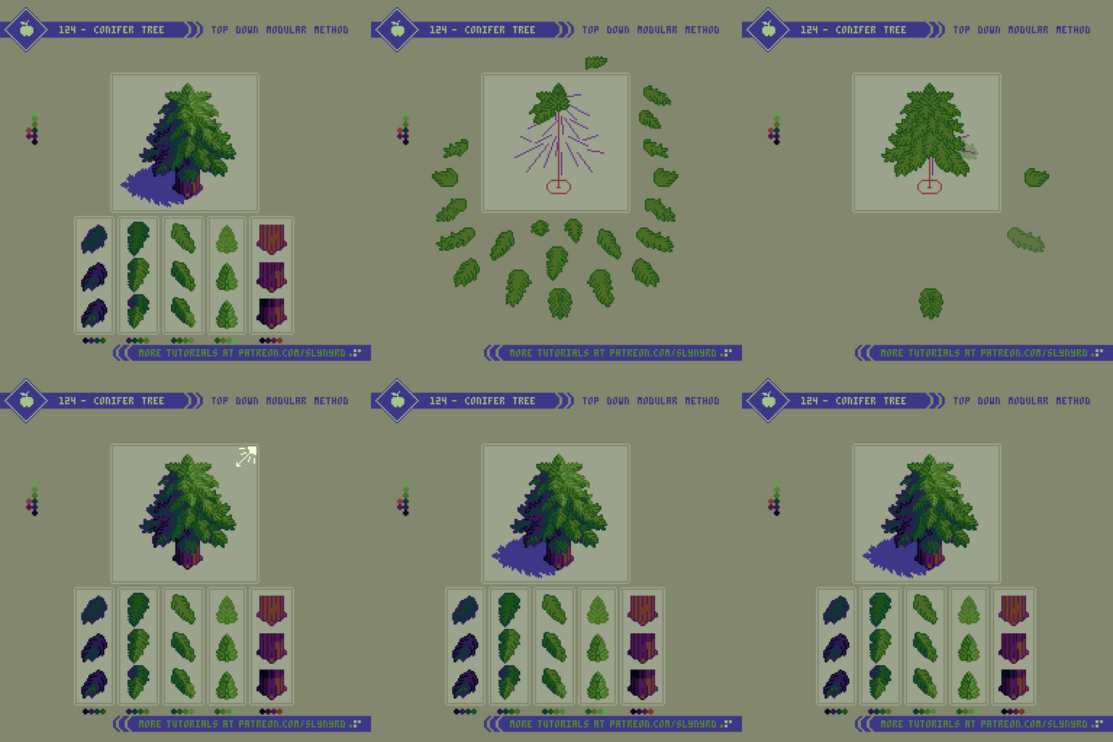
Technically, I can also call this a modular method, but it differs greatly from previous examples in that each module is unique and has specific placement. Furthermore, I cannot tout this as a shorthand for creating conifer trees, but it’s a great way to break down the subject if you have trouble visualizing the entire tree in a single layer from scratch. Personally, I’m not the best natural drawer, and it’s often easiest for me to understand a subject by breaking it down in a way that allows me to construct the image using layers. While somewhat tedious in execution, the realization of each visible branch ensures a convincing result.

Start by making a simple stick tree guide, then start making branches from top to bottom, as parts of the lower branches will be overlapped by higher branches. In my actual process of making this I started with the low branches and many of my details were covered up in the end. Work smarter not harder.

Orientation of the branches is critical to achieving a naturally shaped tree. First, make all the branches with the one fill color, and one outline color. The branches around the center are unique, but all the side branches can be reflected to fill out the opposite side at this point before shading. Once all the simple flat branches are placed, the shading can be rendered according to desired light source. Start the shading process by defining light, medium, and dark branches. The final shading details are a bit more complex than with a leaf bundle, as some branches should cast drop shadows on lower adjacent branches. Ultimately, observation and practice are the best ways to learn, so I’ll just shut up and let you look at the pictures.

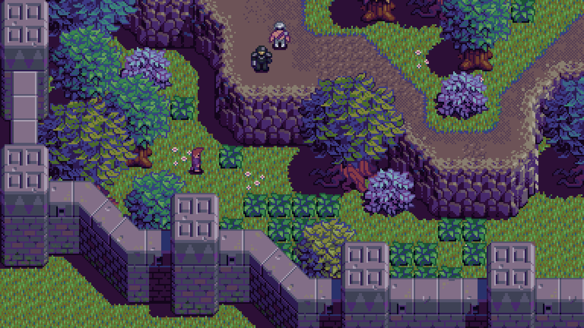
More examples of the modular method being utilized in my game project, Beast Planet.

Final Thoughts

Based on that intro, it’s clear I have a passion for trees. Part of it’s DNA, as humans have shared a beneficial relationship with trees from ancient times. However, much of my appreciation comes from growing up in a place where trees are sparse. Needless to say, it was a joy to put this blog together, but it’s not about self indulgence. We all love trees, and they are commonly featured in games and art. Furthermore, I’ve recently been designing top down trees for my game Beast Planet, and I wanted to share the evolution of the modular method, and other insights I’ve gained from practical application. While the fundamental method is much the same, compared to my first exploration in Pixelblog 2, the results looks much better this time around. This proves the importance of core pixel art skills, which I think is mostly about color choice and clustering. I hate to say it, but no matter how accessible I make my tutorials, heightened sensibility in these core skills can only be acquired through consistent practice. Maybe it’s time for a trip back to basics for a future Pixelblog.

RESOURCES

Please consider supporting my work by becoming a Patron. Among many other rewards, Patrons can download the assets featured in my tutorials. But most importantly, you allow me to continue making new content! 

Alternatively, you can support me by making a one-time donation

Assets featured in this Pixelblog are available in Top Down Nature Asset Pack

Source files used in the making of this Pixelblog are available in Top Down Trees Source Files

Get caught up on all my downloads

You made it to the end of the article. Thank you for reading! 

-By Raymond Schlitter