Intro
In the beginning, pixel art was a practical choice necessitated by technical limitations. Color count, sprite size, animation frames, and layers were all severely limited, if possible at all. Thus, the aesthetic would be defined by economic characteristics. Nowadays, with relatively unlimited computing power, how could it be that pixel art not only lives on, but thrives? Part of the appeal stems from the economy of production, however, I would argue the limitations create design barriers that can require arduous solutions to overcome. In other words, pixel art is not the easy choice. Therefore, it mostly boils down to an aesthetic choice. Sure, nostalgia plays a role for some, but the perpetual love for pixel art has more to do with its intrinsic properties as a visual medium. At its heart, and what I’ve made core to my philosophy on the medium is- the beauty of pixel art comes from the lack of information. The missing details forces the audience to engage their imagination to fill in the gaps, making the experience more personal, and authentic. It’s the same reason why the movie never lives up to the book. Without engagement, it’s just pixels on a screen, or words on a page, but when the human imagination lights up, perfection!
As one becomes more proficient in pixel art, the tendency is to do too much for the viewer, ever pushing for greater details. Continuous improvement through increasing challenge is vital to any artist’s journey, however, to preserve the interactive magic of pixel art, one must strike a balance between necessary information and implied details. As the level of resolution and detail increases, the agency of the audience decreases. At a certain point, it becomes digital illustration when the pixels become irrelevant, and we are all unmistakably seeing the same image. While I greatly admire digital illustration, it seems a waste to achieve it through a pixel art process. The struggle to keep pixel art looking like pixel art is real.
Once in a while, we all need to get back to basics to restore clarity. To stay true to the medium, I’ve cranked down the res for a fun romp in the blocks. Based on an 8x8px tile map, I present a variety of tiny assets that welcome beginners, and remind the pros the joys of simplicity.
Environment
From here on out, the learning comes through visual exploration, and going through the motions presented in the tutorials. For the last several Pixelblogs I’ve designed my tutorials with minimal text baked in the design. Firstly, the pixel font does not read well in text blocks, but most importantly, I want them to be universal by showing without telling. While here in the blog I supplement the gab to provide greater clarity and insight.
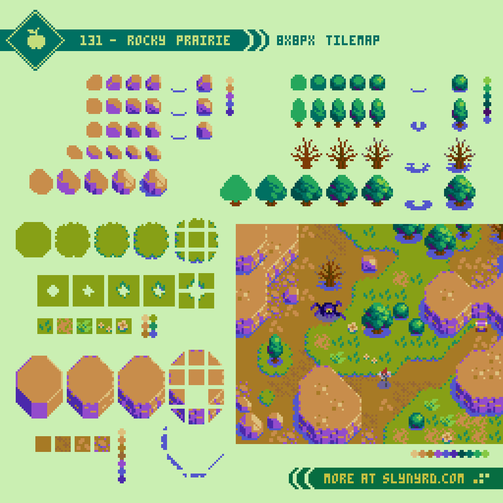
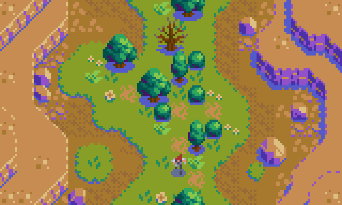
All of my previous tile design content is made with 16x16px tiles. 8x8px tiles always seemed too small for the vision I had in mind, but I never gave it a fair shot. Upon this exercise, I’m surprised at how much can be conveyed in such a small space. I can pretty much translate my 16x16px designs with little compromise. Of course, everything becomes quite chonky, especially if made into a full widescreen mock-up. If I were to create a game in this style I would probably go with a classic 4:3 ratio windowed play area, and build a creative UI around the margins. Perhaps a mock-up is due for a future update.
Similar to some of my previous tile concepts, I’ve implemented a layered approach where drop shadows are applied separately, and several tiles can be combined for variation. In some instances I bake the shadow into the asset where the space within the tile permits. The following is the layer order in the above example.
7. Cliffs 2
6. Shadows 2
5. Cliffs 1
4. Trees & Rocks
3. Shadows 1
2. Grass
1. Dirt
Hero
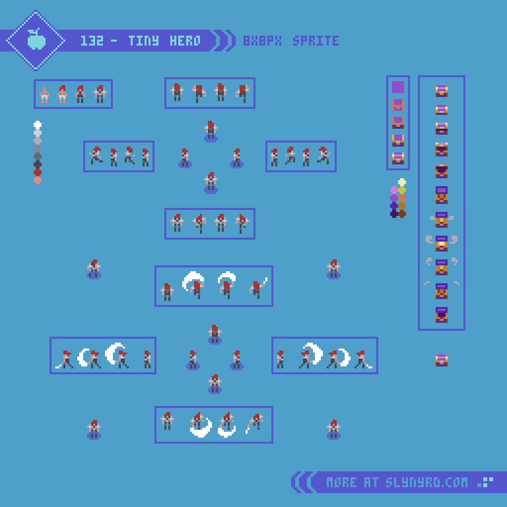
Again, with character sprites, smaller doesn’t necessarily mean less. While many details must be compromised in contrast to my typical 16x32px sprites, everything is there for basic readability. What’s more, the sense of wonder is peaked by the lack detail. It’s clearly a human figure with shoulder pads and flaming red hair, but who this character really is comes from your imagination. In this sense, I find it more novel and compelling than a hyper realistic 3D model rendered in the most advanced game engine.
Much of the expression comes through in the animation. Furthermore, The efficiency of production permits for greater exploration with relatively little effort. Although it’s easy to make many animation frames, the main drawback is there just isn’t many pixels to show the movement. With the minimum of one pixel of movement per frame, just a few frames encompasses a full stride. Fortunately, it’s all you really need. Shift one or two pixels and boom, a turn of the head, or change of posture.
Enemies
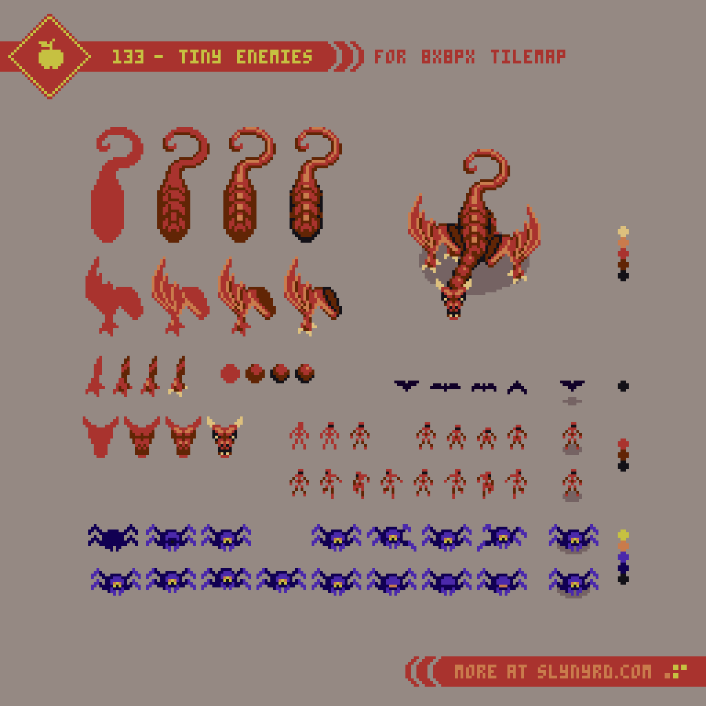
Now for the baddies. Not much to add here in regards to the tiny sprites. For larger characters, both the design and animation can be simplified by breaking it into pieces that can be layered and moved individually. Give it a try!
Final Thoughts
Have you ever felt unsatisfied with the outcome of an artwork, compared to the sketch? Whenever I experience this, it’s usually the fault of overthinking, and overdoing the details. Somewhere, several hours ago I should have put on the brakes, but I just kept massaging the clusters until the magic of the unknown was no more. Whenever I start to veer off the less is more path, of which I believe makes pixel art so endearing, I actually look back at my earlier works to find inspiration. I think, wow, I had the formula figured out and I wasn’t even aware. In my opinion, much of the best art comes from a place of naivety, which intrinsically carries authenticity with it. So how can we maintain that authenticity as our skill grows? Well, it’s a struggle that often gets confounded with comparison. I harken back to the early days, and the simple creations made without any social pressure. To reset my current habits I reconnect to those times with self imposed limitations. For example, keep it tiny.
Resources
Please consider supporting my work by becoming a Patron. Among many other rewards, Patrons can access resources to compliment my tutorials. But most importantly, you allow me to continue making new content!
Alternatively, you can support me by making a one-time donation
Assets featured in this Pixelblog are available in Tiny Pixel Asset Pack
Source files used in the making of this PIxelblog are available in Tiny Pixels Source Files
Get caught up on all my downloads
You made it to the end of the article. Thank you for reading!
-By Raymond Schlitter