
Intro
Roll into the alien underground with a familiar orange suited bounty hunter. In this 8-bit inspired study, I present some fresh riffs off the 1986 NES original, Metroid. Featuring non-linear gameplay, and a memorable lead character, this genre defining game still informs the design of explorative platforming games today. Hence the term ‘Metroidvania.’ As for the pixel art graphics, the use of a dark minimalistic aesthetic effectively captures a moody alien atmosphere. While I appreciate the sense of isolation, the sparse visuals are a bit lacking, even by 8-bit standards. Furthermore, I was inspired to rework elements from this classic cart, while challenging myself to maintain 8-bit restrictions. Go on this 8-bit plunge with me, as I delve into character animation, enemy design, and tiled environments.
Bounty Hunter
Nintendo struck gold when they decided to make the person behind the suit a woman. This was unexpected and intriguing to the gaming audience in 1986, but ultimately her appeal comes from the cool suit designs over the years.
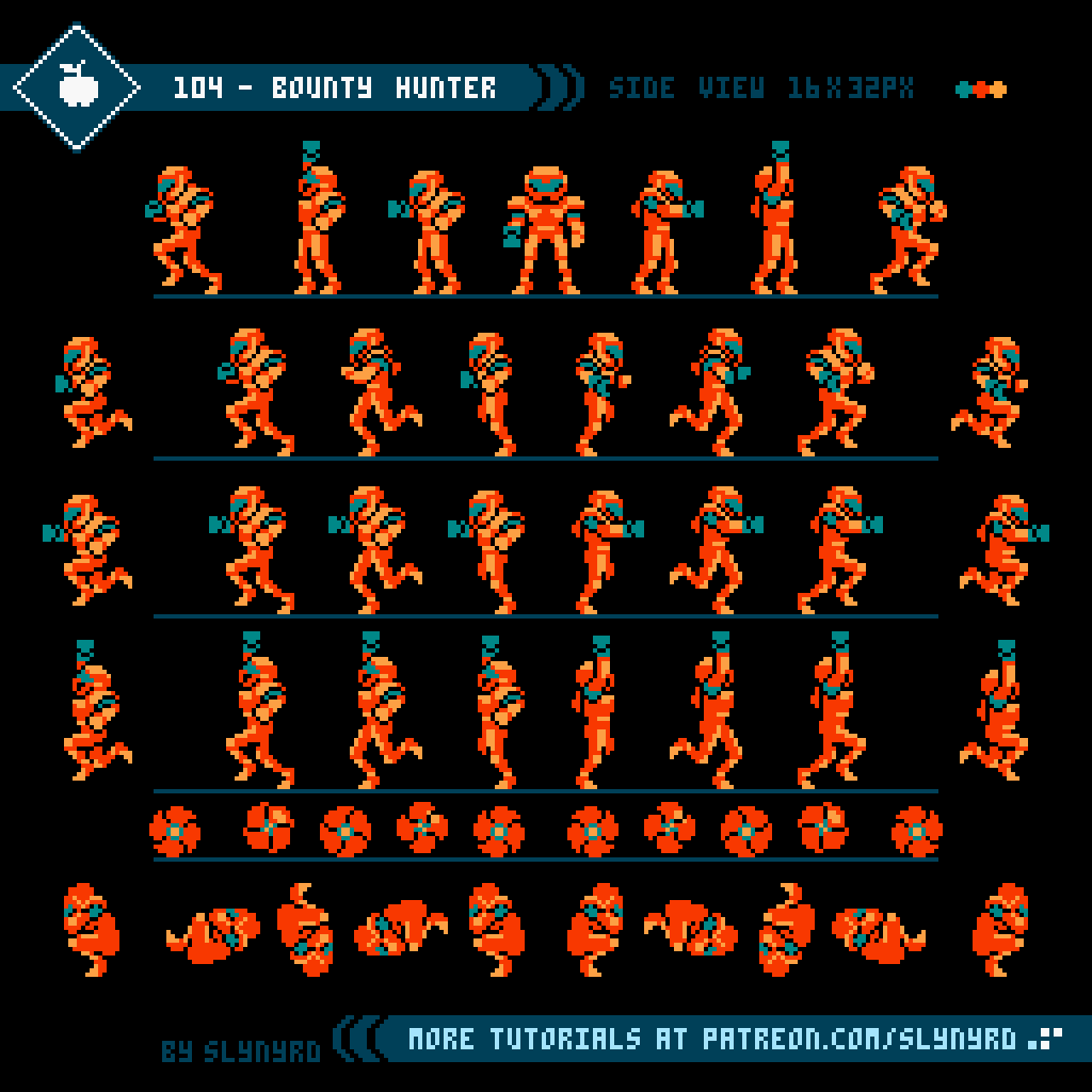
As cool as the design was for Samus Aran, I feel the flat sprite didn’t do the character justice. But, I can’t fault the creators. Capturing the cybernetic details of the character concept within a 3 color 16x32px sprite is no short order, as I found out.
NES Restrictions
I have attempted to maintain the NES limitations with these designs. I’m not well versed on the technical side of things, but an authentic look can be achieved by the following general rules.
• Use the authentic NES 56 color palette
• 3 colors max per sprite plus one shared color across all sprites (black in my example)
• 3 colors max per tile plus one shared color across all sprites
• 12 colors max plus one shared color for any complete scene
• Design tiles and sprites within 8x8px and 16x16px tile map.
• NES resolution is 256x224 pixels (NTSC) and 256x240 pixels (PAL).
For my bounty hunter sprite I vibe off the Samus concept to create a familiar orange suited design, which could work for a male or female character. Or, an alien, or android for that matter. I really wanted a bright yellow green visor, but I ran out of colors. Indeed, compromises were made for the authentic NES look.
While Metroid mirrors the same frames for left and right directions, I decided to make unique frames where applicable for distinct left and right facing versions. All frames have unique left and right versions except the somersault frames are mirrored. It’s a neat detail to see the gun arm realistically change orientation, but it’s hardly worth the effort to manage the extra frames.
The frames off to the the sides of the guide lines are the jump poses. These frames are used for a straight vertical jump, and when you shoot during a jump. The somersault frames are used when jumping left and right. If you shoot while somersaulting it changes to the appropriate jump/shoot frame, if after reaching the apex of the jump. Before reaching the apex, shots spawn from the somersaulting form. Unfortunately, I couldn’t practically illustrate the jump mechanics with the space and frames allotted in this tutorial format. I recommend you to pick up a rom of Metroid and study the implementation for yourself.
The run animation consists of only 3 frames. I wouldn’t have thought this sequence of poses could result in a serviceable run animation, however, when played at an appropriately quick speed, the illusion of a complete run cycle is surprisingly convincing. I’m always surprised by how effective these minimal run cycles are. When working with so few frames it’s a matter of capturing the best key poses, and a helluva lot of trial and error to find the right animation combo, and playback speed.
The animation appears simple, but there’s much nuance in the position of the sprite and placement of each pixel when details and frames are sparse. It’s important to find an anchor point in the character’s center of gravity that has little to no movement from frame to frame. In this case, I made sure the but cheek stays in the same column of pixels in each frame. You really have to go through the motions and create your own sprite to understand the quirks of pixel animation.
Alien Beasts
Taking place on an alien planet, the enemy designs of Metroid are obviously not of this world. Displaying bright colors, armored bodies, and spiky forms, their expression of aggression is universal.
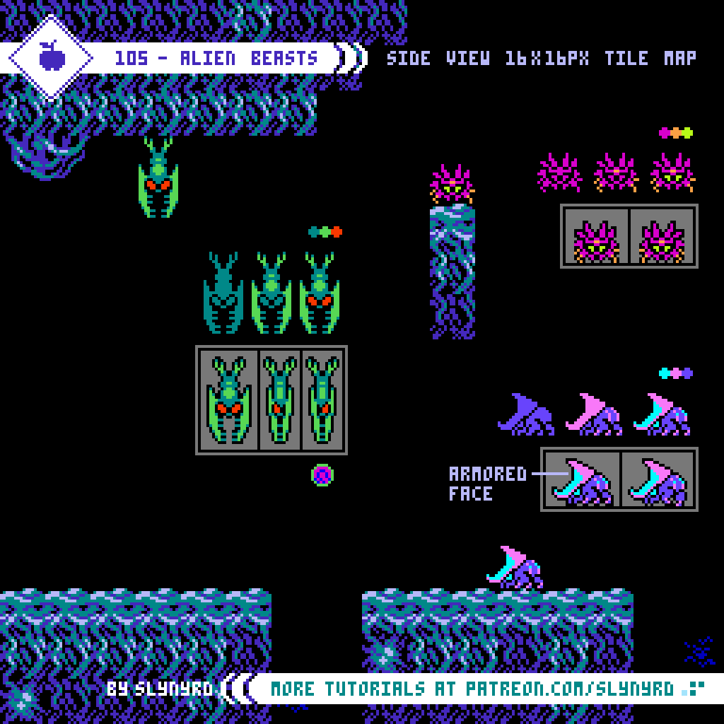
Here are a few enemy designs inspired by some of the first baddies you will encounter in Metroid. I respectively refer to them as diver, crawler, and charger. The diver and crawler are obvious recreations of familiar foes, while the charger is my original concept, which I imagine would blend right in with the cast.
Enemies should be designed around the mobility and capabilities of the player. In Metroid, your character has a high floaty jump and the ability to shoot in four directions. Therefore, threat comes from all directions with many flying and wall climbing enemies in combination with common ground walkers.
When enemies take damage the colors of the enemy sprite swap to the colors of your character. This is a clever trick that requires no extra colors or frames to show a flash effect that indicates the enemy has taken damage. It works all the better since the predominant red and orange colors signify pain.
When the enemy is destroyed a simple singe frame 32x32px explosion is show for a few frames. This also borrows the palette from the main character sprite.
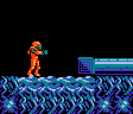
Alien Underground
Are you prepared to enter the alien underground?

For this tile set I analyzed the first area in Metroid to create a similar combination of variants, but with a reimagined look. Leaning into the alien aesthetic, I went for a more organic vascular texture in combination with ornate synthetic designs. You can almost feel the damp alien atmosphere.
I find the static black backgrounds in the original game quickly grow tiresome, so I created subtle textured variants that can be used anywhere in the background to create interest. The only catch is making sure the tiles with collision are clearly defined from the background. But then again, it’s kind of a neat explorative element to have to investigate what parts of the environment are interactive.
There are only 4 colors plus black used across the whole set, while any individual tile maintains the 4 color max limitation. It’s amazing how detailed and rich a scene can be with so few colors. Makes me think many NES games could have looked even better than they did without the need for more graphical power, simply better handling of the pixel art. But to be fair, the games at the time were designed for CRT displays, which softened cluster work that may appear harsh in high definition. Nevertheless, the aesthetics of NES games still looks great, and always will.
Final Thoughts
I vaguely remember Metroid back in the day, as I doubt the kid me had the patience to ever get very far into it. With vastly improved iterations, like Super Metroid in 1994, it’s a bit hard to go back to the original with its archaic password system. However, many of the elements of explorative platformers that you know and love today can be found in this brilliant classic. Unfortunately, the visuals of Metroid have aged worse than other classics, such as Castlevania. If any title was begging for a rework it was this one. It was my goal to make more pleasing color combinations, and bring in more informative details to otherwise flat ambiguous designs. I hope my revisions are not blasphemous to the fans, and furthermore, showcase how graphics can be improved through art direction, while maintaining the technical limitations.
Resources
Please consider supporting my work by becoming a Patron. Among many other rewards, Patrons can access resources to compliment my tutorials. But most importantly, you allow me to continue making new content!
Alternatively, you can support me by making a one-time donation
Assets featured in this Pixelblog are available in Retro Classics Asset Pack
Select source files used in the making of this Pixelblog are available in Metroid Study Source Files
Get caught up on all my downloads
You made it to the end of the article. Thank you for reading!
-By Raymond Schlitter