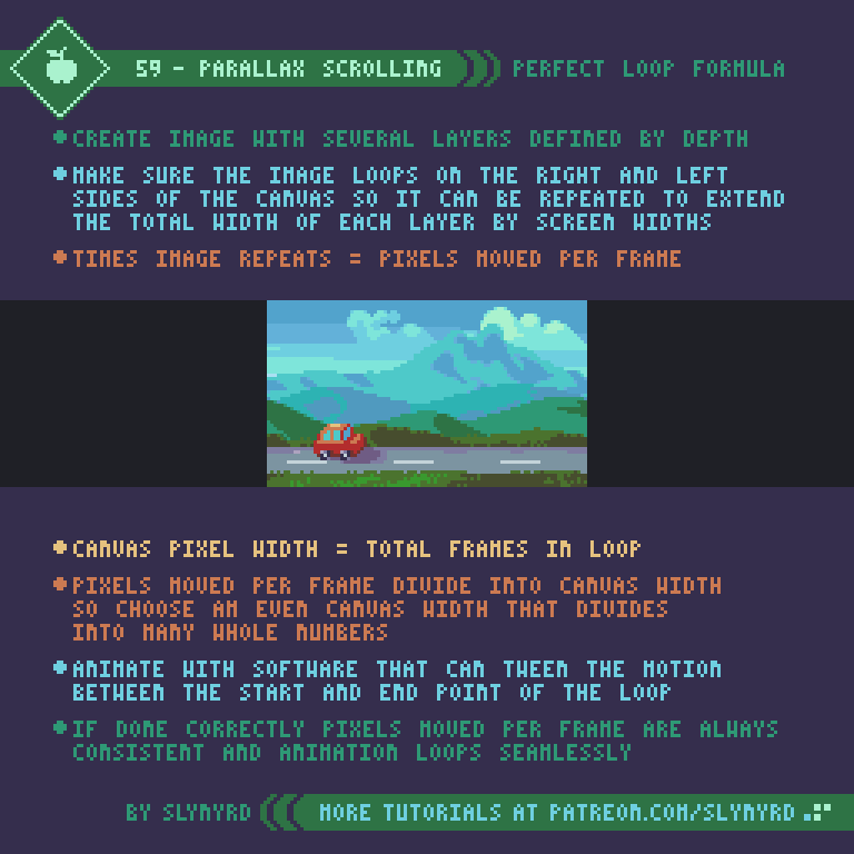
Pixelblog - 28 - Side View Tiles by Raymond Schlitter

Intro

Even with the unlimited potential of technology these days, tile based graphics remain a powerful and efficient way to create game worlds. If you are new to making tiles I suggest reviewing Pixelblog 20, in which I introduced the fundamentals of tile making with top down tiles, and how to best make them with specific software. In this lesson I will guide you through tile creation in the most common projection used in 2D games - the side view.

Title_Image_2.png

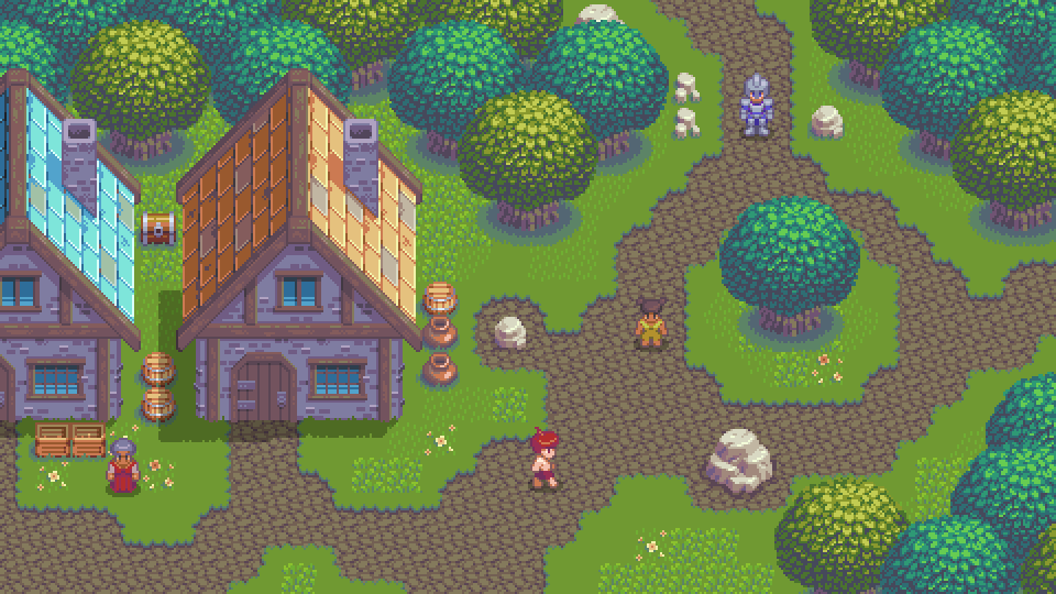
From the foreground to multiple background layers, in the following tutorials I present a variety of tiles for creating a complete environment.

SLY16

Due to the limitations of consoles like the Megadrive, 16 color palettes really hit a sweat spot with pixel art aesthetics. While I’ve made several specific palettes within this range, Sly16 checks all corners of the color wheel. The mindset was to create a retro-inspired limited palette you can create entire game worlds with. To put it to the test, I created everything in this feature with it. To my surprise I never really felt a need for more colors, and the limitation actually frees me from excessive deliberation with color choice.

Sly_16.png

I started by plucking colors from my Mondo palette then refined with testing, and the inspiration of other palettes. I’m always open to future revisions, but I’m quite happy with the current state of the palette. Patrons can download Sly16.

Basic Ground Set

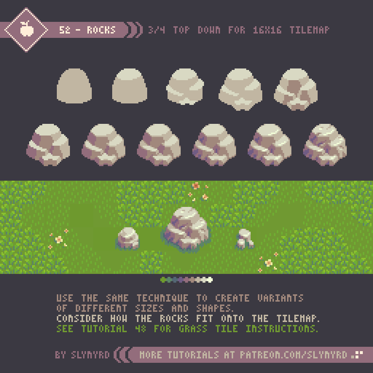
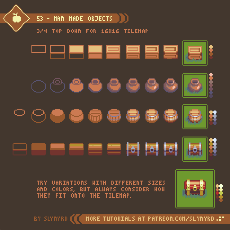
As with my previous tile lesson, I’m using 16x16px tiles. This is one of the most common tile sizes for pixel art games, as it is small enough to work efficiently with but still packs enough pixels for a surprising amount of detail. Also, it’s always a safe bet to work with a size that is a power of 2, as these values have the most consistent multiples, making it easier to create balanced textures. Ultimately, you can make tiles any size you want. They don’t even have to be square, but why complicate things? The basic guidelines I suggest are that your tiles are an even number and square. It all depends on the look you are going for. 

72-Rocky_Grass_Tiles.gif

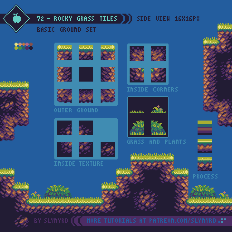
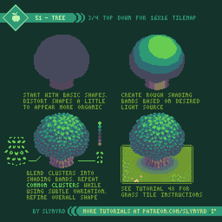
I start with very basic color blocking to capture the most prominent fields of color and define the orientation of the tiles. It is in this first step where I establish a region on the outer face of the tile that appears to tilt towards the background. For example, on the ground tiles with grass, it appears you are seeing part of the grass from the top, like a 3/4 tilt. Furthermore, the corner tiles tilt on the two outer sides, appearing like a cabinet projection. Creating tilted edges like this is critical to achieving depth.

In the rough clustering phase I blend the clusters into the color fields to imply the general textures and begin to smooth out the color transitions.

In the fine details phase I add highlights, push the shading, and refine the clusters to be more descriptive. However, I still like there to be some good chunky clusters in there. Too much detail can end up looking blurry, or noisy.

You can see the grass would have an abrupt flat top if not for the extra grass and plant tiles. The player would walk on top the ground tile and overlap the grass tiles, making it appear like he’s really a part of the environment. This shows how you can add varied edging to your tiles while preserving clean collision bounds.

Platforms and support tiles

level design possibilities are greatly opened with the ability to place a stand alone platform anywhere on screen. However, my rational nature makes it hard to accept floating platforms without some kind of logical explanation, like it’s imbued with magic or hover technology. These explanations are acceptable to me for moving platforms, but for static platforms I usually go out of my way to visualize a logical support structure for platforms.

73-Platforms_Support.gif

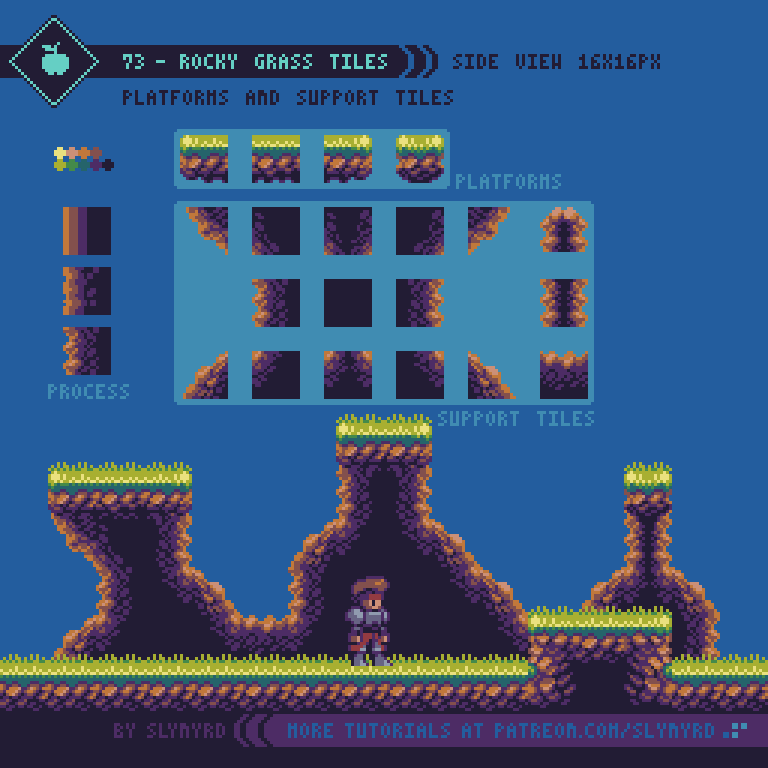
The support tiles are designed to look like they are in the immediate background so it’s obvious you can pass in front of them but close enough they appear to be connected to the platforms. Besides providing a logical support structure to platforms, these tiles also add an interesting background layer, which can also be used purely for visual interest without platforms attached.
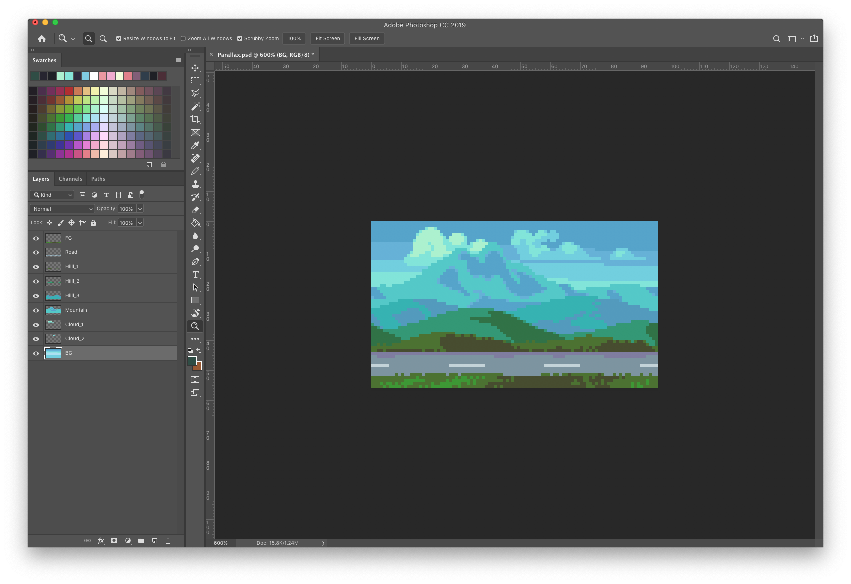
Background Tiles

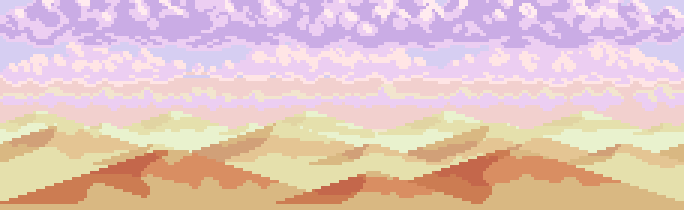
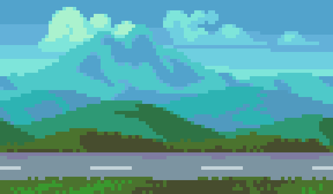
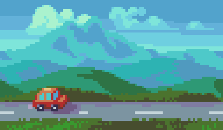
Of course, the goal with the background is to create depth, but also to further contextualize the environment without compromising the readability of the foreground. Moreover, I like to make several simple background layers, and let the sum of the parts create visual richness, rather than having only one or two very detailed background layers. The more layers you have the more depth you can achieve from parallax scrolling, but just a few is usually enough for convincing depth.

74-Background_Tiles.gif

Overlap and the use of subtle outlines allow me to get a lot out of my 16 color limit. Had I used I larger palette I could push for more detail and even more layers in the BG to capture a more realistic sense of atmospheric perspective. However, I’m pleased with the depth I’ve achieved with limited colors, and quite like to colorful retro look. Put it in motion with parallax scrolling and you’ll really sink into the image.

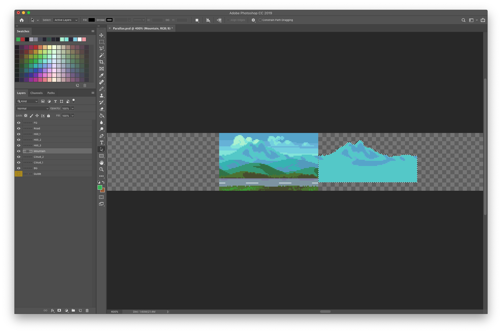
You can see my clouds bleed into the background in places but there is always enough information to imply the shape of the clouds. I would definitely avoid color bleed on sprites and things you interact with, but it is acceptable with passive background elements so long as the object remains readable.

KEY POINTS

These are mostly the same points I describe in my top down tiles lesson with a few new tips relevant to side view tiles.

Balance - Strive to achieve a homogenous distribution of visual weight within a tile. If any area of the tile has a visual dominance the pattern will become too obvious. Include clusters that overlap the edges and loop around the tile to help hide the seems.

Consistency - Define key clusters and shapes and repeat them in several cases to create a pleasing consistency. Avoid touching key clusters with other key clusters, as they clump into different irregular clusters and create noise. Touching corner to corner is okay.

Limit colors - You only need a few colors to make a rich texture. Too many colors and the texture will become blurry. Also, strong contrasting colors in the case of a texture pattern may result in displeasing noise.

Contrast - Consider contrast when combining different textures in the same environment. A busy texture next to another busy texture may exhaust the eyes with too much noise. Negative space is your friend.

Reflect - Often tiles can simply be mirrored to create tiles of different orientation. This saves time, and the symmetry creates a pleasing consistent look. However, this will only work if you have a symmetrical light source, or ambiguous omni lighting. In may example, light is always coming from directly above, making it possible to mirror right and left side tiles.

Resolution - You can make tiles any size you want, but the larger the more laborious. Anything over 32x32px seems like overkill for pixel art. 16x16px is probably the most common size and is sure to do your pixels justice.

Variants - Variant tiles of the same use add interest and reduce repetition. A well designed tile set shouldn’t need a lot of variants, but at least one variant of tiles that are often strung together in repetition will suffice. For example, my clouds have two different middle bottom tiles that I mix up to keep it looking organic.

FINAL THOUGHTS

Building off my experience from creating the top down tile series, I found the process to go quite smoothly. Also, I have worked with side view tiles in the past for a couple of game dev projects, and I’ve become more proficient with using Pyxel Edit, a pixel editor focused on tile creation. Check out Pixelblog 20 to learn more about it.

Making tiles can feel very tedious at the start, but once you have enough tiles to start making something they become a powerful and fast way to create large environments with relatively few assets. Once you feel that power it becomes addictive and you just want to keep building the world. I’d love to expand on this concept in following lessons much like the top-down series. Characters, animations, items, ui, different environments; let me know what subject you are most interested in learning.

Title_Image.png

RESOURCES

Was this article helpful? If you find value in my content please consider becoming a Patreon member. Among many other rewards, Patreon members can access resources to compliment my tutorials. But most importantly, you allow me to continue making new content. 

Assets featured in this Pixelblog are available in Side View Rocky Grass Tile Pack

Get the original palette used in this lesson- Sly 16

Source files used in the making of this Pixelblog are available in Side View Tiles Source Files

Get caught up on all my downloads

If you're not ready to commit to the subscription model of Patreon, make a one-time donation and receive exclusive art and resources. Help continue the content by providing me a living. Thank you! 

-By Raymond Schlitter

Pixelblog - 27 - Under the Sea by Raymond Schlitter

Intro

At a fundamental level, visual art is observation and interpretation of the natural world we live in. Therefore, in order to become a well rounded artist, it’s imperative to keenly study the many realms of nature and depict what you see. No matter how strong your sense of imagination is, frequent natural studies will prove to sharpen your vision. What’s more, you will develop a deeper understanding of the objects you depict. After all, anything imagined must have a source of inspiration in the real world.

Title_Image.png

In a constant quest to strengthen artistic vision and broaden visual vocabulary, I’ve covered several natural studies in previous lessons, such as plant life, and rock formations. In this lesson I dive into one of the most beautiful and mysterious environments on the planet - the ocean! Broad and diverse the world of the ocean is, for it can’t be covered in one lesson. Moreover, for this lesson, I focus on corals and algae. Also, as a bonus I included a submarine tutorial, so we have a watercraft to explore this wonderful world in.

Coral

One of the most unique lifeforms in the ocean, corals come in many forms. Sometimes appearing as rocks, or plants, corals are in fact animals. Actually, a single coral is made up of thousands of tiny animals called polyps. Wow!

69-Corals_P.png

As you can see there are two main kinds of corals, hard and soft. Hard corals are made of calcium carbonate, and the polyps create an exoskeleton, making them hard as rock. Hard corals grow in colonies, eventually forming coral reefs. Hard corals commonly come in yellows and rust colors.

Soft corals are also made of calcium carbonate, but with a blend of protein, which makes them less rigid. Although rooted, a lack of an exoskeleton allows soft corals to sway back and forth. Soft corals come in a wide range of vivid colors.

ALGAE

Commonly referred to as seaweeds, algae make up most of the plant life in the ocean. As a fan of Japanese cuisine I was already familiar with a few species, but I was surprised to discover there is an extensive list of known species, and they exhibit great diversity in appearance.

70-Algae_P.png

Although they may be called seaweeds, algae are not plants. Algae use chlorophyll for photosynthesis and have plant-like cell walls, however, they do not produce seeds or flowers like plants do.

At the basic level, algae are classified as 3 main types; brown, red, and green.

Brown algae is the most prevalent, and touts the largest species. Seaweeds known as kelp are brown algae.

Red algae get their red color from a pigment called phycoerythrin. The ability to absorb blue light allows red algae to live at greater depths than either brown or green algae. A sub group of red algae called Coralline algae contain calcareous deposits, which makes them hard like corals. Pink Plates is an example of Coralline algae.

Green algae is the least common but there are still more than 4000 species on the planet. These algae come in three forms: unicellular, colonial, or multicellular. However, the diversity among green algae is not as great as among red and brown algae, with most species appearing like some kind of sea lettuce.

Submarine

While it’s not really in line with the topic of natural studies, it’s equally important to study man made objects. The value comes from observation. However, I find natural subjects to be more insightful and inspiring. Anyway, figured we needed a watercraft for this underwater adventure.

71-Sub_P.gif

After studying several different subs, I came up with this general design, which exhibits the main parts needed for proper operation. The hull is a pressurized container that makes up the main interior space where the crew operates from. The conning tower is a raised platform on top the ship from which the ship can be operated when on the surface, and contains the periscope. The rudders control the direction of the ship. Vertical rudders control the yaw, or left and right movement, while the horizontal rudders allow the vessel to dive and ascend. Obviously, both are necessary. Finally, the propeller provides propulsion. As long as you have these basic components, it should be a convincing sub design. Play around with different shapes, dimensions, and colors!

FINAL THOUGHTS

Growing up as land locked as it gets in Kansas, I’ve always thought of the ocean as an exotic and majestic realm. The first time I went to a large aquarium in Tokyo I was blown away by the lifeforms on display, and infinitely inspired. Although I had been to the ocean before and had a basic education on marine life, it was like discovering a whole new world. With this lesson I decided to start with the basic life forms, but there is so much more to explore. I’m sure I will revisit underwater environments, and cover different kinds of sea life in the future.

RESOURCES

Was this article helpful? If you find value in my content please consider becoming a Patreon member. Among many other rewards, Pixel Insider members get extra resources to compliment my tutorials. But most importantly, you allow me to continue making new content. 

Assets featured in this Pixelblog are available in Under the Sea Asset Pack

Source file used in the making of this Pixeblog is available in Tutorial 71 Source File

Get caught up on all my downloads

If you're not ready to commit to the subscription model of Patreon, make a one-time donation and receive exclusive art and resources. Help continue the content by providing me a living. Thank you! 

-By Raymond Schlitter

Pixelblog - 26 - UX/UI Design Basics by Raymond Schlitter

Intro

Imagine a game with beautiful graphics and tight controls, but the text is barely readable, the icons don’t make sense, and many useful features are buried in clunky menus. Doesn’t sound so fun, does it? Obviously, the quality of the user interface can make or break a game. Therefore, If you want to make games, you will need to have UX/UI design skills. So what’s this jargon all about? In the first part of the lesson I explain the terms and what they focus on. After the basics we get into designing UI assets that commonly appear in games.

UX vs UI Design

UX refers to user experience and UI is the user interface. I’m sure most of you are familiar with these terms, but there seems to be a lot of confusion about the difference between the two. Well, here’s the way I see it.

66-UX_UI.gif

UX - User experience involves the feel of the design determined by how the user interacts with the visuals. Furthermore, UX design focuses on the feel of the design and the user’s overall experience with it. For example, how easy is it to save your game, change your gear, disable audio, and accomplish various desired tasks? These are some of the concerns of UX design.

Design goals of UX design
• Intuitive and easy to use - The user can smoothly navigate the interface without thinking.
• Interaction feels satisfying - The experience gives you the right thing at the right time.
• Fast and responsive - Smooth, prompt functionality keeps the user from disengaging the habit.

UI - User interface is all the actual visual assets the user interacts with, for example, gauges, fonts, icons, and menus. UI design is the practice of creating these assets and incorporating them into the interface in a manner that is intuitive and smoothly guides the user through the experience.

Design goals of UI design
• Consistent visual language - Color, shape, size, fonts, and positioning of all UI elements should follow consistent rules to bring order and distinct character to your game.
• Aesthetics fit the game concept - Visual style matches the mood of game and the means of implementation intuitively informs gameplay.
•Highly readable, not distracting - Graphically reads well in all situations but does not hinder gameplay and engagement.

As you can see, these disciplines overlap and are both necessary for a successful design. Unreadable text and awkward button placement are examples of bad UI that consequently makes for a bad UX. Conversely, no matter how beautiful the UI looks, it won’t make up for bad UX, such as long loading times and overly complicated menu trees.

PLayer Health

Representation of the player’s health status is one of the most common ui assets. Here’s a look at some general styles and how to make them unique to your game.

67-Player_Health_Long.gif

Every style has pros and cons. Use a style that is most intuitive for the gameplay. Large unique shapes like hearts are graphically charming, but lack technical accuracy, and take up quite a bit of space on screen. On the other hand, numbers are very accurate, but hard to read in the heat of the moment.

Iterate the design to create something unique that visually and conceptually fits your game. This can be done by manipulating basic design elements such as color, shape, and orientation. Some games go beyond basic shapes and use more conceptual representations of player health. For example, in Doom you see the character’s face turn more bruised and bloody as the health percentage drops. In Aladdin for the Sega Mega Drive the player health is represented by the amount of smoke coming from a genie lamp. I always appreciate creative ideas like this, but you must be careful the gauge is still readable.

Player heath is usually the most important status to keep your eye on. Therefore, It should always be readable but never distracting to gameplay and the user’s engagement in the experience.

Common Resources

Beyond player health there are several resources you often see used in games. Let’s explore some common resources to help inspire your game UI!

68-Common_Resources_P.gif

However you choose to represent your mechanics in the UI, make sure to follow the aforementioned design goals and make sure everything is consistent. For example, it would be odd to mix different styles of gauges in the same UI, like vertical and horizontal styles. However, in the case of unique mechanics it can be intuitive to represent them in all in a unique manner.

As for animating your UI, remember function comes first. Although these animations look neat, they could be distracting. If you are directly controlling a character you can see on screen, strong feedback is usually displayed over the actual sprite, and a funky UI could actually distract from where you’re supposed to be focusing. But, you’d have to really push it, and any life you can give the UI with animation is generally welcome.

FINAL THOUGHTS

UX/UI design may not seem like the most exciting aspect of making a game but it’s surprisingly fun! While it can be tedious to create an effective and consistent UI, it’s extremely satisfying to see it functioning properly. Much of a game’s character and professional polish shines through in the UI. Therefore, it’s important to treat the UI with just as much passion as the gameplay, character animations, or any other aspect of the game.

There’s much more to be covered on UX and UI. I hope to continue this topic in an upcoming Pixelblog!

RESOURCES

Was this article helpful? If you find value in my content please consider becoming a Patreon member. Among many other rewards, Pixel Insider members get extra resources to compliment my tutorials. But most importantly, you allow me to continue making new content. 

Assets featured in this Pixelblog are available in UX/UI Asset Pack

Source file used in the making of this Pixelblog is available in Tutorial 68 Source File

Get caught up on all my downloads

If you're not ready to commit to the subscription model of Patreon, make a one-time donation and receive exclusive art and resources. Help continue the content by providing me a living. Thank you! 

-By Raymond Schlitter

Pixelblog - 25 - Motion Cycles by Raymond Schlitter

Intro

Everyone and everything gets around in their own way; some on two, some on four, and some like to soar. In this lesson I present motion studies on 3 different subjects that are essential to hang on any animator’s tool belt. First, we’ll take a look at bipedal locomotion with a human walk cycle, then we step it up to four leg action with a dog walk cycle, and finally take to the skies with a study on the wing motion of birds.

Title_Image_25_2.png

Human Walk

A human walk cycle is always a good place to start your animation studies, or to polish your skills. In my opinion, the subtle movements of a walk make it a bit harder to animate than a run cycle. I cover run cycles in Pixelblog 8.

63-Human_Walk.gif

I present a standard walk cycle here with some exaggeration to help illustrate the subtle mechanics of the motion. Start by making a figure with the body parts clearly defined by color. It’s much easier if you animate one section at a time for all frames. Animate the legs first, then the arms, head, and overall body movement. Take careful note of the position of all the body parts in every frame.

Once the animation is satisfactory you can color and add details. The more detailed the design, the more difficult it will be to keep the movement clean. I recommend keeping your characters simple, especially if you are new to frame animation.

This is a standard walk cycle, but the motion can vary greatly depending on body type, age, and circumstances. To introduce more personality, observe real people and try incorporating their unique movements into the animation. For example, a carefree child marches with pride, the elderly shuffle slowly with hunched backs, the drunk sway and stumble, and so on.

Dog Walk

Quadrupeds are animals that walk on 4 legs. While they exhibit some of the same mechanics seen in bipedal locomotion, the additional set of legs further complicates things. You should have a firm grasp of 2 legged walk cycles before attempting to animate a 4 legged walk.

64-Dog_Walk_2.gif

I chose Shiba Inu, to illustrate quadrupedal locomotion. I’ve never owned one, but surely they’re the cutest!

Same as the human, break the anatomy down into separate body parts defined by flat colors. Think of the legs as 2 sets of biped legs. The bone structure is different than a human but the principle stepping motion is very similar. Animate one set of legs at a time, then do the body, head, and tail.

Observe how the back leg follows one step behind the front leg of the opposite side. Make sure the distance traveled is the same for both the front and back legs, or the body will appear to stretch and contract like an accordion.

Pay close attention to every body part in every frame and make sure the energy of the motion is consistent throughout. The up down motion of the back pelvis and front shoulders undulate with opposite but equal motion, creating a balanced rhythm across the back.

When dogs and other quadrupeds begin to run they actually bound, with the right and left legs working more in parallel. I’ve done one personal study of a bounding dog before and hope to cover it in a later lesson.

Bird Flight

Now you’re probably tired of all those legs, so let’s lighten things up and take to the sky with some simple wing motion.

65-Bird_Flap.gif

I modeled this example after medium sized sea birds, which can provide a template for many bird species and winged creatures.

As with the previous studies, establish the motion with simple shapes made of flat colors. From the front view my wings are simply a wireframe. Make sure to mark the joint placement on the wings. This helps prevent the wings from looking too rubbery by providing a clear folding point.

I went with 8 frames to stay consistent with the other studies and to clearly describe the full arch of motion, however, I think a convincing wing motion can be done with a few less frames. The extremes of motion are keyframes. so you should start with these. then do the smear and take it from there.

Start with the front view before attempting the side view. Animate only the wings first, then add the overall bobbing motion last.

Once the motion is satisfactory, you can color and add details. Notice how I thickened up parts of the wings and added visible tail feathers in my finished version of the front view.

FINAL THOUGHTS

I use a fairly realistic style with some degree of exaggeration for these studies in order to best illustrate the basics of the motion. If I were making sprites for a game I would go for more stylized designs with personality, and possibly with less frames.

In order to develop animation skills one must learn to keenly observe the world around them and the manner in which all things move. However, without tangible practice it’s hard to make those senses kick on. Once you actually go through the exercises you’ll suddenly start noticing all kinds of little nuances of movement in real life. But it won’t stick if you don’t keep practicing. Animation requires a lot of repetitive practice on a regular basis. At least it does for me. So I’ll try my best to keep on practicing and sharing the fruits of my studies with you. Much more to learn!

RESOURCES

Was this article helpful? If you find value in my content please consider becoming a Patron. Among many other rewards, Pixel Insider members get extra resources to compliment my tutorials. But most importantly, you allow me to continue making new content. 

Assets featured in this Pixelblog are available in Anatomy & Animation Asset Pack.

Source file used in the making of this Pixelblog is available in Tutorial 63 Source File

All contents of this lesson use my custom palette Mondo

Get caught up on all my downloads

If you're not ready to commit to the subscription model of Patreon, make a one-time donation and receive exclusive art and resources. Help continue the content by providing me a living. Thank you! 

Pixelblog - 24 - Items by Raymond Schlitter

Intro

Items come in various forms and are used in almost every video game. Often they are found scattered throughout the game world and picked up by the player. Many games also feature inventory systems and the ability to purchase and sell items. Considering the prevalent use of items in video games, clearly depicting them with proficiency is surely a valuable skill for pixel artists. In this lesson I will cover some of the most common items that appear in video games and how to bring them to life with simple animations.

Common ITEMS

Hearts, gems, coins, fruit, and an assortment of common game goodies! Use this reference to help inspire your item creation.

60-Item_Reference_Simple.png

For this reference I used a 16x16 pixel limitation, side-view projection, and every item has about 6 colors or less. The size of your items should be determined by what looks good in relation to your character and the environment. For example, If your environment is made out of 16x16px tiles, then 16x16px should be the perfect relative size of the items, as they will fit nicely into the level designs.

I kept the style fairly generic without an obvious theme to make the reference more universal, however, you should stylize your items to best fit your game. Whatever the style, make sure it’s consistent and the items feel like part of the same universe. For example, I probably wouldn’t have skeleton keys and key cards in the same game, but you never know. Also, make sure the projection is consistent. If your game is top-down these items would probably look out of place and need to be titled forward a bit.

I encourage you to make your own unique items, just be careful to make them understandable to the player. Gamers are accustomed to these common items and have a pretty good idea of what they might do, but unique items require more effort from the player to learn.

Idle Animations

Items that are picked up in the playing field sometimes need a little idle animation to stand out as an item, or just to give them some life.

61-Idle_2.gif

Idle animations should be simple and non-distracting. Some idles suit certain items better than others. For example, shine animation might look odd on food items. Furthermore, rotation animation is overly complex to make for anything but the simplest items. Bounce animation makes sense for items setting on the ground, while bob works best for floating items. However you choose to animate your items, it should be consistent across the board. It might be okay to use different idles for different items in some cases, but it should be a consistent system. For example, currency items shine, while power ups bob. Some games use both floating items and items that sit on the ground. In that case there could be a general rule that floating items bob and ground items bounce. It’s also possible to combine animation concepts, like shine plus bob. Just be careful it doesn’t become too noisy and detract from the readability of the item.

FEEDBACK ANIMATION

Visual feedback from item collection makes picking up items more satisfying, but it also provides a function. The function is to inform the player of the effect of the item, and to emphasize when you’ve picked up an item with more clarity, which is especially important in visually busy games with lots of action.

62-Feedback_Small.gif

This illustrates several examples of item feedback in the traditional arcade context, where the item takes effect by simply touching it with your character. In the case of currency, or non consumable items, the feedback animation plays in the spot of the item. On the other hand, items that do have an effect follow you and play on top the character sprite. This isn’t a rule, but it sure feels intuitive to me.

These are simple ideas that can be translated to all kinds of games. The sparkle animation works well as a generic effect for currency, or non consumable items. Since it’s likely you’ll see this effect a lot, I recommend making a few different small sparkle animations and combining them with some randomization.

The power up animation can be used for all kinds of items that increase your stats in some way. A simple color swap and the same animation could be reused for various items.

The HP up animation shows a bit more unique example of feedback animation. Furthermore, It’s possible to make all kinds of creative feedback, but foremost, make sure it helps inform the effect of the item without eccessive noise. As always, consistency is also important. Make sure all feedback has a similar balance and style. The more important or beneficial the item, the more special the feedback can be.

While I illustrate feedback in the context of a traditional side-scroller, it can and should be implemented in all kinds of games. Feedback on top the character is always good as you are sure to see it, but it could also be applied to UI elements, such as a life bar or profile pick. Some games where you don’t even see your character still have feedback by overlaying colors and effects on the screen. Needless to say, item feedback is important information.

TItan_Feedback_2.gif

Above is a montage of the various feedback animations featured in Hyper Echelon. Notice how they are all unique but have consistent style and the same radial flash appears in all of them.

FINAL THOUGHTS

Whenever beginner pixel artists ask me to assign them homework to help them get started, I usually suggest they draw small items with few colors. This allows them to practice the fundamentals without being overwhelmed. What’s more, they get the satisfaction of making a complete asset that could potentially be used in a game. Games aside, the ability to reduce objects into easily recognizable iconic images is a valuable skill for any artist, especially when working under the limitations of pixel art. So have fun making items until your heart’s content. Although small, the skills to make something epic can be achieved through humble item making.

Work through the backlog of Pixelblogs for more fundamentals on pixeling. In particular Pixelblog - 6 - Lighting, and Pixelblog - 21 - Top Down Objects contain relevant content. Also, if you want to make a simple animated character like in my example, check out Pixelblog - 8 - Intro to Animation.

RESOURCES

Was this article helpful? If you find value in my content please consider becoming a Patron. Among many other rewards, Pixel Insider members get extra resources to compliment my tutorials. But most importantly, you allow me to continue making new content. 

Assets featured in this Pixelblog are available in Items Asset Pack.

Source file used in the making of this Pixelblog is available in Tutorial 62 Source File

All contents of this lesson use my custom palette Mondo

Get caught up on all my downloads

If you're not ready to commit to the subscription model of Patreon, make a one-time donation and receive exclusive art and resources. Help continue the content by providing me a living. Thank you! 

Pixelblog - 23 - Parallax Scrolling by Raymond Schlitter

Intro

Parallax scrolling is a technique used with 2D art where background images move slower than foreground images to capture a sense of depth. Just by applying motion, a scene can immerse you in an endless landscape and tell grand stories. In this lesson I will focus on how to make stand alone parallax animation loops with pixel perfect motion. Furthermore, I will detail my personal technique using Photoshop, which can also be translated into various pixel art apps that allow animation.

Desert.gif

The first thing to consider is the scene you want to animate. Parallax scrolling is well suited for layered scenes that exhibit atmospheric perspective, such as landscape scenery. Parallax will enhance the sense of depth but it may not be convincing if your scene doesn’t already convey depth when static. For more about making landscape scenes with atmospheric perspective, check out Pixelblog 11.

58-Parallax_Reference.gif

Of course, clouds are always a great subject to parallax. I recommend starting with something simple, like clouds or stars to practice on the execution of the animation before attempting complex scenery. Since you need very long or tall images to run across the canvas, it’s best to make images that can loop at the seams of the canvas, and repeat them. The drawback is some layers can look monotonous when repeated many times in the loop. Balanced layers without dominant points of interest help hide the loop.

Pixel Perfect Movement

Pixel perfect movement is movement that only moves in increments of pixel units. Pixel art is created at 1x resolution (one pixel unit equals one pixel on screen) and usually animated on the same scale. It’s possible to upscale pixel art assets and give them smooth sub-pixel movement in a game engine or animation software, but fundamentally speaking, you can’t move a half pixel.

With movement being strictly tied to whole pixel increments, the pixel dimensions of the canvas become critical. For movement to be smooth and steady the scroll rate should be the same amount of pixels each frame. To do so, the pixels moved per frame must divide into the dimension of the canvas the motion runs along, so choose an even value that divides into many whole numbers.

59-Parallax_Perfect.gif

The canvas in my example is 96 pixels wide, which can divide by 1,2,3,4,6,8,12,16,24,32,48. This is a good size as it gives a lot of options for perfect scroll rates, and you can see the jumps between the increments follows a consistent upward curve, which will result in natural jumps in speed between layers.

Before you get too far along it’s good to test out the motion of your layers to make sure the relative speed feels appropriate for the perceived depth of the image. Generally, I start with my furthest background layer scrolling at 1 pixel per frame, and each layer that gets closer to the viewer scrolls at the next faster perfect rate. Sometimes when I want movement slower than 1 pixel per frame I do 1 pixel per 2 frames, which requires the image to repeat twice on the same screen, as it only travels halfway across the canvas throughout the loop. However, I try to avoid slower than 1 pixel per frame, as the motion can look a bit jittery.

Made in Photoshop

Now I’ll take you through my process to animate parallax scenes in Photoshop, using the frame animation tools. Frame animation in Photoshop is pretty bare bones, but it always gets the job done. With proper planning and organization, I’ve managed to create a number of complex animated scenes with it. There’s something deeply satisfying and almost hypnotic about creating the perfect animation loop under the limitations of frame animated pixel art.

Screen Shot 2019-11-16 at 2.13.33 PM.png

First I choose my canvas size(96x56px) and create my scene out of several layers.

Screen Shot 2019-11-16 at 2.26.13 PM.png

As soon as the final image size is established I like to extend the canvas width by a large even amount of pixels just to make plenty of room to work with. Image-Canvas Size (⌥⌘C). The anchor point stays centered.

Screen Shot 2019-11-16 at 8.59.34 PM.png

Now I can make sure my images connect and see how they look when repeated.

Screen-Shot-2019-11-16-at-2.28.00-PM.jpg

Once I’m satisfied with the composition I make a guide that measures screen widths on a new layer. I number the increments that divide into final image width(96px). The guide is made long enough to accommodate the fastest moving layer.

Screen-Shot-2019-11-16-at-2.28.51-PM.jpg

Using the guide I loop out each layer by screen widths. The number of repeat screen widths will equal to the number of pixels moved each frame when animated.

Timeline.gif

After extending all my layers I turn on the Timeline to animate (Window-Timeline). Then click in the bottom left to covert to frame animation.

Frame_delay_2.gif

I set the frame delay before I make more frames. The frame delay determines the playback speed of the animation. Clicking on Other… allows me to set a custom delay for much faster playback. I set it to 0.08s in this example.

New_Frame_2.gif

I add one new frame in the timeline, which creates a duplicate of the previous frame.

Screen-Shot-2019-11-16-at-2.28.51-PM.jpg

Frame 1 still looks like this.

Screen-Shot-2019-11-16-at-2.43.50-PM.jpg

In frame 2, I slide each layer to the left the distance of how many repeat screen widths it has, coming all the way to the right edge of the static background. With the start and end point of my animation set I can turn off the guide layer.

tween_motion.gif

Next, I select both frames and click on the Tween command.

Screen Shot 2019-11-16 at 2.40.31 PM.png

The Tween command adds frames between two existing frames and interpolates any change in position, opacity, and layer effects. In this case, it will automate the movement of my layers between frame 1 and 2 with however many frames I specify. I want my total frame count to match the pixel width of the final canvas size of 96px. Since the centered image in frame 2 is the same image as frame 1, this layer will be trashed after I tween. Therefore, the number of frames added is the final canvas width -1. So in this case, I add 95 frames.

Trash_Frame.gif

This results in 1 extra frame at the end, which needs to be deleted to make a seamless loop.

Screen Shot 2019-11-16 at 2.42.37 PM.png

After I’ve tweened the motion I set my canvas size back to the final desired width of 96px. Adjusting the canvas to a smaller size masks the data that is off the screen, so I can always go back to the wide canvas and everything will still be there.

Parallax_No_Car.gif

Boom. The movement of each layer is consistent in every frame, and the loop is perfect.

Screen-Shot-2019-11-16-at-7.17.06-PM.png

After I’ve animated my parallax background I can go back and add details, like an interesting subject that moves with the camera. In order to keep the complete animation a perfect loop, any constant looping animation that is added to the parallax must loop in a number of frames that divides into the total number of frames. In this example, I add a car that animates in a 4 frame loop. To add the car I create each state of the animation on a separate layer. I then have to go through all the frames 1 to 96, and cycle the visible layer to animate it. This step can be tedious if the animation has many frames, but is made much easier by assigning keyboard short cuts for Go To> Next Frame, and Go To> previous frame.

Screen-Shot-2019-11-16-at-7.03.31-PM.png

To save my animation as a gif I use Save For Web (File-Export-Save For Web ⌥⌘⇧S). This brings up a panel with several options. In the top right I set the file type to GIF in the second drop down. The settings for the selected file type is optimized by default but can be further tweaked if needed. In the bottom right I can choose the size if I want to upscale. For pixel art the size should be scaled only by multiples of 100% and the quality set to nearest neighbor. Also, I make sure the looping options is set to forever to make the gif endlessly loop.

When working in Photoshop the playback speed of the timeline can be quite laggy, which makes it hard to see what the animation actually looks like. To work around this I frequently export it as a gif and jump to it in the finder to preview it in real time speed.

Intro_Parallax.gif

Let’s go road trippin’ forever. Feel that parallax pull you in.

Key Points

  • Parallax scrolling is well suited for layered scenes that exhibit atmospheric perspective, such as landscape scenery

  • Screen width = total number of frames in loop - choose even value that divides into many whole numbers.

  • Make image loops on edges of the canvas so you can repeat the image to extend it

  • Times image repeats = pixel movement per frame (scroll rate)

  • Balanced layers without dominant points of interest help hide the repeating images

  • Any constant looping animation that is added to the parallax must loop in a number of frames that divides into the total number of frames

  • Animate with software that can tween the motion between the start and end point of the loop

  • If done correctly the scroll rate of every layer should be the same every frame, and the animation should loop seamlessly

Final Thoughts

There’s something about turning a static scene into an endless expanse that feels like magic. I started using this technique in the early days of my pixel art journey, but my proficiency and execution has greatly improved over the years. So I think even beginners can try this tutorial and learn through practice. The animation is actually a piece of cake. Making quality art with depth and balance is the main challenge of creating an attractive loop. Plan well and don’t rush the art. However, it’s good to do motion tests before spending too much time on your art, especially if you don’t have a good feel for the speed of pixel movement. Happy parallaxing my friends!

Resources

Was this article helpful? If you find value in my content please consider becoming a Patron. Among many other rewards, Patrons can download resources to compliment my tutorials. But most importantly, you allow me to continue making new content. 

Assets featured in this Pixelblog are available in Parallax Scrolling Asset Pack

Source files used in the making of this Pixelblog are available in Parallax Scrolling Source Files

Get caught up on all my downloads

If you're not ready to commit to the subscription model of Patreon, make a one-time donation and receive exclusive art and resources. Help continue the content by providing me a living. Thank you! 

-By Raymond Schlitter

Pixelblog - 22 - Top Down Character Sprites by Raymond Schlitter

Intro

Welcome back to the charming world of top down pixel art. In the previous 2 Pixelblogs we covered basic ground tiles, and various environment objects. Now, in the 3rd part of the top down series we’ll bring the world to life with fully animated character sprites.

Title_Image.png

Character sprite Process

In order to animate a top down character you will need to represent the sprite in at least 4 directions. Unless you’re using dramatic directional lighting, or your character has an asymmetrical design you wish to accurately display based on orientation, the side facing version can simply be reflected for right and left movement. Therefore, our first goal is to create a character facing in 3 directions of the screen; up, down, and to the side.

54-Character_Sprite_2.png

Before you jump into character design it’s important to establish the sprite size, as the size of your characters can strongly affect the look and feel of your game. Generally, tile size is the best gauge for determining sprite size. As shown in the lower section of the above tutorial, relative sprite size usually conforms to a tile unit, or multiples of the tile unit. The height and width can multiply independently. For example, 1 tile wide by 2 tiles tall is one of the most common sprite sizes, and is the size I’ve chosen for my example.

Basing the character size on tile units allows the sprite to naturally fit in the grid-like structure of the tile based world, with simple collision bounds also defined by tile units. While modern tools allow one to break the grid and create sprites and environments of arbitrary size, the snug logic of the grid-based approach is still common convention.

Note, the frame of the sprite size is relative and the character doesn’t have to completely fill it edge to edge. However, you don’t want there to be too much empty space around your character, as to avoid pronounced gaps with adjacent sprites and parts of the environment with collision. Conversely, pixels spilling out of the frame may lead to unwanted overlap. With the top down viewpoint there is implied depth along the Y axis, as we assume objects lower on the screen are closer. Therefore, it looks perfectly natural and improves the sense of depth to allow the top half of a 2 tile high sprite to overlap sprites that are just a bit higher on the screen. However, overlap along the X axis is arbitrary and confusing to the eye.

Walk and Run Animations

Once you have created the idle position of the sprite facing 3 directions you can begin creating a walk/run animation. It’s best to keep the sprite very basic at this point and add details after you are satisfied with the motion.

Animation_Dummy.png

I often establish the animation with a dummy sprite composed of clearly defined solid color body parts like the above image. In this case, since the sprite is quite small and some of the lighting details effect the appearance of the motion, I skipped the dummy step and straight up animated the details on the first pass. However, I recommend always starting with a dummy, especially if you are working with larger more detailed sprites.

55-Walk_Run_2.gif

While my walk cycle is 4 frames and the run cycle is 8, you don’t really need to create that many unique poses. The walk cycle borrows all its frames from the run cycle, but simply omits the frames where the character is in full stride, and the playback speed is slower. The frames with the arms swinging can simply be reflected for the up and down facing versions.

Once you are satisfied with the animation you can use these frames as the base for all characters in your game with similar proportions. I suggest starting with a basic nude, which you can easily build off and accessorize.

Although we only have the sprite in 4 directions, you can still implement 8 direction movement and it will look acceptable when any of the 4 directions veer off at an angle. Applying 4 directions to 8 directional movement was common practice with many 16-bit games and still looks good to me. Secret of Mana, and A Link to the Past, are a couple examples that come to mind. But if you want to get fancy, you can try adding the 4 angles. I think the absence of the angles only becomes jarring if the sprite is large and detailed.

Character Sprite Reference

After you have created a base model for a character sprite, the real fun of designing unique characters can begin.

56-Example_Characters.png

As a basic proportion guide, I created various heights to distinguish between male, female, young, and elderly. Of course, there can be exceptions, and I permit some wiggle room for slight variation in height between the same types. However, when working with such limited information, I find it best to stick to a system and not challenge the player’s expectations too much. Remember, the part of the sprite in the upper half of the frame can overlap sprites, so no need to worry about the empty space at the top of the frame.

The smaller the sprite the more condensed and abstracted the proportions tend to become. When working with limited size the head usually takes up a third to half of the total sprite. This is to emphasize the expressive features of the character, which helps the player form an emotional connection to the characters. Going for realistic proportions at such a small size will result in a stick figure, which can be an interesting style, but lacks personality. While a small canvas seems to allow little room for stylistic choice, there is always potential for creativity. I challenge you to create your own unique style of characters.

House

Wherever you have people, you are sure to find dwellings. I just couldn’t help myself, and had to make a bonus tutorial for creating a house!

57-House.gif

The size of the house is also based on tile units, so it logically fits into the game world with no odd gaps or unwanted overlap. Furthermore, it could be broken into tiles and expanded into different structures by adding various filler and connection tiles. For now, it’s just one large sprite.

The scale of buildings in top down games is often shrunk in relation to the characters, appearing tiny on the outside, then magically become spacious when you step inside. This partly originates from technical limitations, but also makes navigating a village much more practical, especially if the game doesn’t have a run feature. While it’s still an acceptable convention and has a certain charm, I like my buildings to at least have a believable scale in relation to the character sprites. Once you go inside, it’s still perfectly acceptable to expand the layout of the building.

Screen Size

The screen size/native resolution of your game should be established in the early stages of development, as it can strongly affect aesthetics and gameplay. When working with pixel art it’s especially important to pick a screen size that can perfectly scale to fit common displays and remain pixel perfect. 1920x1080p is one the most common display resolutions, and many displays have a 16:9 ratio. Therefore, the basic guideline I use is to make sure your native resolution perfectly multiplies into 1920x1080. However, you should also consider other common displays, such as 1366x768.

480x270px native resolution feels just right for this mockup.

480x270px native resolution feels just right for this mockup.

In order to preserve the pixel art aesthetic there’s a limited range of acceptable resolutions. Too high resolution and it no longer appears as pixel art. Too low resolution and it becomes abstract blocks. This leaves us with a handful of acceptable options that perfectly scale into 1920x1080, and closely fit other common displays.

320x180(6x) Quite chunky when viewed on a large display but still an acceptable retro look
480x270(4x) A good fit for my top down mockup made with 16x16px tiles
640x360(3x) This is the resolution of the shmup I’m making, Thyrian Defenders

Of course, your resolution is not limited to these options. There are complex scaling solutions that allow other sizes to display with a pixel perfect look, but my technical knowledge is very limited on the matter. If you choose an arbitrary resolution your game may not be able to display pixel perfect at full screen, leaving borders around the play area. However, I find this more acceptable than distorting the pixel units in order to fill the entire screen.

When choosing a size It’s important to consider the relative size you want your sprites to appear on screen and how this may affect gameplay. The higher the resolution the smaller the pixel units become, or more zoomed out everything will appear. Therefore, the higher resolutions might be a good fit for something with fast scrolling, and fast moving sprites. If you’re going for something less twitchy, or simply want a retro look, perhaps you want to try one of the lower resolutions. Ultimately, screen size is something you should mock up and test for yourself before deciding on.

Final Thoughts

Well, this is the 3rd and final part of my multi-part series on top down subjects. From the start, I had a general plan with the intention of creating a cohesive game world with lessons that build upon each other. Honestly, I wasn’t quite sure what I would end up with when all I had were grass and dirt tiles, but with each lesson the world grew more lively. Now, it’s starting to feel like a real game, and I almost wish it was. I hope you have learned much on this journey with me. I know I have. Although it’s a bit sad, I’ll move on to a new subject in the next Pixelblog, but I don’t think you’ve seen the last of this world. There’s still plenty of opportunity to expand this world with new lessons on top down subjects.

RESOURCES

Was this article helpful? If you find value in my content please consider becoming a Patreon member. Among many other rewards, Pixel Insider members get extra resources to compliment my tutorials. But most importantly, you allow me to continue making new content. 

Assets featured in this Pixelblog are available in Top Down RPG Starter Asset Pack

Source file used in the making of this Pixelblog is available in Tutorial 55 Source File

Get caught up on all my downloads

If you're not ready to commit to the subscription model of Patreon, make a one-time donation and receive exclusive art and resources. Help continue the content by providing me a living. Thank you! 

-By Raymond Schlitter

Pixelblog - 21 - Top Down Objects by Raymond Schlitter

Intro

In Pixelblog 20 I introduced the fundamentals of making tiles with various 16x16 pixel grass and dirt textures from a 3/4 top down projection. Now I will continue developing the environment with some natural, and man made objects. Since the base ground is made of 16x16 tiles it’s important to consider how the objects will fit onto the tilemap. In this case, I break my objects down into 16x16 tiles so they can easily be used in a tile editor and laid out in a logical manner.

Title_Image_Edit.png

Tree

Of course, we’ve gotta have trees. A grassy environment without trees just feels lonely. So let’s get to it and spring up some green darlings!

51-Tree.gif

The ball shape design is a cute approach, but more importantly, simple shapes with symmetrical balance create visual stability, fit together nicely onto the tilemap, and look good when used in repetition. Furthermore, they can be placed in staggered overlapping rows to create a solid forest pattern with no odd gaps or noisy pixels. To keep the asset feeling fresh, try a simple color swap here and there. A more unique, asymmetrically shaped tree looks good when used sparingly to create a point of interest, but will look odd if often repeated on the same screen. This is a general rule for any kind of objects used in repetition.

Using simple shapes and visual symmetry, a pleasing canopy of dense forest can be made with a single base asset.

Using simple shapes and visual symmetry, a pleasing canopy of dense forest can be made with a single base asset.

Rocks

Well, we have grass, dirt, and trees. What next? You guessed it, rocks of course!

52_Rocks_2.gif

This approach exhibits a blocking technique, which is basically throwing down the basic shapes with solid colors and progressively refining the details as you introduce more colors. I usually use this technique if the sprite is not very big(low res). However, for larger sprites that are especially angular I sometimes start with an outline approach.

When designing your rocks it’s good to think about the geology of the area and what type of rocks you would realistically find in the environment. I imagine my rocks are some kind of limestone found in a prairie land. Moreover, I use warm colored blocky forms with a hint of smoothness, as these sedimentary rocks are susceptible to erosion and oxidization. Whatever the style of rock they will often share some of the same, or very closely related hues found in the dirt. Otherwise they are likely to look out of place. For more about rocks check out Pixelblog 13.

Man Made Objects

No matter what the environment, it seems treasure chests just seem to pop up out of no where. Curious, isn’t it? May as well cover some other common man made objects while we’re at it. I’m sure a village can’t be far away.

53_Man_Made_Objects.png

Here are some common man made objects you often find scattered around human settlements in top down rpgs. All except the large treasure chest snuggly fit into a 16x16 tile. This makes it so they can be cleanly placed on the tilemap, and fit together nicely when used in repetition. The large treasure chest is a bit irregular, sort of half filling a 32x32 space. However, in this case I think it’s okay, as it would be a rare object, usually placed off on it’s own.

Due to the precise geometry of man made objects the consistency of the sense of perspective is especially apparent. Make sure all your objects adhere to the same projection rules. For more about graphical projection, and 3/4 top down in particular, check out Pixelblog 3.

Cast Shadows

Shadows.png

Cast shadows help make objects feel like they actually connect with the ground. It’s best to keep them subtle and not cast out long in any particular direction, as to minimize conflicts with overlapping adjacent tiles. In some cases where the shadow can easily be contained within the frame of the sprite, such as my tree, it’s okay to bake the shadow into the same asset. However, in most cases I make the shadows on separate tiles and place them on a different layer than the sprites. This allows me to just have one base sprite, and create shadows for different surfaces as I need them.

Final Thoughts

After creating the base ground tiles in the previous blog the real fun is just beginning. It can be tedious at first, but once you start to develop a substantial set of assets it becomes addictive to create tiled environments. I find myself wanting to flesh out this world with more and more assets! In the next Pixelblog, this world will truly come to life with the introduction of character assets.

RESOURCES

Was this article helpful? If you find value in my content please consider becoming a Patreon member. Among many other rewards, Pixel Insider members get extra resources to compliment my tutorials. But most importantly, you allow me to continue making new content. 

Assets featured in this Pixelblog are available in Top Down RPG Starter Asset Pack

Source files used in the making of this Pixelblog are available in Basic Nature Source Files

Get caught up on all my downloads

If you're not ready to commit to the subscription model of Patreon, make a one-time donation and receive exclusive art and resources. Help continue the content by providing me a living. Thank you! 

-By Raymond Schlitter