Intro
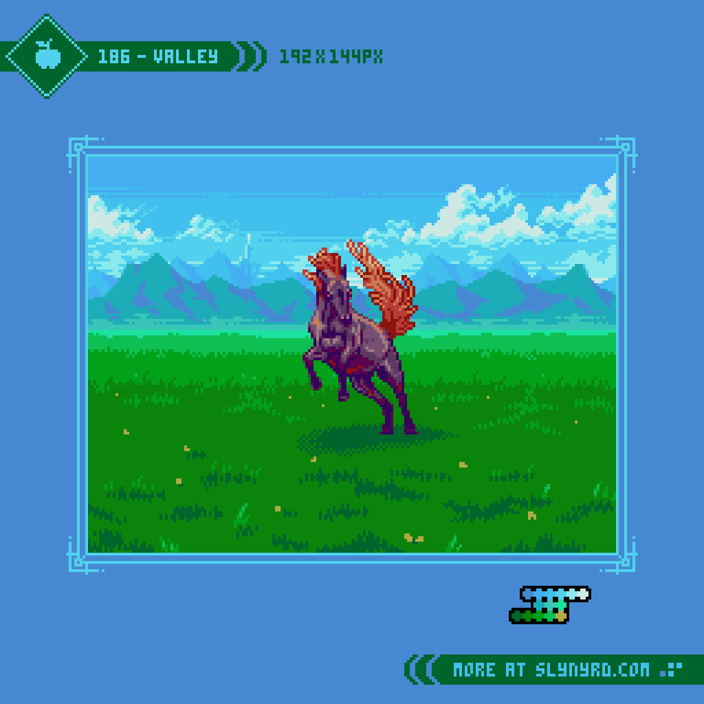
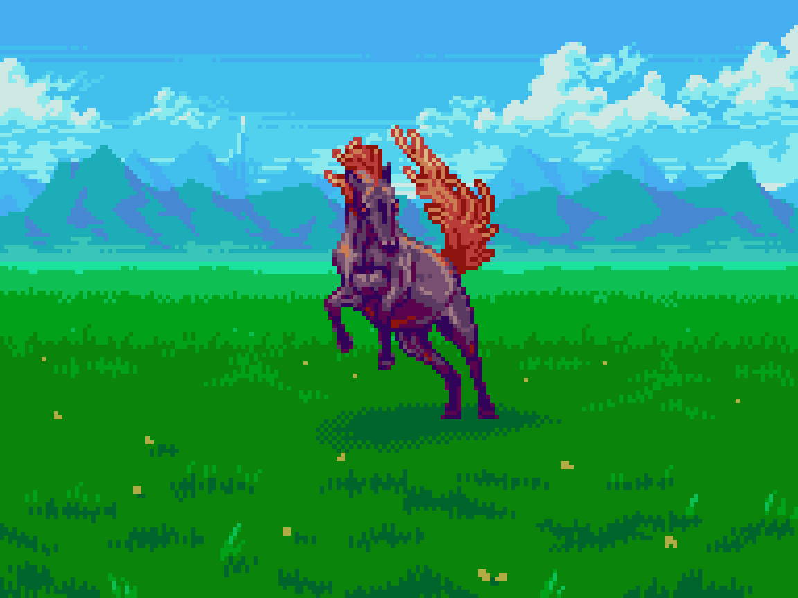
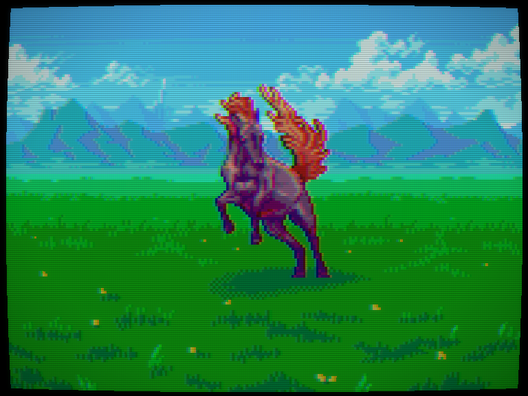
A light breeze passes through the valley, carrying a sweet fragrance of wildflowers speckled among the hearty grass covering. In the distance, mountains suddenly rise up from the fields, framing the vast prairie with a majestic ridgeline of sweeping dips and sharp climbs. Perched among the highest peaks, a grand palace flaunts opulence with its massive towers ascending into the clouds, sunlight glinting off pearl white bricks for all the realm to see. Caught up in the enchantment of the scene, your moment of serenity is abruptly shattered by a rage mare charging directly at you. Will you fight, or run?
It paints quite the scene, doesn’t it? Indeed, the topic at hand is landscape backgrounds. It’s almost an injustice to call them backgrounds, as the scenery behind the action does much to establish the context of the setting, and enrich the world building. Background art literally paints the picture that gameplay cannot do alone, and pulls you into a game so intuitively, you may overlook its importance. While it may exist in the background of a game, background graphics should not sit in the background of your game’s production priorities. However, it’s more than a matter of making pretty pictures.
Backgrounds should service the scene without distracting from the gameplay. Depending on the demands of the gameplay, the method of creating appealing backgrounds varies. For example, high readability of the interactive elements is especially important in real-time action based games such as platformers, and shmups. Therefore, backgrounds in these types of games may need to be muted, or simplified to ensure sprites are clearly contrasted on them, even if it comes at the cost of some visual disconnect. In RPGs and adventure games that don’t demand twitch reactions, it’s more a matter of creating rich scenery that you feel directly immersed in.
For the hypothetical game concept of this feature, I’ve focused on the battle scenes of a turn based JRPG. Drawing inspiration from Dragon Quest games, and Phantasy Star 4, I’ve created vast, open-air landscapes, in which monsters can appear front-facing across the center area of the composition. I’ve also left room on the bottom of the composition where the heroes could stand with their backs to the screen, but those assets will have to come in a future feature. For this lesson, the main focus is creating natural landscapes that have a realistic sense of depth using only 16 colors or less. While my concept is geared for single screen RPG battles, the principles covered here can be adapted for all sorts of game backgrounds, or simply landscape art that can stand on its own beauty.
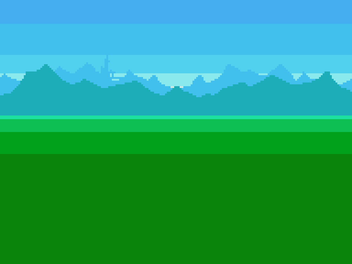
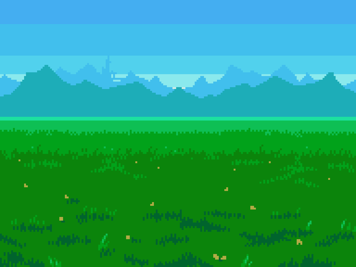
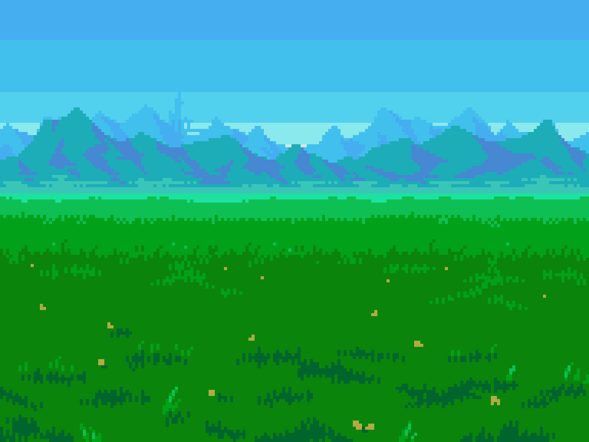
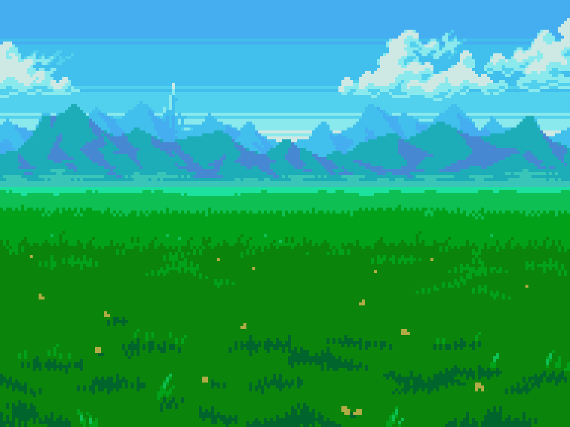
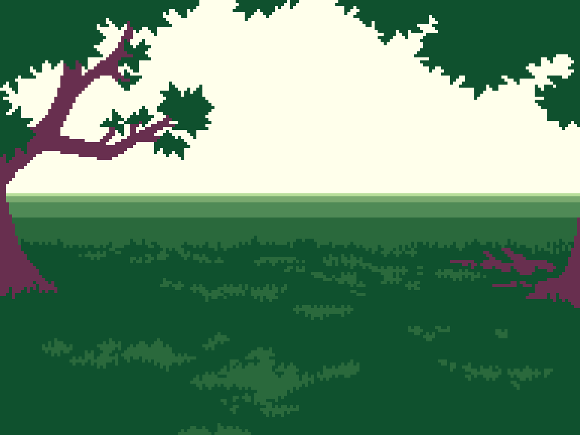
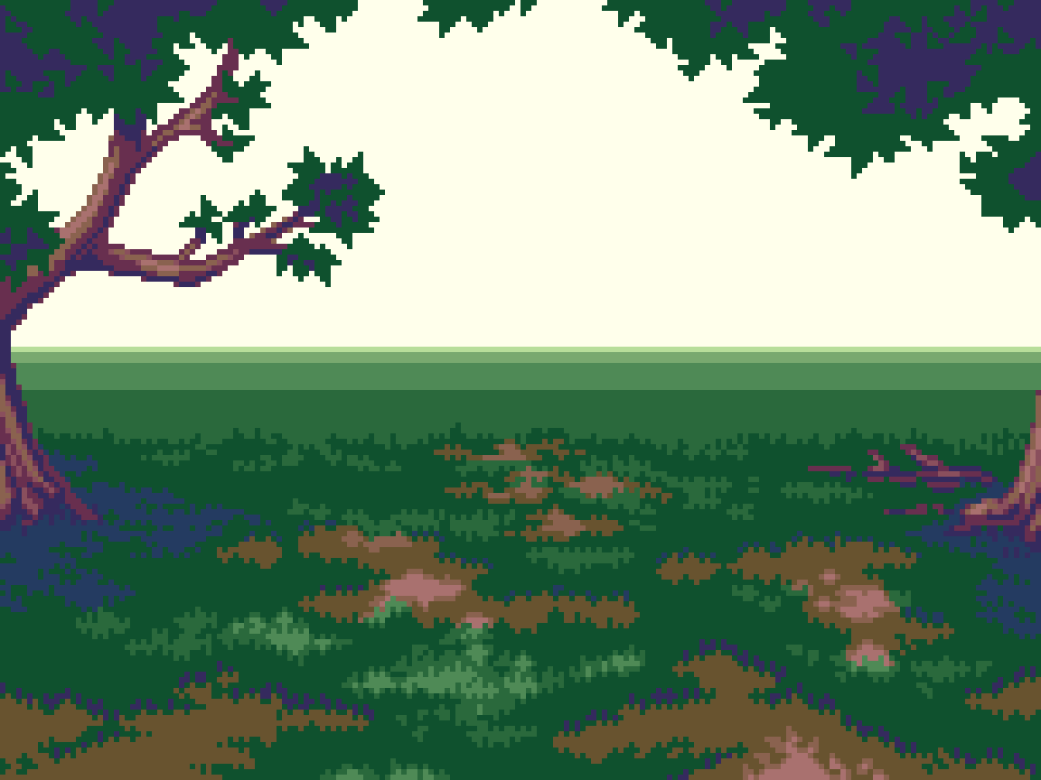
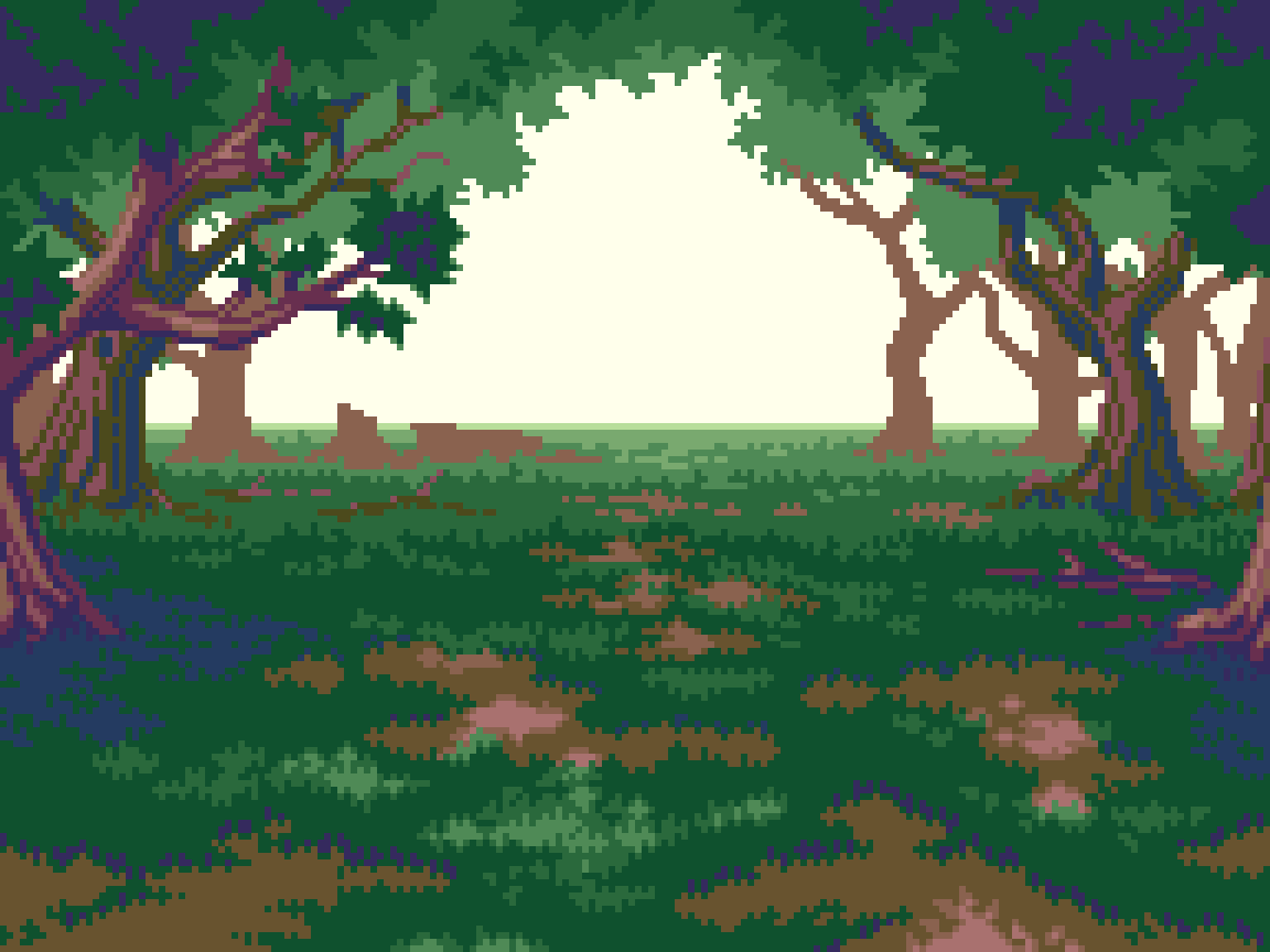
Valley
Our first location is the valley- a good place to grind out a few levels on the relatively tame fare of monsters. Don’t worry, those rage mares rely on intimidation, and are more likely to run from you if you stand your ground.


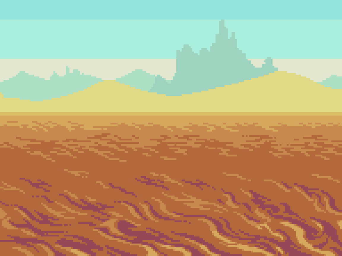
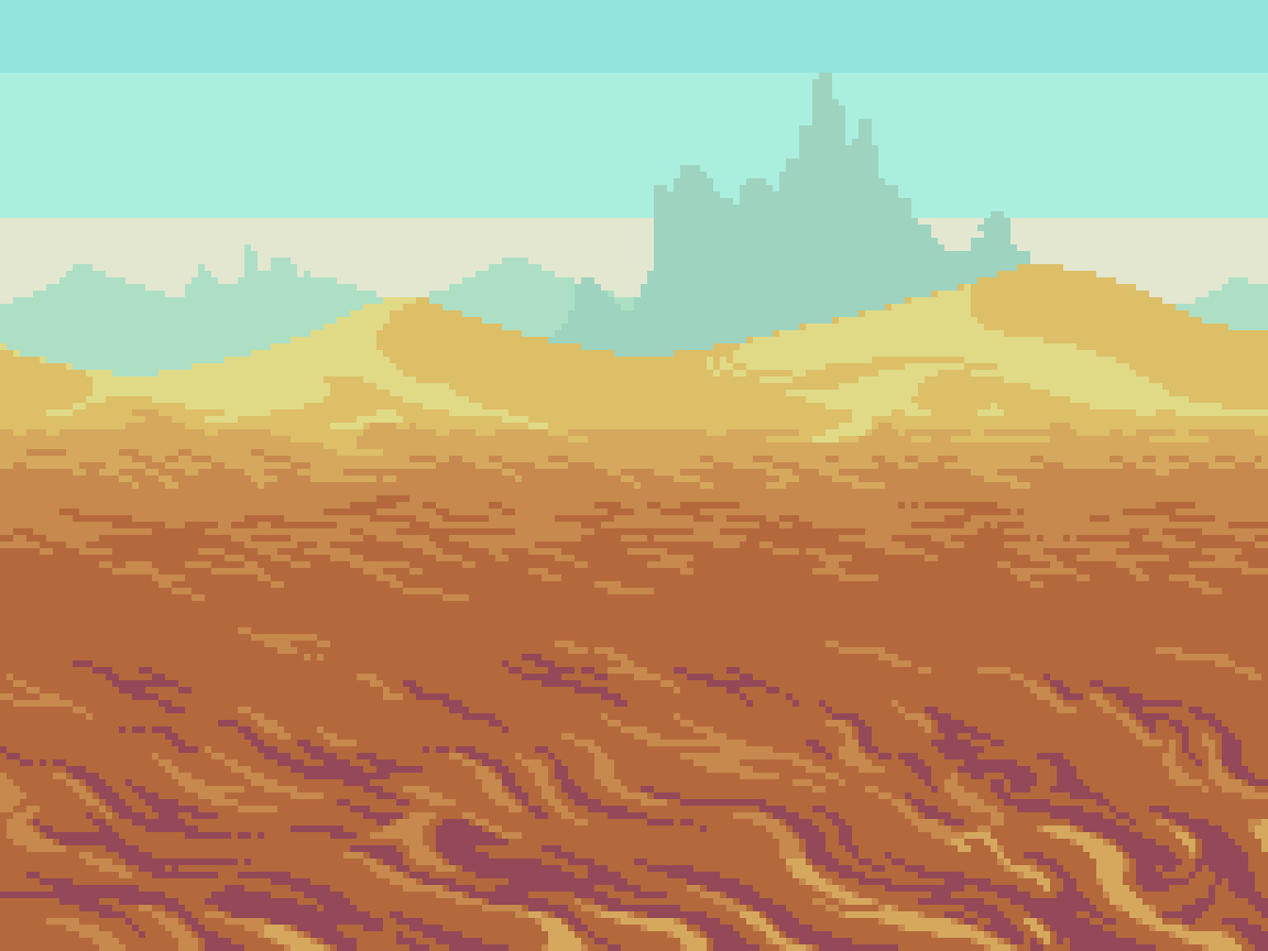
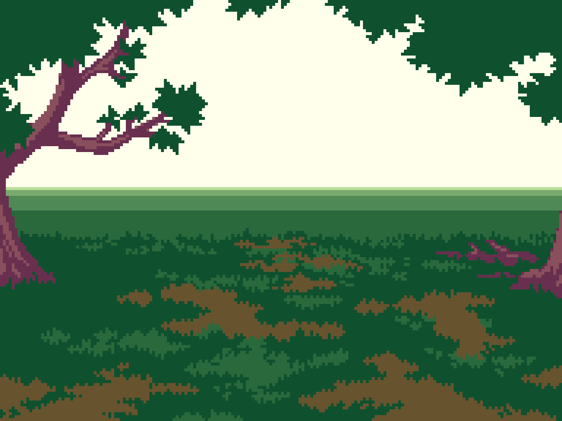
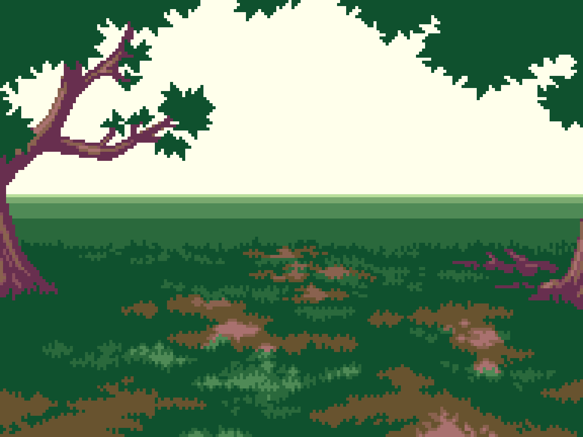
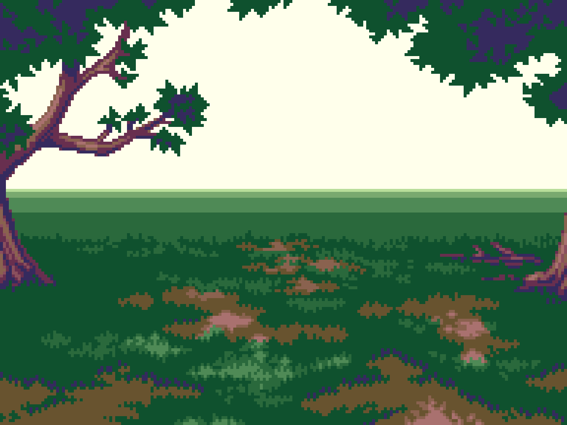
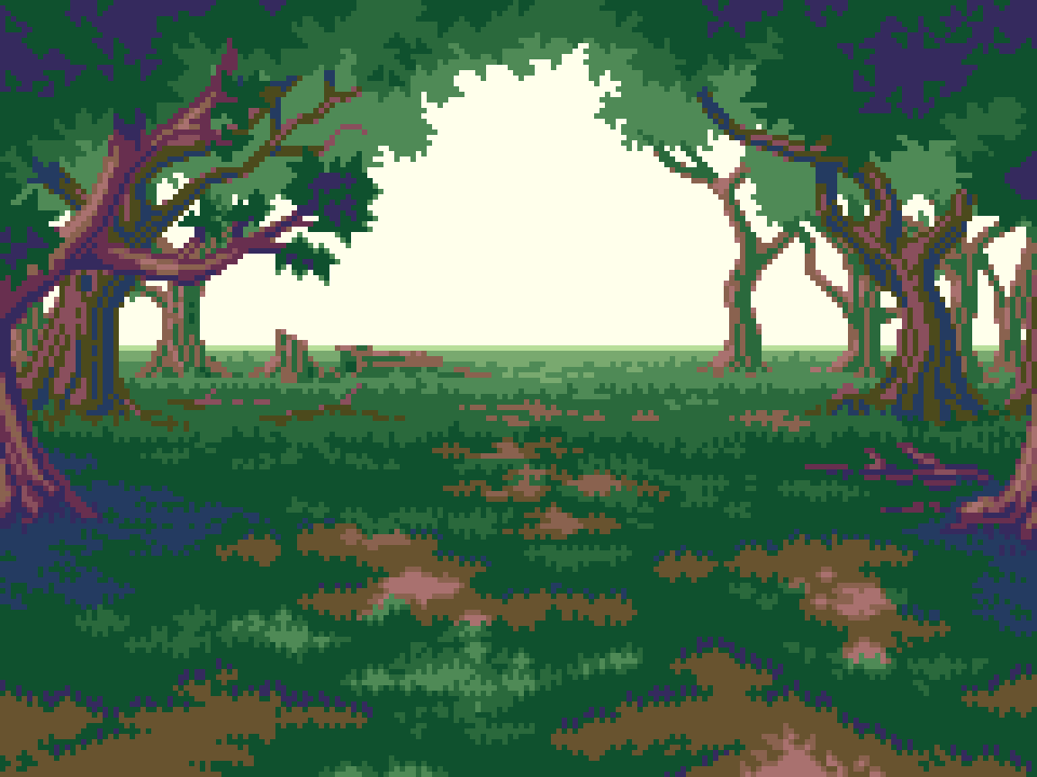
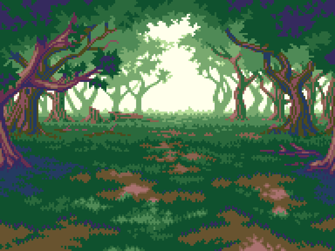
I included all the steps as separate images, so you can easily digest the process at your own pace. Click on any thumbnail to enlarge. Cycle through images with arrow keys, or click/tap the sides of the canvas.
I’ve covered landscapes many years ago in Pixelblog 11. While I’ll be touching on the core principles established there, you may want to review if you are new to the subject.
First step is to choose the canvas size. Of course, this can always be changed later, but pinning it down helps clarify the vision, and smooth out the process. I chose 192x144px. This fits nicely into my tutorial format, and conforms to a traditional 4:3 ratio. Furthermore, it fits within common resolutions used on 8, and 16-bit consoles (256x224, 256x240), in which the battle scenes could be windowed with decorative bordering, or surrounded by UI elements. Lastly, 192px works nicely if I decided to apply parallax scrolling with pixel perfect movement. For more details on my method for parallax scrolling, check out Pixelblog 23.
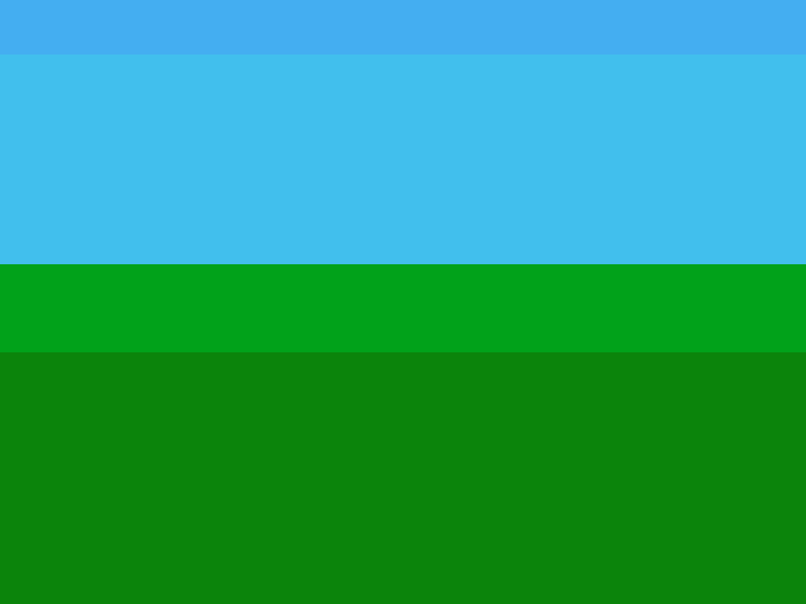
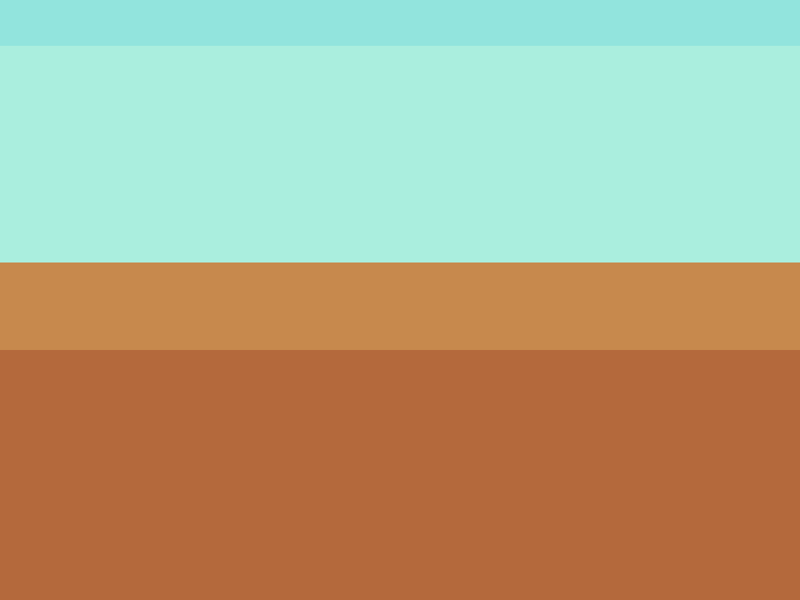
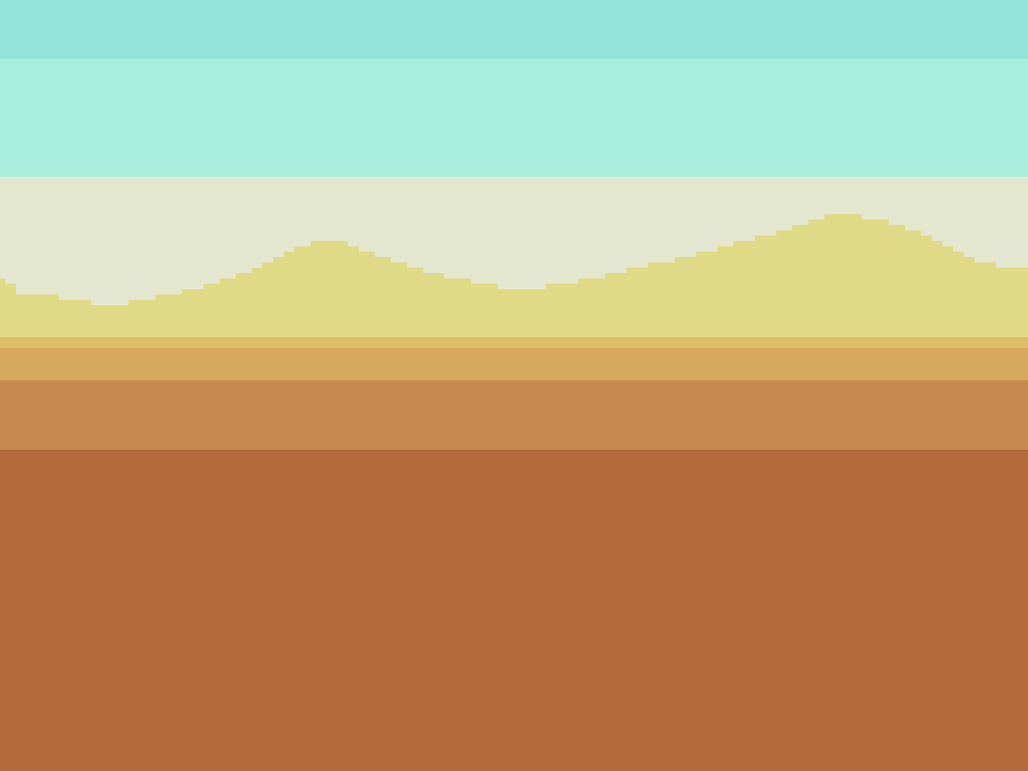
The painting process starts with creating solid horizontal bars of color to define the horizon line. Then, I further break down the ground and sky into several more bands of color. This step is critical, as the illusion of depth is primarily conveyed by color choice. The selection process is a nuanced affair, guided by the concept of atmospheric perspective. As it goes, the closest plane is the most saturated with strongest contrast between light and shadow. Therefore, saturation reduces with each receding plane, while lightness increases when under the circumstances of daylight, and atmospheric haze. Also, the hue shifts more to the color of the sky with each receding plane. In this case, it’s a clear blue sky, so the closest grass plane is the warmest hue, and each receding plane shifts more towards blue.
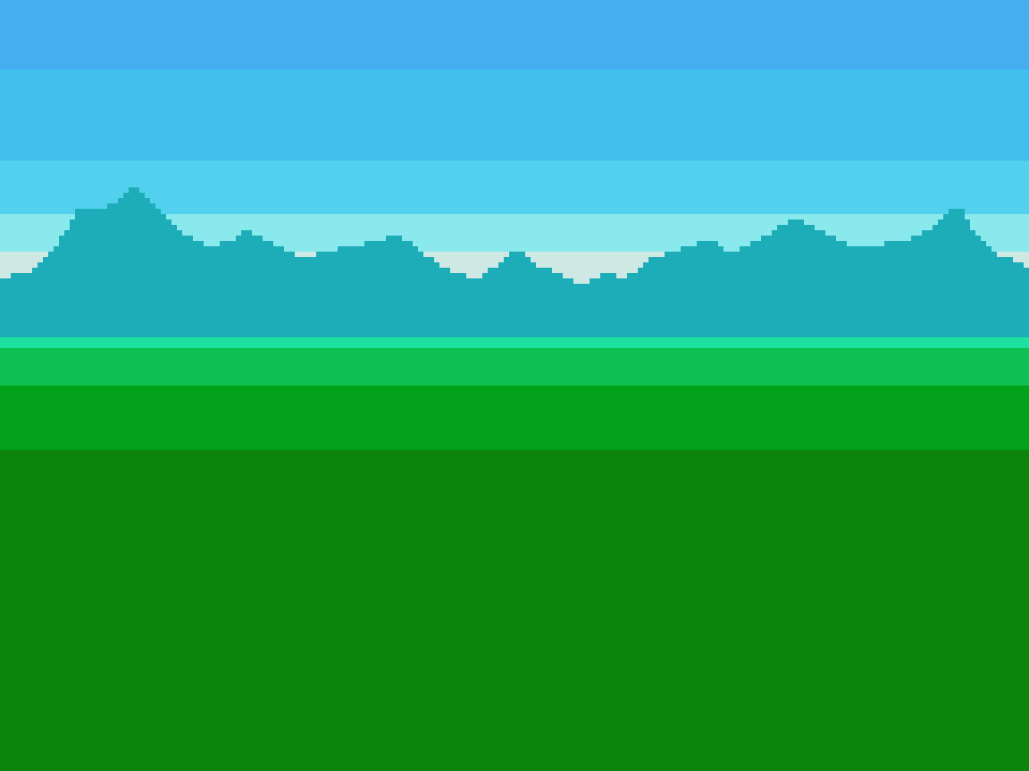
After the basic color planes, I slot in two mountain layers, starting from the furthest grass plane. Covered in dense vegetation, they contrast the nearby grass with a slightly darker, more blue color. The subsequent distant layer shifts even more blue, less saturated, and significantly lighter to imply vast distance, which is reused from one of the bands in the sky.
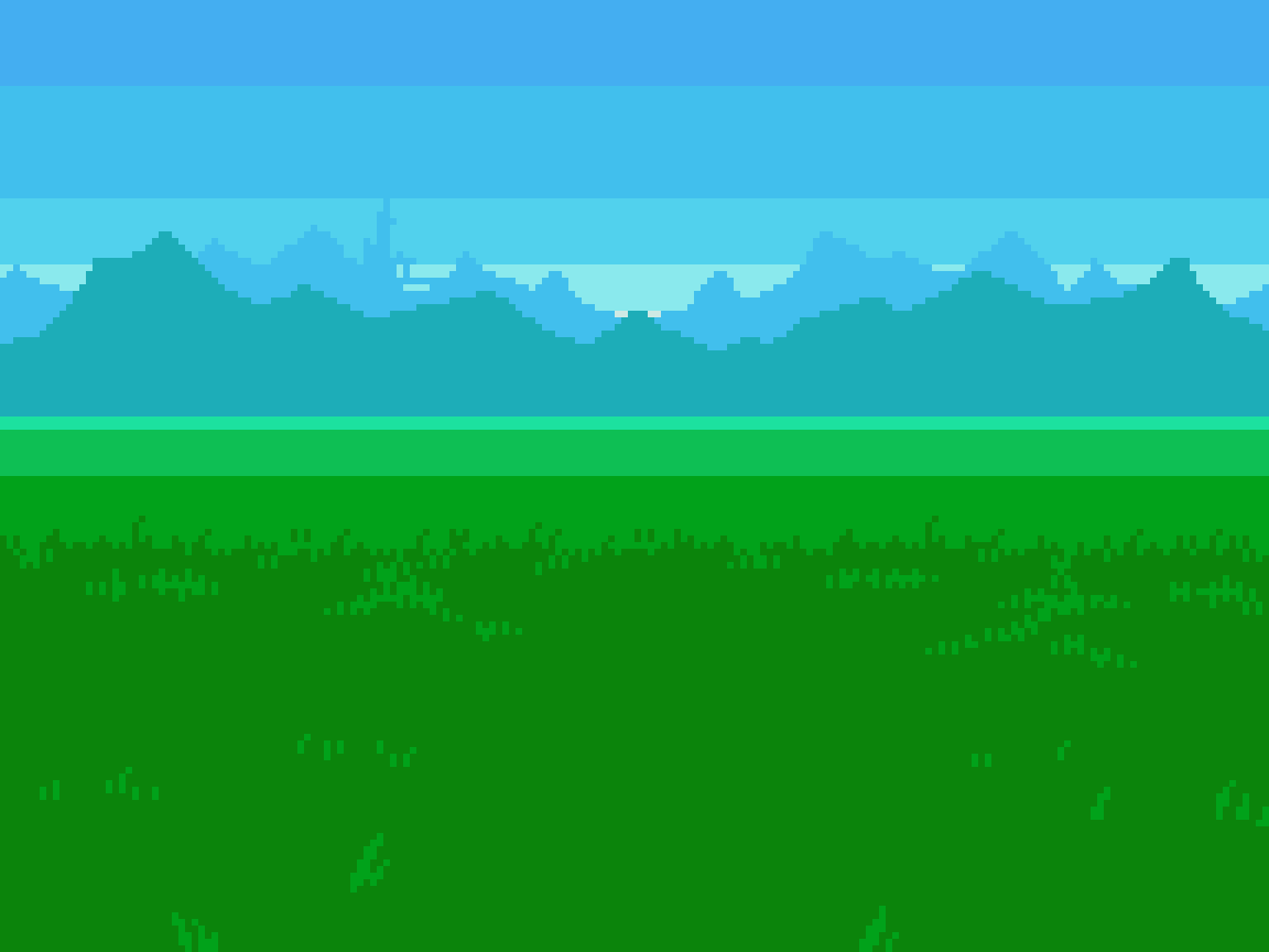
From this point, I get down to details. I add one darker shade to the grass of the nearest plane, and reuse the colors of the other grass planes to blend the gradation with grass texture. The grass texture is simple enough with lots of single pixel wide, short, vertical streaks to evoke the fuzzy quality of thick grass. The key is consistency in clustering, and scale. In the nearest plane, there are thick apparent blades of vegetation, while the next plane only uses one, or two pixel tall clusters at the most. The subsequent planes no longer depict single blades of vegetation at such a great distance.
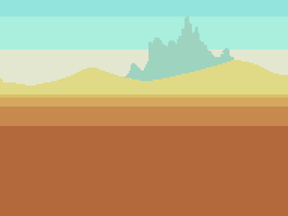
Next, details are added to the mountains. I added a band of haze along the bottom to blend better with the grass. A more blue shifted hue with more inherent darkness is used for all the shading. The shadow color for the distant mountains is again, reused from the sky.
Finally, a few layers of clouds adorn the scene, with the nearest formations arising amidst the mountains. Applying the principles of atmospheric perspective, the nearest clouds exhibit the most contrast and detail. Note, the reuse of colors among the cloud layers. The farthest clouds are baked into the sky background, along with more variation to the linear texture that blends the sky gradation. Only 15 colors in all.
Desert
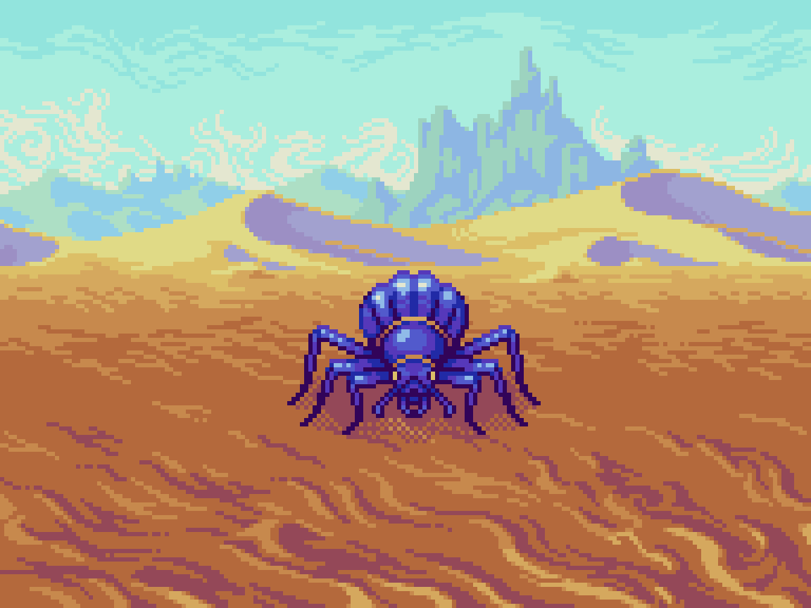
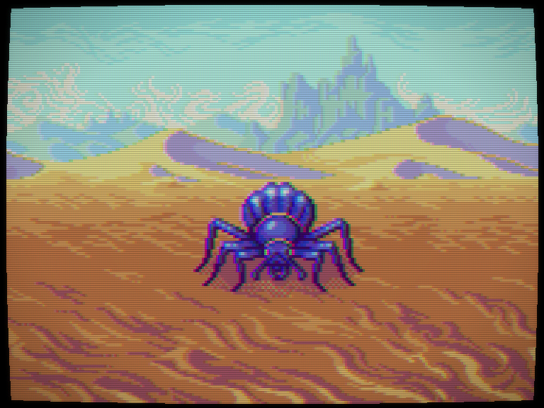
It's said, the eternally shifting dunes are alive, feeding off the souls of unsuspecting travelers. If you hope to survive the desert, bring a sharp weapon that can pierce the shells of giant beetles. Although foul to the senses, their internal water sacs are safe for drinking if properly dissected.
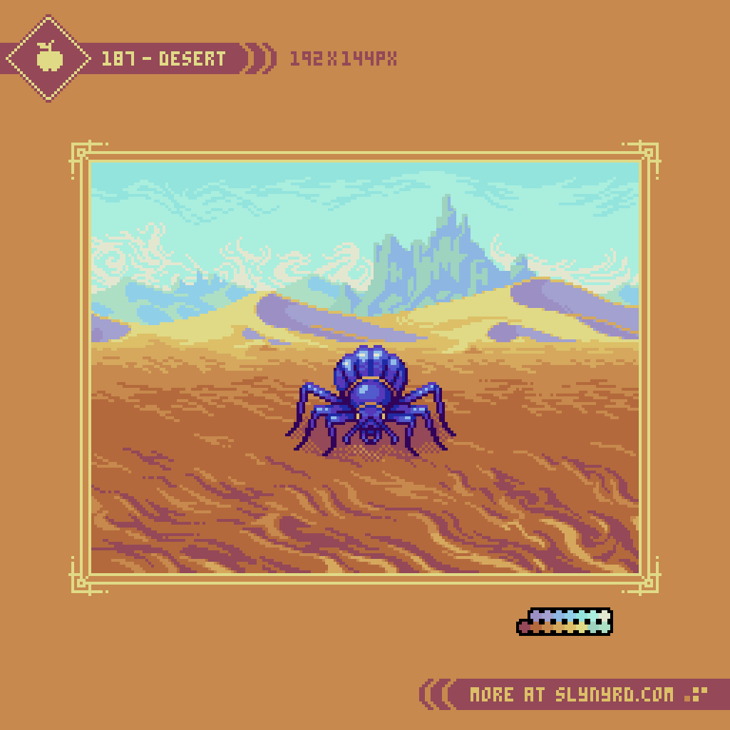


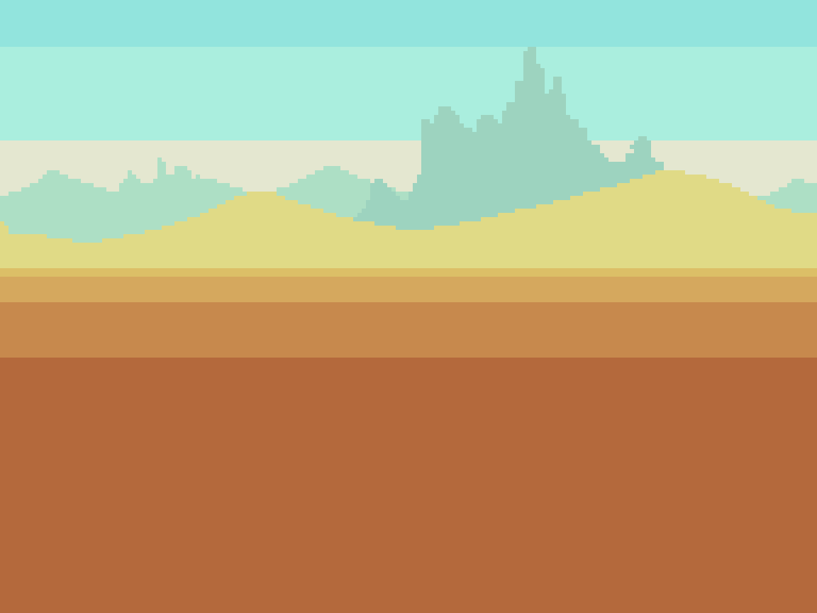
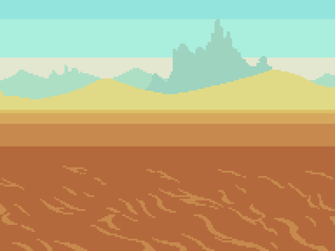
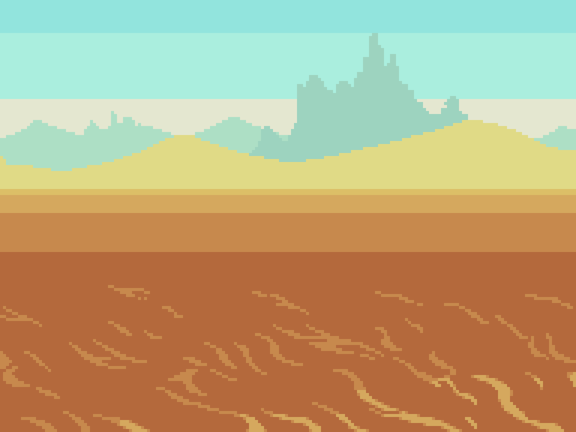
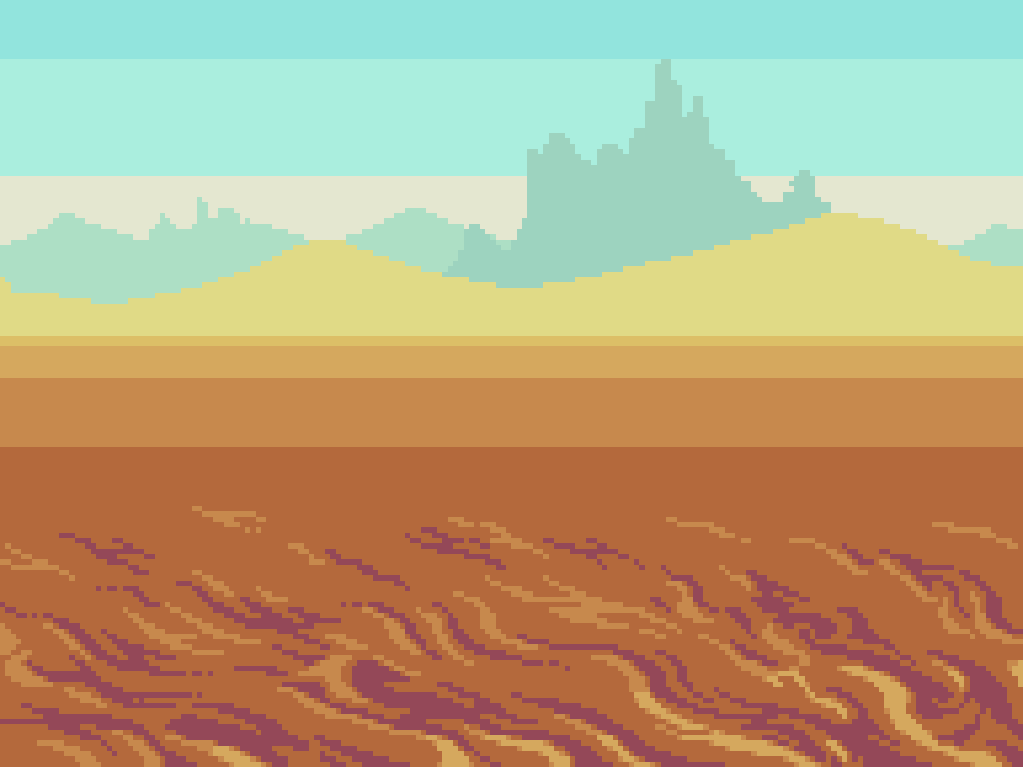
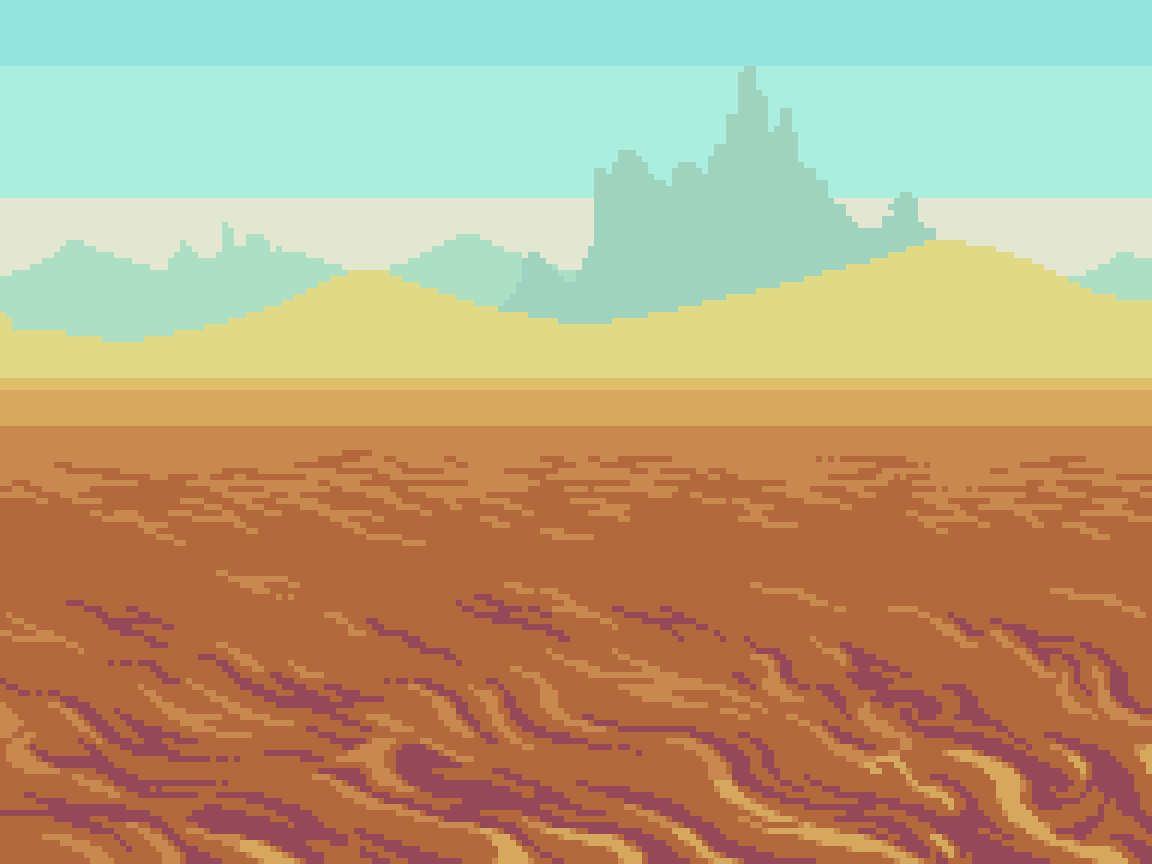
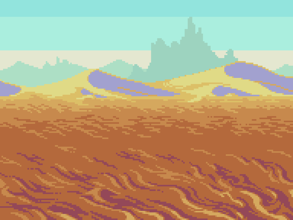
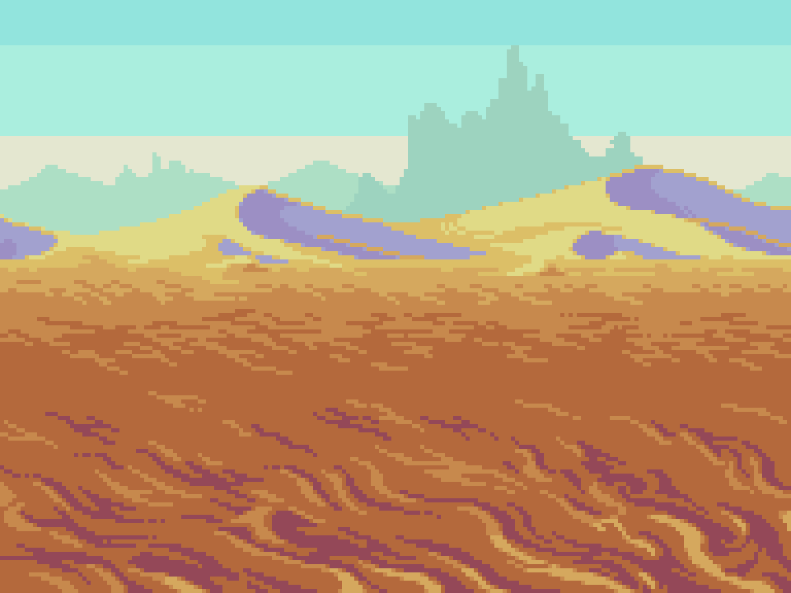
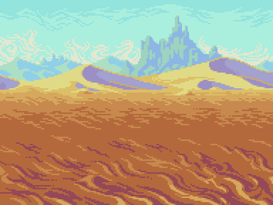
The desert follows nearly the same formula as the valley in terms of color band proportions and layers. However, the palette, textures, and landscape features are changed up to suit the desert setting. While also set in bright daylight, high heat and dry sand creates a thick haze that pales the blue sky. This makes the color shift more pronounced at distance. Deep orange sands shift to more light yellow as they recede towards the horizon line, and eventually become light blue at the farthest distance. Dark red shadows in the near plane become lighter violet tones on the distant dunes, and faded blues beyond.
The texture/clustering style uses wispy ‘s’ and ‘c’ shapes to depict sandy terrain. The dry climate makes cloud formations sparse, so I made swirly texture on the sky gradation to add interest, and enhance the haze effect. Again, note the efficient reuse of colors throughout the composition, making the total only 15.
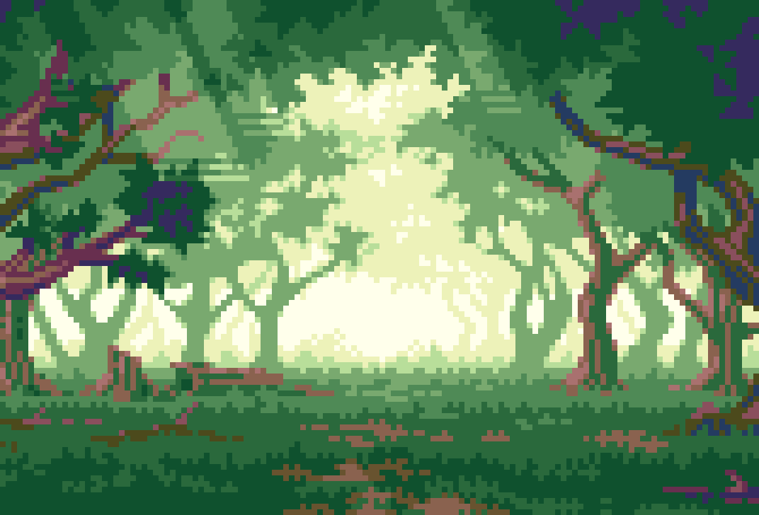
Forest
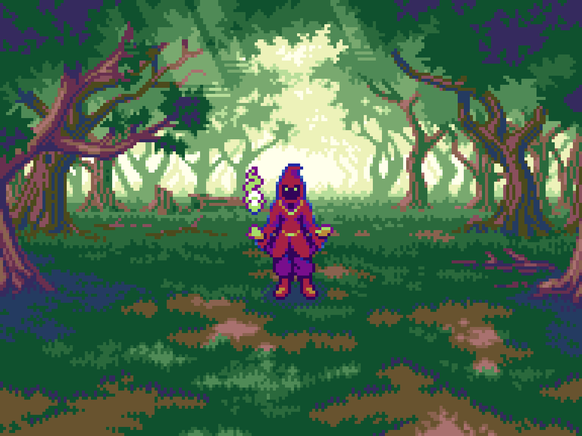
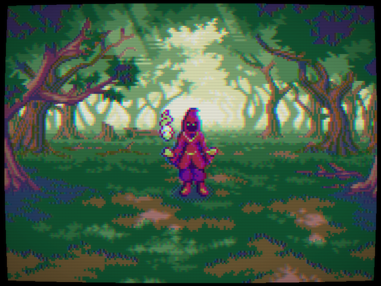
Even in the day time, haunting shadows cast under the thick canopy of the forest can spook the bravest warriors. Inhabited by the ghostly figures of dark mages, there is no shame in being a little on edge in these parts.
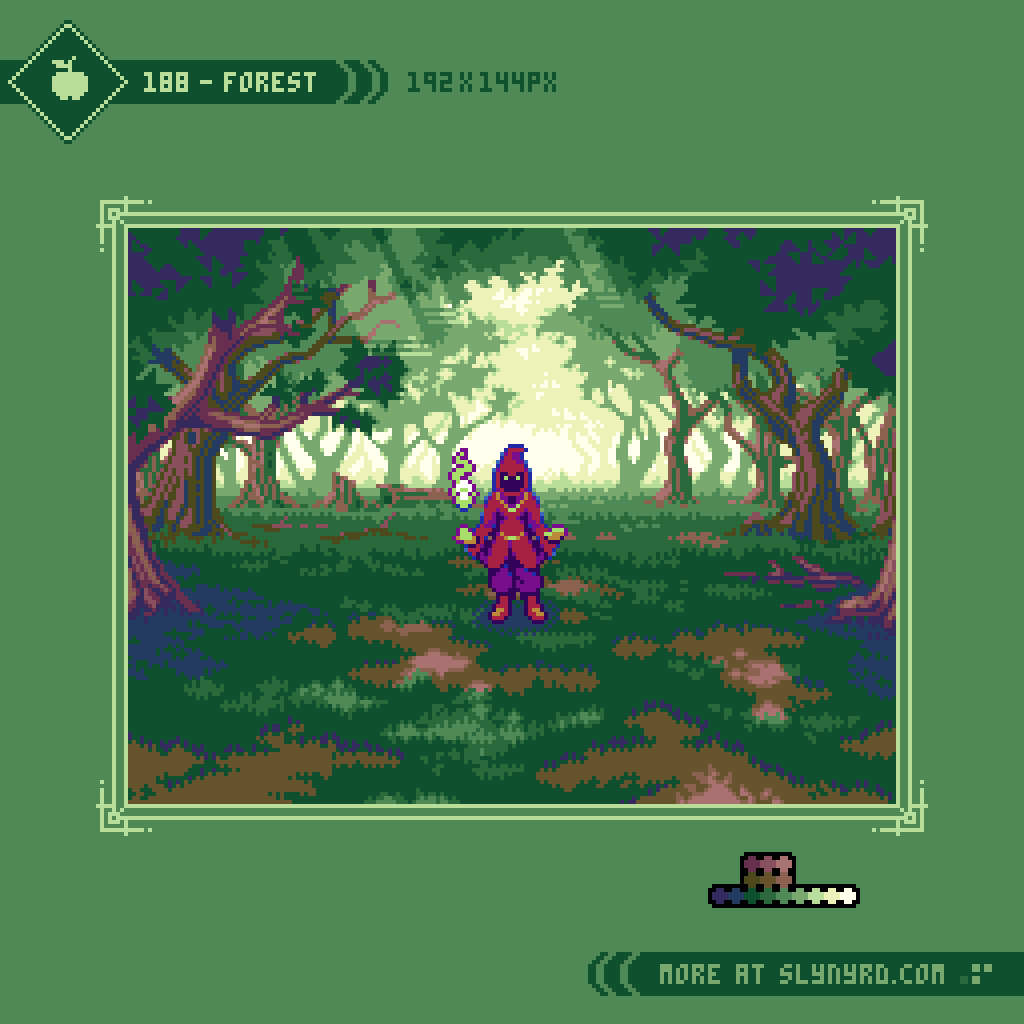


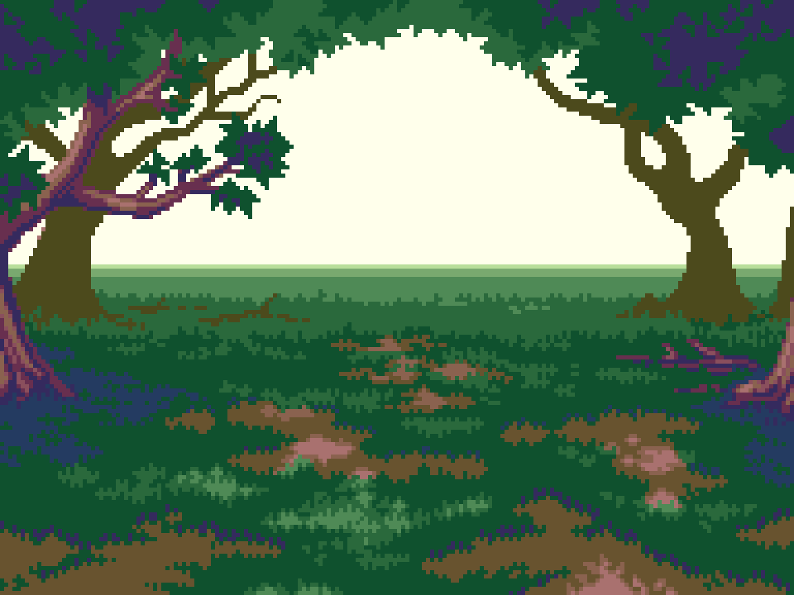


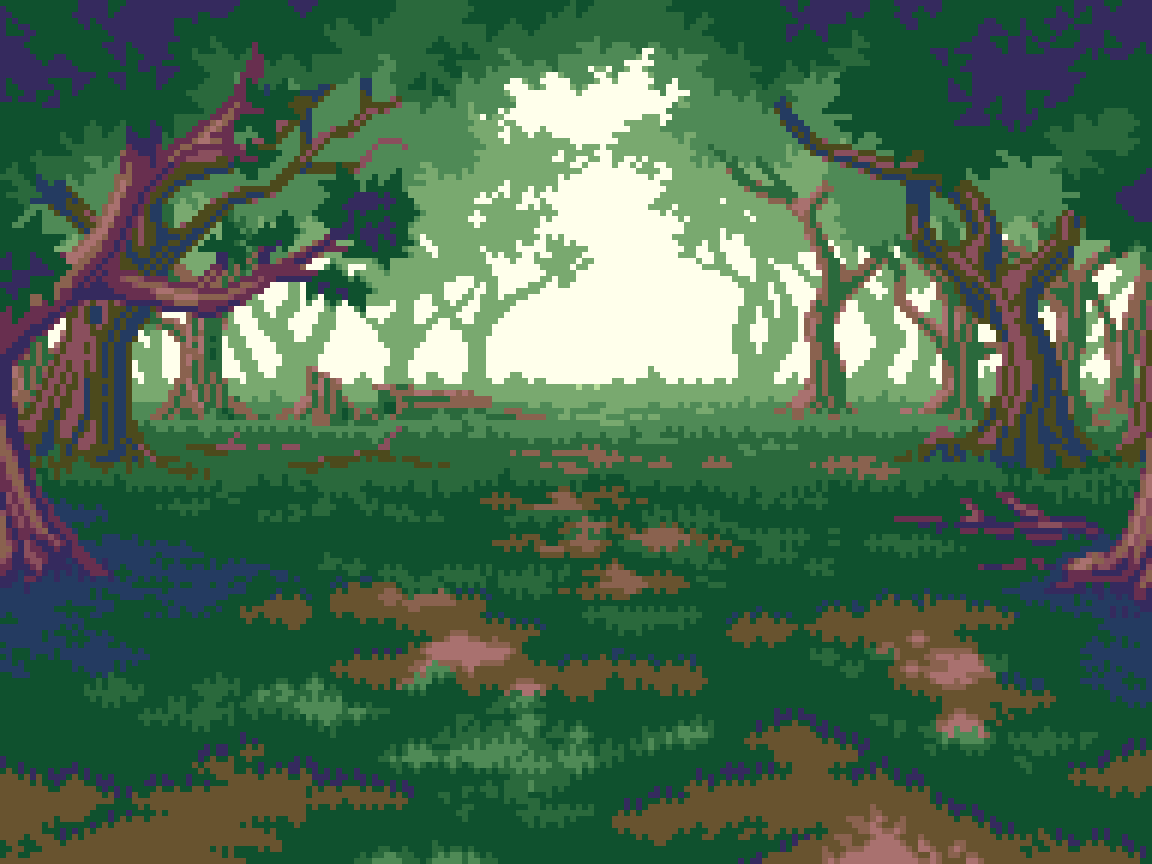
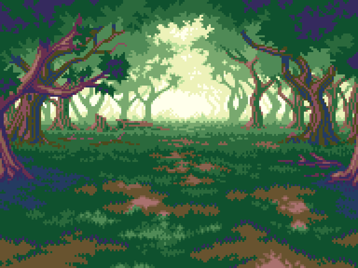
The basic formula stays about the same, but the implied viewing distance from vantage point to horizon is reduced, compared to the previous scenes. This is mainly achieved by the less extreme scaling of size and details from layer to layer. Note, how even at the farthest distance, individual branches can still seen, and foliage details reach to the top of the canvas. I think it’s nice for a game to have variation in the depth of scenes, and is necessary to show more inclosed environments, so long as things feel consistent. Phantasy Star 4 does a good job of this, contrasting vast scenes in the open world with tight dungeon areas.
Speaking of variation, hue shifting flows differently than the other locations. Here, the vantage point looks out from the shady embrace of thick foliage, towards the warm glow of sunlight at the edges of the forest. Therefore, the nearest greens shift away from darker blue tints to warm yellow in the distance. However, saturation and lightness flow in similar course.
Despite the less extreme sense of depth, I found the forest to be the most challenging of the bunch. Obviously, this is due to the trees, which require more details on every layer of depth, and encompass the whole upper portion of the canvas, while I was mostly working with a basic ground texture in the other environments. There is also more variation in the ground itself with grass, dirt, and dappled sunlight. Furthermore, the color demands of the trees pressed me to stay under my self imposed limit of 16. With some clever reuse of colors, particularly the green for shading of farther trees, I was able to pull it off with only 15 colors.
Enemies
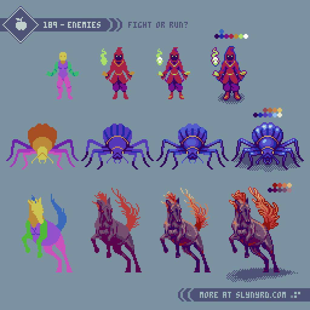
The basic color coded anatomy has become an essential first step of character design for me. Sometimes I can skip it of the sprite is tiny and simple, but even then a might suffer for it. Once the gesture and anatomy are established, it’s a matter of filling in the details. Easier said than done, these things come to feel with practice. Use consistent, simple clusters and keep colors limited. Clarity of what every pixel is trying to convey is more important than forcing details you see in your head.
I tried to come up with monster designs that suited each environment.
Dark Mage: I just worked from the idea of some kind of cloaked magic user without any reference. The kind of suspicious character that would have to practice their occult art in the cover of the forest.
Giant Beetle: I took inspiration from various desert beetle species, and gave it a fantasy twist by changing the scale, and applying unique coloring, with vivid accents.
Rage Mare: Horses are majestic animals, often friendly in domestic settings, but could be quite imposing if aggressive. I was inspired by some wild breeds, and searched many references to find a proper pose I had in mind. I stuck to realistic anatomy, but embellished the colors, and hair features for a fantasy twist.
Taking inspiration from real world species, to reimagine new creatures is always an effective approach to monster design. Being recognizable makes it easier to emotionally connect with, while the fantasy twist keeps things interesting. However, I think it’s cool to also throw in some oddball imaginations of the surreal, and grotesque variety. Something I’d like to explore more in the future.
CRT Filter
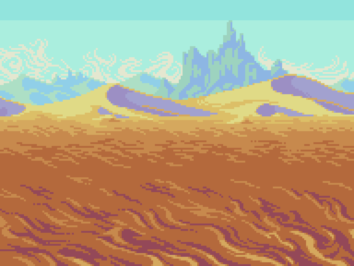
Learning pixel art in the modern era, I’ve naturally refined my clustering techniques for display in HD. For this, I’ve never felt compelled to apply screen effects to my work, despite being a big fan of retro gaming, and an owner of multiple CRTs. Perhaps, my familiarity with the authentic experience also contributes to my dissatisfaction with simulated effects. However, I do appreciate the option when done well, and I often play modern ports of older games with screen effect settings. So, you could say I’ve warmed up to screen effects over the years, as they’ve gotten better, and retro gaming has gotten more expensive. All that to say, something about the aesthetic of these landscape scenes inspired me to finally investigate screen effect options for my own art.
I tried a few different online options before I found a site that delivered satisfying results. Moreover, I created the above images on Vayce. Various sliders allow you to easily customize the effect, including screen curvature, scanline intensity, aberration, and more. Some drawbacks are the lack of specific value amounts on the sliders, so you have to take note of the exact position of the slider. This issue is made worse by the inability to save custom settings. So, if you find settings you like, better take a screenshot. Fortunately, you can reuse the same settings for multiple images by simply dropping more files into the image field.
*Update 6-20-26: It appears Vayce updated the CRT screen effect webpage, and it now includes percentage values on the sliders. Maybe they got wind of my article, ha!
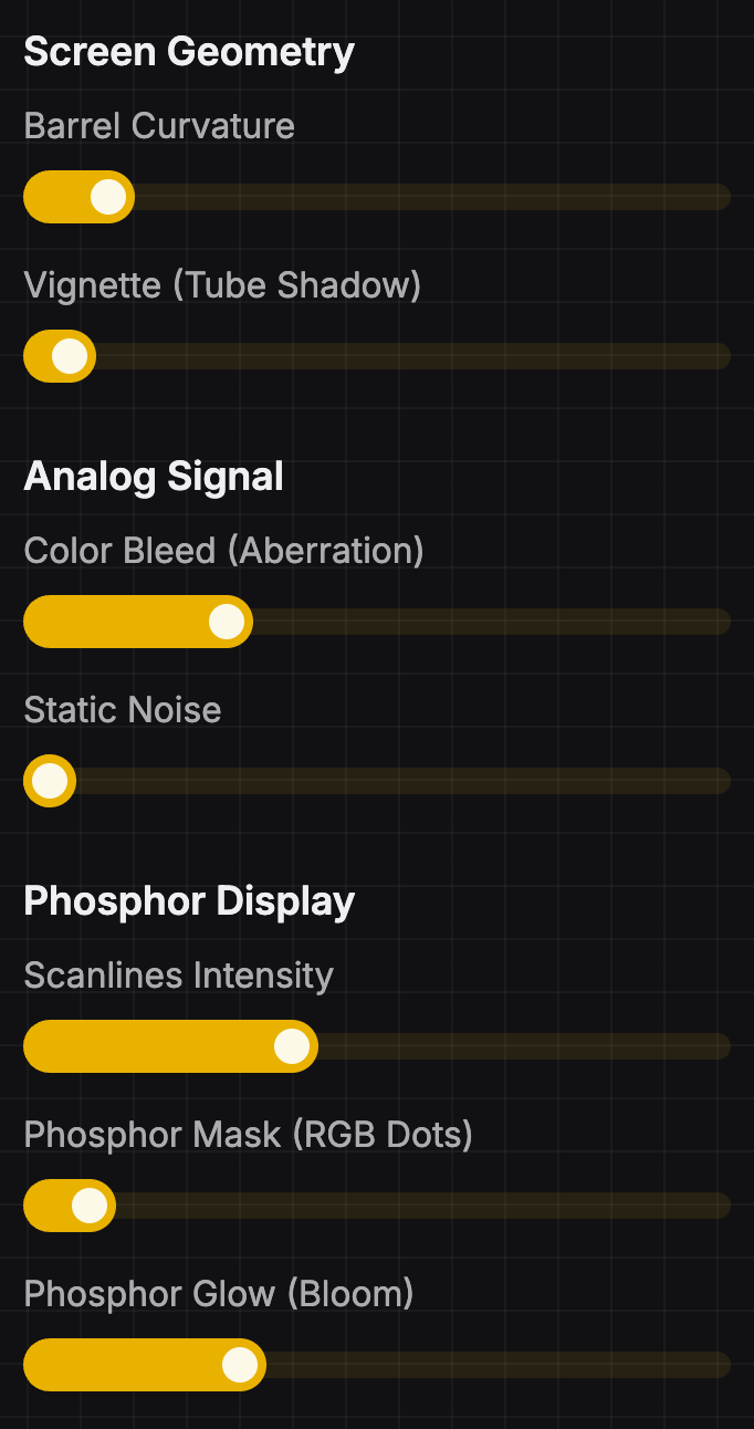
These are the settings I went with for the above images. Note, that the size of your image will alter how the effect appears. Keep things relatively small if you want those scanlines thick and juicy. My images were scaled x4 to 768x576px.
Final Thoughts
I started this feature with the basic idea of studying landscapes, but as usual, inspiration hit by the time I completed my first scene, and it expanded into a full hypothetical game concept. The tangible dream of where the lessons could ultimately lead help motivate my work, but more importantly, I hope it inspires the learner to envision the possibilities of their own dreams. To build on the dream, I’ve planned these scenes for potential expansion in future features. Hero characters, attack animations, and UI elements could be prime additions. If that sounds like something you’d like to see, or if you have any other thoughts to share, comment below!
Resources
Please consider supporting my work by becoming a Patron. Among many other rewards, Patrons can download the assets featured in my tutorials, and use them for commercial projects. But, most importantly, you allow me to continue making new content!
Many of my popular assets are also available to purchase from my digital shop
Alternatively, you can support me by making a one-time donation
Assets featured in this Pixelblog are available for commercial use in Landscape Backgrounds Asset Pack
Source files used in the making of this Pixelblog are available in Landscape Backgrounds Source Files
Get caught up on all my downloads
You made it to the end of the article. Thank you for reading!
-By Raymond Schlitter