Intro
Simple on the surface, yet infinitely deep in its mastery of play, the shmup endures for its pure skill based design. As both an enthusiastic player, and developer of the genre, I will never stop extolling the virtues of shoot ‘em up games. Unfortunately, due to a slew of hybird genres, and a vast wake of influence, the term shmup has become nebulous. On behalf of hardcore fans, we prefer to bestow the label to the classic arcade formula, defined in simple terms by auto-scrolling level design, direct input 8-direction movement, and a heavy emphasis on dodging projectiles while shooting the hell out of everything. Games like Raiden, Gradius, Thuderforce, and Dodonpachi fit the mold. Many sub-genre labels can further describe aspects of the design, including vertical shmup, or horizontal shmup. While this determination of orientation is mostly cosmetic, tracking, and dodging patterns that predominantly come down the screen versus across does fundamentally change the feel of the game.
Having covered vertical design in Pixelblogs 31, 32, and 48 this will be my first feature to focus on asset creation for a hypothetical horizontal shmup. Where the former were presented with a space theme, and a modern military theme, this time I’m going with WW2 airplanes, and vehicles battling it out over a natural landscape. Godspeed!
Player Airplane
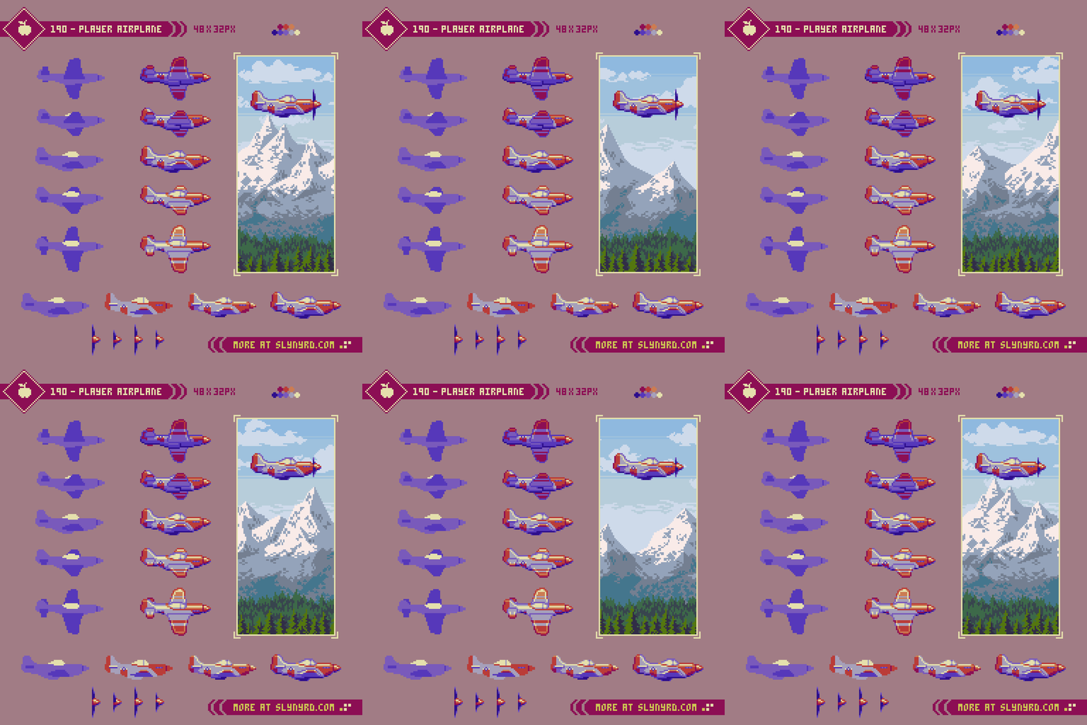
I like to start with the player character, or airplane in this case. This design helps set the tone for the entire game world, and provides a foundation for determining the resolution, and all subsequent game assets. With an overall sprite size of roughly 48x32px there is ample room for distinguishing details while remaining economical. Modeled after the P-51 Mustang, the hero of this game is repping one of the most capable warbirds of the era.
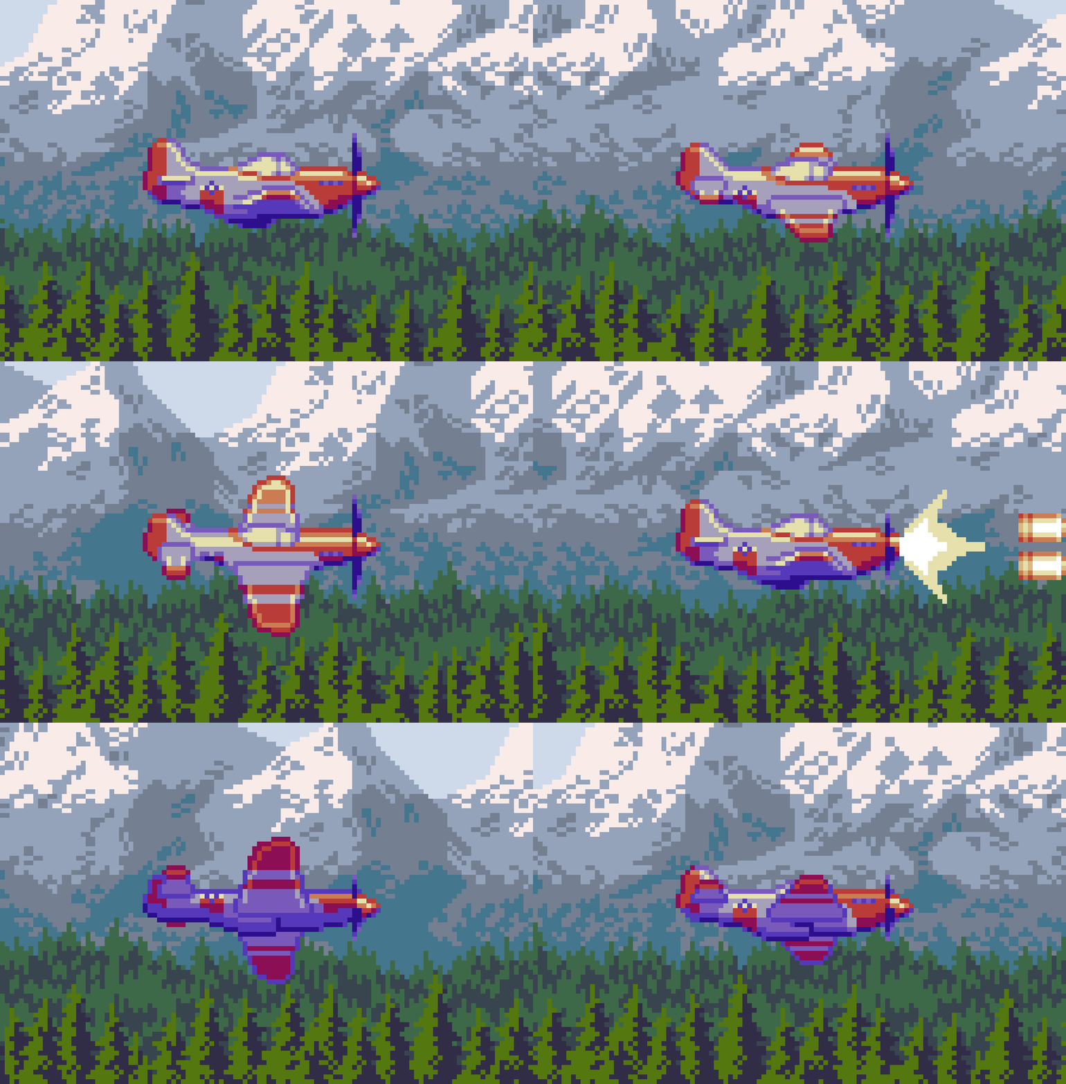
In real flight physics, altitude is most directly controlled by pitch, while roll is applied for lateral movements, however, it is common to illustrate roll for vertical movement in horizontal shmups. This gives the plane lively movement while always keeping the nose level for consistent forwards facing fire. More realistic pitching animation could be used, but it would look awkward if the bullets always shoot straight forward. Alternatively, the direction of fire could articulate in sync with the pitch, but is an unconventional approach that strongly influences level design. While it‘s not uncommon to have weapon or ship types that bend a portion of your fire based on movement, conventional level design would assume your are always able to shoot straight forward without delay. Another issue with illustrating pitch is how rotation tends to distort the clusters. Even when refined by hand it can be difficult to express various angles at low resolution without some noisy jank. In summary, roll keeps the the sprite clean looking, and it looks cool.
To bring my sprite to life, I used 5 orientations to coordinate with vertical movement; a neutral frame for level flight, and 2 positions of roll for both up, and down movement. Also, constant prop movement adds energy. I added inertia to the example animation for the sake of presentation, but in context of actual gameplay, I strongly advise you never apply inertia to movement. In a genre that focuses on lighting fast reactions, and precise movements, inertia adds a handicap that regresses the level design. Furthermore, with a flat velocity for all movement input, the roll animation is determined by press time. Tap up or down, and the plane should briefly show the first degree of roll, and only move a smidge before leveling out. Pressing, and holding up or down should make the plane show the first roll position very briefly then go to the fully banked position, and stay like that as long as you continue moving in that direction. When the input is released it should level back out, again, briefly showing the shallow roll position on the way back to neutral.
Which roll direction to use for up, and down is interchangeable, so it just comes down to artistic choice. This is the way that felt right to me.
In summary, gameplay is king in shmups, and should be in all games that are trying to be fun imo. Movement, and animation is about what feels intuitive in context of the gameplay, which first most offers interesting visual flare, but not necessarily realism.
Options
Another element that is often integral to the player ship in shmups is options. These come in the form of smaller crafts, pods, creatures, etc, which hover around your ship and offer extra fire, or in some cases, defensive tech.
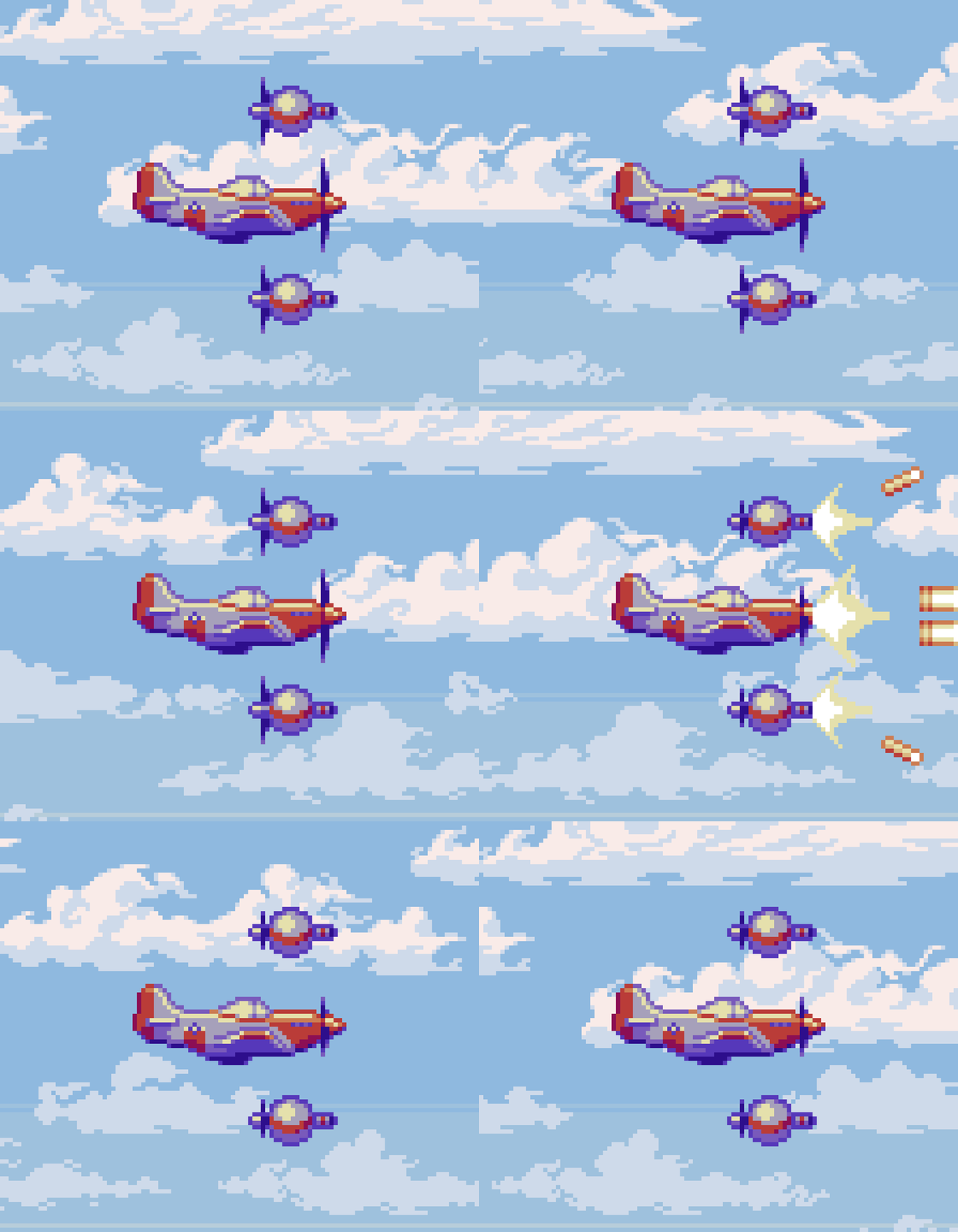
Gameplay mechanics aside, options also add visual distinction, and screen presence. Usually your eyes are focused on reading incoming bullet paths, and you only briefly look directly at your ship for intense micro-dodging. I think it’s under appreciated how much screen presence helps you feel your ship position while reading patterns. Besides the sprite itself, options, and your outgoing attacks heavily contribute to screen presence.
Enemy Units
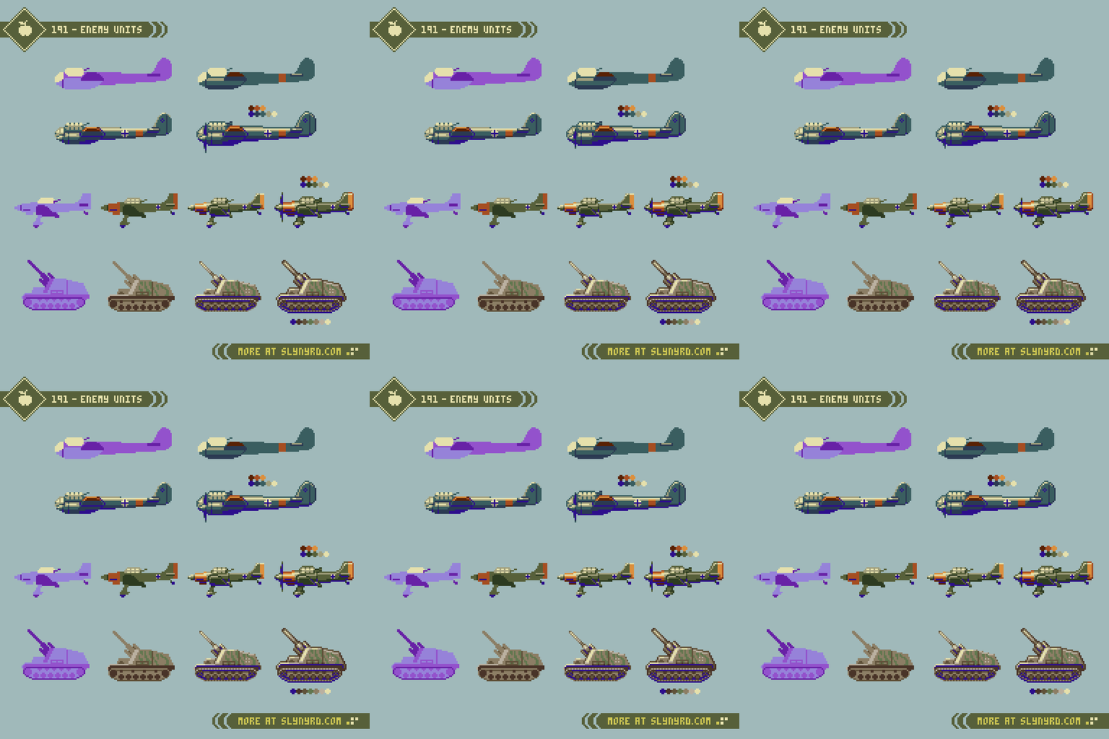
If the good guys are flying Mustangs, than the bad guys must be flying Junkers, although it would be fun to fight for the other side for a change. I always appreciated the aesthetic of German engineering from the time, not so much the ideology. There might be a psychological component involved, but objectively, the brutalistic shapes, drab color schemes, and iconic symbols make their war machines feel imposing.
From top to bottom, we have the Junker Ju-88, Ju-87, and the Hummel artillery. There’s not much I can say beyond what the picture describes. I start with references, and make the simple template version by blocking out the primary shapes with a few colors. Next, I fill it in with proper colors, and add more basic details. Then, I polish up the lighting, and add the finer details. Lastly, I apply the outlining.
All sprites should have some kind of movement to bring life to them. Just swap the palette, and the prop animation can be reused from the Mustang for the Junkers. A similar roll animation would also be great, but adds lot of labor if every enemy plane needs multiple frames. Consider the behavior, and apply economy where it makes sense. If an air unit moves up, and down the screen a lot, it’s worth giving it some kind of pitch, or roll animation. However, the extra frames aren’t needed if something just flies relatively straight. For most ground units, moving treads, shimmering wheels, and a simple bobbing animation can be applied with few frames, to great effect.
Background Assets
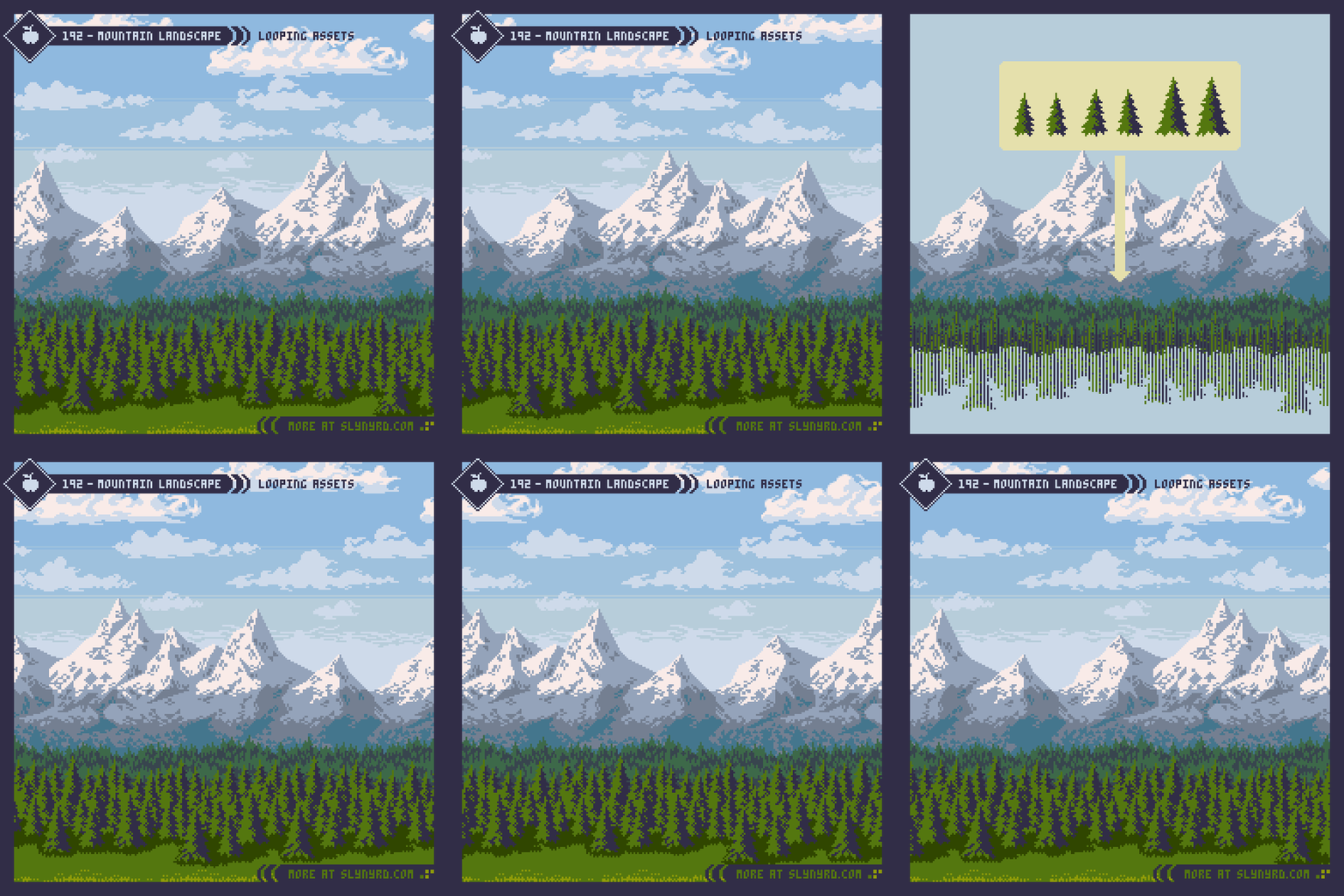
The background is created by applying the same techniques covered in Pixelblog 62, where I made several layered natural landscapes. However, this time the assets need to loop horizontally, so they can continuously scroll. The longer the asset, the less obvious the looping pattern, but the more time it takes to create. Varied features like the mountains are harder to mask the loop, and worth taking the time to make large(wide), while consistent textures like the trees look fine in high repetition. To keep things simple, and make sure I could have pixel perfect scrolling motion in the tutorial, I made all the assets 240px wide. In an actual game, the screen size/resolution should be the key factor that informs sizing of the background assets, as you want to limit obvious repetition seen within the play area. More on choosing a screen size in the following section where I put everything together in a screen shot mockup.
To learn more about parallax scrolling, and my pixel perfect technique, please refer to Pixelblog 23. In the context of a game engine using a camera system, this animation technique need not apply, however, the basic principles to create layered, looping backgrounds that don’t feel monotonous is always key.
As for the art, I started with reference study per usual. The mountains are the most dominant, and distinguishing feature, so I made them first, then built the other layers out from there. All together, there are 6 layers of depth with varied scroll speed. I used the aforementioned looping technique with Photoshop. I tried some tweening scripts in Aseprite, but I had trouble getting consistent movement across all frames. My example animation plays at a constant frame hold of 50ms, which translates to 20fps. This is for economy, and the limitation of the gif format. Of course, for a game you would want to target at least 60fps. Regardless of frame rate, the distance moved should be consistent for every step/frame of movement.
1. Grass - 4 pixels per frame
2. Trees 1 - 3 ppf
3. Trees 2 - 2 ppf
4. Mountains + Clouds 1 - 1 ppf
5. Clouds 2 - 0.5 ppf
6. Sky - 0 ppf
Hit Boxes
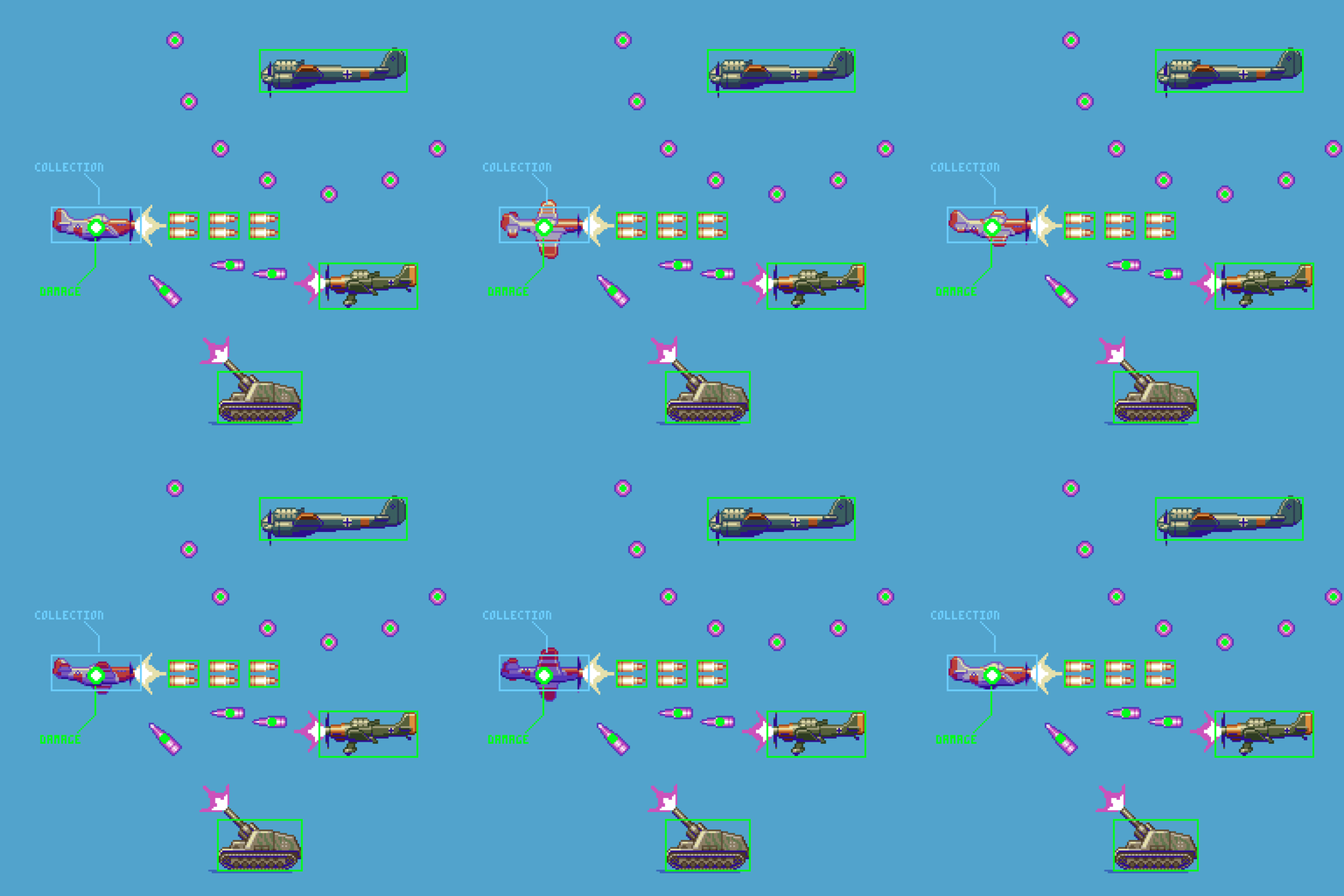
Defining the collision bounds is a crucial aspect to any game with real-time action based gameplay, which can make or break the entire feel of the game if not balanced carefully. In shmups, the particular style of gameplay should influence the balancing of hit boxes. Generally, the hit box for the player is a small circle placed center mass of the sprite, which should always stay in the same place throughout all animation frames. Player bullets, and enemy sprites have generous bounds to ensure your aim always feels solid, and fair. Enemy bullets have small circle hit boxes in the center of the mass. Combined with the small player hitbox this provides a buffer for very tight smooth dodging through dense bullets patterns, and that’s where the fun is at.
If the game is a bullet-hell with high bullet density, the player hit box should be very small. If bullet density is low, the player hit box can be made a bit larger, and enemy bullet speeds can be quite fast to maintain a good challenge. Whatever the gameplay style, I would avoid making the player hit box so large it extends beyond the actual pixels of the sprite. That just never feels like a fair challenge.
Note the difference between the player damage, and collection hit boxes. If the game has physical pickups, you want these to be easy to make contact with, so a separate, much larger hit box is used for this.
Bonus Micro Tutorials
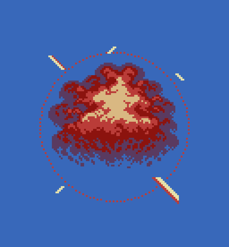
I have supplemented this feature with bonus content via Micro Tutorials 17-20. Explosions, shrapnel effects, hit effects, and more bullet variety are covered in these 4 bonus tutorials. Micro Tutorials are exclusive to Patreon subscribers at the Pixel Examiner tier and higher. The assets featured are also included in the Horizontal Shmup Asset Pack. Learn more about my expanded resources in the section at the end of this article.
Putting it all together
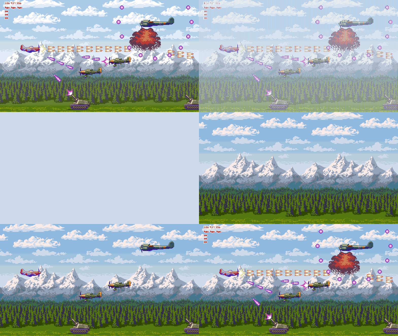
Screen size/resolution should be determined in coordination with desired asset sizes, and feel of gameplay. Horizontal shmups play in nicely with the standard 16:9 format, allowing the play area to fill most displays. However, I think the excessively wide space of 16:9 in contrast to 4:3 feels like a detriment to the gameplay of many 2D arcade genres, yet it can be overcome with clever level design. Basically, you don’t want it to be possible to kill everything before it even gets close to you while also being given too much space to easily anticipate attacks. Object speeds, entry positions, pathfinding, HP values, pretty much everything should be tuned slightly differently than what might feel optimum at 4:3.
Pixel art must be scaled by whole number multiples to avoid distortion of the pixel units. Furthermore, for my mockup, I chose a native resolution of 470x240px, which scales to 1920x1080px at 4x. That solves the pixel perfect issue, but just as importantly, it offers a balanced sprite to total play area ratio. In other words, the player airplane in relation to the play area based on the desired gameplay doesn’t feel too big, or too small. For more info on screen sizing your pixel art game, check out the bottom section of Pixelblog 22.
The 240px wide assets all just need to be looped twice to fill the background. I think it fills the space quite nicely without feeling too repetitive. However, after a screen length or two at most, I would introduce a landmark, or some kind of variation to break things up.
Vertical scrolling can also add visual, and mechanical interest. So, if you fly up or down, it drags the camera to reveal a bit more of the background. The amount of extra off camera area can vary from section to section of the game, or be a standard gutter space. This type of scrolling adds a layer of challenge to routing, but I generally welcome it, as it gives a subtle cinematic quality, and makes the levels feel more expansive.
Readability in shmups should always be priority, especially the clarity of projectiles. After putting everything together the sprites didn’t quite pop off the background as well as I’d like. I was already utilizing outlines, and bright colors for the bullets, so the next measure was to adjust the background levels. I kept the nearby grass layer the same, but for all other layers I turned down the saturation and contrast while slightly bumping up the brightness. To be specific, using the adjustment tools in Aseprite- S -20, C -15, B +15. I think it actually improves the atmospheric depth, and greatly improves readability.
Final Thoughts
My shmup design IQ has grown a fair amount since i last covered the genre. It’s good to update the catalogue with more insights, and finally delve into the horizontal style. I wish there was more demand for shmup content, as it’s my favorite genre to play, and where I have the most real game development experience. I always loved shmups as a casual player, but it wasn’t until I started playing for 1CCs a few years ago that I unearthed the true thrilling brilliance of the genre. While they are simple pick up and play games, the barrier of entry to finding that deeper layer of nirvana is hard to onboard newcomers too. However, resistance is an invitation to a shmup head, and I‘ll never stop trying to bring more people into the fold with my art, and games.
I really wanted to include more tutorials on essential assets, like bullets, explosions, and other effects. I plan on supplementing this feature through my exclusive Micro Tutorials on Patreon. I will append links as more comes along. Beyond that, I can guarantee more shmup themed features will hit the blog.
Resources
Please consider supporting my work by becoming a Patron. Among many other rewards, Patrons can download the assets featured in my tutorials, and use them for commercial projects. But, most importantly, you allow me to continue making new content!
Many of my popular assets are also available to purchase from my digital shop
Alternatively, you can support me by making a one-time donation
Assets featured in this Pixelblog, and accompanying Micro Tutorials are available for commercial use in Horizontal Shmup Asset Pack
Source files used in the making of this Pixelblog are available in Horizontal Shmup Source Files
Get caught up on all my downloads
You made it to the end of the article. Thank you for reading!
-By Raymond Schlitter