Pixelblog - 11 - Landscape Pixeling by Raymond Schlitter

Intro

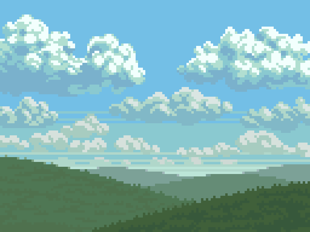
For a medium defined by limitations, I’m always surprised by the flexibility of pixel art. As a nature lover, I’ve been pleasantly surprised by how well pixels handle landscape art. In my beginner days, I thought the hard edges and overall blockiness was a poor fit for natural subjects. However, with practice I discovered the abstraction of low resolution lends an expressionist quality well suited for landscape art. What was once thought as a limitation becomes an advantage, and so goes the story of pixel art.

Landscape.png

Clouds

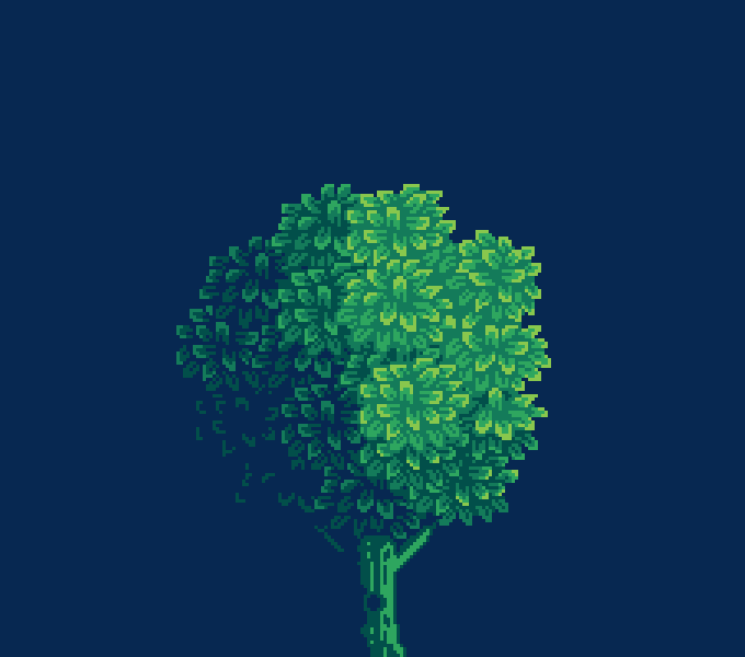
For me, the heart of a landscape is what’s written in the sky, and clouds are the language of this beautiful poetry. While clouds offer a good opportunity to play with creative forms, it’s important to become familiar with the scientific classification of cloud shapes and the circumstances behind them. But I’m not here to give a science lesson. Depending on geography we all have an intimacy with certain skies and more or less know how clouds work. I’m a big fan of fair weather days full of lots of puffy cumulus clouds.

21-Clouds.gif

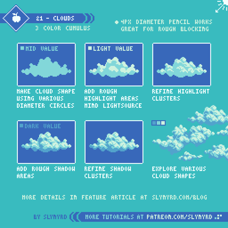
This is just one style of cloud, but this basic technique can be used to make all kinds of clouds. Try various shapes and light conditions.

Atmospheric Perspective

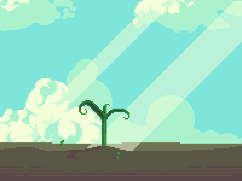
One of the most effective ways to capture depth in a landscape is atmospheric perspective, or also called aerial perspective. Atmospheric perspective is the effect the atmosphere has on the appearance of objects depending on viewing distance. The further the object, the more it takes on the color of atmospheric haze. In a day time setting, close objects are more saturated with clear contrast between light and shadow, while far objects become less saturated and contain less colors.

The vertical position of an object on the canvas also informs the depth. The closer an object is to the vertical position of the horizon, the more distant it appears.

22-Atmospheric_Perspective.gif

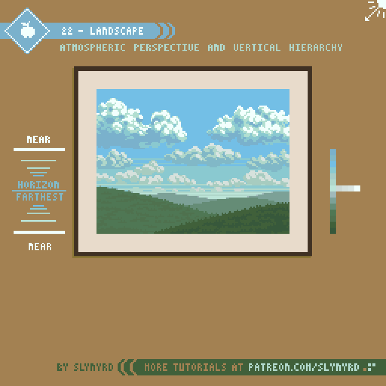
This is a simple landscape but the same approach can be used to create all kinds of landscapes with a convincing sense of depth. My terrains often feature subtle rolling prairie land, a nod to my home in Kansas. However, I also enjoy creating exotic alien landscapes. I suggest starting with real world references of scenes that have meaning to you. Once you get the hang of the basic principles you can create more imaginative scenes. For more tips on how to create texture for grass and clouds check out Pixelblog 2
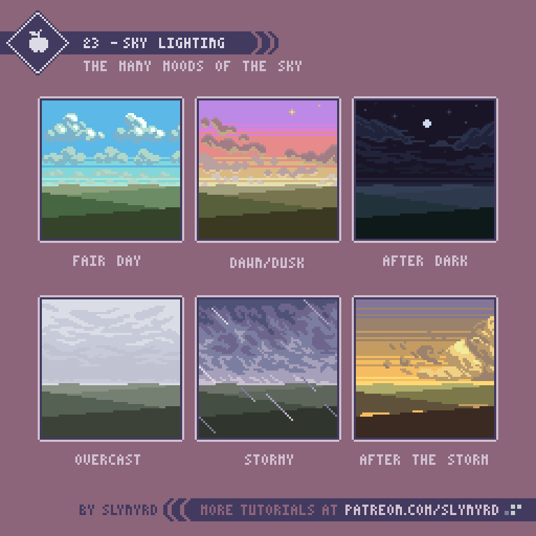
Lighting

Lighting totally changes the mood of a scene. Bright blue skies gives both an energetic and relaxing feeling. The warm hues of dawn create a contemplative mood, while a fiery sunset can speak of romance. Let’s get creative and explore the expressive qualities of the sky.

23-Sky_Lighting.png

FINAL THOUGHTS

Nothing inspires quite like a real nature experience. Wherever you live, I hope you can easily access clean nature. I recommend you explore your local surroundings, take photographs, and study the landscape. I love going on long country drives and exploring every interesting nook I can find. While I don’t often follow one particular image, my collection of photographs, and visual memory of my experiences, help guide my vision. When your art expresses something from your true surroundings the heart can be felt.

RESOURCES

Was this article helpful? If you find value in my content please consider becoming a Patreon member. Among many other rewards, Pixel Insider members get extra resources to compliment my tutorials. But most importantly, you allow me to continue making new content. 

Unrelated to this lesson, I’m sharing Prairie Churches Asset Pack, which includes 9 top-down church sprites from my Pixelminis series. Each made at 64x64px, these detailed structures can be put to good use in your pixel art studies or game dev projects.

Get caught up on all my downloads

If you're not ready to commit to the subscription model of Patreon, make a one-time donation and receive exclusive art and resources. Fan support is necessary to keep producing content. Thank you! 

-By Raymond Schlitter

Pixelblog - 10 - Water in Motion by Raymond Schlitter

Intro

Wherever there is water, populations will gather. Of course, this is mainly due to our dependance on water for survival, but the attraction to water extends beyond our basic needs. The reflective quality of the surface, the soothing sounds of waves and currents, the overwhelming wonder of the alien world below the surface; without a doubt water has an aesthetic allure. Let’s look at various ways to bring this attractive feature to life in our pixel art with movement.

Intro_Image.gif

Wave motion

The constant rolling motion of a sine wave can provide the base for many pleasing animations, including water effects. Surface waves on the ocean seen from a direct side-view are similar to a sine wave shape. The crests of surface waves are actually slightly steeper than the inverse dips. Please take note of the difference illustrated in the tutorial. Nevertheless, a sine wave is very easy to generate and can be modified into many interesting effects.

18-Wave_Motion_2.gif

It’s all starts with creating a chain of ovals. This makes it easy to trace a symmetrical wave shape that can be tiled. Also, the guide can be used to test if the motion loops properly before animating the wave.

Make sure you are satisfied with the shape of your wave before animating movement. Obviously, the shape of your oval chain will change the curvature of the wave. Use circles for short deep waves, and wide ovals for shallow wide waves. Try an asymmetrical oval pairing to capture more realistic shaped surface waves.

My example uses uniform ovals, therefore resulting in a sine wave. I could probably modify my waves to look more like surface waves on the water but it’s not so noticeable when the waves are small and narrow. The wider the wave the more apparent the difference between sine waves and surface waves. In any case, I find it easiest to start with a generic sine wave and modify as needed.

I’ve utilized this technique on several animations in Thyrian Defenders, not necessarily related to water. While these have been heavily evolved, they all started with the same technique of creating a basic wave.

Redwing_Fireshield_On_Off.gif
Sniper_Blast.gif

Can you see where the wave motion is incorporated in the animations? Anyway, getting back to water…

Waterfalls

Waterfalls are as hard as you make them. It may seem like a great challenge but there are many simple solutions. Here is a breakdown of one of my animated scenes, which features animated waterfalls and a sparkly surface effect.

19-Water_Falls.gif

It’s easiest to break the waterfall into 3 main components; the mouth, the flow, and the splash. The mouth is where the water flows over at the top. This area is brighter with lots of reflections. The flow is the main vertical section where movement needs to be conveyed. In this case I use bands that sag and darken as they move downward. Eventually the bands break apart as they reach the bottom. The splash is the fun part. Just makes sure it loops in sync with the flow.

You might also be curious about the sparkly water surface animation. This is also a 6 frame loop. All the motion is simple linear movements, which are plain to see. The overall lighting and texture of the surface is made to capture the profile of the clouds. It’s quite subtle but you’ll notice the lighter reflective areas relate to the position of the highlights in the clouds. Check out the entire image.

River flow

River_Flow.gif

Simple pulsing lines can be used to express directional river flow. I came up with this technique on a game project several years ago. It works especially well if your river has lots of twists and turns and doesn’t adhere to a tiled grid. Just make a few little animations like these and place them wherever it feels like movement is needed.

Water Reflection

A reflective water surface adds lovely atmosphere to a scene and is surprisingly easy to execute. Creating a static reflection is as simple as flipping your image and applying some highlights. However, adding meaningful movement to the reflection can be tricky. I’ve discovered an easy solution using one of the most basic stock effects in Adobe After Affects.

20_Water_Reflection.gif

Regardless if you have After Effect or not, it all starts with good art. If your scene looks bad without animation, it won’t look any better with it. So take your time and make a nice believable reflection before applying motion. In many cases the reflected image is slightly shortened, but it’s not always the case. As with any form of illustration, it’s always a good idea to use a reference.

Even if you’ve never used After Effects before, this effect is very easy to understand. If you want slow subtle movement like in my case, wave speed, width, and height should be set quite low. One of the most important settings is where you place the ripple source. I placed my source off the bottom side of the image area so you only see waves moving in one general direction, creating the illusion of a linear flow. In order to do this you must add plenty of extra transparent space around the asset you apply the effect to, as the effect can only be generated within the dimensions of the asset. Play with lots of positions and settings until it feels right for you.

One trick with this method is getting the animation to loop smoothly. Honestly, I got lucky and the settings I liked just happened to loop perfectly on a 2 second timeline. Fortunately, it’s not so miraculous to find this sweet spot. First, get the effect to look how you want it, then search for the magic point in the timeline where it loops.

While I have a lot of experience using After Effects in my graphic design days, this is the first time I’ve used it for pixel art animation. It’s surprisingly easy to create cool effects that are applicable to pixel art and I’m excited about the potential for new animation ideas. Don’t worry if you don’t have access to this software. I’m only talking about the occasional trick here and there, which can still be insightful and inspire your own animation techniques.

Final Thoughts

Whether it has to do with water or not, I hope this collection of flowing animations can provide solutions to your own creative problems. There’s still much to be discussed on the topic of water, and I intend to return to the subject soon. Let me know what trips you up about illustrating or animating water and I’ll try my best to offer solutions.

RESOURCES

Was this article helpful? If you find value in my content please consider becoming a Patreon member. Among many other rewards, Pixel Insider members get extra resources to compliment my tutorials. But most importantly, you allow me to continue making new content. 

This month I’m sharing another color palette. Introducing Lucky Sevens, a 140 color palette I originally created for my Xenaqua mockup. While it was created with a vivid sci-fi aesthetic in mind, it’s proven to be a very useful general purpose palette. I have to say the value transition across the ramps is very well-balanced and it’s easy to navigate despite the large number of colors. If you like the looks of Xenaqua, or Hangar Helpers, you’ll love this palette. Download Lucky Sevens.

Get caught up on all my downloads

If you're not ready to commit to the subscription model of Patreon, make a one-time donation and receive exclusive art and resources. Fan support is necessary to keep producing content. Thank you! 

-By Raymond Schlitter

Pixelblog - 9 - Melee Attacks by Raymond Schlitter

Title_Image.png

Intro

Time to face it straight and swing some limbs! Melee attacks are heavily used in games across many genres and come in many forms. In this lesson we'll examine some basic melee attacks using side-view characters. Even if you're more of a lover than a fighter, it's an important animation challenge. Especially if a game focuses on melee mechanics, the animation quality can make or break the game. A melee attack with just the right timing, motion, and sound effect can be a thing of beauty. Let's see if we can make some pleasing action starting with simple punches. 

Punches

16-Melee_Attacks.gif

Before you just start carelessly swinging limbs around you need to think about exactly what kind of punch your character is throwing and study the proper form. Of course, you can exaggerate and create abstract motion but the real physics should be studied first. It all starts from the punch stance. Depending and the fighting style the stance may change. My fighter has a standard boxing stance; fists raised up by the face, hips between the feet, knees slightly bent. 

Jab - If right-handed, the jab should come straight out with the left hand. While the hips slightly open and the legs tense, most of the motion is in the punching arm.

Cross - If right-handed, the cross comes from the right hand in a straight line from the face. The cross has more power and range than the jab but is still quick and easy to throw. you can put a bit of a step lunge into the cross but make sure the back doesn't hunch over and the head stays up straight. After the recover frame I move the stance one pixel to the left for one frame to create a bounce effect. This illustrates an important animation principle known as overshoot, which says that an object stopping will slightly ‘overshoot’ the stop point before eventually stopping.

The overshoot is applied to the recovery frame.

The overshoot is applied to the recovery frame.

Introducing weapons brings in all kinds of possibilities. While there is always room for creativity, the stance is largely influenced by the weight and balance of the weapon. For example, a broad sword is commonly held with two hands like in my example. But a lighter curved blade might be held with one-hand off the side of the body or possibly over the head. Choose a stance that makes sense in concerns to the weight balance of the weapon and the strength of your character.

It's also important to think about how you want your character to attack and make sure the motion naturally transitions from the stance. For example, if you want your character to make backhand upward slashes with a blade, it makes sense to have the blade start in a sheathed position off the hip. On the other hand, for downward vertical slashes a raised two-handed grip like my example works well. 

To emphasize weight you can add more frames or hold certain frames a bit longer. I hold the follow through a slight moment longer than the other frames to give the sword a touch of weight. For heavy weapons like a mace or two-handed axe, one would expect a slower anticipation and recovery. However the smear frames should always be few and fast. 

Gameplay

Realism is good and all but when it comes to games, gameplay is king. Moreover, you should always think about how the melee attack will translate into gameplay. Anticipation and recovery frames add realism but can make sluggish gameplay. Too much anticipation will give a nasty feeling of input lag, and too much recovery will make your character feel sticky and vulnerable. If you intend to have slow methodical gameplay it's okay to have realistic weighty movements. However, when a player pushes a button they expect immediate feedback. Most pixelart games keep it snappy and can get away with even fewer frames than my examples. 

Another thing to consider in terms of gameplay is the area of attack. My sword attack example is actually quite strong, as it covers a large 90 degree area from above the head to straight in front of the character. This allows the character to attack enemies from above without jumping. Only the lower body is left vulnerable to low attacking enemies. However, if it were a straight pierce motion or pure horizontal slash, more precision would be required to align your attacks. There is no right or wrong, it just depends on how you want your character to feel and the gameplay you are going for. Generally, weapons with a wide area of attack are slow but powerful, while weapons with a small attack area are fast with weak to moderate power. 

KEY POINTS

Stance - It all starts from the stance. Choose a stance that fits the character, weapon, and attack motions. You don't have to always play it by the book though. The stance is a great opportunity to give your character a unique feel.

Smear frames - Typically a smear frame is a non-keyframe that is blurred to emphasize the motion and add expression. Smears are essential to creating a smooth feel, especially when using few frames. Usually a single smear frame can get the job done. Make sure your smear motion follows a natural path from stance to follow through. Experiment with a variety of smear shapes and colors to find the right motion and expression. Adding color gradation to a smear can enhance the smoothness without adding extra frames.

Freeze Time - Hold a pose for a few extra frames to add impact. I like to do this for anticipation poses and the sometimes the impact frame on strong collisions. This should be subtle, and not held for too long. Use this technique only for exaggerated actions.

Overshoot - Any moving object that is stopping will miss the stop point a bit before eventually stopping. The faster the object is moving the greater the overshoot. This principle can be illustrated by a pendulum swinging to a stop.

Exaggeration - It never hurts to exaggerate movements to bring more energy to your animation, as totally realistic poses sometimes feel stiff in pixel form. I often make the arms or weapon slightly elongated at the max extent to give a loose feel and increase the range of the attack. 

Gameplay - If you are animating for a game, the desired gameplay should dictate how you handle melee attacks. Quick low frame animations may not be super fancy but they always work well for quick responsive gameplay. On the other hand, long high frame animations look sexy but often translate into sluggish controls.
 

Final thoughts

The world of hand to hand combat is rich in style and weaponry. To make nice melee attacks requires some understanding of the real world physics along with a sense of how the action translates to gameplay. Here I've provided some standard attacks to build from. In the future I intend to elaborate and explore more attacks, weapons, and how to string together combos. Also, I want to explore similar animations for different styles and perspectives. For example, 3/4 top-down characters. There's so much to yet learn and teach!

RESOURCES

Was this article helpful? If you find value in my content please consider becoming a Patreon member. Among many other rewards, Pixel Insider members get extra resources to compliment my tutorials. But most importantly, you allow me to continue making new content. 

This month's resource is all the frames from the featured tutorials as separate png files, and the separate animations as gifs. I've even included the punching dummy and simple hit effects. All files have a clean transparent background. Having access to the raw files makes it easy to analyze the frames and use them as a template to design your own attacks. The gifs also reveal the frame timing. Please enjoy playing with my Melee Attacks Assets Pack

Get caught up on all my downloads

If you're not ready to commit to the subscription model of Patreon, make a one-time donation and receive exclusive art and downloads. Fan support is necessary to keep producing content. Thank you! 

-By Raymond Schlitter

Pixelblog - 8 - Intro to Animation by Raymond Schlitter

Title_Graphic.png

Intro

While the economy of pixel art makes it a splendid medium to animate in, the limitations present peculiar nuances. The majority of pixel art is animated in a traditional frame by frame manner. Most often you will find pixel art animation in the form of short looping cycles, especially when used in video games. As simple as they may seem, looping animations demand great attention to detail. When repeatedly played over an over again you notice every detail, and a single misplaced pixel can create an eyesore. In other words, you can't hide poor cluster work with fluid animation. Furthermore, I recommend developing confidence in your basic pixeling skills before getting too carried away with animation. But ultimately, the most effective way to learn is by going through the motions. Best to start with simple small sprites and limited colors. Let's ease in with some idle cycles. 

Idle Cycles 

13-Idle_Cycles.gif

Idle animations are a simple and effective way to bring life to your art or game. The basic requirement for an idle cycle is movement. It doesn't even have to make sense, just move. In 8-bit JRPGs you commonly see them reuse the same 2-frame walk cycle for the idle animation, so the character appears to always be marching in place. I thought this was quite funny as a kid but I realized it's actually a clever way to bring life to incredibly small and simple sprites on a tight memory budget. However, the most common idle cycles come in the bouncy breathing variety.

As for the above examples, they are all reasonable solutions. The complexity of your idle cycles should be determined by the scope of your project. For example, if you are a small team making a game with lots of unique character sprites it might be unreasonable to give every character an 8-frame idle cycle. However you choose to approach idle animations they should be consistent. 

Run Cycles

14-3-Frame_Run_Cycles.gif

Now it's time to pick up the pace and go for a run. This is a good point to become familiar with keyframes. Keyframes are basically guide frames that determine the start and end of a specific motion. For example, say I'm going to animate a character throwing a punch. First I would make one keyframe of the character wound up before the punch, and one keyframe of the punch at full extension. If needed I would then make the frames that fill the motion between, which are called in-between frames.

Keyframes should be the most dramatic poses that capture the essence of the motion. Even with the in-between frames removed the gist of the animation should be readable from the keyframes alone. Many good examples of pure keyframe animation can be found in older games. In the 8-bit era limited memory left little to no space for in-between frames, so developers were forced to create economical animations using only keyframes. While they appear simple, finding just the right poses to create the illusion of motion is an art in itself.   

I particularly admire the Mega Man run cycle. With just 3-frames it captures more kinetic energy than most modern run cycles made with many more frames. Technically there are 4 frames in the loop but the same pass frame is used twice. This is the model I used for my own exampIe. 

In my practice I found a few keys to making a good 3-frame run cycle. First, you want to make powerful stride poses with limbs extended and the character tilted forward. Often the fist is swung up in a manner that almost looks like the character is punching to maximize the action. The pass frame should have all the limbs close to the body in neutral positions so it connects with both stride poses. Lastly, don't forget to include some vertical movement to get the bounce effect. 

15-Run_Cycles.gif

Now let's pick up the pace and look at run cycles with higher frame counts. I first created the 8 frame cycle and simply removed frames to make the economized cycles. So how do I decide which frames to remove? Well, we know from our study of 3-frame cycles that contact and pass frames are crucial keyframes, so we don't want to get rid of them. If you observe all of the frames you can see the recoil frame is quite similar to the contact and adds little movement. Therefore, I first remove the recoil to make the 6-frame cycle, and you can see it's of little consequence and may actually have better energy without them. Finally, the only non-keyframe I can remove to make the 4-frame cycle is the high point. This more significantly impacts the animation but the core movement and energy are still preserved. 

In order to preserve that same energy the playback speed must also be adjusted when frames are removed. For example, each pose in the 8-frame cycle is shown for 80 milliseconds, while each pose in the 4-frame cycle is shown 160 milliseconds.

The most important thing when creating a run cycle for a game is the energy of the motion. As you can see in these examples, more frames creates smoother animation but not necessarily more energy. In fact, too many in-between frames can make your motion look sluggish. It's best to have trust in your keyframes and not weaken them with excessive in-betweens. The above example shows how your imagination fills in the blanks. Making an energetic run cycle all starts with strong keyframes. Nevertheless, I find 6-frame cycles work well in most cases. They are easy to manage and just have a nice gallop to them.   

KEY POINTS

Start simple - Create simple sprites with clear color separation for the sake of animating. You can add details after you are satisfied with the motion.
Size - Tiny sprites limit the motion you can depict, while larger sprites are time-consuming and difficult to animate. Pick a size that is comfortable for you. 
Keyframes - Good animation all starts with strong keyframes
Excessive frames - Too many frames can leach the energy from your motion. Focus more on solid keyframe design
Attention to detail - Respect the clusters of every single frame. A single orphan or misplaced pixel in a looping animation is obvious.
Energy - Smooth movement doesn't necessarily equal good animation. Focus on the overall energy of the motion.
Playback speed - The duration each frame is shown dramatically impacts the energy of the motion. Experiment with many speeds and feel it out.

Final Thoughts

Animation is a wonderful skill to develop and a very effective way to exploit the charms of pixel art. Especially if you want to make pixel art for video games, animation is a must. Don't worry if your first attempts are miserable, animation is a skill learned with practice. The first time I tried animating pixel art in Photoshop it nearly brought me to tears and I seriously thought maybe I should just stay away from animation. But I continued to practice and over the years my dread turned to joy. Now animation is one of my favorite things to make and continues to grow on me as I improve. I hope you too can experience the satisfaction of bringing your pixels to life with motion.

I'm just scratching the surface here and will continue covering animation topics in future posts. I hesitate to do software specific content, as we are all using different tools and I don't want to alienate anyone, but I'm curious to know what subjects or aspects of animation you would like me to cover. Explosive effects, parallax motion, sub-pixel animation, and quadrupedal run cycles are just a few examples on the table. Better make sure I know how to do all that;)  

RESOURCES

Was this article helpful? If you find value in my content please consider becoming a Patreon member. Among many other rewards, Pixel Insider members get extra resources to compliment my tutorials. But most importantly, you allow me to continue making new content. 

This month's resource is all the frames from the featured tutorials as separate png files, and the separate animations as gifs. All files have a clean transparent background. Having access to the raw files makes it easy to analyze the frames and use them as a template to design your own cycles. The gifs also reveal the frame timing. Really, you are free to do as you like with the Animation Intro Assets Pack

Get caught up on all my downloads

If you're not ready to commit to the subscription model of Patreon, make a one-time donation and receive exclusive art and downloads. Fan support is necessary to keep producing content. Thank you! 

-By Raymond Schlitter

Pixelblog - 7 - Developing Style by Raymond Schlitter

Intro

Despite the limitations set on the medium, pixel artists have formed a diverse range of styles over the years and continue to evolve the art form today. Developing your own personal style goes a long way to finding commercial success. The consumer and potential employer are attracted to specialization. Furthermore, you need a brand to get noticed. But don't expect it to come to you over night. In order to properly form a style you must first explore and develop skill. Allow me to share an encouraging account of my own growing pains. 

Think of style like an aesthetic concoction.

Think of style like an aesthetic concoction.

My Journey

If you've decided to focus on pixel art, half your journey is already over. Before I committed to pixel art I was all over the place in my creative endeavors. At one point my portfolio included logos, drawings, paintings, photography, and various digital mediums. My explorative nature was applauded by other creatives, yet I had a hard time finding jobs and selling my art. I thought the diversity was demonstrating my talent, but it was actually holding me back. I needed to find my thing. 

Thankfully, I finally discovered my passion for pixel art and it became obvious where I should focus my effort. I had greatly narrowed my path but I had only just begun my adventure in the realm of pixel art. Just like everybody else I sucked at first and had no apparent style.

Eww, my first attempts at Pixel Dailies from March and April of 2015. We all gotta start somewhere.

Eww, my first attempts at Pixel Dailies from March and April of 2015. We all gotta start somewhere.

Let me take you back to early 2015 and show you my first 3 attempts at Pixel Dailies. I had done a few sporadic experiments before, but this was at the point where I decided to focus on pixel art. Pixel Dailies and other pixel art communities are a great way to develop your skills in the company of other artists. It really helped give me the initiative, and I learned a lot about my art based on feedback and level of engagement.

'Octopus' - I think the size was restricted to 32x32px. I had never worked so small before and it really forced me to become aware of the clusters. You can see I made a lot of noob mistakes just like everybody else (pillow shading, doubles, excessive and ineffective color).  

'Study' - The study was to create a Neo Geo Pocket style sprite. I used the Ryu sprite as a template and I was amazed how much character could be expressed with simple outlined clusters and limited colors.

'Akira' - This was just a theme with no restrictions. Being a huge fan of Katsuhiro Otomo's work, I couldn't pass up the challenge. Still pretty rough but you can see my aptitude for mechanical subjects, as I started to develop a better sense of light, giving the sprite more depth than my previous attempts. 

More early work from April to May of 2015

More early work from April to May of 2015

Here are more assorted Pixel Dailies from my first few months practicing pixel art. Dithering, outlines, no outlines, chibi sprites, large sprites, isometric; you can see how I was exploring many different techniques just feeling out the medium with no particular style. There are some bright spots but I was still struggling with lighting, color, and making clusters do what I want. At this point I remember it was very difficult for me to work from scratch without literally tracing a reference to get started. Somehow I had aptitude for the isometric viewpoint right away, probably because of clear established guidelines. 

In June of 2015, about 4 months after I started pixeling seriously, a style started to emerge.

In June of 2015, about 4 months after I started pixeling seriously, a style started to emerge.

At about the 4 month mark things were starting to come together in a more cohesive manner. Once I discovered the brilliance of minimal colors I was able to focus more on clusters and my lighting/shading improved dramatically. I can't stress enough the importance of limited color. Especially for a beginner, I recommend using only about 5 colors until you feel super confident in your shading and cluster work. Excessive color choices will only impede your development of the fundamentals.  

At this time I was beginning to develop an affinity for certain colors, cluster patterns, and other aesthetic elements. Consequently a style started to emerge, however it was vague and I was still in exploration mode. Even though I was adept in certain techniques, I was not about to rest on my laurels. Even today I still strive to evolve.

In July of 2015, I began to exploit the 1/2 sideview and my passion for mechanical design, which helped crystalize the core of my style.

In July of 2015, I began to exploit the 1/2 sideview and my passion for mechanical design, which helped crystalize the core of my style.

Within the next month I discovered one of my favorite perspectives, which I now call the 1/2 side view. As far as I can tell the airship in the top image was the first time I used this skewed projection angle. I still use this perspective all the time and it's become one of the most prominent elements in my work. Also, notice a familiar theme emerging at this time? 

Over the past couple years my style has continued to evolve but the foundation I established in my early development is still evident.

Over the past couple years my style has continued to evolve but the foundation I established in my early development is still evident.

Although still a bit raw, the nucleus of my style had formed in matter of months. Through repeated refinement of techniques and subjects it became a legit style. To this day I continue to evolve my techniques and append new ones, but the core I established in those early days is still a huge part of my style. I learned to manage more colors, but limited palettes and minimalism is still a major slice of my brand. It's important to always continue exploring while keeping sight on your brand. But most importantly, make sure your work gives you pleasure. 

What Defines STyle?

Every aesthetic choice you make including the subject matter plays into the definition of a style. Here are some of the elements that most strongly define a pixel art style. 

Color - Color can have a deep psychological impact and usually determines the first, and overall impression of a work. There are endless ways to handle color; particular hues, color combos, saturation levels, brightness levels, color count. What are your color tendencies?
 
Cluster Work - Remember, clusters are any group of touching pixels with the same color. How you handle clusters can totally change the feel of a work. Lots of simple and repetitive clusters arranged in a controlled manner tends to create a clean or cute look. Widely varied spontaneous clusters creates a sketchy organic look. Clusters express your handy work.

Perspective - As you saw in my own account, frequent use a of a particular perspective can certainly distinguish a style. 

Resolution - The size/resolution of pixel art impacts the overall look. Some artists like minimalistic super chunky pixels and others brave large canvases to deliver great detail. There's a range for diversity but the scale can tip too far at either end. Usually too high resolution brings out the pixel snobs, and that would include me. 

Subject - What do you depict with your pixels? Cute characters, landscapes, mecha, monsters, or maybe non-objective designs? If a particular subject dominates your portfolio it certainly plays into your style.

Self ANAlysis

You don't just pick a style out of a hat, it comes from within. You should always be reflecting on what you are actually doing, and why. You might not know why at first but over time an aesthetic philosophy will form. The more conscious you become of your philosophy the more likely your creative decisions will result in a distinguished style. For example, I value clean lines over realistic perspective. This is just one guiding philosophy that answers why I so often use abstract projections to achieve depth. By analyzing your work you can see what defines your style, and why. The greater the sample size the more you can refine the definition, but it's not to be written in stone. Just as you change through life, your style undergoes refinement and evolution. 

Inspiration

Developing a style requires exploration. The best way to explore is to analyze other artists and pixel art games. Let's take a look at some other pixel artists with evident style.

Nemk.png

Formerly known as Nemk and now @deadlyyucca creates lovely minimalistic pixel art. I was especially impressed with her sci-fi scenes from a few years ago. The airy compositions and pale colors create a beautiful desolation. The minimalistic approach influenced me, and I'm pretty sure it was her work that turned me on to the 1/2 side-view.

Yur Gus.png

Yur Gus (@yg_fool) creates exquisite scenes with natural colors. The whimsical painterly quality gives his scenes a story book feel. A mythical story book crafted by gods. Aim for this style if you want to kill yourself. Just kidding, but really I can't even estimate how many hours of work I'm looking at. A true artisan.

Valenberg.gif

Valenberg (@MrValenberg) is decidedly married to the cyberpunk aesthetic and sticks to an appropriate color palette strongly featuring pink and blue. Rain soaked night cities, neon signage, hover cars, cyborgs, and cigarettes commonly grace his scenes. I appreciate the aesthetic, but what makes his work great is the cinematic quality of his compositions. A skill that makes him sought after for music videos. 

Kirokaze.gif

Kirokaze (@kirokaze) is a prolific artist who makes a variety of scenes often presented as game mock-ups. He sticks to a consistent slightly muted palette, but often jumps between sci-fi and fantasy scenes, or somewhere in between. Every scene includes interesting narrative woven into the details, and the worlds feel well thought out beyond the boundaries of the canvas. 

Johan_Vinet.gif

Johan Vinet (@johanvinet) is a gamedev centric pixel artist. His work exhibits quite a bit of diversity but he still has a style. I would say it's mostly defined my his enthusiastic use of vivid color and low-res cuteness. With very few pixels he manages to create expressive sprites with fluid animation.

I'm always hesitant to reference other artists because there are so many good ones and I don't want to leave anyone out, but it can't be helped. There are many more talented pixel artists out there worth analyzing. Get on the webs and check em' out! 

Balance

While a unique style will help you get noticed, it's a good idea to remain flexible. Ideally, you could just make that one thing you really dig and everybody wants your thing. But you'll likely have more opportunities if you can adapt your brand across various styles and subjects. Usually a client wants to take advantage of your strength, but sometimes they might see a potential in your style you hadn't considered a part of your visual vocabulary. If you feel something is just too out of character it could potentially hurt your brand. However, stepping from your comfort zone often leads to a new discovery and it could evolve your style rather than muddle it. You can widen the spectrum of your brand and still have a recognizable style, but open it too wide and people can no longer see what makes you special.

Sprite Styles

Often the overall style of a game or artwork starts with the sprite design. When deciding on a style for a game it's most important to make sure it suits the gameplay. Large sprites look cool but can be clunky to control and also require much more time to animate. Let's look at some simple examples of side-view sprites.

12-Sprite_Styles.png

FINAL THOUGHTS

Reviewing my early days of development sure was a trip down memory lane. But I didn't write this article just to reminisce. Analyzing my path of progress should encourage and help you navigate the development of your own style. Just let it happen naturally and don't force it. Everybody develops at their own pace. My previous creative experience and intimacy with retro video games gave me a head start. If you're coming in with little to no creative experience it will require more time, but you can achieve your goals if the motivation is there. Explore as much as you can to discover the aesthetic elements that speak to and uncover your style, but never become complacent. There's always room to grow. 

RESOURCES

Was this article helpful? If you find value in my content please consider becoming a Patreon member. Among many other rewards, Pixel Insider members get extra resources to compliment my tutorials. But most importantly, you allow me to continue making new content. 

This month's resource is another master color palette. Introducing all 200 colors of Bright Future! You might have seen my Steam Lords palette. Well, it's derived from Bright Future, and there are many more resplendent possibilities with this massive palette. 

Get caught up on all my downloads

If you're not ready to commit to the subscription model of Patreon, make a one-time donation and receive exclusive art and downloads. Fan support is necessary to keep producing content. Thank you! 

-By Raymond Schlitter

Pixelblog - 6 - Light and Shadow by Raymond Schlitter

Intro

As with any form of illustration, a good sense of light is key to capturing depth and atmosphere. Pixel art especially has a tendency to appear flat if light is not handled with care. Finding the right approach to light can be a delicate matter when working within low spec parameters. However, limitations can allow more flexibility in terms of abstraction, and subtle details go a long way.  

Intro_Image.png

What is light?

Light is what lets us see the world and affects the way we see color. Color is the way objects emit light. In terms of pixel art I'm referring to the management of color and clusters in order to simulate shadow, highlight, and mid-tones. 

Light source

A light source should be established at the very start of any illustration. This will dictate the flow of shadows, tell you where highlights should be placed, and otherwise guide you with selecting color. Don't overthink it, context should always help you determine a light source. Often light comes from multiple sources at different intensities, but the most common and natural light source is from somewhere above. This always feels natural because the sun is usually above us, and most artificial light comes from overhead as well. Personally, I most often have primary light from the top right or left hand side of the composition. I feel this creates dynamic highlights and shadows while remaining balanced and natural. But this is just one simple approach. Light can come from any combination of sources, directions and intensities. 

9-Lightsource.gif

Mood

How do you want the viewer to feel when they see your art? Happy? Relaxed? Melancholy? Light is one of the biggest factors in determining mood. Changing the mood often involves changes to cluster work, but simple color selection can make all the difference.

10-Mood.png

Notice how I also play with the cast shadows to change the mood. Shadows can be stylized for the sake of expression but they also indicate the quality of the atmosphere. For example, If the air is hazy or if there is thick cloud coverage, light diffuses and cast shadows become less defined and soft. On the other hand, clear atmosphere keeps the light hard and makes crisp dark shadows. In outer space where there is no atmosphere shadows are elongated and razor sharp. 

More Tips

11-Lighting_Tips.gif

Final Thoughts

Well, I've given you some simple concepts to approach light and shadow with confidence. The true nature of light can become much more complicated, but when it comes to pixel art I find the simple approach always works well. While my approach may be simple, the execution should be handled with care. Every detail is magnified under the minimal constraints. Sometimes it just a matter of finding the right level of contrast, adding some cast shadows, and bam, it suddenly jumps off the screen and immerses you. 

Resources

If you find value in my content please consider becoming a Patreon member. Among many other rewards, Pixel Insider members get extra resources to compliment my tutorials. But most importantly, you allow me to continue making new content. 

This month's resource is Gonzo Buidling, a blueprint to create a unique pixel art building. I supply the basic design in outlines and you can use it to practice coloring and shading, just like an old fashioned coloring book.

Get caught up on all my downloads

If you're not ready to commit to the subscription model of Patreon, make a one-time donation and receive exclusive art and downloads. Fan support is necessary to keep producing content. Thank you! 

-By Raymond Schlitter

Pixelblog - 5 - Back to Basics by Raymond Schlitter

INTRO

Greetings pixel peeps. In an attempt to answer your most frequently asked questions I'm taking you back to the basics. What helps jumpstart a beginner can also sharpen up a pro. So strap in for a nice collection of tips, personal insight, and a quick lesson in the fundamentals. 

We all gotta start somewhere. Under the right conditions you'll be amazed how fast you can grow.

We all gotta start somewhere. Under the right conditions you'll be amazed how fast you can grow.

WHAT IS PIXEL ART?

Before even attempting to make pixel art it's good to know what it actually is. Pixel art is a kind of digital art characterized by a low spec aesthetic. In mention of pixel art most people probably think of pixelated graphics of some sort. Low resolution, and other low spec parameters are indeed essential qualities of pixel art. However, the number one defining factor is intention. The pixels should be placed with deliberate thought in a precise manner. Not to say every pixel needs to be hand placed one at a time, but there should be a conscious care and control over every pixel on the canvas. Even a large high resolution image can be pixel art if it's made with precise control on a single pixel level. But if the pixel units become so fine you can't even notice them, you have to ask, why? Pixel art should be about embracing limitations. 

Tree.png

The above tree is obviously pixel art. Why? Well, first you can clearly see pixels but what is important is they appear to be arranged in a deliberate manner. Repetition, order, and lots of similar clusters make it appear all the pixels have purpose.

Tree_digital.png

Now take a look at this digital painting I made several years ago. While it is technically comprised of pixels it is not pixel art, because I paid no mind to the actual pixels as I made it. I was concerned with light, form, color, but the resolution is too high to recognize what the pixel clusters are doing. Also I was using soft brushes with anti-aliasing already applied to the edges of the strokes. This kind of automation is a major contradiction to the concept of pixel art. 

Tree_2.png

On the other hand, low res illustration is not always pixel art. I would not call the above example pixel art, as I just scribbled out the basic forms without care for the clusters. But let's say I did deliberately place the pixels this way. Technically, it would be pixel art then, but the ambiguity makes it an extremely poor style. Pixel art often looks like this at some point in the process, but the artist would go back in to clean up the clusters and treat the pixels with care before trying to pass it off as pixel art.

WHAT IS A CLUSTER?

If you are new to pixel art you are probably wondering what all this cluster talk is about. In pixel art a cluster is any group of touching pixels with the same color. Paying attention to clusters should be a primary focus, as they will dictate the overall look of your work. Do you want a simple sharp look, or a sketchy organic look? Much like lines in drawing or strokes in painting, clusters can unlock the expression of your work.  

Simple angular clusters makes for a clean sharp look

Simple angular clusters makes for a clean sharp look

Lots of unique organic shaped clusters makes for a natural look

Lots of unique organic shaped clusters makes for a natural look

TOOLS

What program do you use? While this should be one of the least critical concerns for pixel art it continues to be the most frequently asked question. Honestly, it's whatever works and what is comfortable for you. Masterpieces can be made on 30 year software just as well as today's high end software. Part of what makes pixel art so alluring is the ease of entry. Almost everybody already owns software capable of producing pixel art and probably doesn't even realize it. Hell, I've even seen pixel art made in Excel! That being said, it's important to find the right tool for you.

I've only made pixel art on a fraction of the tools available so I will only speak on behalf of what I'm familiar with.

Photoshop
This is my main jam for pixel art. Being the most ubiquitous image editing software means exhaustive features for endless possibilities. As a graphic designer I used Photoshop for many years before I even realized I could make pixel art with it. Therefore, I feel very comfortable with the interface and extensive list of features.
Pros - Powerful, slick UI, exhaustive features, fully customizable, animation tools, lots of documentation and support
Cons - Excessive features can get in the way of just making pixel art, pricey, animation process can be frustrating to learn

Ah, Photoshop and its cumbersome, yet capable frame animation

Ah, Photoshop and its cumbersome, yet capable frame animation

I'm a big fan of the smart guides in Photoshop. Subtle pink lines and spacial measurements that indicate positional relationships with other layers. Something of a luxury feature but greatly missed in other apps.

I'm a big fan of the smart guides in Photoshop. Subtle pink lines and spacial measurements that indicate positional relationships with other layers. This is especially helpful with UI layout.

Aseprite
I picked this up specifically for its nice animations tools. The visual layout of the frames as cells in a timeline combined with the ability to add independent animation layers feels logical and is easy to learn. Funny thing, I used Photoshop for so long I'm still more at home in its cumbersome frame animation tools.

Pros - Simple and easy to jump right into, affordable, layered animation interface, handy tools designed specifically for common pixel art tasks, comes with lots of color palettes, easily converts images into color palettes, large enthusiastic user base, developers continue to add features and improvements, pixel art UI is charming if that's your thing.

Cons - Few luxury features in default software, but some whistle and bells can be added through scripts/tools, inserting text is cumbersome, performance can suffer with large canvases and lot of layers, pixel art UI can be jarring if it's not your thing.

Aseprite animation timeline has layers!

Aseprite animation timeline has layers!

Pixel Studio
This is my recommendation for a free/cheap pixel editor for mobile. You get all the basics tools with the free version, but no amount of ads is reasonable in my opinion. If you like the feel of the app it’s well worth the $7.99 to get the pro version and have all the features you need to make legit pixel art and game assets on your mobile device. There is also a desktop version of Pixel Studio, which seems to mirror the mobile version. I have only sampled the free version, but It doesn’t seem quite optimized for desktop.
Pros - Animation tools, layers, tile mode (pro), passionate developer who seems committed to improving the platform.
Cons - Fitting all those features on a small screen leads to a cluttered UI with many tools hidden in expandable menus. How can I import a custom palette?

Pixel Studio is a fun and cheap way to pixel on the go.

There are so many more pixel art programs but these are the few I actually have sufficient hands on experience with. For an exhaustive list of pixel art programs check out Lospec (an all around great resource for pixel artists). There are many free options, which includes several online editors. Personally, I prefer Photoshop and create almost all of my pixel art with it, but like I said, the software isn't terribly important. Creativity and a fundamental understanding of the principles involved in making pixel art take precedent.    

HARDWARE

While I constantly get asked about software I rarely get asked about hardware. However, I actually think hardware is equally important, if not more important than software, especially if you're planning on pixeling for the long haul. It's all a matter of physical health. Pixel art requires long hours staring very closely at a monitor while making repetitive actions over and over again. The more comfortable you are the better. But be warned, you may think you are comfortable now, as it can take years before health issues manifest.   

My view all too often.

My view all too often.

My personal setup is a Wacom Intuos 5 tablet with my iMac. I prefer using a stylus over a mouse for just about everything, but more than a matter of preference I think it's actually healthier. The natural gestures made with a pen use the whole arm and feel much more sustainable than the clicky ckicky mouse action focused on one specific repetitive movement. Since we're talking about a form of illustration here it's no surprise that I'm also much more proficient with a pen. The tool doesn't make the artist though, it's mostly a matter of comfort.

As for the eyes, the best thing you can do is take breaks. It's good to go outside and let your eyes focus on things in the distance from time to time. They also make special glasses designed to reduce the harshness of screen light, but I haven't tried them for myself. Another tip is to make sure your monitor brightness is turned low and don't work in a completely dark room. Work on a gray background instead of solid white. This is easier on the eyes and better for balancing your colors anyway.

While we are on the subject of health I also have to warn you, sitting for long hours is very bad for your back and can cause other health ailments. Make sure you have a nice chair that keeps your posture upright. Standing desks are highly praised for improving back health and energy. They can be a bit pricey so I just set my laptop on some boxes when I feel I really need to get off my keister. The best thing is to just take breaks often and get daily exercise. Especially focus on strengthening your core to avoid back pain. 

CANVAS SIZE/RESOLUTION

I was surprised to see so many people lost when deciding canvas size, but it does take some practice to get a feel for how size impacts the overall look. Generally, pixel art is low resolution, or in other words created at a very small size. With all the HD graphics and displays with thousands of pixels these days it can seem very odd to get situated in front of a canvas that's no more than 100 pixels square. That's actually quite a bit to work with when it comes to pixel art. For context the resolution of NES games is 256x240 pixels. If you're totally lost you should find a reference point like this to base your work in. And don't forget you can always change your canvas size during the process. I often start small so I can focus in on a simple idea and I expand the canvas bounds as needed. I think this is better than starting too large and feeling like you have to use all the space.  

Another concern related to size is scaling. Since pixel art is created at such low resolution, if you were to present it at original size it would be too tiny to appreciate. Therefore, it is usually scaled for the sake of presentation. Scaling your art is simple but there are a couple key rules. When scaling pixel art you should increase the image size only by whole number multiples in order to preserve the uniformity of the pixel units. For example, you can scale the original size by 200%, 300%, 400%, and so on. If you try to scale to an arbitrary size like 193.5%, you will notice the pixel units become distorted and are not all perfectly square. The other key rule for scaling is to make sure there is no anti-aliasing applied. This goes for all operations in pixel art. Anti-aliasing provides an algorithm to automatically smooth the edges of curves and angles. That's a big no no in pixel art. We want to preserve the hard edges of the pixels. Anti-aliasing can be applied manually, but that's for another topic.  

For reference, most of my compositions are created at around 128x128px to 256x256px, then scaled 2x to 4x. Usually my target size for the final presentation file is around 500x500px to 800x800px. 4x scaling is about the max I ever go. Anything beyond that is just too chunky. 

STUDY TIPS

I'm often asked for advice on how to study and improve as a pixel artist. As with anything, practice makes perfect. When you are first starting I think exploration is key. At this point you probably don't have a particular style and that's perfectly reasonable. In order to find your style you must heavily experiment. Study the classic games of the 8 and 16-bit eras. Study other artists styles. Do tutorials. There is no shame in mimicking or even directly tracing over another artist's work if it's only for the purpose of studying. Sometimes you can only do so much analysis with your eyes and you don't get it until you go through the motions. Eventually, you'll find the colors, clusters, and techniques that resonate with you. Before you know it a style will emerge! 

In order to stay motivated and keep a constant flow of challenges coming it's very helpful to post your art online and engage with the pixel art community. I got started making Pixel Dailies on Twitter 3 years ago. The variety of themes and imposed restrictions forced me to try new challenges I wouldn't have thought of otherwise. Also, the interaction with other artists and instant feedback you get from posting your art online is incredibly valuable. There are many circles of pixel artists doing cool studies. Here's a list of the popular ones, again brought to you by Lopsec.

FINAL THOUGHTS

Although the basics have been repeated time and time again, it's nice to consolidate things in my own words. There are actually some other bits I was going to include in this feature but I have to save them for another time.  

RESOURCES

If you find value in my content please consider becoming a Patreon member. Among many other rewards, Pixel Insider members get extra resources to compliment my tutorials. But most importantly, you allow me to continue making new content. 

This month's resource doesn't exactly relate to the article but I thought it was time for another palette share, and it's a whopper! Download Planemo 8, the complete 140 color palette used to create Hyper Echelon!

Get caught up on all my downloads

If you're not ready to commit to the subscription model of Patreon, you can also make a one-time donation and receive exclusive art and downloads.

-By Raymond Schlitter

Pixelblog - 4 - Graphical Projection Part 2 by Raymond Schlitter

Intro

Welcome back for another round of graphical projection. In last month's Pixelblog I created a farm house from top-down and side-view perspectives. Now I'm going to take it to the next level and reveal more dimension to our humble little abode. Get ready to produce graphics in one of the most iconic pixel art styles!  

Iso_Scene.gif

ISOMETRIC

Isometric_Diagram.png

Isometric projection uses a tilted top-down view similar to 3/4 top-down, but it also rotates the building 45 degrees. This unique 3D perspective allows you to display a great deal of information by revealing the roof and multiple walls at the same time. 

Isometric_Cube.png

In true isometric projection the angles between the projection of the axes are equal, or 120 degrees if a cube. In pixel art this is most closely achieved by using angled lines with a 2:1 pixel ratio. I sometimes refer to these as two-step lines. It's possible to use a different projection angle, but two-step lines create the most realistic perspective. Essentially, isometric pixel art can be made by conforming to a grid of such lines. 

Key Points

Isometric pixel art has been heavily used in video games since the early 80's as a means to produce convincing 3D graphics. Now, It's become iconic of the retro aesthetic and is still a crowd-pleaser. It sure does look nice but there are a few things to consider.

Advantages - Creates convincing 3D assets. Can be tiled. Opens more dimensional possibilities in terms of gameplay when used in video games.

Disadvantages - Economical but still more demanding to produce than straight side-view or top-view. The rotated perspective makes it difficult to create video games with precise direct input controls. Twitchy games like shooters can be very hard to control when presented in isometric perspective. 

6-Isometric_Cube.gif

Now let's make an isometric version of our farm house from the previous lesson.

7-Isometric_House.gif

That wasn't so bad, was it? Check out some tips to sharpen your isometric skills.

workflow tips

Define rules - You will save yourself a headache by establishing some guidelines as early as possible. For example, color palette, light source, scale, proportions and other style properties should always be consistent. This goes for any style of pixel art.

copy_paste.gif

The art of copy and paste - You will often see the same clusters repeated in isometric forms, so why not reuse them? Work efficiently by copying and pasting this and that here and there.   

Work on a grid - Using a grid can be a good way to quickly lay down lines with the correct angle. Patreon members can download a custom isometric grid.

Use a ruler - If you find grids to be distracting simply designate a layer to use as a ruler when things need to be lined up. Make a long line with the 2:1 pixel ratio in a bright color and you're set!

Final Word

So now we've covered top-down, side-view, and isometric perspectives. There are many different graphical projections I haven't covered yet, but these are the most common and those I'm most familiar with. I will revisit the subject another time when I acquaint myself with some other projections. 

Resources

If you find value in my content please consider becoming a Patreon member. Among many other rewards, Pixel Insider members get extra resources to compliment my tutorials. But most importantly, you allow me to continue making new content. 

This month I'm sharing the isometric farm assets of all the buildings featured in the opening image. This includes all the buildings as individual sprites, and the animations as separate frames. Play with these as you like. I'm also sharing an isometric grid that you can work on top of. 

All assets for this feature use colors from my custom palette Mondo.

Get caught up on all my downloads

If you're not ready to commit to the subscription model of Patreon, you can also make a one-time donation and receive exclusive art and downloads.

-By Raymond Schlitter