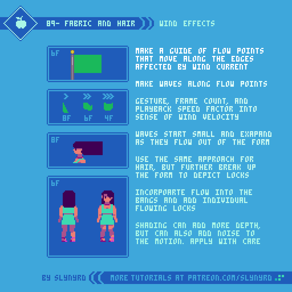
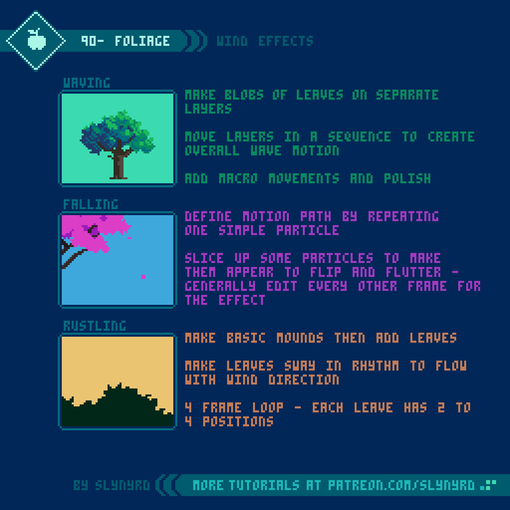
Pixelblog - 37 - Castlevania Study by Raymond Schlitter

Intro

Continuing my exploration of 8-bit aesthetics, I present a new vision of one of the most iconic franchises on NES. Released in North America way back in 1987, Castlevania immersed me in a way that shouldn’t have been possible with such limited hardware. The castle setting, epic music, and unforgettable character designs all came together to form a unique gothic aesthetic that perfectly suited the whip slashing gameplay. Today, these games look just as good as they did back then, if even better. Castlevania is a shining example of how less can be more, how technical limitations can result in genius. Analysis of art made within the strict restrictions of old hardware provides highly valuable insight to the pixel artist. For this study, I focused mainly on Castlevania 3, which I think has the most refined graphic presentation of the 8-bit trilogy. To keep the aesthetic in line with the originals, I used the official NES palette for all graphics in this lesson, but I don’t strictly adhere to the true technical limitations. To round out the vision, I cover player sprites, enemies sprites, and tiled environments.

Vampire Hunter

Pardon the nudity, but the goal here is to provide a base model one can build their own design upon. For the creation process I referenced the actual Trevor Belmont sprite from Castlevania 3, reworked all the frames, and included some extras. After stripping down Trevor, I found the base anatomy was done quite well, but I was still able to make improvements to the positioning, and bring out my own expression within the clusters and colors.

As for my own extras, I added the ability to move while crouching, and I gave the attack a bit of flair. Instead of just one frame with the whip extended, I broke it into a smear and overshoot, respectively seen in the 3rd and 4th frames of the attack.

The crouch frame is reused for the jump animation. If you attack while jumping it uses the regular attack frames. I played around with making unique jump frames, but the repurposed crouch frame still looked better. No need to add extra frames.

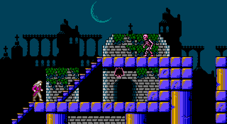
Take note of how the actions fit precisely in a 16x16px tile map. The jump height is 2 tiles. When you get hit you get knocked back 2 tiles. Stair movement goes in half tile whole step increments, as it would look really odd if you could stop the player in mid step.

To make your own kick ass vampire hunter, try recreating these frames with stylings and gear of your choice. Technically, moving sprites on the NES are limited to 3 colors, plus one shared color across all sprites. Admittedly, I’m adding some extra colors here and there to add graphical interest, while cautiously maintaining a seemingly authentic retro aesthetic.

Monsters

One of the most memorable aspects of Castlevania is the diverse cast of enemy characters. All manner of undead, possessed, and blood sucking creatures make an appearance in the harrowing halls of Dracula’s castle. I took a stab at creating some fiends that would be right at home in Transylvania. When creating these sprites I made sure to use multiple references, not just the relevant game sprites.

BLOOD BAT
Of course, we have the necessary bat enemy for a vampire story. I referenced ultra slow motion video of bats in flight, and used this knowledge to revamp the standard bat enemy from the games. This also lead me to add one extra mid-wing frame for more natural flight motion, whereas the original reuses one generic mid-wing position.

POSSESSED PINCHER
The Possessed Pincher was inspired by the cat enemies in the first level of Castlevania 1. I wanted to try something a little different, and I think dobermans can look viscous. However, by using photo references, my initial design looked like a normal dog. Possessed eyes and evil colors tell you he is no longer man’s best friend.

FISHMAN
The Fishman always makes an appearance somewhere in the bowels of the castle. In order to understand all the details they were trying to depict in the 8-bit sprites, I took a look at several iterations of this creature, including concept art, and modern iterations. Considering all these designs, I made my own version based on the Castelvania 1 original. I really wanted to bring out his fishiness, so I made him green and emphasized the gills and fins.

FUNNY BONES
Lastly, I figured I must include a skeleton to round out the examples, as so many iterations have appeared throughout the series. I referenced photos of skeleton models alongside various game sprites to snap up this old clacker. At first, I was only going to make a simple two frame walk, but after iterating several poses I noticed some stances seemed to be in a taunting position ripe for laughter.
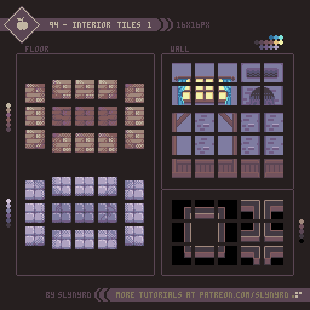
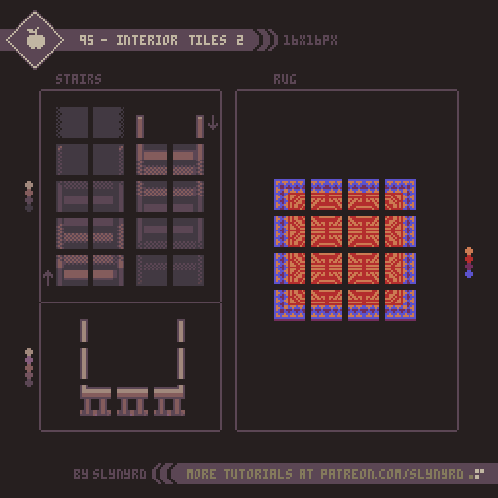
Tiles

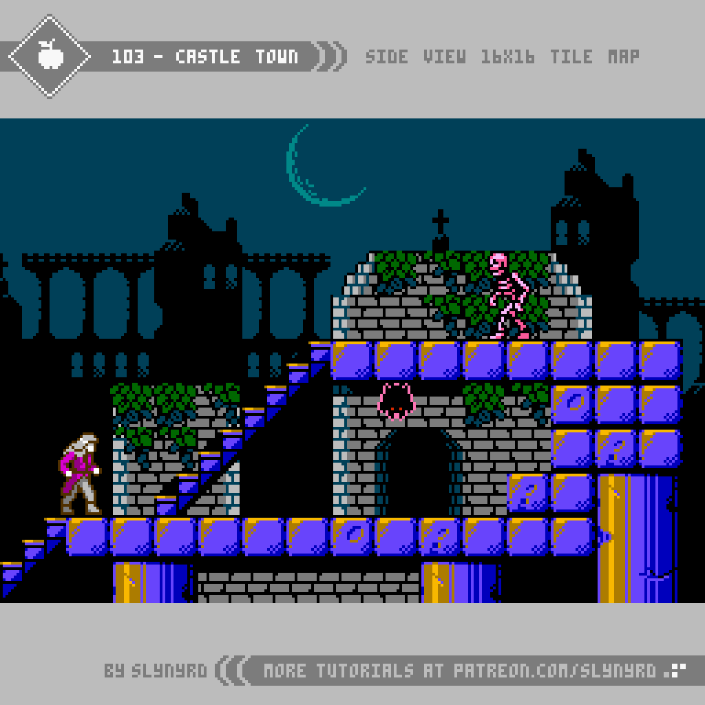
Arguably the most significant and memorable character in the entire Castlevania series is the castle setting. Including ivy covered courtyards, dank dungeons, and steam filled clock towers; every scene in the game oozes atmosphere and personality. Albeit, somewhat flat in presentation, even the 8-bit versions encapsulated all this gothic glory with simple variations of tiles. Well, it all seems simple in the end, but designing with lo spec restrictions requires a surprising amount of thought, as every pixel and color choice can effect dramatic change.

KEY POINTS

The following are some general tips for making retro inspired sprites based on actual games.

Bend the rules - Unless you’re an ardent purist, don’t worry so much about adhering exactly to the technical limitations of the past. However, if you intend to preserve the ‘look’ of your retro inspiration don’t push it too far. I’m just talking about a few extra frames or colors here and there.

Use multiple references - Use multiple references, including real world examples when applicable. If your only reference is a sprite from another game, it’s hard to imagine your own iterations.

Break down the sprite into sections - It’s good to quickly capture the overall rough form of a sprite, but as for the details, I find it helpful to focus on one section at a time. Especially larger humanoid sprites can feel overwhelming at first, but once you have a nice head, the torso comes easier, and so on.

Don’t trace over sprites - Observe and recreate in your vision on a blank canvas, otherwise it will just come out pretty much the same as the inspiration. If you’re completely lost and don’t know where to start, tracing can still be a good learning practice, but I would not recommend it if you want any originality.

Consider the display - Console games used to be designed to be displayed on CRT monitors, which gave the pixels a softer look. Due to this, some pixel clusters found in old sprites may appear harsh in hi definition. Don’t be afraid to clean things up and make what looks right to your eye on a sharp display.

Final Thoughts

The one thing I kept thinking as I made this lesson is how it looks much easier than it actually is. I first thought this 8-bit exploration would be a fun diversion from my typical style, but it’s actually quite advanced. Finding the perfect combination of colors and clustering with such limited options, it’s like solving a puzzle. After close inspection, I’m even more impressed with the quality of Castlevania’s design. In some cases, I found it difficult to make meaningful changes that feel like they actually improve upon the original. Some of the questionable cluster work found in originals was likely due to the fact these games where designed to be displayed on a CRT.

It’s a bit off brand for me to do an overt clone of a specific game, however, I’ve found it very enjoyable and insightful to study. Moving forward, I’m definitely interested in analyzing more masterworks from the past. What games would you like to see my take on?

RESOURCES

Please consider supporting my work by becoming a Patron. Among many other rewards, Patrons can access resources to compliment my tutorials. But most importantly, you allow me to continue making new content! 

Alternatively, you can support me by making a one-time donation directly on my homepage, and receive exclusive art and resources.

Assets featured in this Pixelblog are available in Castlevania Study Asset Pack

Source files used in the making of this Pixelblog are available in Castlevania Study Source Files

Get caught up on all my downloads

You made it to the end of the article. Thank you for reading! 

-By Raymond Schlitter


Pixelblog - 36 - 8-bit Adventure by Raymond Schlitter

intro

Once upon a time, bits where all the fuss when measuring the prowess of your favorite console. Most didn’t understand how it worked, we just knew more was better, as we happily moved on from 8-bit computers to greener blast processed pastures. However, I soon realized the mighty bit doesn’t equate to better games without good art. Turns out, the most beautiful expression comes in limited forms, namely pixel art. Moreover, as computer processing continues to advance, the term ‘8-bit’ remains relevant in modern discussion. In today’s context, ‘8-bit’ is generally used to refer to low-res pixel art and chiptune music that captures the aesthetic of the 8-bit era. A time which was dominated and defined by the NES. Carrying this modern sense of the term, I present a top-down world inspired by the technical restrictions of the NES, but not 100% restricted to. Including characters, animations, and environment design, the following lessons are the making for a great 8-bit adventure!

All the colors used in this feature are derived from my original palette, Bright Future.

Player Sprites

A natural place to start our adventure is with the hero, or at least one of them.

To keep a consistent retro look I used the general size of 16x16px, and limited the palette to 3 colors in addition to the outline per character. I chose this size to mesh well with environments made out of 16x16px tiles, which was very common for games of the era. I referenced a handful of games including Zelda and Pokemon, but drew the most influence from Final Fantasy 1 for the design. If you like this sprite style, I definitely recommend you study the FF1 sprites.

When it comes to the animation, I limited the frames as much as possible to capture a retro look, while remaining effective and satisfying. Surprisingly, you only need two frames to capture most actions, and it looks pretty darn good if you get the poses just right.

The timing of frames and delay between strikes is up to how you want the gameplay to flow. In this example, strike, follow through, and overshoot frames play at 0.08 seconds, with a 0.32 second delay on the Idle frame before it’s possible to attack again.

The idle and walk/run animations all use the same 2 frames, but with different timing. While the idle animation of marching in place can seem a bit silly, it adds life to stationary characters in a non distracting way, and the economy of the design is truly clever.

Enemy Sprites

If you wanna collect those sweet experience points you gotta have some baddies to slay!

SLIME
Ever since the first Dragon Quest, slimes have become a trope in a many RPG and adventure games. However, I get the sense the prominence of slime enemies has little to do with a love for sticky blobs, and is much more about their objective simplicity. Anyone can draw a blob, and the damn thing will be charming. From the top down projection, you only need the down facing orientation and movement works in all directions! In order to bring a little more interest and get even more milage from your slime designs, experiment with different colors and behaviors. Color swapping the same sprite is an easy trick to get more enemy variations with little resources.

SAND ROLY
Familiar designs like slimes are a fun place to start, but you should focus more on original designs that mesh with theme. As an example, I have created the sand roly. The first thing I consider when designing a creature is that it fits the environment, which in this case is a sandy beach. Furthermore, one need only look at the wonders of nature to find inspiration for creature design. Monster design is often a matter of exaggerating and combining real life creatures into new fantastic life. In the case of sand roly, the anatomy is inspired by mole crabs, and the balling trick comes from roly polys. The color is mostly a cosmetic choice that contrasts nicely on the sand background, but it also seemed appropriate it be seared pink out in the sun. Next time you visit the beach, beware of sand rolies!

EFFECTS
As for the special effects, a little goes a long way. In my example, there are two hit frames that momentarily flash when the enemy receives damage. First, I create the damage pose with the bugged out eyes, flailing limbs, etc. Then, I convert the colors to red hues by adjusting the channel mixer and color balance settings (Photoshop). After that, I make an inverse color version. By flashing these two frames it ensures great readability, and gives a strong impression of pain.

The X shaped strike frames appear over the point of collision with an empty frame between them for a flash effect, indicating a successful strike.

The 3 frame circular explosion is what I call vaporize effects, which can be used to show the destruction of enemies. Simply flash away the enemy into oblivion while the vaporize effect plays over it. To sufficiently cover the enemy, spread out the placement and repeat the effects for longer, larger explosions.

The large two frame explosion is intended to harm the player if too close. Alternate frames at high speed for desired duration of effect. Simple as sin, but it works so long as the animation doesn’t hang on screen too long.

Seaside Environment

Bright green grass and soft sand beaches surrounded by calm blue water… What better place to grind away on the easy fodder?

I approached the design of this environment as if it’s the first stage, or starting area of the game. Generally, games start in a welcoming environment with very passive enemies. This creates a relaxing atmosphere where you can come to grips with the game before venturing to more treacherous terrain. I certainly appreciate this approach, and again want to emphasize the importance of theme. Mesh the enemies and mechanics with the environment, so each area stands out, and the introduction of each new enemy is memorable.


Again, I’m drawing inspiration from 8-bit iterations of Zelda, Pokemon, and Final Fantasy for parts of the tile design. As for tips on making beautiful top down tiles, please review Pixelblog 20 for the fundamentals.

Final Thoughts

With technology today, you can use countless colors, make huge sprites, and include as many frames of animation as you like. While I appreciate the artisanship in hard labor, and the spectacles brought by advancements in computing, the old school graphics just keep looking better and better. So, why overcomplicate things? Seriously though, I would love to be making this game for real. Maybe someday… or, you could make it for me, Haha! Join my Patreon and download all the assets to use for yourself!

RESOURCES

Please consider supporting my work by becoming a Patron. Among many other rewards, Patrons can access resources to compliment my tutorials. But most importantly, you allow me to continue making new content! 

Alternatively, you can support me by making a one-time donation directly on my homepage, and receive exclusive art and resources.

Assets featured in this Pixelblog are available in 8-bit Adventure Asset Pack

Source files used in the making of this PIxelblog are available in 8-bit Adventure Source Files

Download the palette used to create this tutorial, Bright Future.

Get caught up on all my downloads

You made it to the end of the article. Thank you for reading! 

-By Raymond Schlitter

Pixelblog - 35 - Top Down Interiors by Raymond Schlitter

Adventure calls…

Intro

Pixel art is often described as cozy, and while much of this sentiment comes from gaming nostalgia, I believe there is an inherent quality in the art form that evokes the fuzzies, evidenced by its popularity among all ages. Young people who never had to blow in a cartridge can be enchanted by the warm vibes of pixel art just as easily as the graying retro gamer. Furthermore, the pixel artist should be in tune with this cozy feeling and learn how to exploit it. In this lesson, we step into one of the coziest of pixel subjects, house interiors.

Presented in a 3/4 top down projection, this lesson builds from the materials in Pixelblogs 20, 21, and 22. Please review these lessons for greater context on the top down world presented here, and the basics of making tiles. All the colors used in this series come from the Mondo palette.

No time for breakfast, gotta go adventure!

Interior Tiles

Built of wood and stone, the homes of this small village have a simple rustic quality. However, the proud owners find a slice of heaven in humble, yet comfortable dwellings.

The tiles are 16x16px. I find this to be the most balanced size to work with, providing plenty pixels for detail, but small enough for efficient production. As a conventional tile size throughout the 8 and 16 bit era, 16x16 tiles also produce an authentic retro aesthetic.

Designing visually pleasing tiles can be deceptively difficult. Refer to the Key Points section of PB 20 for the fundamentals. It can feel tedious to design within a tile map, but the utility it provides the game design is well worth the effort. Once you have a functioning tile set made, it’s an absolute blast to design environments. A good variety of boxy shaped rooms can be made with the above wall frame tiles, but you will find some minor limitations.

Continuing with the same interior set, we now introduce stairways and rugs. Often stairways are simplified to a single tile in top down games of this style. This is for the flexibility of level design at the sacrifice of visual accuracy. For my stairs I take a fairly realistic approach, creating stairways in proportion to the character sprites and wall height. While it looks cool, they take up quite a bit of space and are limited in orientation.

The railing tiles will need to go on a separate layer above the stair tiles.

Making the rug was particularly fun. Referencing antique handmade rugs, I freely threw down shapes and colors until a meaningful pattern emerged. Keep it simple, or go crazy with colorful details. Either way, you had better work in a tile friendly app, such as Pyxel Edit, which allows you to see all the tile connections in realtime as you edit. Otherwise, it’s no fun at all.

Furniture

Now that we have a some fine interior spaces, it time to decorate! While these may not appear as tiles, they are designed within a 16x16px tile map, so they mesh with the environment and can efficiently be broken into tiles.

This first set of furnishings is oriented around the dining area, including a table, stool, countertop, and stove.

This furniture set focuses on living room and bedroom items. Not much else to say, as it’s all contained in the visuals. Try repeating my process and see where it takes you.

I feel I could go on and on making little furniture, but that covers most of the common objects needed to make a complete happy home. All we’re missing is a pet.

Final Thoughts

I’m happy to finally return to my top down series, last featured all the way back in PB 22. I was new to tiles then, and I was convinced I sucked at it. But, my experience over the years has made the process much smoother. Keep practicing, folks!

The 16-bit aesthetic this series is inspired by captures a sweet spot for me. Something about these rooms lifts away anxiety, and makes me want to live there forever. I hope you will take the time to make your own interior tiles, and experience the immense satisfaction of designing rooms. Don’t hold back. Let this lesson be a launchpad to creating an entire village.

The community reading hut…

RESOURCES

Was this article helpful? If you find value in my content please consider becoming a Patron. Among many other rewards, Patrons can access resources to compliment my tutorials. But most importantly, you allow me to continue making new content. 

Assets featured in this Pixelblog are available in Top Down Interiors Asset Pack

Source files used in the making of this Pixelblog are available in Top Down Interiors Source FIles

Get caught up on all my downloads

If you're not ready to commit to the subscription model of Patreon, make a one-time donation and receive exclusive art and resources. Help continue the content by providing me a living. Thank you! 

-By Raymond Schlitter

Pixelblog - 34 - On The Farm by Raymond Schlitter

Intro

Most people fly right by these parts, but we’re gonna take a cozy detour for a stay on the farm. As a country boy myself, the simple scenery of rural life captures an aesthetic precious to me. Far from the amenities of the city, life maintains a connection with nature that people long for in the modern world. It’s no wonder causal daily life themed video games with farming mechanics have become more numerous in recent years. Not surprisingly, pixel art captures the farm world with exceptional charm. In this super casual lesson I present a handful of subjects associated with farming. It’s all in a hard day’s work. Let’s get to it!

Barn

What’s a farm without a barn? You gotta have a place to store farm implement, but more importantly, a shelter for your animal peeps.

3/4 top down projection is a fave of mine. By maintaining clean lines while depicting a sense of depth, it’s especially conducive to architectural forms. Much in line with architectural themed tutorials of the past, you should be right at home with my approach to the barn. I always start by making the roof and the front face of the building with solid flat colors. This quickly captures the entire form and defines the lighting. From there, it’s just a matter of details. My example is modeled after a real barn in my area, which I used reference photos of to inform the details. No matter how simple or abstract the assignment, references are always helpful. After all, visual art begins with observation.

While structurally sound, my barn is considerably weathered, therefore exhibiting a strong textural element. Texture can add a lot to a piece, but it must be applied with care, as subtle edits can make huge changes when working with limited pixels. Texture elements should clearly inform about the materials without adding unnecessary noise. Keep it simple and repeat consistent clusters for the texture to read well. Refer to Pixelblog 2 for more tips on texture.

Tractor

The little engine that could. Every farm needs a tractor for pulling stuff.

Also in 3/4 top down projection, this tractor stylistically and proportionally meshes with the barn. However, it’s too large to store in said barn, it will require a large hangar to keep protected from the elements. Another win for references, I modeled this one after the Ford TW-35. By taking a constructive approach and breaking down the components step by step, you can realize an intricate machine with accuracy. If you can establish these 3 views, you are well on your way to creating a fully animated 8 directional sprite. Just need to solve those dang angles, yet.

Produce

At the end of the day, it’s all about enjoying the fruits of your labor. Sample some fresh produce while you’re on the farm.

Here are your common garden variety of veggies, and fruits if you’re going by the botanical classification. All sprites are within a 32x32px frame, and range from 5 to 9 colors. For most of the sprites I use a tilted style, while the cabbage sits more straight on. The cabbage simply reads better this way, and I think the combination works well here, thanks to the variety of organic shapes across all sprites. However, I would not recommend mixing styles among sprites with consistent geometry.

FINAL THOUGHTS

It’s not the most exciting subject, but there’s something very fundamental and pure about farm life that I find beautiful. Given the popularity of farming in games, I’m hopeful many of you do too. Although, I’m not particularly interested in games focused on farming, I think the backdrop of the farm can serve for a whole new kind of adventure. Games aside, the countryside provides great inspiration for fine art. I left a lot of ideas on the table for this series, and I would be happy to expand upon the theme in future blogs.

Resources

Was this article helpful? If you find value in my content please consider becoming a Patron. Among many other rewards, Patrons can access resources to compliment my tutorials. But most importantly, you allow me to continue making new content. 

Assets featured in this Pixelblog are available in Items Asset Pack.

Source file used in the making of this Pixelblog is available in Tutorial 91 Source File

Get caught up on all my downloads

If you're not ready to commit to the subscription model of Patreon, make a one-time donation and receive exclusive art and resources. Help continue the content by providing me a living. Thank you! 

-By Raymond Schlitter

Pixelblog - 33 - Wind Effects by Raymond Schlitter

Leaves_Loop.gif

Intro

The shifting forces of the atmosphere are ever present in nature. Growing up in Kansas, I’m especially familiar with winds that make the landscape dance for days. Furthermore, I often find myself depicting wind in my pieces. However, the howls of mother nature are not just a point of inspiration. Animating wind is a practical and effective way to breathe life into a piece without disturbing the overall composition. So hang on to your hats, as I present a variety of animation concepts that can easily and effectively depict wind.

Swirls

Wind is visually perceived through the movement it imposes on things. Swirls are a good general solution to illustrate wind in just about any environment. Even when there is nothing in your composition to reasonable move around to illustrate wind, swirls can be generated to imply wind.

88-Swirls_2.gif

The basic particle version is the most subtle and abstract solution. It can be used anywhere in a composition you want to imply wind current. Used alone it feels a bit generic, but it’s quite effective when combined with blowing leaves, debris, or dust clouds.

The cloud versions take on a more tangible form made of dust, dirt, or whatever tiny debris you might imagine. It generates from the ground where the particles of dust are whipped up by the wind. Moreover, dust clouds are most suitable for environments containing dust, dirt, or sand, which is most places on this planet.

Fabric And Hair

Make it wave…

89-Hair_&_Fabric.gif

While I’ve made several subtle iterations, I’ve been using this basic wave technique for years. First, I start with a simplified form of what is going to be blown, and create flow points that run along the edges that will be most affected by wind. Then, I create waves along those flow points. The waves start small and expand as they flow out of the form.

Take a look at the flag in the top frame. You will notice there are multiple of the repeated waves on each frame. In order to do this, the waves need to have equal distance from each other, and have consistent movement that can be looped. For example, my flow points are 12 pixels apart, and they move 2 pixels a frame for a 6 frame loop.

I use the same approach for hair, however, I further break down the form to include some visible locks. After I have the motion established on the main form, I add motion to the bangs and other parts of the hair.

Shading adds depth, but can also create needless noise if not done well. Flat color works fine for most small sprites and keeps the motion pure.

Plants and Foliage

The soothing rustling of leaves, and the hypnotic waves rolling across swathes of vegetation -
The real magic of wind is found in its interplay with nature.

90-Foliage.gif

Waving - Breaking down the vegetation into separate layers allows you to create all manner of wave patterns in a practical fashion. For my small tree sprite, I found the sweet spot to be one wave per loop. The motion of each ball of leaves is very simple; up and right 1 pixel, down 1 pixel, left 1 pixel to return to default position. However, when moved in sequence with the other layers they appear to wave in the wind. Playback speed is 0.2s per frame. Once satisfied with the basic waving motion, it’s possible to provide further polish by editing the actual leaf balls on some frames, so they include more little movements.

Falling - Start with a 2x2px particle. Duplicate it many times and create the desired motion path with consistent pixel increments each movement. Mine moves only one pixel per frame. Once satisfied with the motion path, edit the particles so they appear to flip and flutter in the wind. To do so, my general technique is to cut off the top half of the particle every other frame. When the particle does a little loop de loop, I cut out the pixel closest to the pivot in each frame.

Rustling - This is so easy to execute, but it gives a great impression. Simply make the leaves sway back and forth with an overall flow in one direction. I animate one leaf at a time moving in the direction with the wind to create the overall flow in one direction. When a leaf dips into the wind, the leaf nearest to it will dip on the next frame, and so on. For a nice moderate breeze, 4 frames should be sufficient. Each leaf moves in a similar fashion with 2 to 4 positions max.

Obviously, all these techniques can be combined to great effect.

Final Thoughts

Wind effects are essential to have in the animator’s toolbelt, especially if you do a lot of landscapes. Nearly any static scene can be brought to life by implementing these simple animations. Observe my animated works over the years and you are sure to spot trademark wind effects. They have served me well, and I’m sure to continue using them, while always striving to refine, and invent new approaches.

Hair_Thumbnail.gif

RESOURCES

Was this article helpful? If you find value in my content please consider becoming a Patron. Among many other rewards, Patrons can access resources to compliment my tutorials. But most importantly, you allow me to continue making new content. 

Assets featured in this Pixelblog are available in Wind Effects Asset Pack

Source file used in the making of this Pixelblog is available in Tutorial 89 Source File

Get caught up on all my downloads

If you're not ready to commit to the subscription model of Patreon, make a one-time donation and receive exclusive art and resources. Help continue the content by providing me a living. Thank you! 

-By Raymond Schlitter

Thyria, Thyrian Defenders, Hyper Echelon?: A Devlog by Raymond Schlitter

The long haul

Hello, hopeful new recruits. I know your triggers are itching to blast some mecha goons out of space after all these years of development. I moved gamedev updates to my Patreon content years ago, but as we sit on the cusp of release, a full blog post is warranted to cover the happenings and my thoughts as we near the end of our long journey.

It’s too hard!

We began beta testing in late January, which is still ongoing. Overall things have gone pretty smooth, and we’ve made many major improvements thanks to our testers’ feedback. While the graphics and audio have received much praise, the difficulty factor has been the most common critique. The game is geared for hardcore players by design and does require repeated plays to advance, but we still want to make the game accessible to an audience beyond shmup junkies without spoiling a meaningful challenge. In order to ease the difficulty and strip out some grinding, we’ve made many significant changes. Such changes include universal slowing down of enemies and projectiles in early missions, increased fire rate, increased ability to earn GP faster, increased invulnerability period after taking damage, auto-shields on fatal hits, complete removal of tedious objectives, minor level design changes, and the inclusion of a full tutorial mission. In spite of all this, we still have users requesting an easy mode.

NO Easy mode

While I’m generally against the whole idea of accessibility modes, I understand the implementation for certain types of modern games. For example, easy mode makes sense In the case of a story driven graphical powerhouse where much of the enjoyment is derived from the cinematic experience. However, hand holdy mode is not appropriate in the case of a skill based game where the core enjoyment comes through the gameplay and satisfaction of overcoming challenges. Although our game has some nice graphics and presentation, it definitely is the latter type of game that focuses on skill based gameplay. So, while we’re open to balancing changes, we believe a full on easy mode would undermine the design.

Varied repetition and Organic Difficulty Curve

To advance you must do more than survive, you must earn medals by completing 4 specific objectives in each level. Repeated plays are by design, and you should not feel defeated for not completing all objectives when you finish a mission. To break the monotony, each objective emphasizes different strategies, and you should only try to achieve one per run until you get the hang of it, and/or have a power advantage with upgrades. The feel of the level is always changing as you upgrade your ship and wingmens’ abilities, and improve in skill. When you unlock more wingmen you also have that variation to play with.

Our game actually has 4 difficulty tiers for each mission, rookie, ace, veteran, and master. You start on rookie and have to complete all 4 objectives on that setting to unlock the next difficulty. Therefore, easy mode is essentially baked into the experience as the first few missions on rookie. Once you get to the 4th mission things really start to heat up, and you are forced to hone your skills. However, even if you aren’t very good at the game, the upgrade system works as a built in handicap, as you are able to keep any GP you acquire in a level, even if you die or quit mid mission. You should have several missions and difficulty tiers open by this point to allow yourself a variety of meaningful activities as you improve your ship. Moreover, GP need only be gained organically as you make legitimate attempts at clearing level objectives. Therefore, it’s possible to beat the game without true grinding, however, the option to grind is always there.

Extra Modes

Enjoy endless score chasing fun in Survival mode.

Enjoy endless score chasing fun in Survival mode.

Should you fall weary in the mission mode, you can play the procedural survival mode for a refresh, or practice the bosses in boss rush mode. After chasing a score in the chaotic patterns of survival mode for a while you might return to mission mode finding your senses heightened. Getting all the way through a level only to be crushed by a boss? Why not master that boss in boss rush mode before raising the stakes? All the tools are there to allow the player to improve and continue advancing.

Master the bosses in Boss Rush mode to insure victory in the main game, and compete for the best time on the leaderboards.

Master the bosses in Boss Rush mode to insure victory in the main game, and compete for the best time on the leaderboards.

Inclined to give up, or conquer?

I’m somewhat perplexed by how many gamers these days will gleefully cut down trees or kill slimes in some vapid environment for hours on end, but they’re not willing replay a handcrafted 5 minute mission a few times to learn its thoughtful design. I get it. Sometimes you just want to kick back and zone out on some casual gameplay. But personally, I get the most enjoyment out of games that demand skill. I think it’s fun to suck at something and gradually get better. Having this demeanor towards all challenges will increase your chances for success and fulfillment in life. I know it’s a game, but it’s not just a game. We learn a great deal through play. The games we play, and the stories we tell have profound influence on our psychology. No participation trophies here.

Finding our audience

Since challenging skill based gameplay is usually the standard when it comes to shmups, they tend to attract a niche audience of hardcore players. Therefore, we felt secure in emphasizing the challenge as we designed the game. Strangely, we seem to attract an eclectic audience of few hardcore shmup players so far. This may partly be due to the colorful aesthetic. Or, it’s because our name is attracting fans of the game Tyrian, which apparently includes many difficulty modes to allow players to ease into the game. Well, I’m sorry to burst your bubble, but our game is not inspired by Tyrian at all.

Not Tyrian

At the start of development we had never even heard of Tyrian. The origin of our title ‘Thyrian Defenders’ comes from our original fictional universe it takes place in, which we named ‘Thyria’, simply because we really like the sound of the word. Turns out a total coincidence that a really similar word is used for a game title in the same genre. We came aware of this unfortunate coincidence some time ago, but we thought the different spelling and phonetic would be enough to bury the past with an exciting new experience. Also, we figured the association couldn’t hurt, because it’s the same genre, and fans of another vertical shmup would likely enjoy ours. However, we’ve come to understand that Tyrian is a much different game than ours, and approaching our game with false preconceptions seems to hinder the ability to enjoy our game for what it is.

We were actually working on a canceled project before this that takes place in the same universe called ‘Thyria’ and nobody made an association to Tyrian, because it was a different genre(platformer). But now that it’s a vertical scrolling shmup, it’s become obvious we must distance ourselves with a completely different title. By the way, very few people have ever pointed out our true inspirations, as it is definitely not Tyrian. Ever play Skyforce?

Hyper Echelon

The evolution of our name and logos over the years.

After a couple weeks of brainstorming for a new name, we have arrived at ‘Hyper Echelon’. Since we’re going to participate in the Steam Next Fest, we had to notify them of our new name ASAP. So, I hope you like it, as it’s pretty much already official. Well, let me tell you why it’s a good name.

First, the phonetics are pretty, and it feels sufficiently shmupy. What’s more, the meaning is totally appropriate. Basically, it means beyond rank, higher than top class. You’re going to need to ascend into such an echelon if you want to defeat the final boss in this game. Also, we have a lot of tiers in the game such as the difficulty levels, the different star systems, and the rank system that grades your performance. We want to emphasize this aspect of the game, as it very much a game about skill.

We considered synonyms for the word hyper, but found it sounded best phonetically, and had the most spacey feel. Also it appears in several instances through the game. You must get through multiple Hyperspace missions, and destroy the Hyperqueens in order to step up to more advanced star systems.

The meaning doesn’t end there. Echelon can also refer to a flight formation of units stepping off to the back right or left, just like the way the titan and wingmen are arranged! We think that’s really cool since the wingman feature is one of the distinct aspects of the game.

We had become quite attached to Thyrian Defenders over the years, but we’re quite happy with everything entailed in Hyper Echelon. It captures the spirit of the gameplay, and implies a hardcore nature to the game. Hopefully that will speak more to hardcore shmup fans in general, and distance us from the Tyrian nuts. Nothing against Tyrian fans, but you must understand how annoying the constant association is when you’re trying to make your own IP.

It’s always strange to change names, but I’ve settled into it. My only concern is if it sounds lame or silly in some other languages/cultures. Let me know what you all think.

The new logo in pixel form

This is the current iteration of the new logo. I liked the old logo, but the font didn’t seem to fit the new words, both visually and in meaning. We want to emphasize the second word ‘echelon’, while with the old name both words were of similar emphasis, and ‘Thyrian’ was distinguished with the wings. Hence, the total overhaul. I think it’s about there, but I might find a way to make it better yet.

The new logo in vector form

While the old logo was a work of art in itself, it lacked functionality. There were a few too many letters in the title, and the font was very chunky, making it difficult to read at a glance. Especially when scaled down, it became noisy and barely readable. This new logo is instantly readable and is able to remain consistent in all formats. Also, I like the color variation.

It’s strange to get used to a new name, but it had to be done. Hope you’ll grow into it. At the time of writing this, we still haven’t implemented the name change in the game, and on all marketing materials. Please be patient as we phase out the old name across all channels.

Well, we’ve hit about every pitfall out there in this gamedev cycle. Hopefully this name change is the last, but I’m not counting on it. Thanks to everyone who’s supported us on the journey. I believe a game will be released at some point.

-By Raymond Schlitter

Pixelblog - 32 - Shmup Design Part 2 by Raymond Schlitter

Intro

Strap in for another round of space shooting goodness, as I expand on several aspects of shmup design. Building from the designs I created in Pixelblog 31, I will now introduce examples of player shot types, pickups, and environment assets. By the time we reach the end of this lesson we’ll have enough elements to create a full fledged shmup level!

Parallax.gif

Player Shot

If you’re going to shoot em’ up you’re going to need a weapon. The primary shot of the player in shmups is foundational to the overall gameplay and should be developed with care.

85-Player_Shot_Fast.gif

Here I cover 3 conventional types of weapons that are commonly found in the genre.

Vulcan - The most common type of player shot found in shmups is a linear string of bullets, which evolves into a spread shot through some kind of upgrade system. This provides a great balance for all types of players. Usually it starts as an unimpressive but practical pea shooter, and becomes significantly more satisfying as it spreads out.

Laser - A linear beam that widens and becomes more powerful through an upgrade process. The small area of coverage requires precise aim but it makes up for it with sheer power and the ability to shoot through multiple solids. Furthermore, it may be a hard sell for a beginner, but can become the most effective choice once familiarized with the level design. My laser stays on for a duration with brief stoppages between shots. This makes usage a little more strategic, but I would make the off period so brief, as to make auto fire still very effective. A constant beam might provide slightly more power but I predict it would feel a bit noisy to always be on and become exhausting. The interval approach seems more interesting to me.

Homing - The homing shot eliminates the need for precise aim by automatically seeking out the nearest enemies. This advantage makes it a great choice for the beginner who is not yet familiar with the level design. With upgrades these spinning bullets become larger, more powerful, and side pods provide additional bullet streams. In order to keep this from being an overpowered handicap, homing shot deals the least damage of the bunch. While effective against swarms of small enemies its advantage is minimized against large strong enemies and bosses. Furthermore, it makes the beginner instantly feel powerful, but the advantage of homing becomes less significant as the player memorizes the level design.

Key points

Geometry - This describes the flight path and area of effect. The geometry strongly impacts the player’s behavior. For example, your flight path when using homing will differ from when using laser.

Fire rate - Generally, the faster the fire rate the more powerful and satisfying the weapon feels. However, if each bullet deals a great deal of damage, a high fire rate can become overpowered. Also, consider how an extremely fast fire rate creates noise by jamming the screen full of bullets.

Power - The amount of damage dealt should be balanced in relation to geometry and fire rate. For example, homing should be relatively weak, or it will become overpowered and unbalanced due to it’s seeking attribute. On the other hand, the laser needs to be quite powerful for its narrow area of effect to still be useful. Power should also be carefully balanced in relation to fire rate. Generally, a slow fire rate should be compensated with power, and fast fire rate should have the power toned down.

Appearance - This refers to the visual appearance of the projectiles. While mostly cosmetic, the visual style should fit the behavior. For example, an arrow shaped projectile would look awkward as a homing bullet unless it rotated to always point in the direction it moves. Moreover, I chose to make my homing bullets spinning ellipses, which look interesting and lend them selves to omni-directional movement.

Obviously, all these characteristics are interconnected and should be carefully balanced together.

Pickups

Pickups are a staple of most game genres, and have an especially prominent place in shmups.

86-Pickups_Long.gif

Pickups should generate excitement and make the experience more dynamic. To do so they should all have distinct meaning, and a varying range of rarity. This set exhibits many examples of the conventional pickups found in shmups, with a touch of unique character to fit my design aesthetic.

The following describes the above pickups from top to bottom. The specific attributes and quantities are a personal choice. As the developer, you are free to implement ideas in any manner you like.

Power up - P stands for Power up! These are how you turn your pea shooter into a glorious spread shot. Each one you get levels up your shot to a max of 5 levels.

Speed - Boost the speed of your ship. Each one you get adds a speed tier to a max of 3. The tiers can be cycled through, so you can adjust your speed depending on the situation, as speedy movements can be a disadvantage when navigating through tight spaces.

Bomb - Bombs are a special weapon that destroy all surrounding enemies and projectiles. Bomb pickups give you an extra use. You start with one by default and can bank up to 3. One bomb equals use.

Life Token - The classic one up item. A life token gives you an extra ship.

Heart - Completely restores your ship’s armor if you’ve taken damage. It’s common for shmups to strictly have only one hit kills, but I think a life meter system promotes a more dynamic and interesting experience. However, I still think taking damage should be of high consequence. For this project, I’m going with a 3 hit system where most hazards dish out a single hit, but some less common threats could inflict 2 at once, or instant death. I would likely also include a small heart pickup that only replenishes one hit of armor.

Pazul - A fictional resource that fills a shield meter. The more you fill the meter the longer the shield lasts when you use it. As with the heart, I would likely include one or two more sizes of the pickup to make the mechanic more dynamic, and the pickups more exciting to collect.

Key Points

Appearance - In concerns to the visual design, pickups should read well and have a distinct appearance that sets them apart from other sprites, as to not be confused for a hazard. A lively idle animation goes a long way here. There are many simple idle animations you can apply, which can be observed in my examples.

Distribution method - The distribution method must also be considered. For example, it could drop from specific enemies, be given by a special neutral unit, or simply just enter the screen randomly. Try to think of a fun and engaging method that best suits the gameplay.

Movement - With all the action happening in a shmup, just getting a pickup can be an interesting challenge in itself. For example, it could drift side to side as it comes down the screen, bounce off the borders of the playing field in angular patterns, or simply sit in the place it spawns from.

Space Environment

We’ve covered all manner of sprite designs commonly included in shmups, but we’re still missing a huge piece of the puzzle where much of the artistry lives - the environment design.

87-Environment.gif

Here I present a practical approach to environment design with a space scene. The first thing to consider is if, and how you can interact with elements in the background. For example, I want to be able to have enemy ground units and buildings on the nearest background layer that you can destroy. To do so, this ground layer must appear fairly close to your ship but still maintain the illusion that you’re flying over it at a consistent altitude. Some games incorporate a secondary weapon for shooting things on the ground, like a mini bomb that you see dropping to the ground in front of you. This helps preserve the sense of depth, but personally, I find this mechanic tedious. Furthermore, I prefer to have your main stream of bullets collide with both ground units and air units. As long as the background layer with the enemies on it doesn’t appear so far away the collision remains believable. I just imagine there’s an imperceivable degree of auto-targeting going on.

Key Points

Layers/Parallax - It’s key to incorporate multiple layers into the background, so you can apply the magic of parallax scrolling. At minimum, you need at least 2 layers for parallax scrolling, but I think it really comes alive with 3, as in my example. When creating multiple background layers you should consider scale, and how color is used to capture atmospheric perspective.

Foreground - In some scenarios you can also have a foreground layer, such as clouds that pass overhead. However, if you do incorporate a foreground layer, make sure it doesn’t dramatically impede your vision of the play area, or appear like it will collide with you. Generally, I avoid having fully opaque foreground objects, but don’t rule it out. If they are off to the sides and pass by quickly, it could work. The trick is designing the foreground objects so they obviously appear above you and not on the same layer as you. Sorry, I didn’t attempt a foreground in my example.

Tiles - I used tiles to create the ground layers. This is not a technical requirement for pixel art games, it’s simply an efficient way to design environments with few assets. What’s more, tiled designs tend to capture that cozy retro aesthetic that makes pixel art so charming. On the other hand, if the tile design is uninspired it can appear monotonous. If I were to create an entire level with the above concept, I would surely add more variation. I like to combine many small generic tiles with large custom assets, which brings me to the next key.

Landmarks/Visual pacing - An interesting and varied background obviously enhances the aesthetic experience, but it also contributes to the gameplay. The key to winning in shmups is memorization. Furthermore, It’s important to create a memorizable background that doesn’t give you a feeling of deja vu. Just a glance at the background should always help orient the player as to where exactly they are in the level. While it’s possible to memorize a level based purely on enemy patterns, it’s so much more intuitive to also have cues from the background to tell you what’s coming next.

The occasional unique landmark is the best way to create a memorable background. Also, the generic sections can be memorable by mixing up the visual pace. For example, a large chunk of land that fills the entire screen, followed by small scattered islands, a brief section of open space, a large chunk of land running along the right side of the screen, then the left side of the screen… You see what I mean? Don’t just make a homogeneous flow of the distribution of the assets, vary the visual pace.

Final Thoughts

Part 2 of the shmup design series down! I actually wasn’t sure if I would have enough material to make a substantial follow up to Part 1. However, as I created this feature I started to think I might need to go for a part 3 to fully flesh out the project! While I covered many aspects of shmup design, we still have no UI, or bosses… Tell me if I’m forgetting something else meaty. In particular, I feel a UI is needed to bring the whole vision together. Let me know your thoughts in the comments below.

If you’re enjoying this series you’ll certainly get a kick out of my game Thyrian Defenders, due out this spring. Many of the concepts presented here I learned through my experience creating TD. So, if you really want to see what’s possible with my design approach, check it out!

RESOURCES

Was this article helpful? If you find value in my content please consider becoming a Patron. Among many other rewards, Patrons can access resources to compliment my tutorials. But most importantly, you allow me to continue making new content. 

Assets featured in this Pixelblog are available in Space Shooter Asset Pack

Source file used in the making of this Pixelblog is available in Tutorial 86 Source File

Get caught up on all my downloads

If you're not ready to commit to the subscription model of Patreon, make a one-time donation and receive exclusive art and resources. Help continue the content by providing me a living. Thank you! 

-By Raymond Schlitter

Pixelblog - 31 - Shmup Design Part 1 by Raymond Schlitter

Intro

Short for ‘shoot em’ up,’ ‘shmup’ seems to be today’s most common term for this classic video game genre. When I was a kid we just called them shooters, but that term is now associated with the first person variety of shooting stuff. So what’s a shmup all about? Gameplay and visual style varies upon design, but generally I think of a shmup as game where you control a small sprite in a conventional 2D space where you must shoot up hordes of enemies while dodging a multitude of attacks. This simple concept provides a welcome entry point for inexperienced game developers, and a wellspring of potential to the creative mind; the perfect playground for kenetic game design.

Mock_up.png

As I said, shmups come in many flavors, but in this lesson I focus my designs within a consistent style in order to create a feasible well developed game concept. Drawing from my experience developing Thyrian Defenders, I present a vertical scrolling arrangement with a space themed aesthetic. However, the fundamental ideas presented here translates across a wide variety of shmups.

As I have much experience in the shmup department, this will likely span into a multi part series. For this first lesson I’m focusing on sprite design, projectiles, and some basic enemy behaviors.

Support

Before we get started, I’d like to ask for your support. If you think I do a good job and enjoy my content, please consider becoming a patron, or making a donation. Not only does your support help me continue creating content, but it also grants you access to a treasure trove of exclusive materials!

Resolution

If you are intending to create a game with your designs, it’s important to have a resolution/screen size in mind from the outset. Resolution not only effects the aesthetic, but also the gameplay. As far as visuals, the smaller the resolution the blockier the graphics will be, as the pixels will be more noticeable. Nothing wrong with that if you are a pixel lover, what’s more, it takes less time to create small assets. On the other hand, increasing resolution exponentially increases the amount of time it takes to create assets. The pixel art aesthetic is all about reading the intention within the clusters. If the resolution is so high I can’t recognize the pixels, I don’t really see the point of it being pixel art. In regards to the common 16:9 screen ratio, I think the golden range is from 320x180px to 640x360px. For this tutorial, my designs are based on a target screen size of 480x270px.

When it comes to gameplay, the size of the player’s sprite in comparison to the overall screen size is the critical factor. A small character on a large screen will accommodate fast paced gameplay and lots of elements on screen, while a character that fills a large portion of the screen will permit fewer sprites on screen, and less time to anticipate attacks due to the tight space.

Player Ships

With all that considered let’s get started with the player sprite. Depending on the theme of your shmup the player might be a helicopter, a flying robot, or a witch on a broom. I’m keeping things pretty traditional and using space planes, which can operate in space or atmosphere.

81-Player_Ships_P.gif

As I mentioned before, the size of the player’s sprite in relation to the screen is key. If too large it will make you an easy target, but if too small it will be hard to keep track of, and may lack character. Choose what you think will best accommodate the style of gameplay you have in mind.

To bring alive the feeling of flight it’s essential to show some degree of roll when moving side to side. At minimum, one left and right frame in addition to the center frame can get the job done, but I like to have two frames for each side of increasing degree of roll. This makes the animation appear smoother, and allows two different degrees of roll determined by the speed of lateral movement, which is particularly nice if the game supports analog input.

As in my example, a directional light source coming from the side requires unique frames for each side. This gives a realistic feeling of depth, but all sprites and environments in the game must have the same lighting treatment in order to preserve the illusion.

Try to make a distinct, yet simple ship design. The more complex and detailed it is the harder it will be to animate. I like to put some kind of striping on the wings to give it more character, and it helps emphasize the depth of the roll if animated well. Also, thruster animation is a must!

Enemy Units

Now we need some things to shoot. Enemy units make up a large portion of the game design and should be crafted with care. Every unit should bring something new to the experience both in visuals and behavior.

82-Enemy_Units_P.gif

I’ve designed a batch of units that have overall visual consistency to imply they are all part of the same faction, yet they are distinguished in shape and color. These are not intended to be a complete set for a specific level, just some general types that fit the space them and could be plugged in anywhere. If I have a specific environment concept, I would introduce unique units that better fit the theme of the specific stage. In the end, I would also like to have greater variation in size by including several larger units and an occasional miniboss. Furthermore, I consider these as familiar types that can be used throughout the game, which could evolve with subtle iterations to keep things fresh. Such designs make for a good starting point, allowing you to quickly scrap together a variety of sequences and groupings to get a feel for the action.

In terms of behavior, each unit should bring new meaning to the experience by encouraging different strategies from the player. The following are several characteristics to consider with unit design.

Speed - The speed at which the unit itself moves and the speed of its projectiles, if it has them. Fast moving units are often counter balanced with lower HP and meek projectiles, while slow units typically have high HP and greater firepower.

Hit Points - Higher HP enemies are usually isolated instances and will need to stay on screen longer for the player to be able to destroy them, while low HP enemies can make brief appearances and often come in groups. Units that take a single shot to kill I refer to as popcorn. These rarely present much challenge, but bring a greater sense of action to the overall experience.

Size - A wide spectrum of size across the enemy roster keeps things interesting. The bigger it is the more fun it is to kill. However, small enemies are also satisfying to kill when you are greatly outnumbered. Large enemies tend to have high HP and firepower, but slow movement, while small enemies typically have low HP and fast movement.

Geometry - Perhaps the most impactful characteristic is the movement paths of the units and projectiles. Break things down into geometric concepts such as straight lines, zig-zags, loopty loops, s-shapes, spirals, and so on.

Color - Depending on specific game mechanics color can be more or less meaningful. Furthermore, certain colors might signify certain attributes. Special mechanics aside, a wide array of colors keeps things interesting. I stuck to a gray base for my generic examples, but I would probably splash more paint on them depending on how they contrast with a specific environment.

Projectiles

You can’t call it a shoot em’ up if it doesn’t involve a great many projectiles.

83-Projectiles_P.gif

Reading projectiles and making precise evasive maneuvers is the heart of a shmup’s challenge. Therefore, the most important aspect of projectile design is visibility. While it can be fun to befuddle the player within chaos, the projectiles should always be readable across all backgrounds.

To keep things visually stimulating, projectiles should come in a wide variety of shapes, sizes and colors. The following are keys to creating fun and highly visible projectiles.

Color - Usually projectiles are the most vivid objects on the screen. Use bright saturated colors to set them apart from the background. Same as with enemy units, color might signify meaning depending on special mechanics. Regardless, I like to match the projectile color with the unit color.

Size - The bigger it is the easier it is to see, but the more space it takes up on screen. At a certain point large projectiles look goofy and ruin the overall aesthetic. On the other hand, super small projectiles tend to get lost in the action are less impressive. Include a wide variety of sizes for interest. Generally, the bigger it is the more damage it causes.

Shape - Unique shapes can help projectiles stand out, and provide more visual interest than simple balls.

Outlines - In order to keep projectiles readable on top of all backgrounds, outlines are almost certainly necessary. For insurance, I sometimes use a double outline made of a bright and dark color. Since I don’t intend to have swathes of white or super bright areas in the background, I often use white outlines. This also, sets them apart from all other sprites, which use dark outlines.

Flashing Effect - This not only improves visibility, but also make the projectile feel alive and dangerous. Simply alternating between two frames gets the job done. The more the frames contrast the more intense the effect. However, too much contrast can make it harder to track when it’s moving quickly. Experiment with many colors and sequences.

Rotation/Motion - Subtle expansion and contraction can be applied to any shape for a pulsing effect. Rotation can be applied to shapes like stars, squares, and oblong ovals. You can also try to make them appear to spin on the z axis for a 3D effect.

Explosions

With all this shooting things are bound to go kaboom!

84-Explosions.gif

This explosion is designed for a top down projection, but can also work in the side view. Its symmetrical expansion is best suited for aerial units, but doesn’t look too shabby on the ground units either.

I like to start with circles that expand into thin rings, which allows me to easily establish the overall size and expansion rate. I also like to incorporate the dominant colors in this first step. Once I have my circle guide I convert it into organic fiery blobs. Some trial and error will be required for polished motion within the clusters, but as long as you adhere to the circle guide the overall expression will be preserved. The following are some key tips.

Start by making circles that become thinner rings as they expand.

Hot air expands quickly and slows as it cools. Therefore, the explosion expands rapidly at first, and slows significantly before it dissipates.

The color starts white hot and fades to warm hues, then to gray as it dissipates into smoke.

The blobs start as consistent shapes and become more numerous and complex with expansion, as the darker areas encroach into them.

Once the blobs reach max expansion they slowly rise and dissipate into smoke.

The rings from the guide can be converted into a shockwave effect with minor modification.

Final Thoughts

I’ve learned a great deal from developing Hyper Echelon over the past several years, and I’m excited to pass on the knowledge in the hope to inspire many more awesome shmups. The concepts described in this tutorial should provide a solid base to begin designing a shmup on, but there’s a lot more I’d love to cover. Bosses, environments, and power ups are just a few more huge aspects to the game design. I feel a sequel coming!

RESOURCES

Was this article helpful? If you find value in my content please consider becoming a Patron. Among many other rewards, Patrons can access resources to compliment my tutorials. But most importantly, you allow me to continue making new content. 

Assets featured in this Pixelblog are available in Space Shooter Asset Pack

Source file used in the making of this Pixelblog is available in Tutorial 83 Source File

Get caught up on all my downloads

If you're not ready to commit to the subscription model of Patreon, make a one-time donation and receive exclusive art and resources. Help continue the content by providing me a living. Thank you! 

-By Raymond Schlitter